Only Natural Pet Dehydrated Raw Food Pouch
DownloadTopics
Details
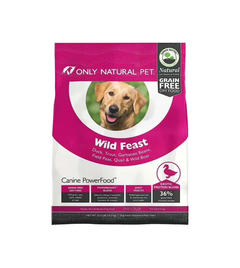
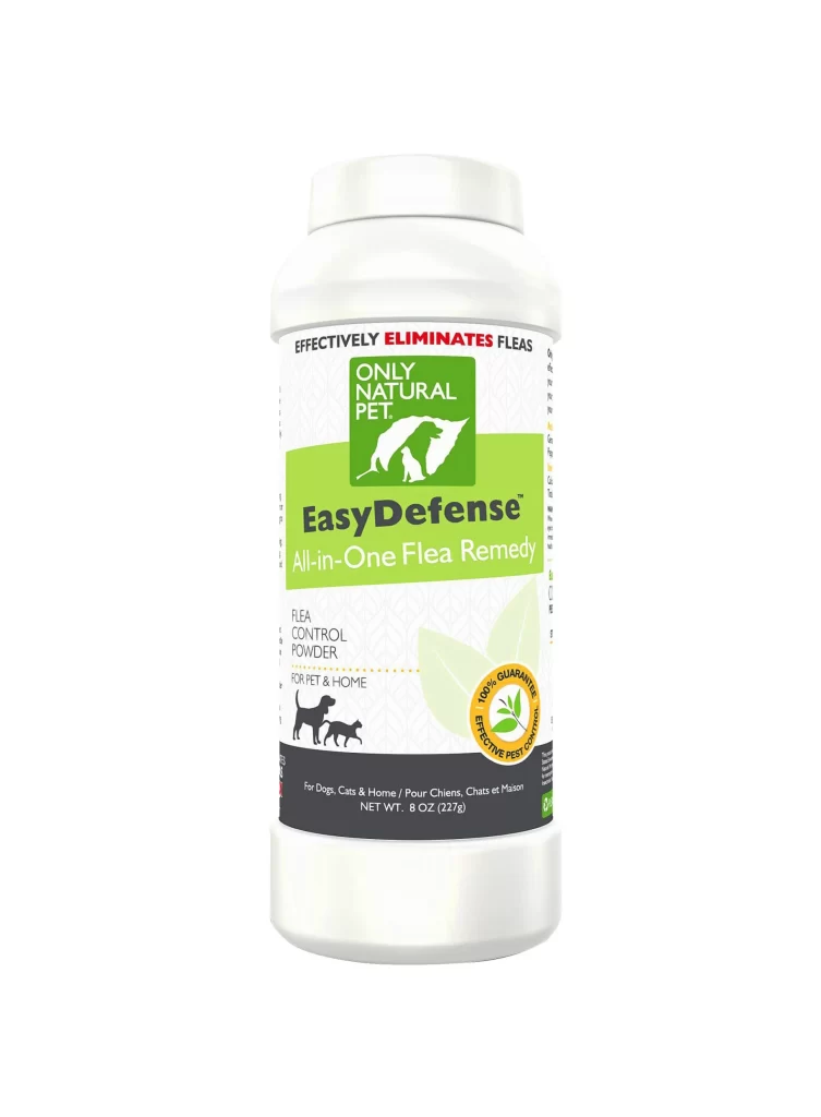
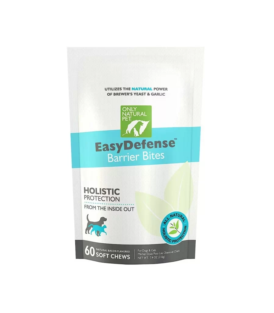
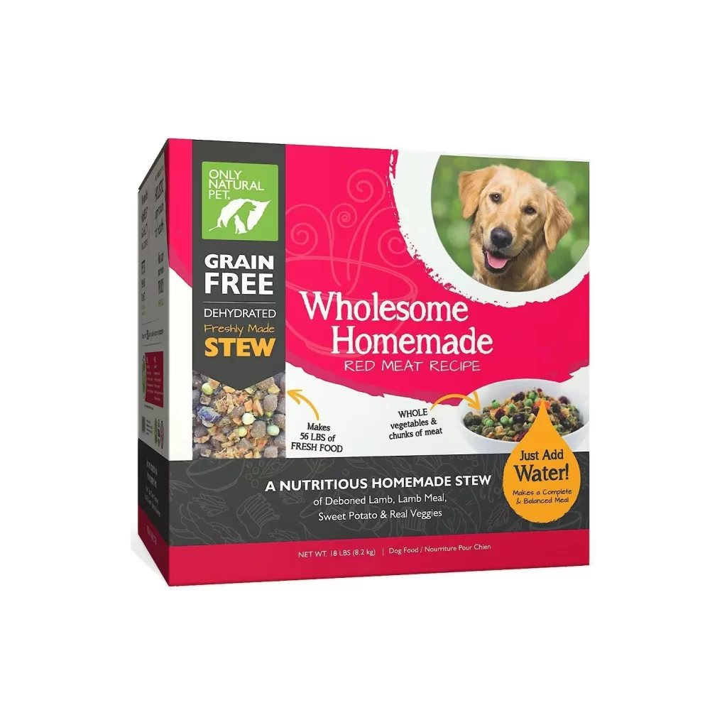
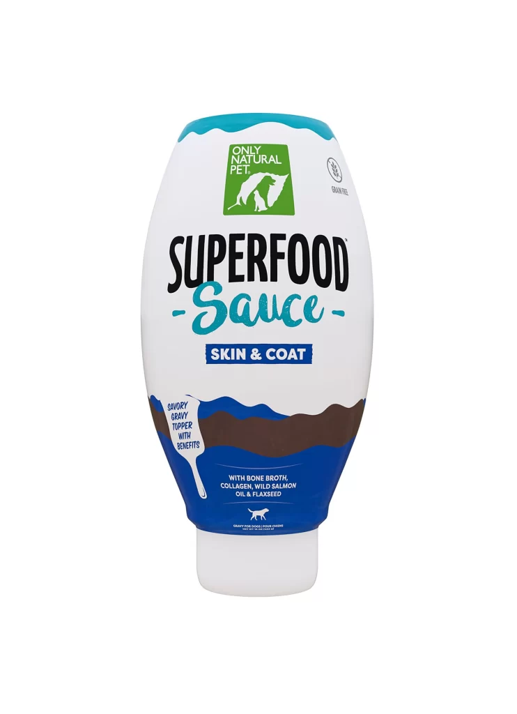
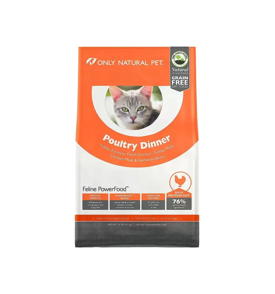
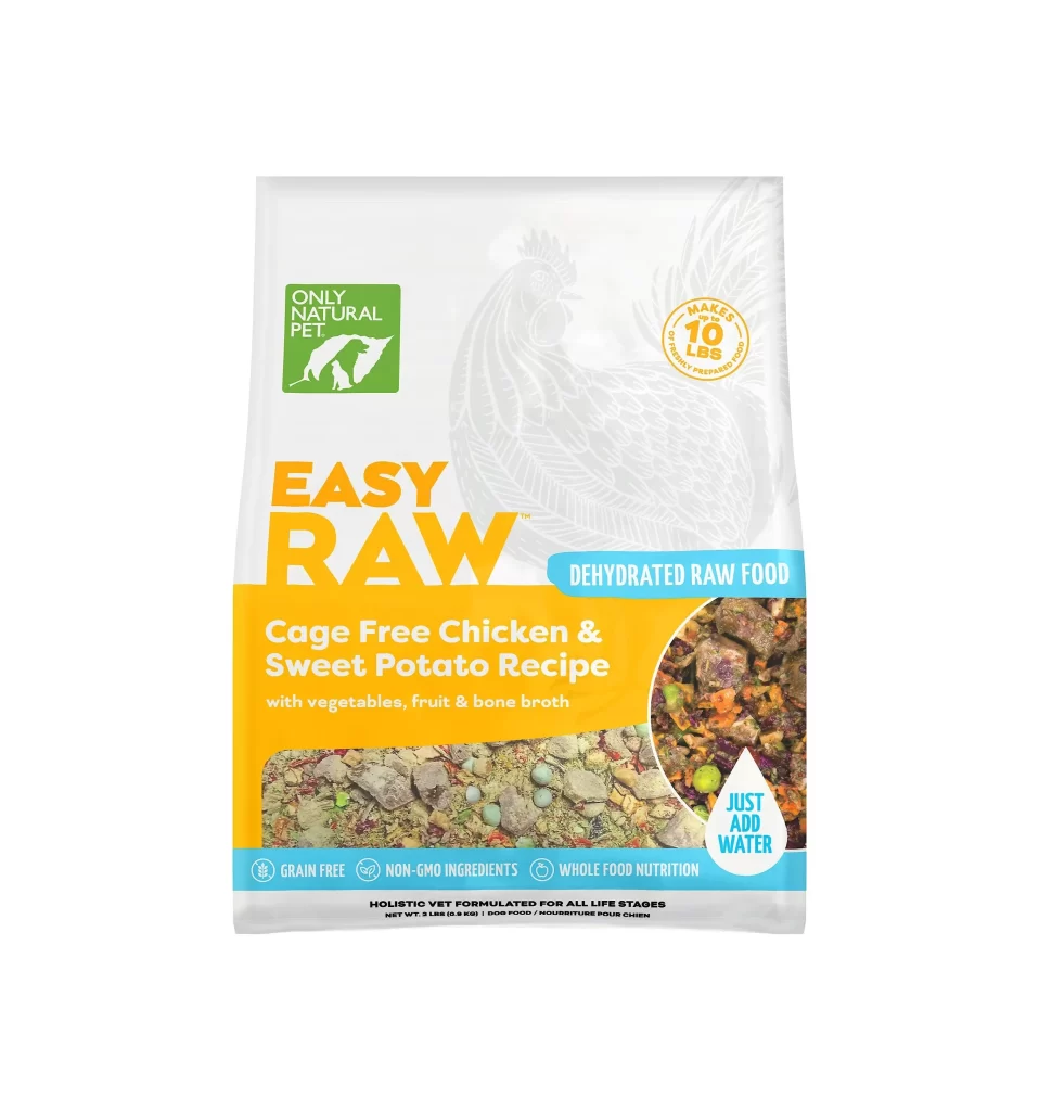
Centered on a seamless white background, the product packaging displays a clean vertical layout dominated by a bright orange lower band and white upper section. The brand name 'EASY RAW' appears in large, bold orange sans-serif letters above the specific recipe title, while a green square logo containing the text 'ONLY NATURAL PET' sits in the upper left corner. A circular photographic inset on the right reveals the rehydrated food texture, contrasting with the flat dehydrated mixture shown across the bottom edge.
Visual hierarchy is established through strategic color blocking, where the saturated orange field draws immediate attention to the flavor profile before the eye moves to the nutritional claims. The inclusion of a faint line-art chicken illustration in the background adds subtle depth without competing with the foreground typography. Designers studying this composition can access the full-resolution file for free to examine how the teal banner anchors the bottom information block effectively.
Packaging engineers and brand identity specialists would utilize this reference to analyze current trends in pet food marketing aesthetics, specifically the balance between medical-looking cleanliness and appetizing food photography. E-commerce teams might employ this visual to benchmark their own product photography setups or to train AI models on retail package recognition. The clear typographic treatment also serves as a useful case study for anyone needing to organize complex ingredient lists within limited real estate.