Elliott Lily Pet Treats Minimalist Blue Brown Pattern
Topics
Details
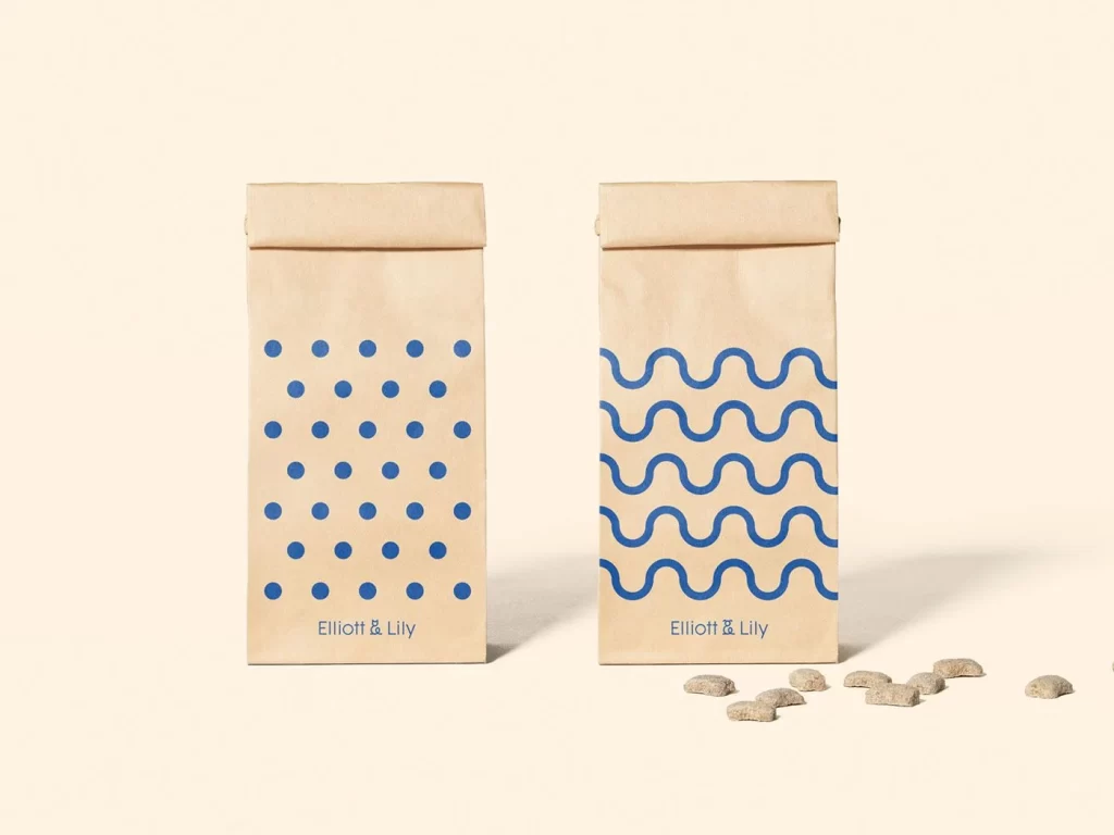
Kraft paper pouches with rolled tops display two distinct blue graphic patterns against a pale cream surface. The left bag features a grid of solid blue circles, while its counterpart showcases four horizontal wavy lines in the same deep azure hue. Both packages bear the text "Elliott & Lily" in a clean sans-serif font near the bottom, and several bone-shaped treats lie scattered to the right of the wavy-patterned bag under soft, even lighting.
Visual distinction emerges from the deliberate contrast between organic material and geometric precision. The matte brown texture of the paper provides an earthy foundation that makes the saturated blue graphics pop with modern clarity. Choosing between polka dots and undulating waves creates a subtle system for product differentiation without abandoning the cohesive brand identity established by the consistent color palette and typography.
Brand designers developing artisanal pet food packaging will find this composition useful for studying how minimal pattern variation can distinguish product lines. Packaging engineers might reference the structural details of the folded closure when prototyping similar resealable formats. Art directors planning e-commerce photography could analyze the spatial relationship between the upright bags and the casually placed treats to achieve a similarly approachable yet polished aesthetic.