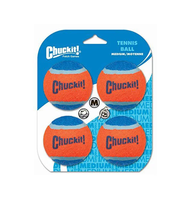
Chuckit Tennis Ball Packaging
Topics
Details
Four orange and blue tennis balls dominate the front of a blister pack, each emblazoned with the 'Chuckit!' brand name in dark blue lettering. The packaging itself features a vibrant blue header card that transitions into white, decorated with repeating 'MEDIUM' text patterns in the lower right quadrant. A circular 'M' size indicator sits between the upper and lower pairs of balls, while the product category 'TENNIS BALL' appears in light blue text near the top right corner.
High-contrast color blocking between the saturated orange felt and deep blue rubber bands creates immediate visual pop on the retail shelf. The repetitive background typography reinforces the size classification without cluttering the primary product view, while the clear plastic bubble allows the texture of the balls to remain fully visible. This particular layout balances brand recognition through repeated logo placement with functional information hierarchy for pet owners selecting appropriate toy dimensions.
Packaging designers studying effective color theory for sporting goods might analyze how the complementary orange-blue scheme draws the eye across multiple SKUs. Industrial photographers could reference the even lighting distribution that eliminates glare on both the glossy plastic dome and the matte ball surfaces. Marketing teams developing point-of-sale materials for pet retailers would find value in examining how size indicators integrate into the overall graphic composition without disrupting the hero product imagery.