NaturVet Calming Chew Pouch
Topics
Details
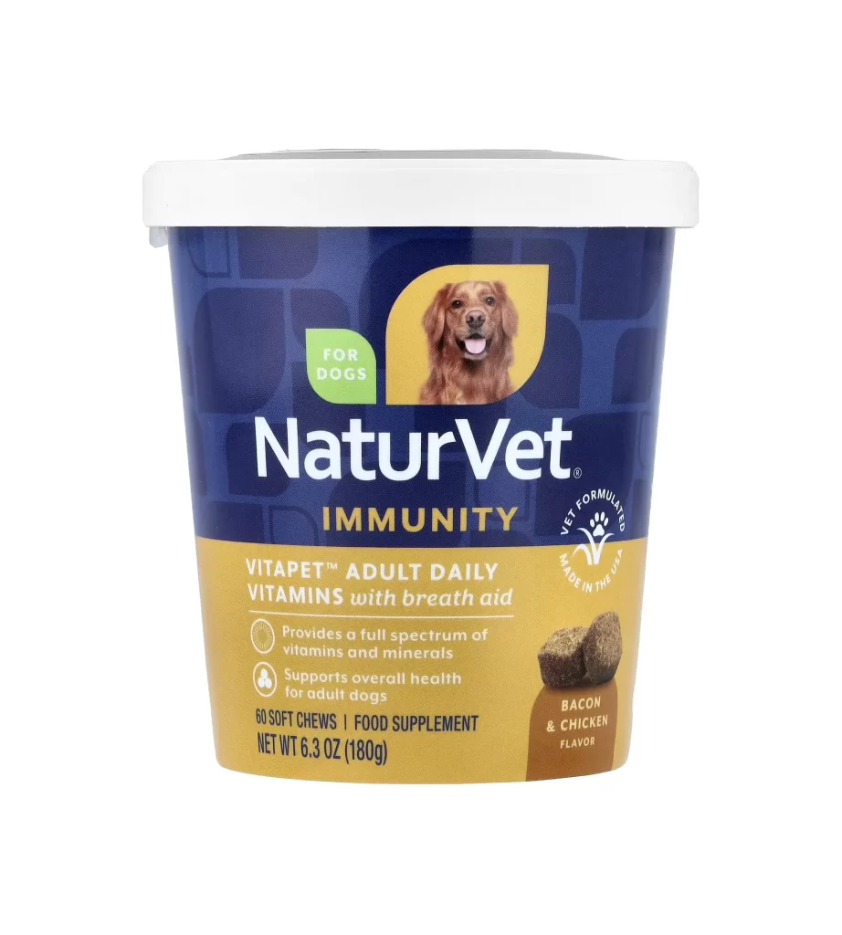
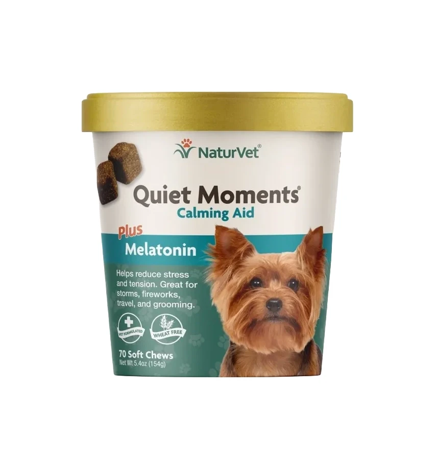
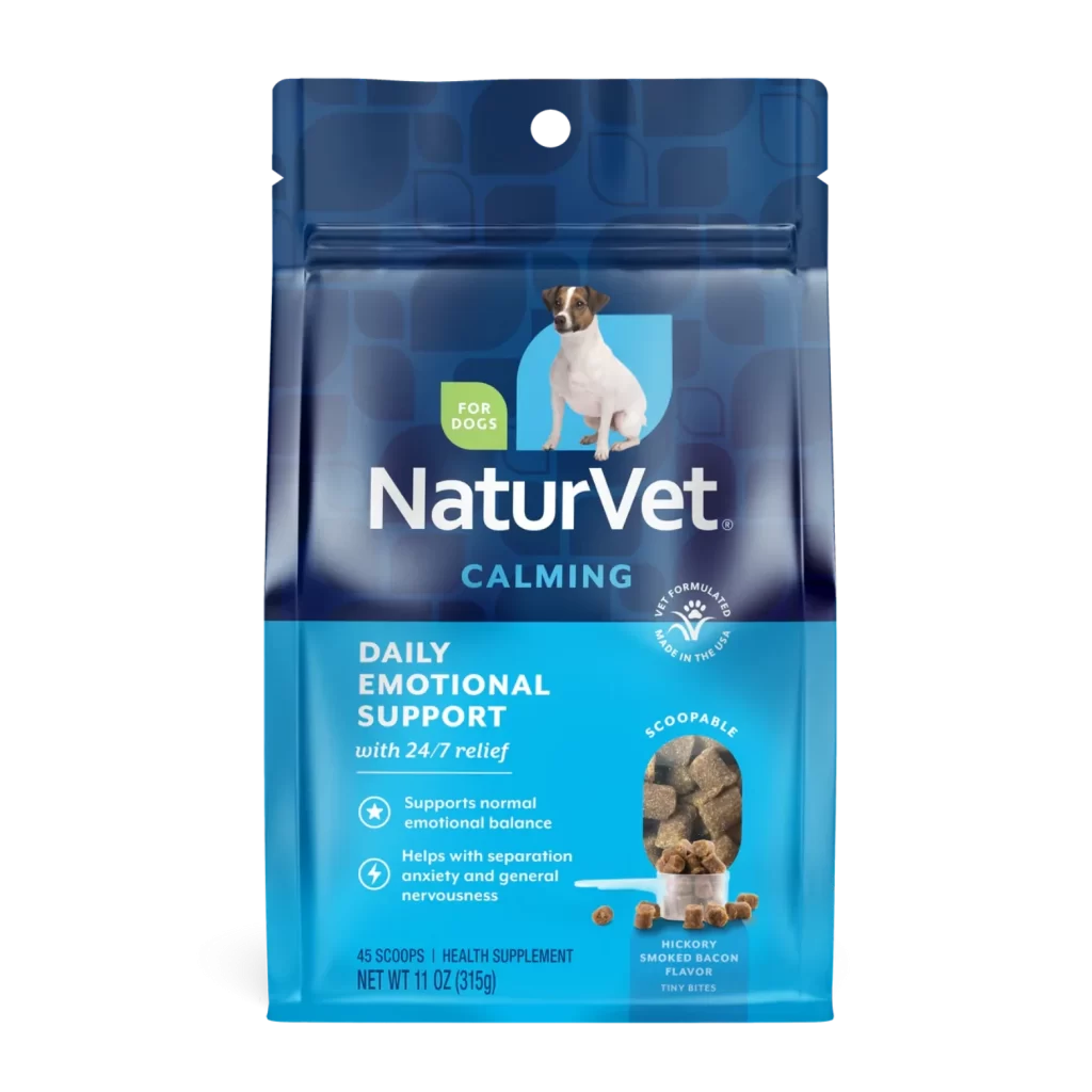
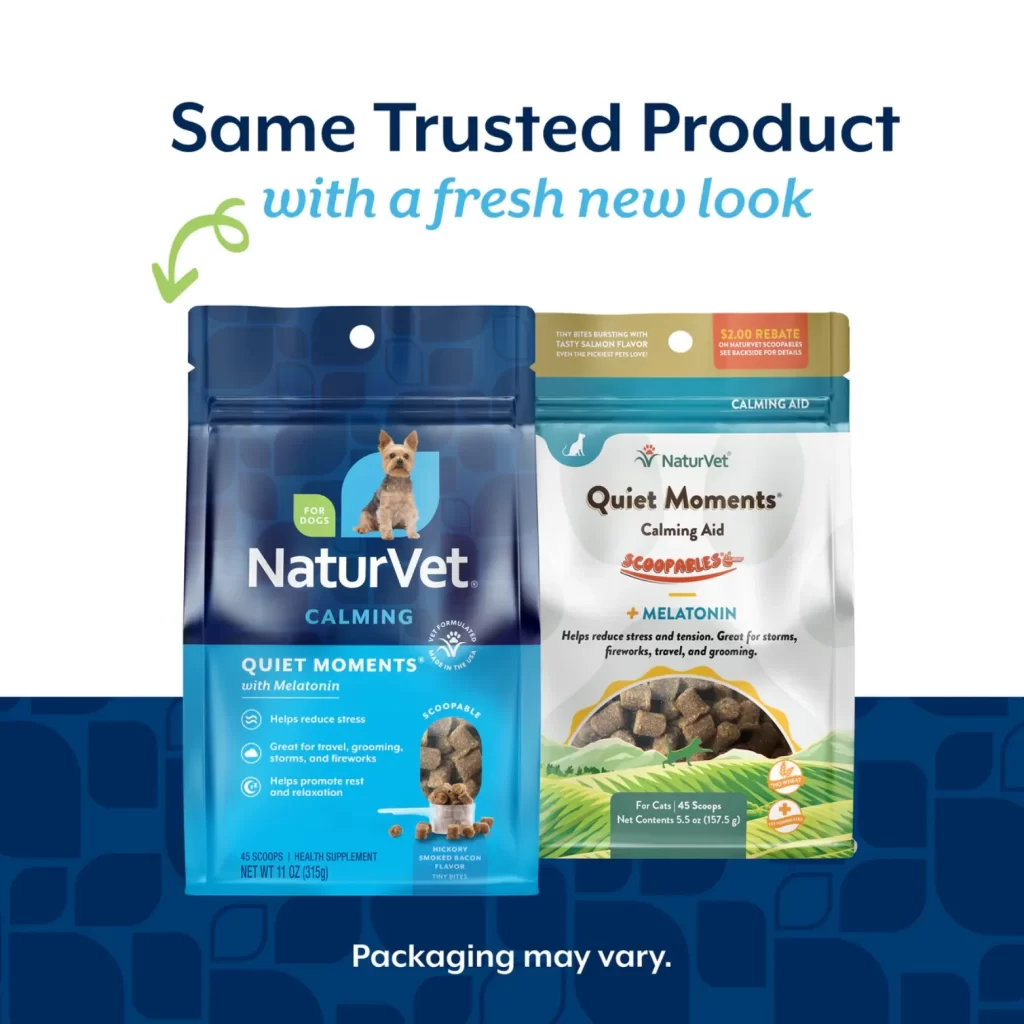
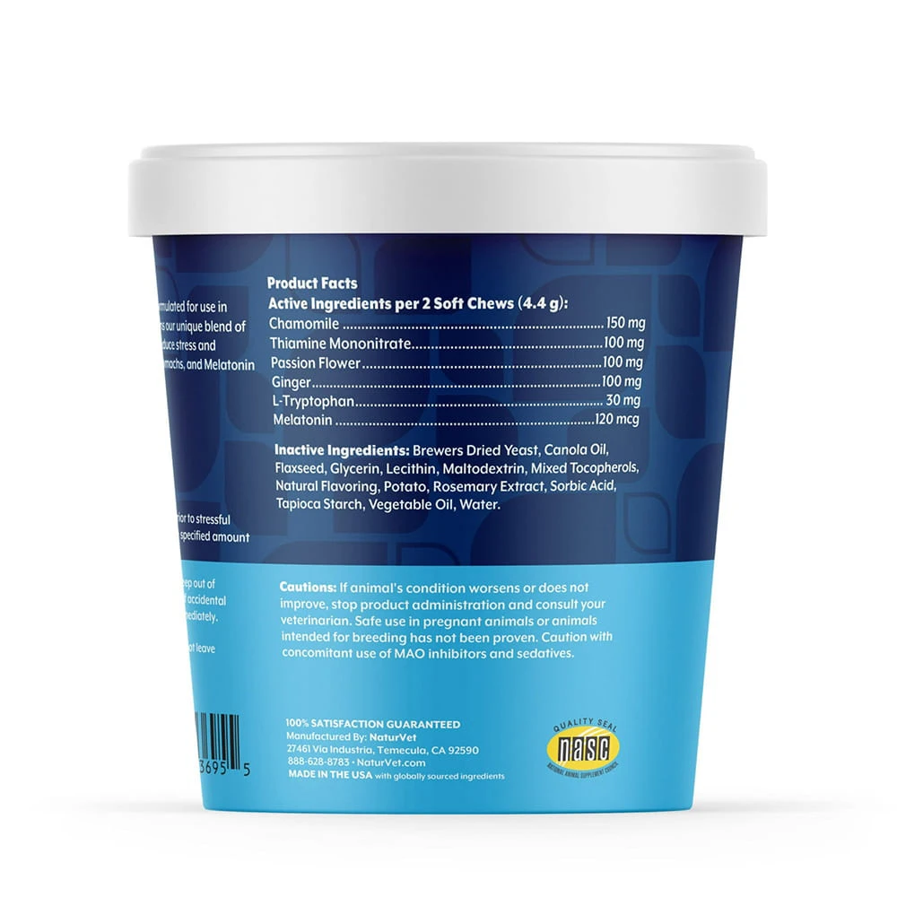
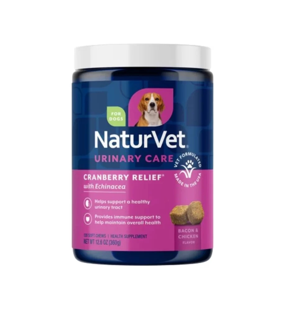
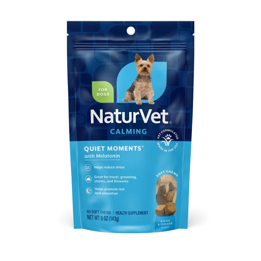
Deep navy blue dominates the upper half of this resealable pouch, transitioning into a lighter cyan at the base where product details reside. A small Yorkshire Terrier sits centered within a rounded blue shape, its tan and dark fur contrasting sharply with the cool-toned background. White text spells out the NaturVet brand name prominently above the word "CALMING," while a green leaf-shaped badge in the upper left corner clearly indicates the product is intended for canine use.
Visual hierarchy guides the eye efficiently from the brand identity down to the specific benefits listed alongside minimalist circular icons. The inclusion of an actual photograph of the soft chews in the lower right corner provides tangible texture reference that complements the clean, medical-aesthetic typography. Such deliberate placement of the "Vet Formulated" seal and flavor designation demonstrates how pet supplement packaging balances professional authority with approachable consumer appeal.
Packaging designers studying the pet care sector might examine how color psychology here employs soothing blues to reinforce the calming product claims. Marketing teams could analyze the spatial distribution of text versus imagery to understand effective information density for health supplements. Photographers specializing in commercial product shots would find value in studying how the even lighting eliminates glare on the glossy plastic surface while maintaining legibility of fine print.