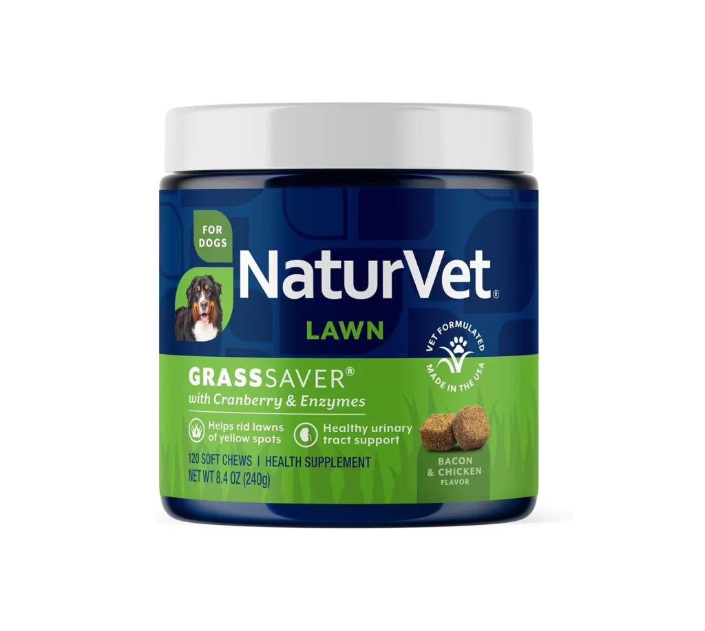
NaturVet Hemp Joint Health Cat Chews Packaging
Topics
Details
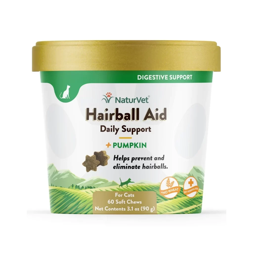
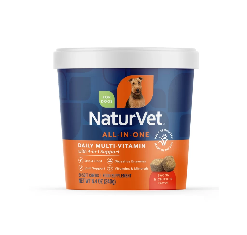
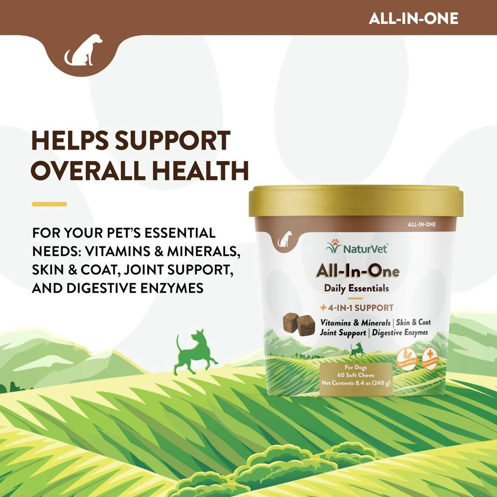
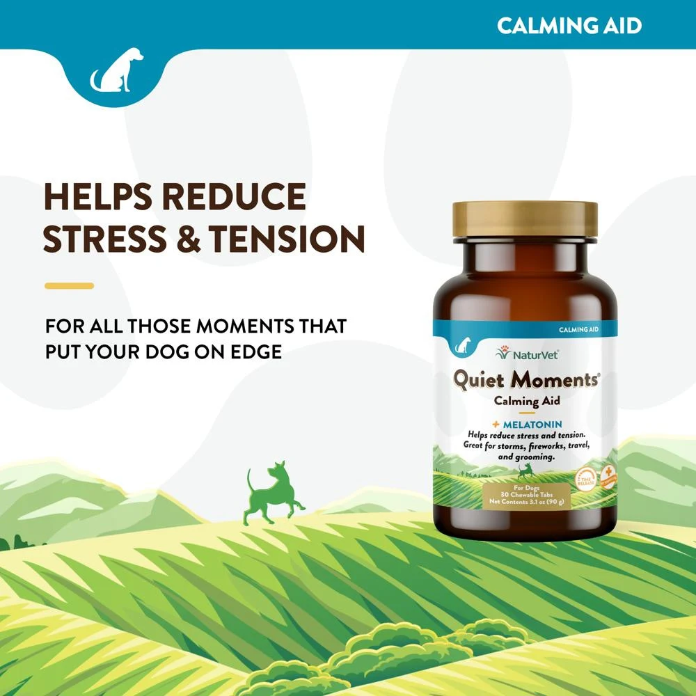
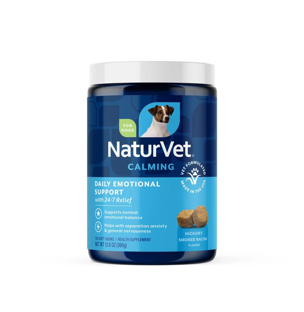
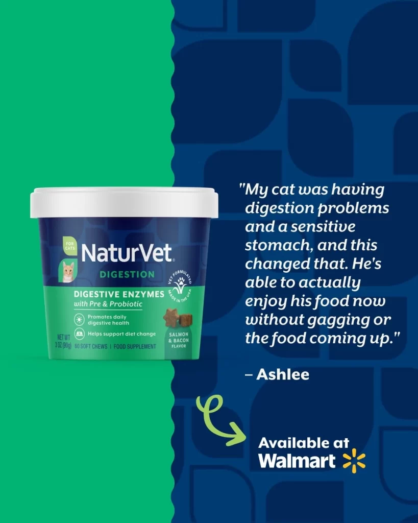
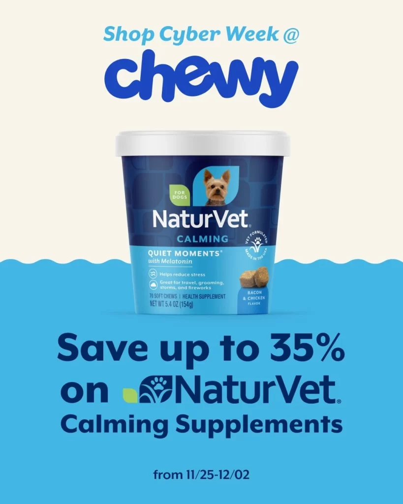
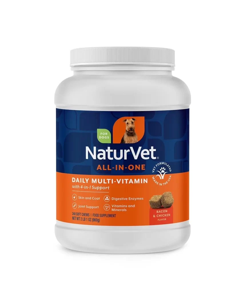
A cylindrical plastic supplement jar displays a two-tone color scheme of forest green and cream, sealed with a smooth matte green lid that matches the lower band of the label. The upper off-white section serves as the canvas for the NaturVet branding and product name, while a realistic photograph of a long-haired tabby cat with striking blue eyes occupies the right side against a white background.
Visual hierarchy is established through the bold, dark brown typography used for the product name ‘Hemp Joint Health,’ which stands out sharply against the lighter label background. Two heart-shaped soft chews are depicted in the upper left corner, providing immediate visual context for the physical form of the product inside. Circular badges on the left edge highlight specific dietary benefits such as being veterinarian formulated and wheat-free, adding functional credibility to the aesthetic layout.
Packaging designers studying pet nutrition branding would find this composition useful for analyzing how to balance photographic elements with dense informational text. Marketing teams could utilize this visual to benchmark current trends in natural supplement labeling, specifically regarding the integration of hemp-based ingredients into traditional joint health products. Furthermore, 3D artists requiring reference material for rendering plastic containers with paper labels can study the lighting reflections on the curved surfaces and the way the lid sits atop the jar rim.