NaturVet Skin & Coat Omegas Pet Supplement Packaging
Topics
Details
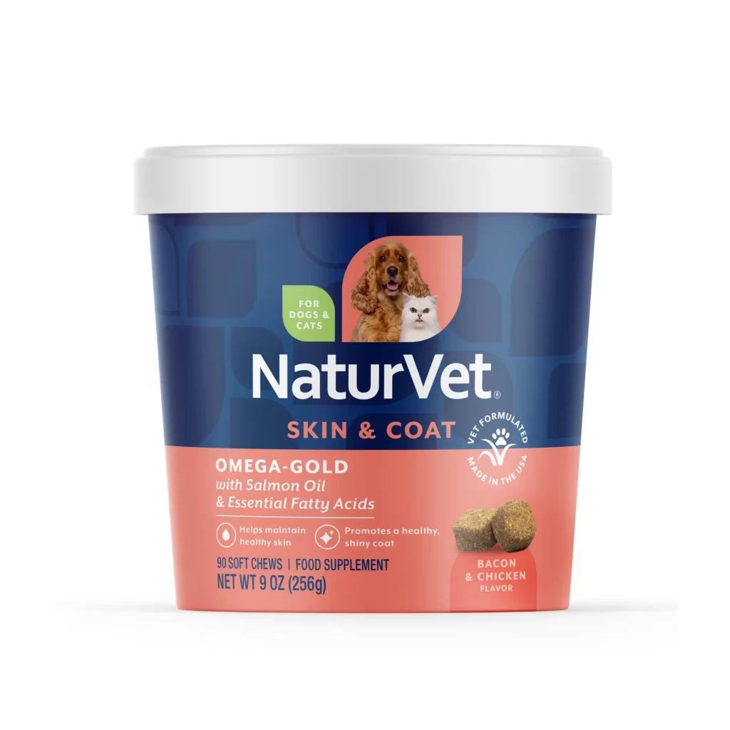
A cylindrical silver bottle topped with a black pump dispenser stands on a white background. The label features a cream-colored upper section displaying the NaturVet logo, followed by bold brown text reading 'Salmon Oil' and 'Skin & Coat' in gold. A golden banner labeled 'Omegas' sits above a dark green block containing white text about healthy skin and coat support, alongside images of a dog and cat.
Visual hierarchy is established through the strategic use of contrasting color blocks and typography sizes to guide the viewer’s eye from brand identity down to specific product benefits. The inclusion of photorealistic animal imagery creates an immediate emotional connection with pet owners while clearly indicating the target species for the supplement. Clean lines and ample negative space around the central graphic elements ensure that the packaging remains legible and professional even at smaller scales.
Packaging designers studying the pet care market can utilize this example to understand how to effectively combine medical-grade aesthetics with warm, approachable animal photography. Marketing teams might examine the layout to see how benefit-driven copy is integrated alongside visual proof of results without cluttering the design. Brand identity specialists could reference the balance between the corporate logo and the descriptive sub-branding elements to create cohesive product families.