NaturVet Stool Ease Pumpkin Pet Supplement Packaging
Topics
Details
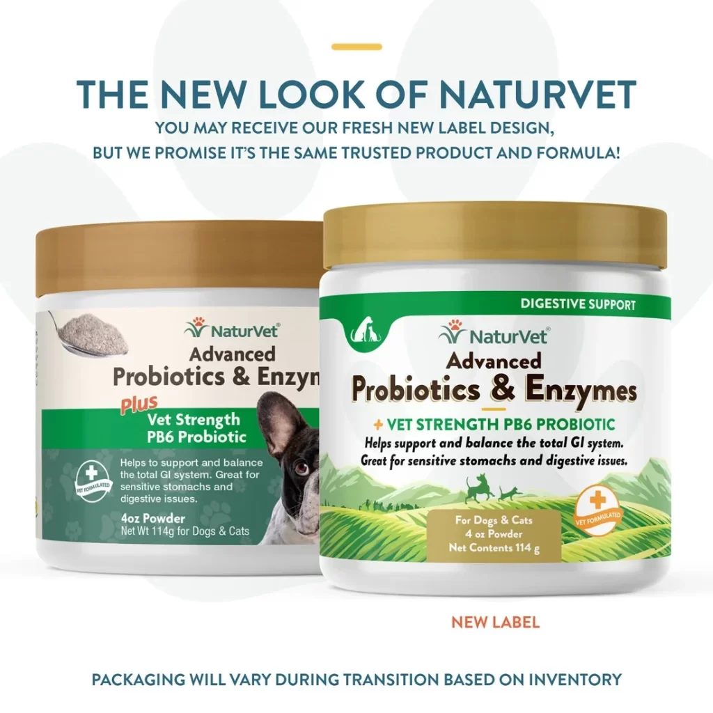
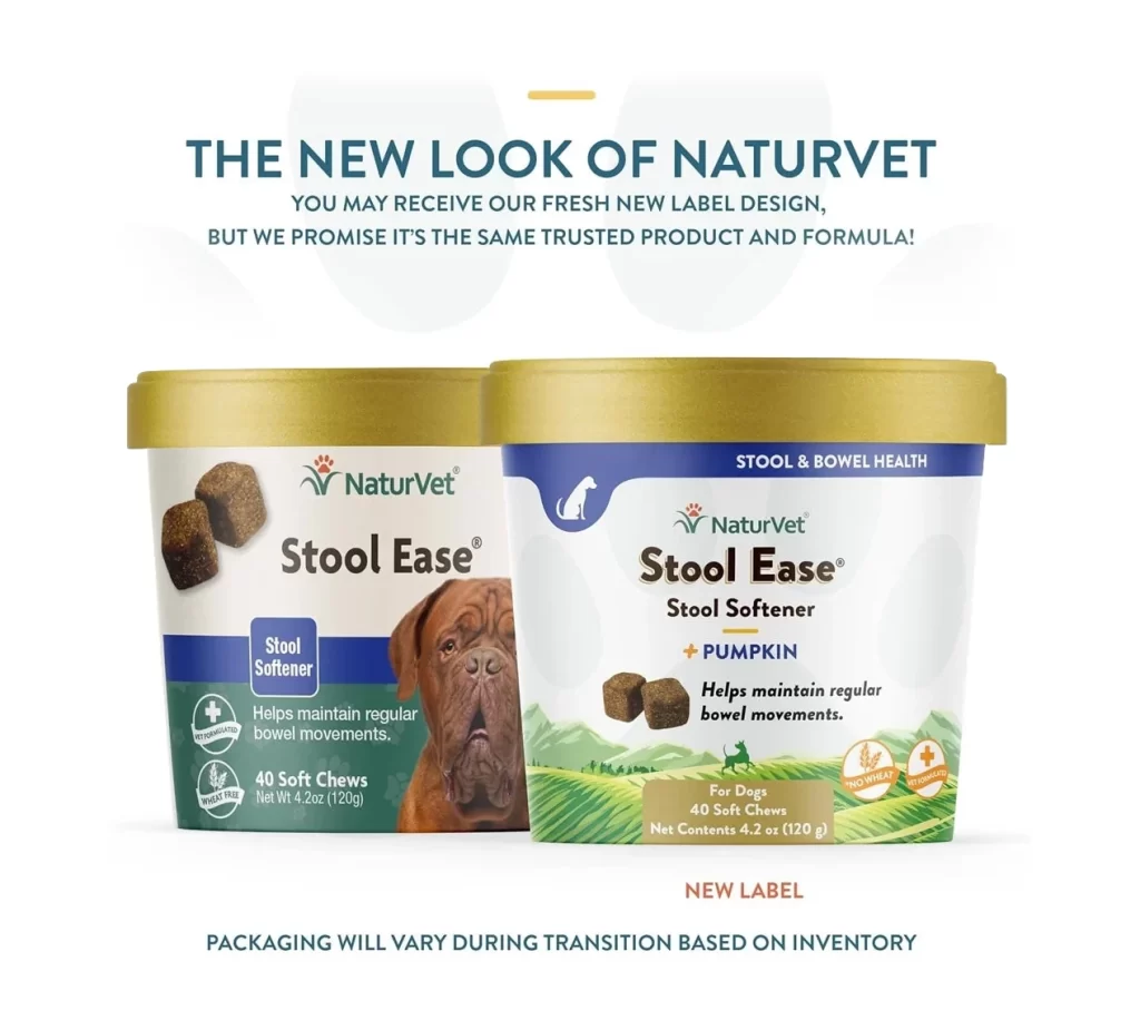
Two cylindrical supplement containers with gold lids stand side-by-side to illustrate a brand refresh for NaturVet Stool Ease. The older packaging on the left features a white body with a deep green lower band, displaying a large photograph of a brown Mastiff alongside dark brown soft chews and the text 'Stool Softener' and '40 Soft Chews'. To its right sits the updated version, which swaps the dog portrait for a green pastoral landscape and adds '+ PUMPKIN' to the labeling while maintaining the same product specifications on a white background.
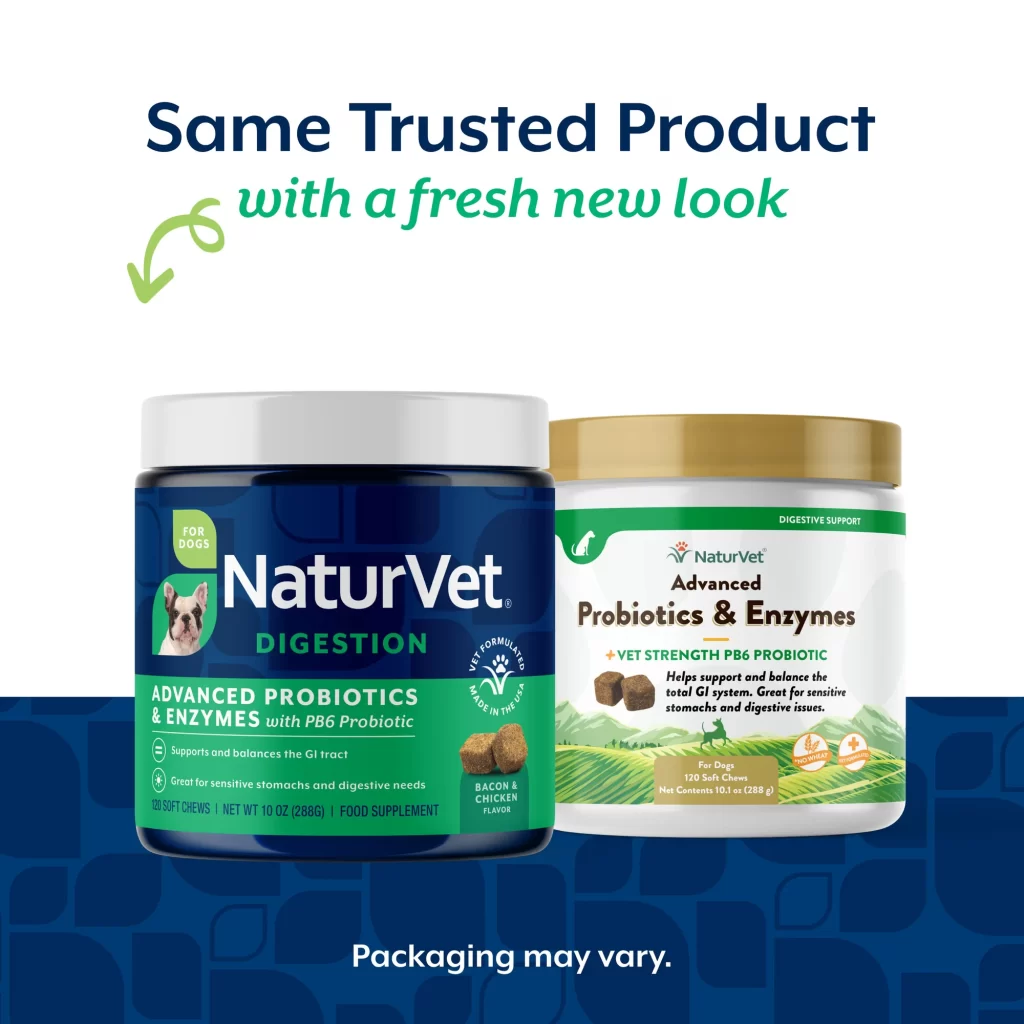
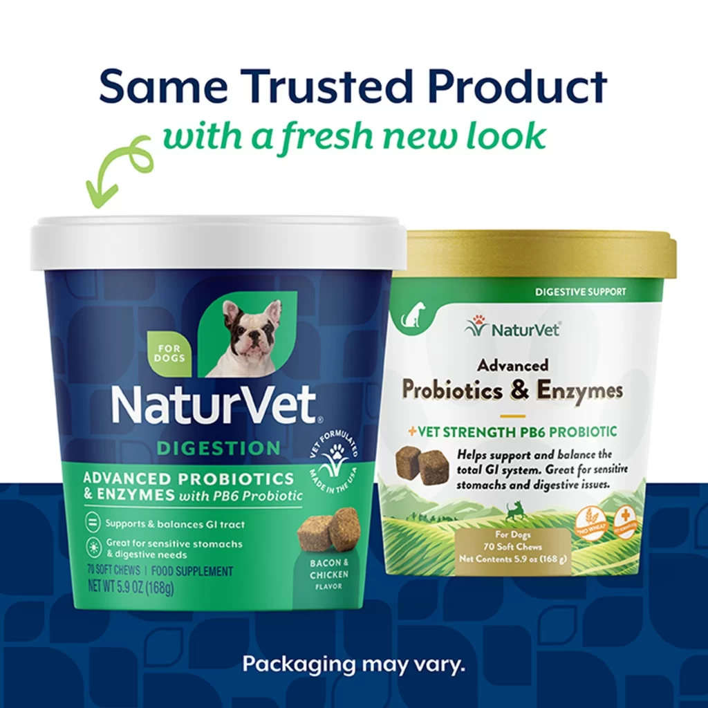
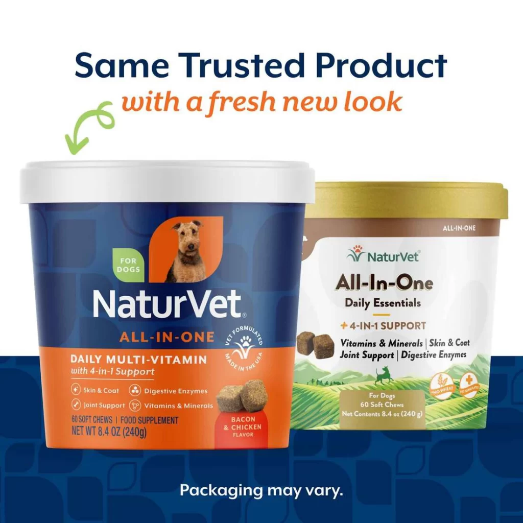
Visually, the transition from a pet-centric photographic approach to a nature-inspired illustrative style marks a significant shift in the brand’s visual identity. While both designs maintain the core NaturVet logo and product name hierarchy, the new label introduces a more structured color blocking system and cleaner iconography for dietary claims like ‘Wheat Free.’ This side-by-side comparison effectively demonstrates how a company can modernize its shelf presence while keeping key functional information—such as the 40-count soft chew quantity and net weight—perfectly legible for consumers.
Marketing teams and brand managers can utilize this specific comparison to plan their own packaging transitions, ensuring that loyal customers recognize the product despite aesthetic changes. Packaging engineers might study the consistent use of the gold lid across both versions as a strategy for maintaining brand continuity during inventory rollouts. Furthermore, copywriters can analyze how the headline ‘The New Look of NaturVet’ directly addresses potential consumer confusion about formula changes versus design updates.