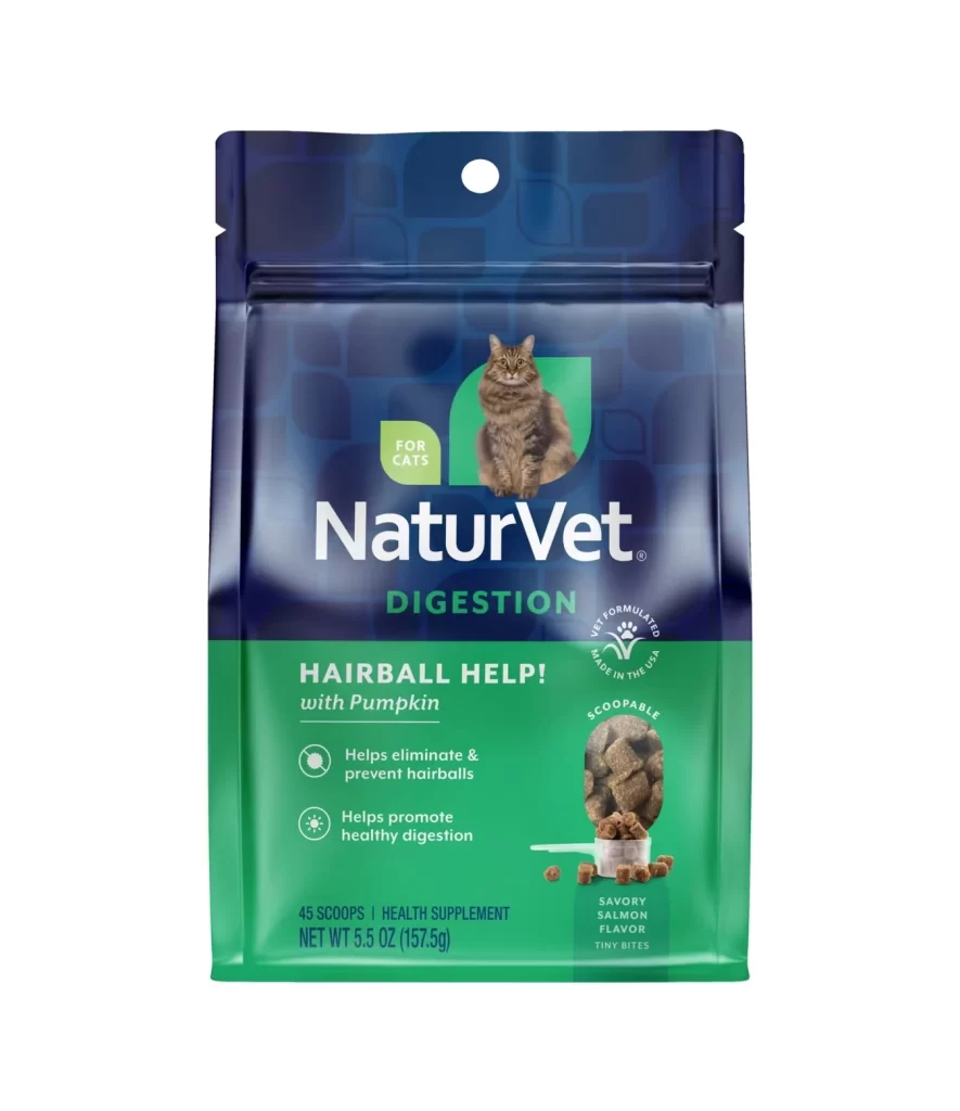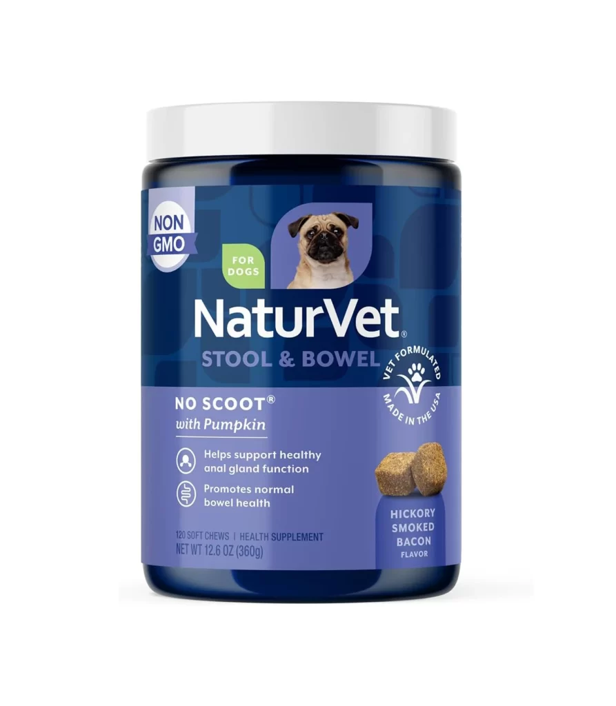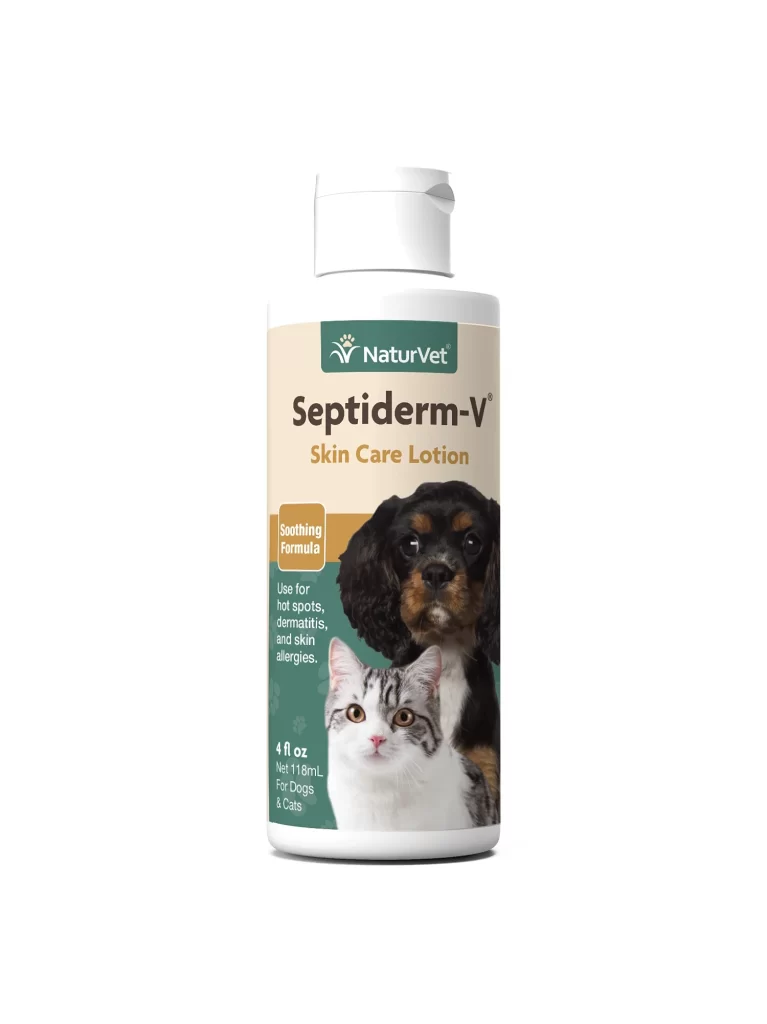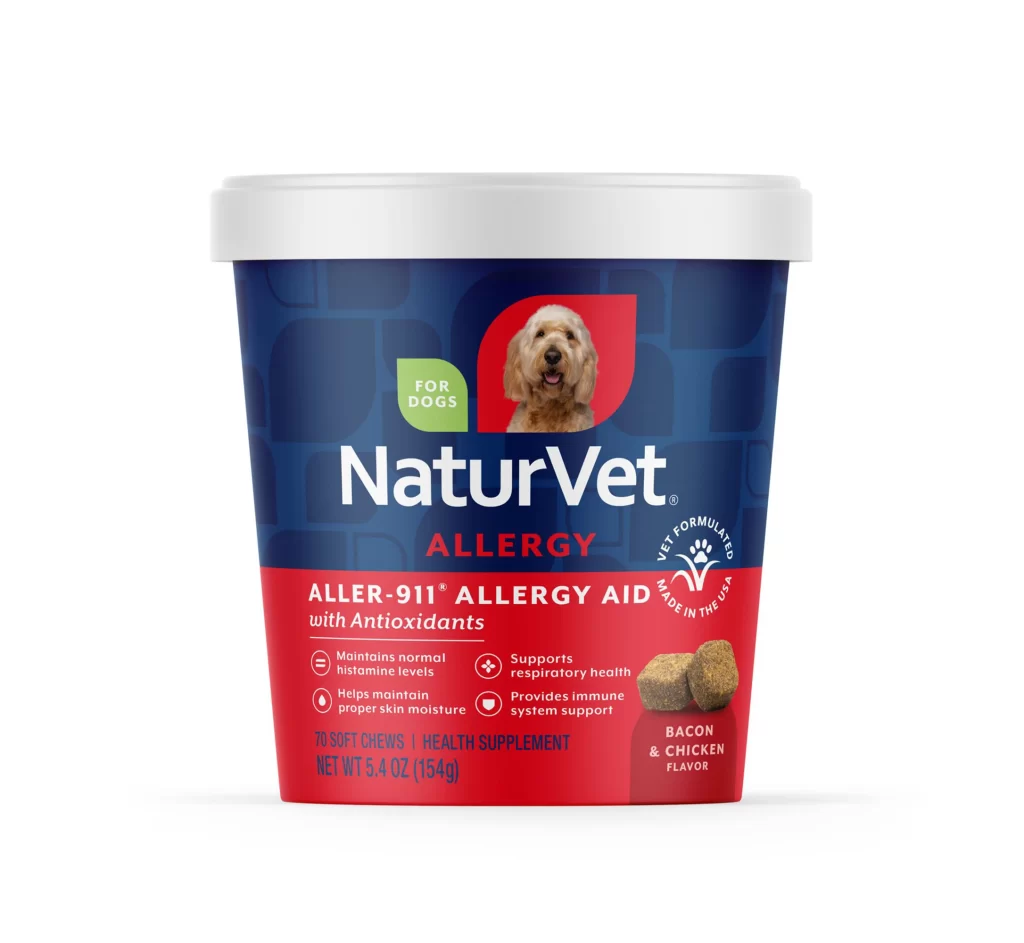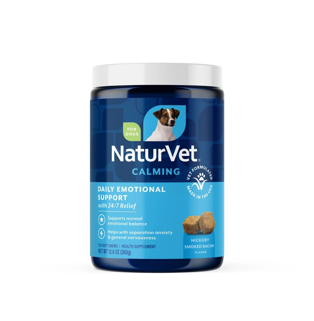
NaturVet NO SCOOT with Pumpkin Pet Supplement Packaging
Topics
Details
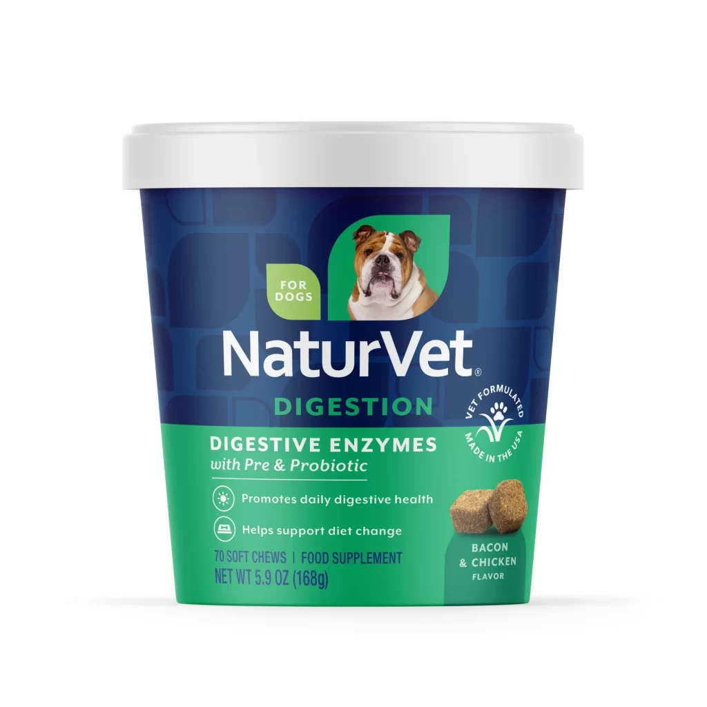
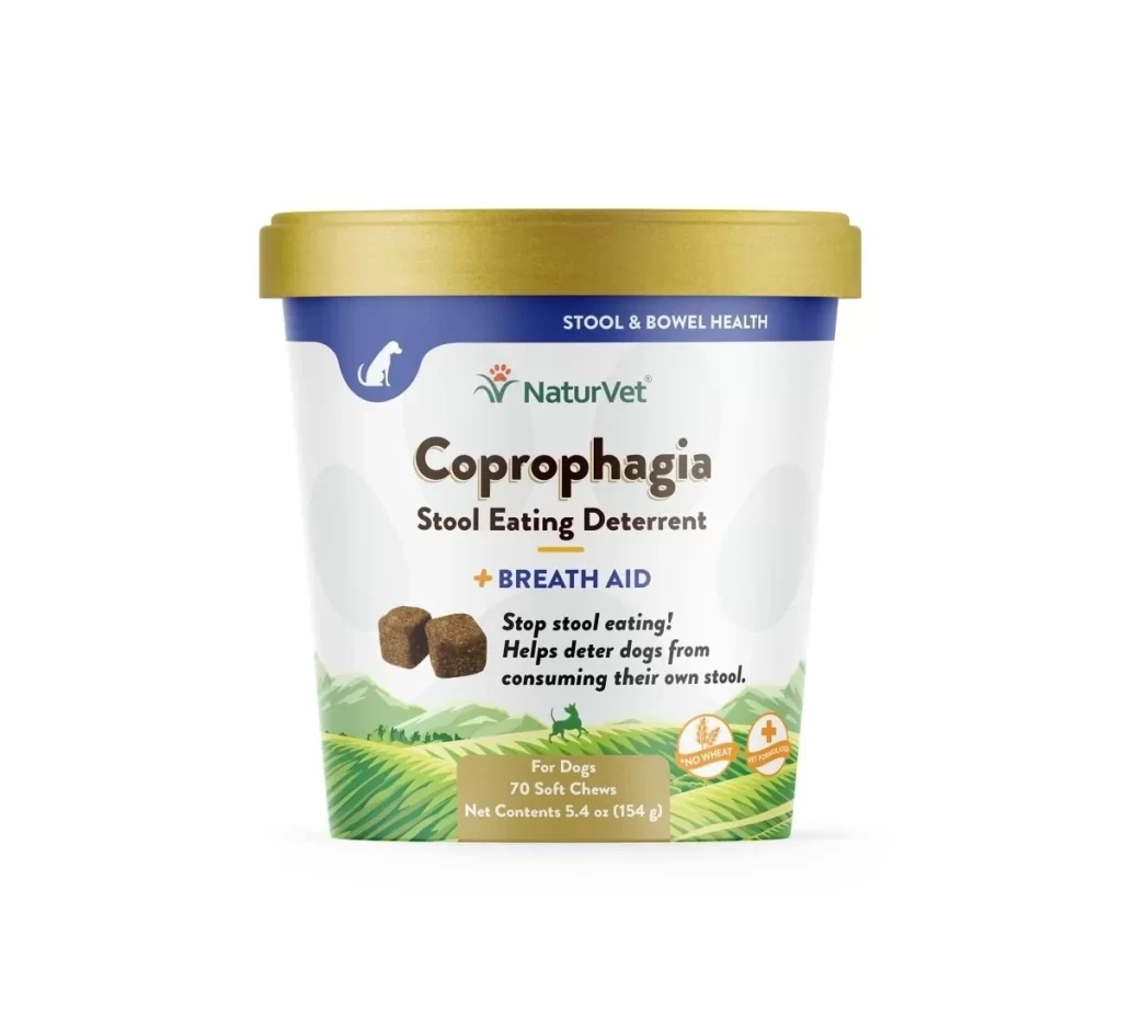
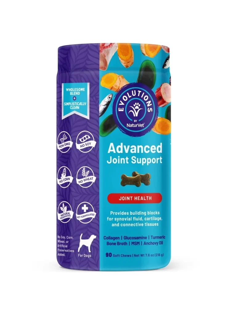
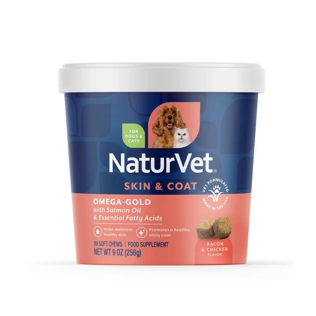
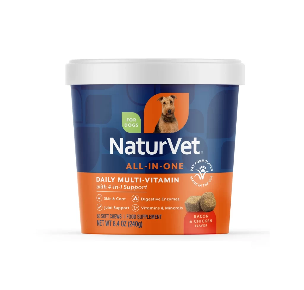
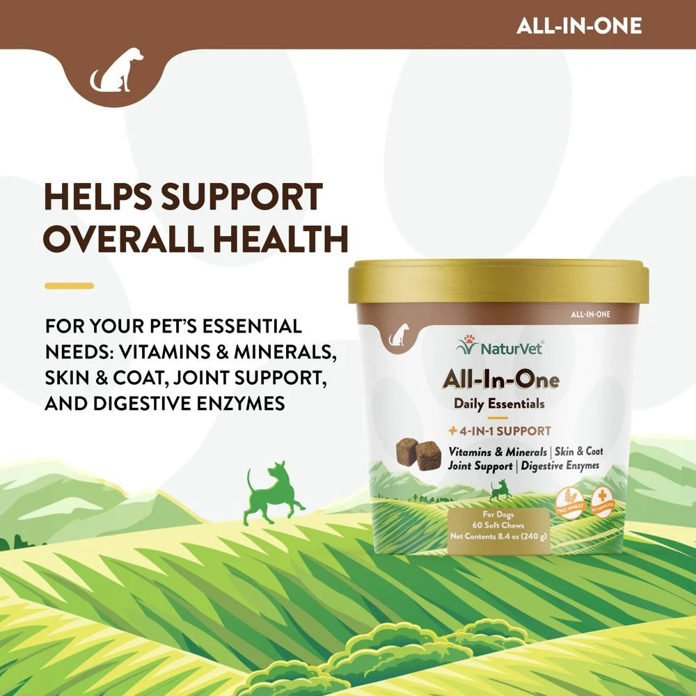
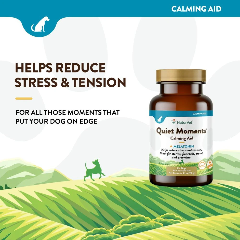
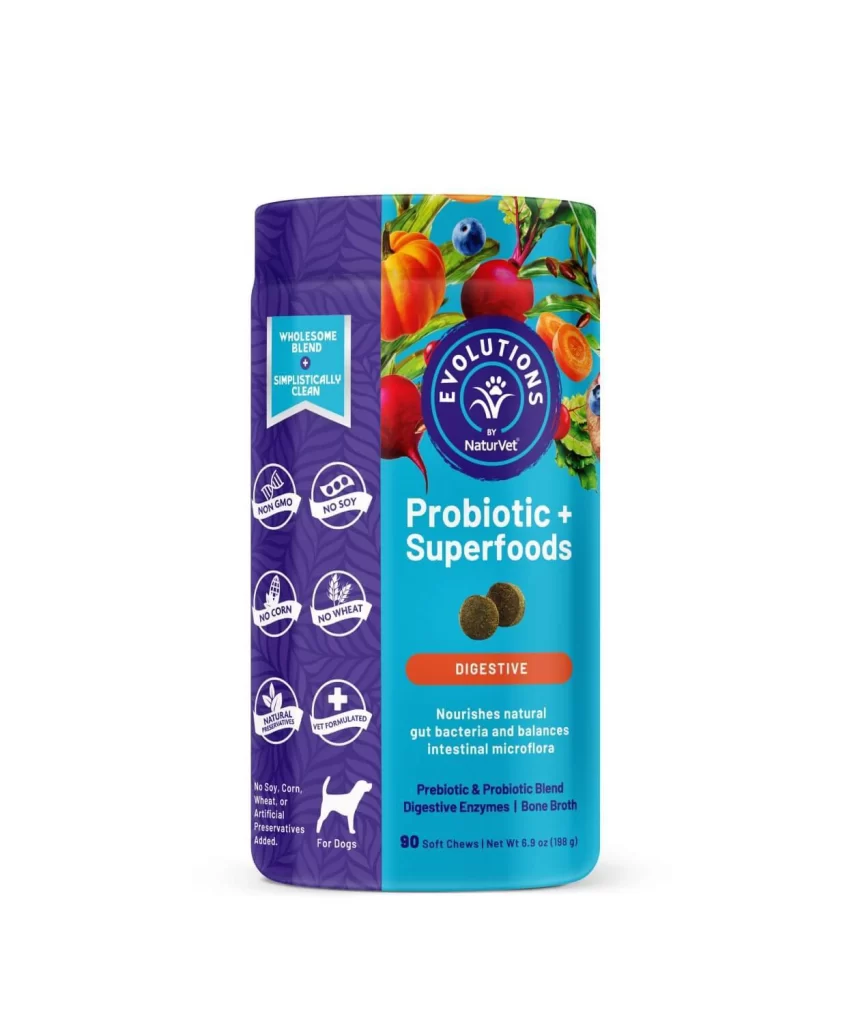
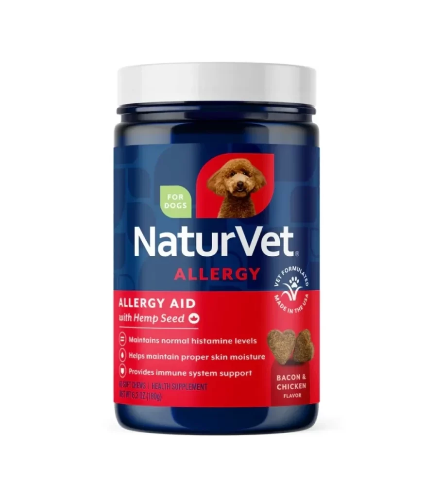
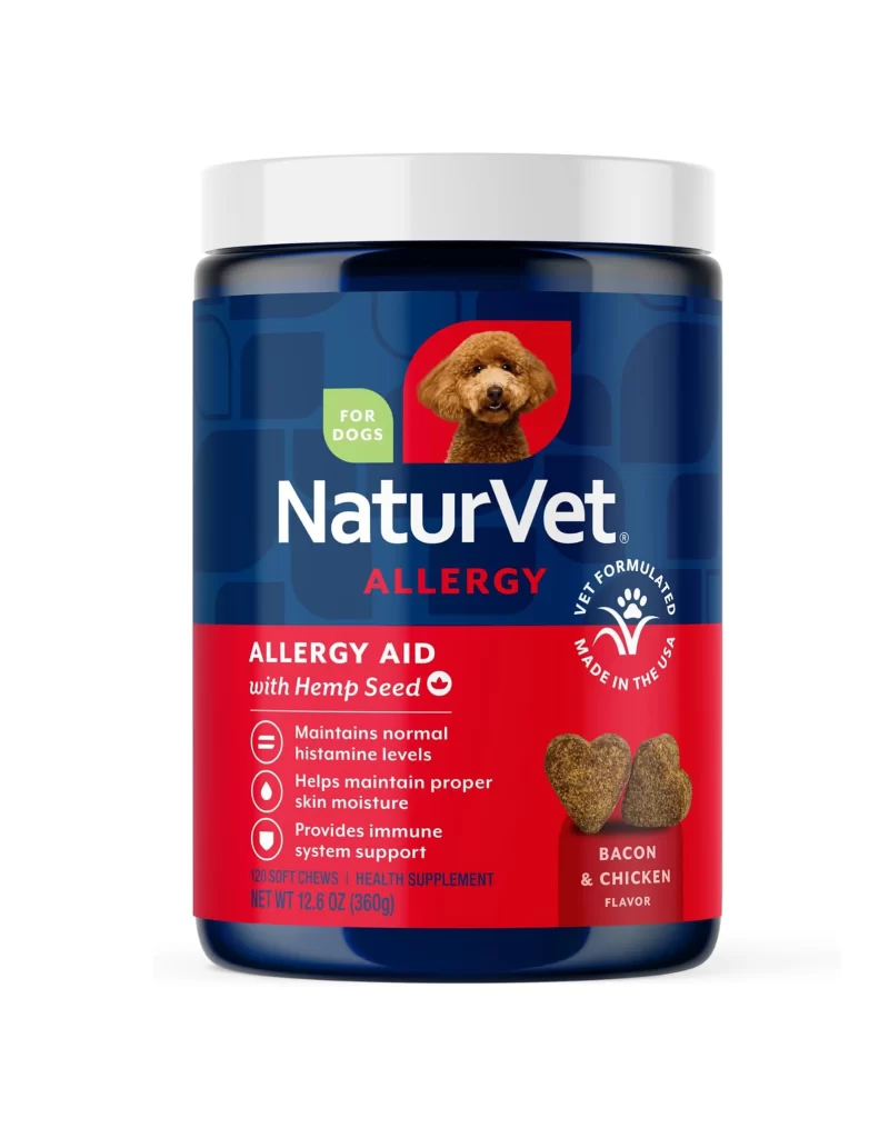
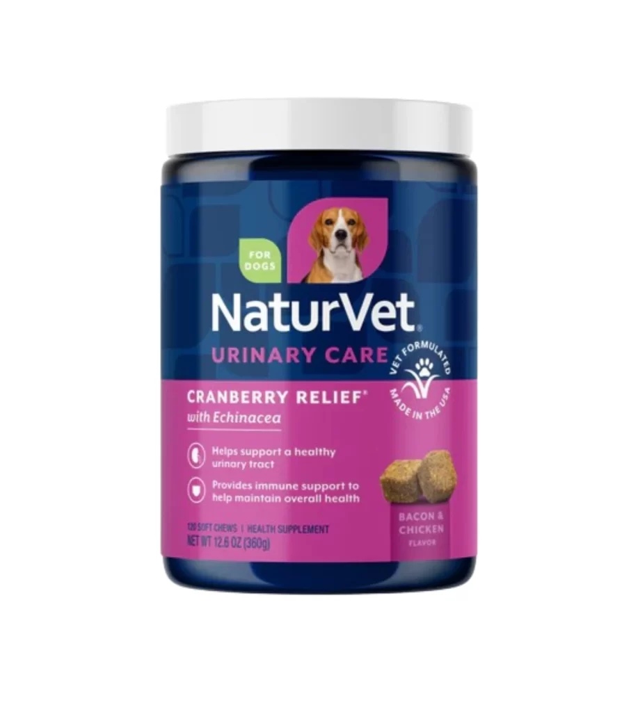
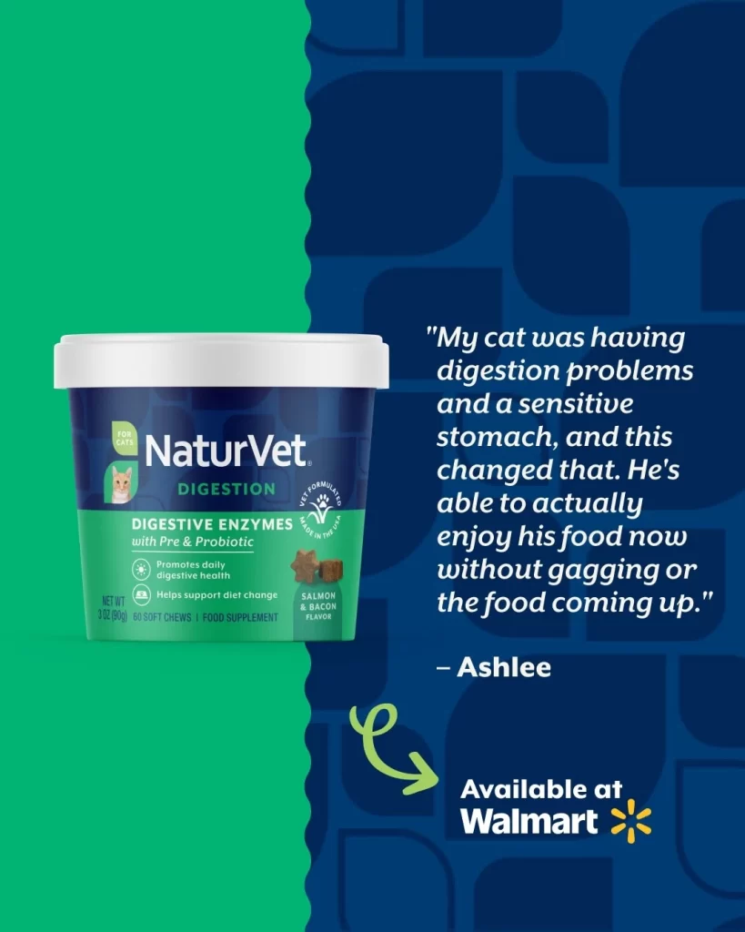
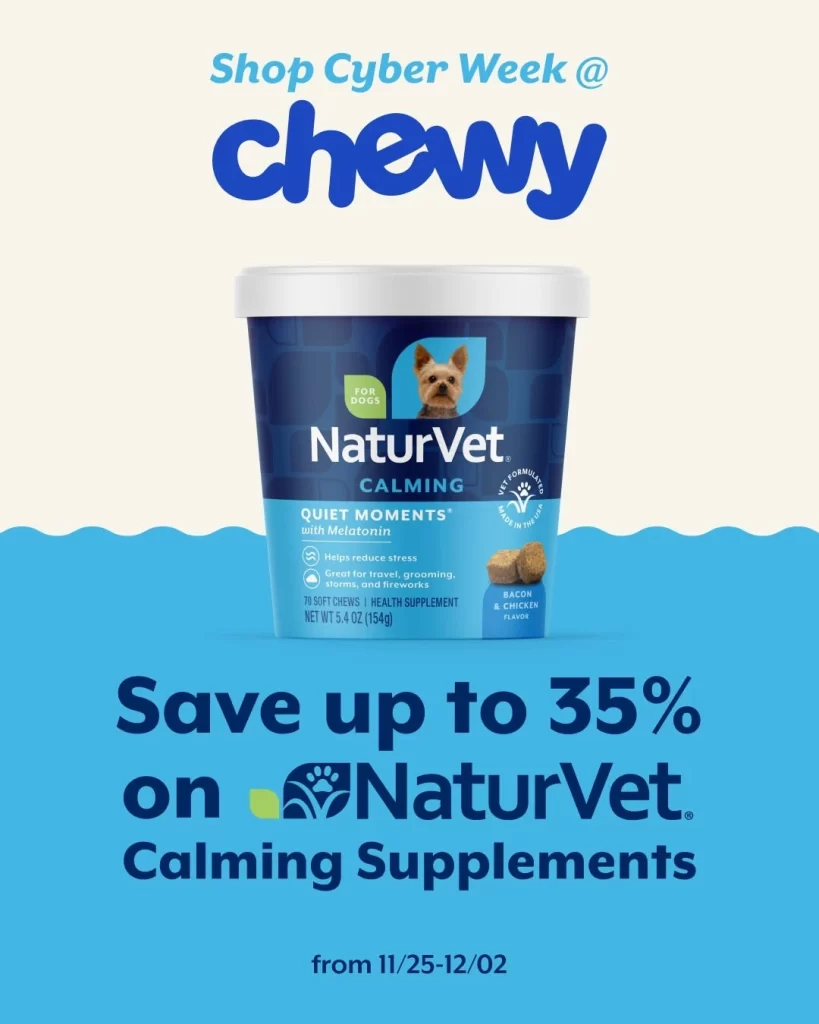
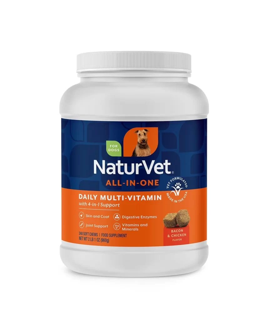
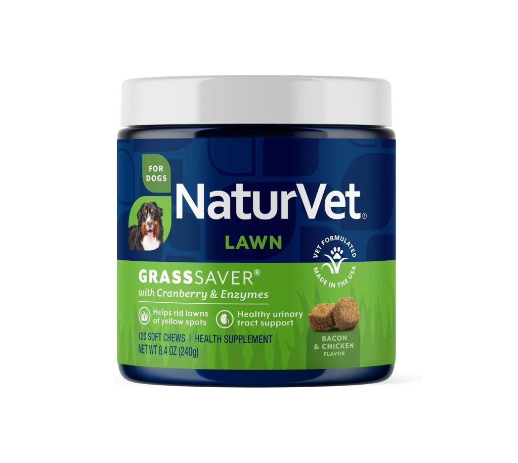
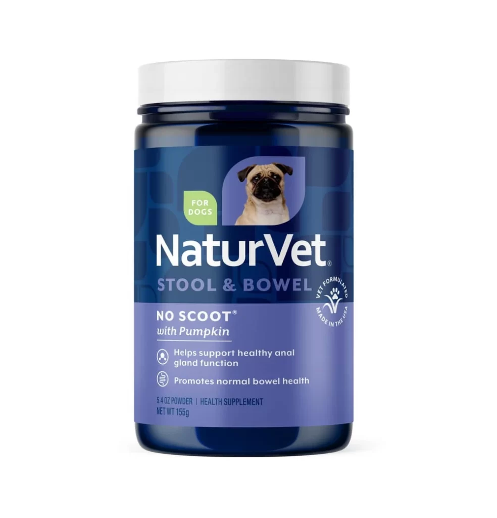
A cylindrical supplement container with a deep navy blue body and a matte white lid stands as the central focus of the image. A lavender-purple band wraps around the lower third, displaying white sans-serif typography for the product name 'NaturVet' and the 'NO SCOOT with Pumpkin' designation. The packaging features a small image of a pug dog within a purple rounded rectangle and a green 'FOR DOGS' badge, all set against a clean white background.
Visual hierarchy operates through a disciplined color-blocking strategy, where the transition from dark blue to lighter purple subtly guides the viewer from brand identity to functional benefits. The inclusion of a live animal photograph introduces an organic element that softens the otherwise pharmaceutical aesthetic, balancing technical information with emotional resonance. Typography scales deliberately decrease from the bold brand name to the fine-print net weight, ensuring legibility while maintaining a clean, uncluttered surface that communicates trustworthiness through restraint rather than ornamentation.
Packaging designers analyzing pet-health market trends would examine this specimen to understand how color psychology influences consumer perception of medical efficacy for animals. Brand strategists might deconstruct the label layout to study optimal placement of regulatory badges versus lifestyle imagery in crowded retail environments. Furthermore, product photographers could utilize this composition as a benchmark for lighting setups that eliminate glare on curved plastic surfaces while preserving text readability across gradient backgrounds.