Organic Pet Superfood Immunity Supplement Packaging
Topics
Details
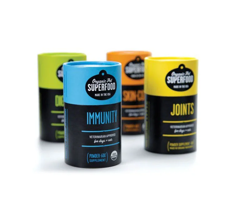
Four cylindrical containers of Organic Pet Superfood supplements stand in a staggered arrangement, with the Immunity variant positioned prominently in the foreground. The packaging features a two-tone construction consisting of a matte black lower body and a brightly colored upper cap—lime green, sky blue, tangerine, and canary yellow—each corresponding to a different product function. White and colored typography identifies the brand within an oval badge at the top, while large sans-serif lettering spells out 'IMMUNITY' on the blue container, followed by smaller text indicating veterinarian approval for dogs and cats.
Visual hierarchy relies heavily on the contrast between the dark base and the saturated lid colors, creating immediate product differentiation across the line without altering the core structural form. The consistent placement of the brand mark and functional claims establishes a cohesive system architecture, while the specific hue assigned to each supplement allows for rapid recognition at a distance. Subtle details like the USDA Organic seal and powder weight notation add credibility without disrupting the clean, modern aesthetic of the cylindrical format.
Brand strategists developing pet wellness product lines could examine this color-coding methodology to organize complex ingredient portfolios into an intuitive visual language. Packaging engineers might reference the structural proportions when designing similar paper composite tubes that require both shelf stability and tactile appeal. Marketing teams preparing retail displays would benefit from studying how the staggered depth creates a natural focal point that guides the viewer's eye toward the primary hero product.