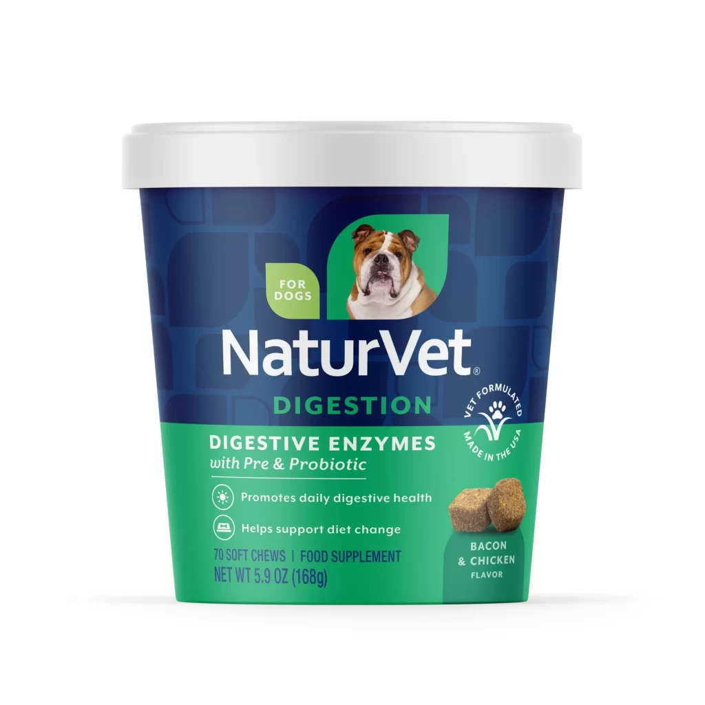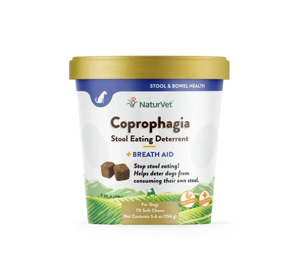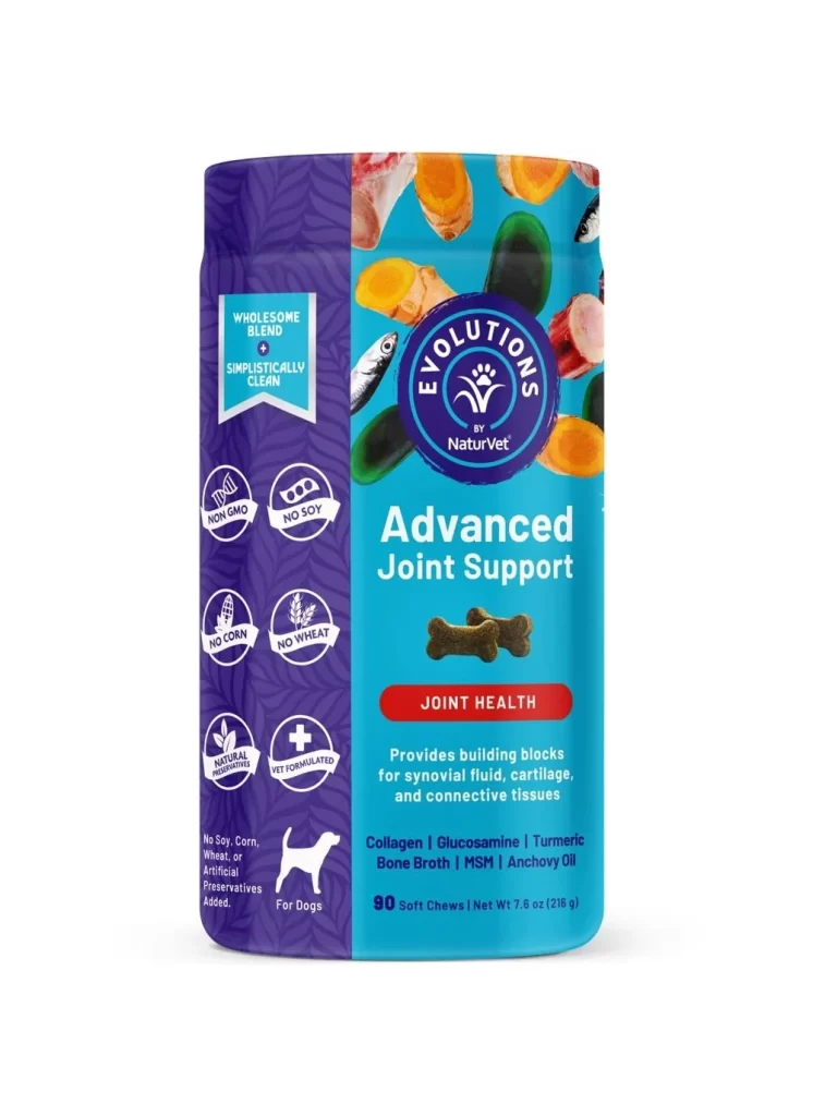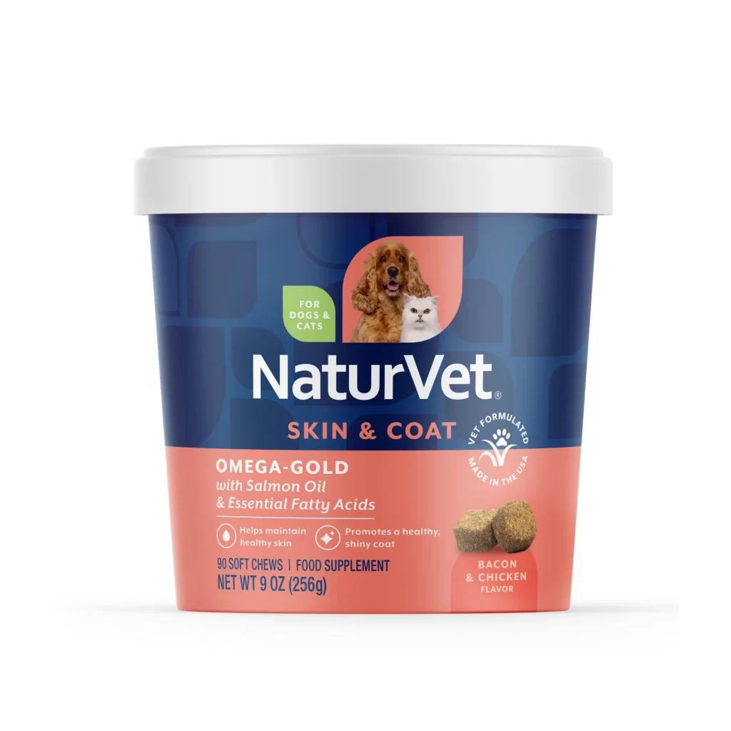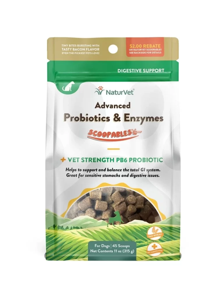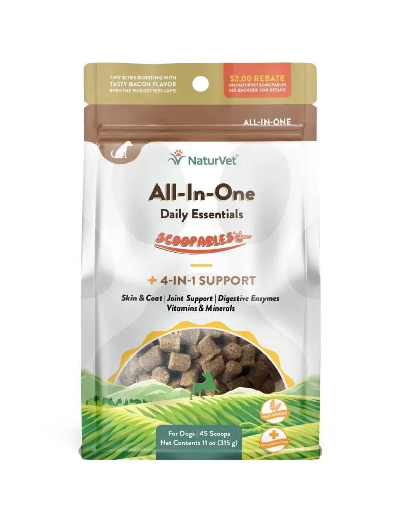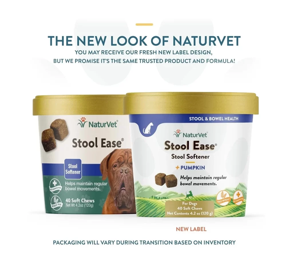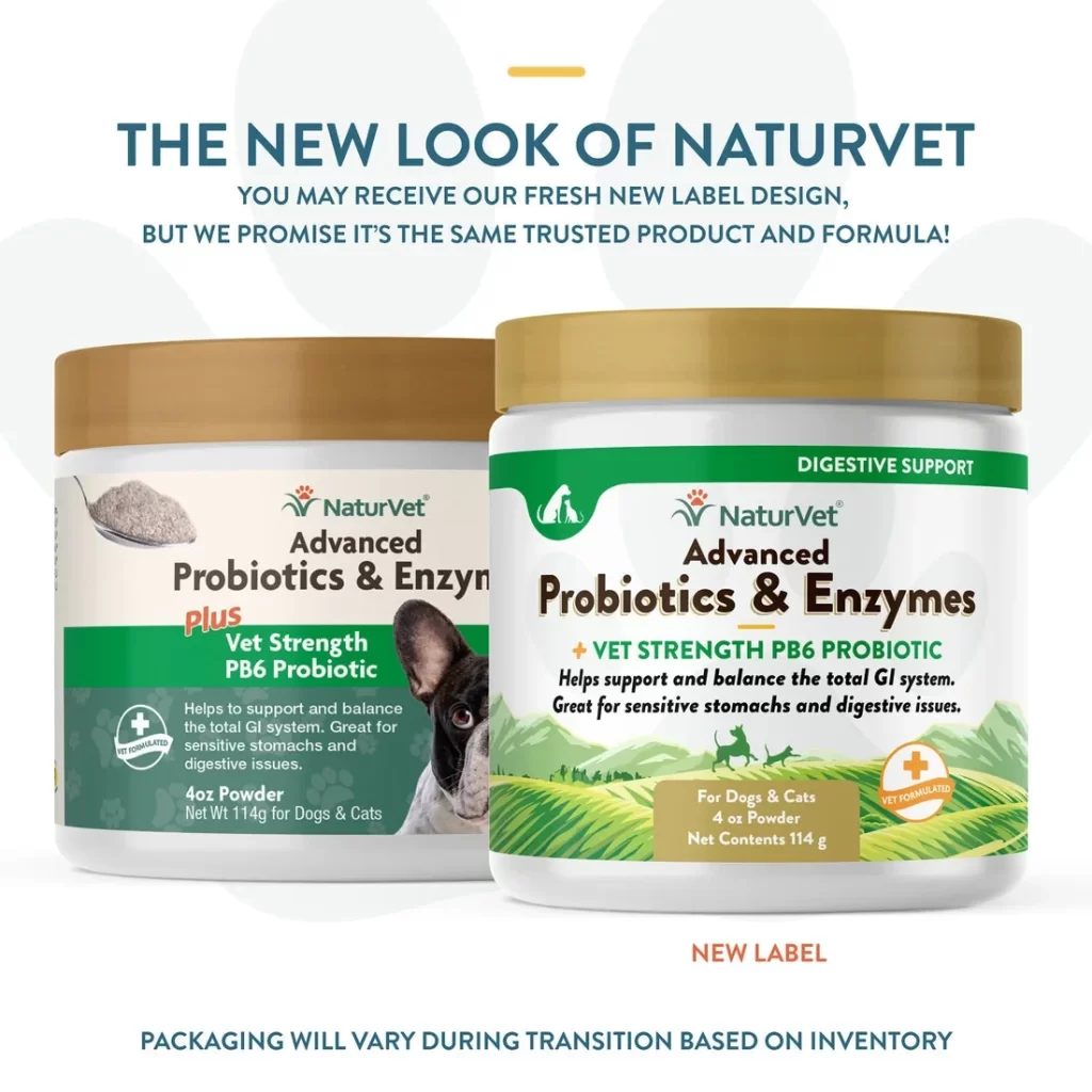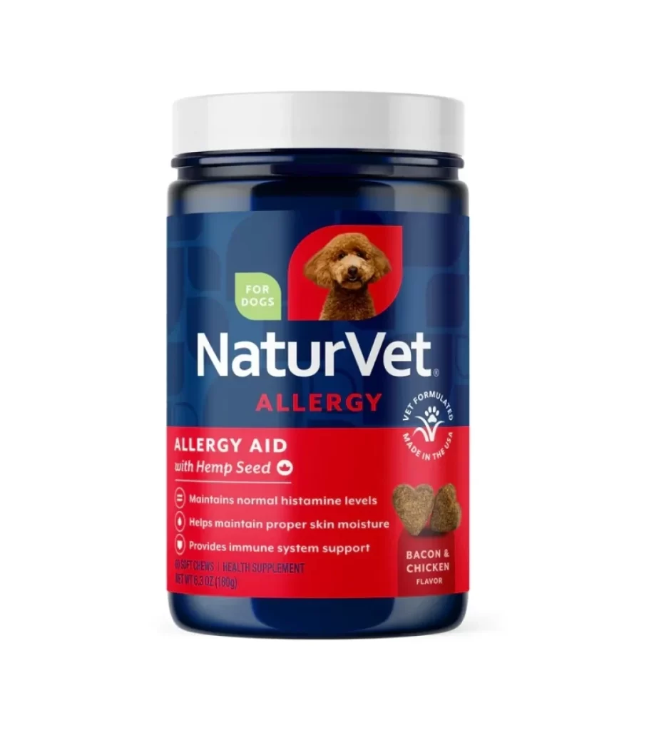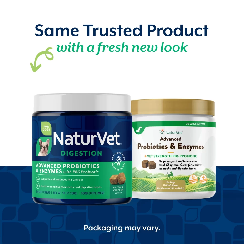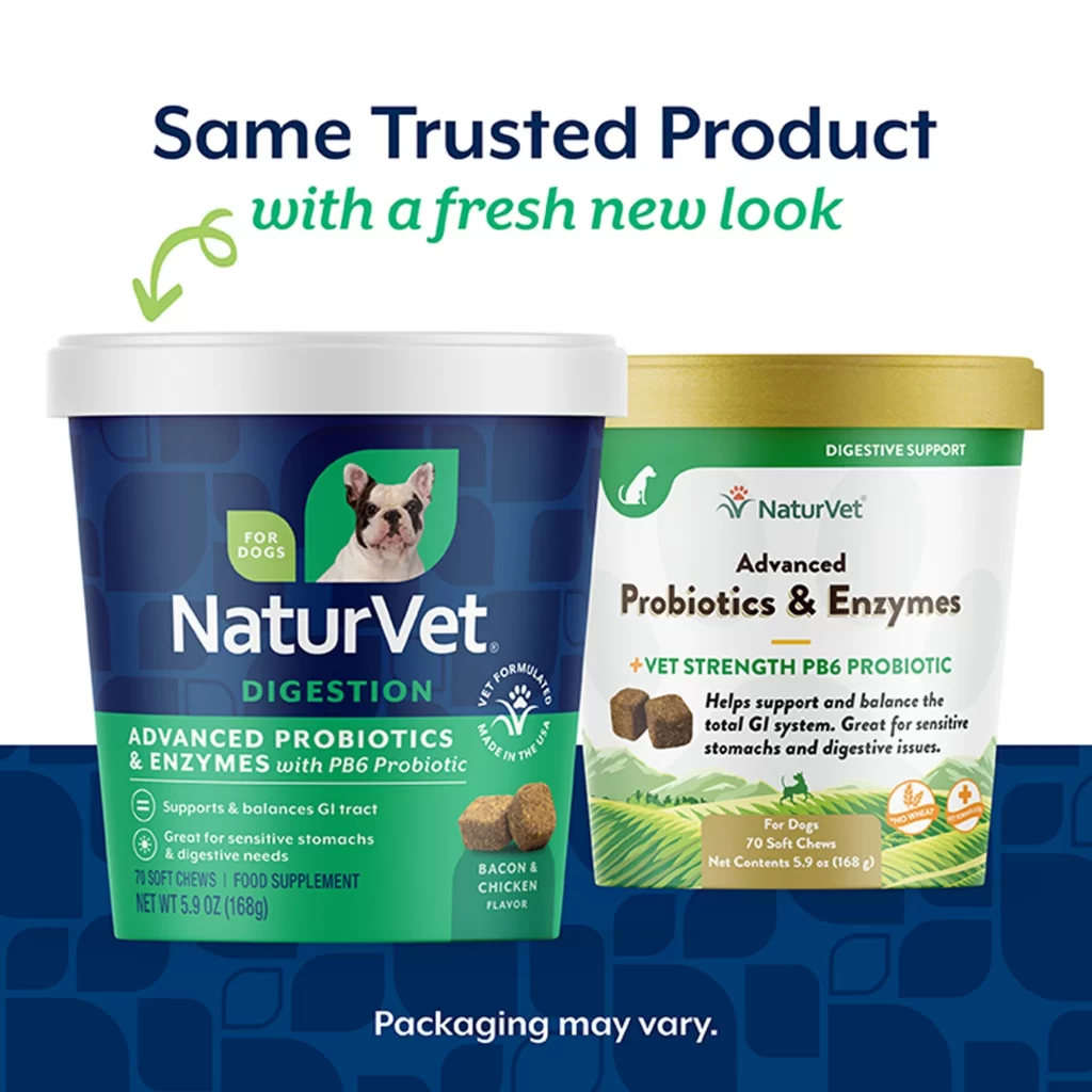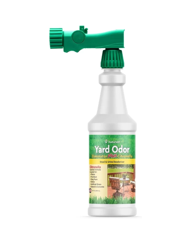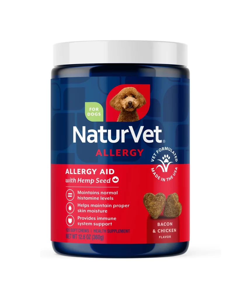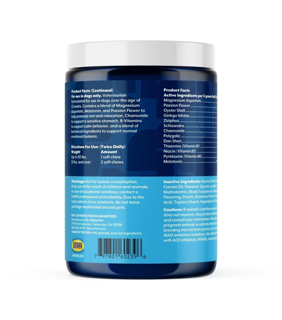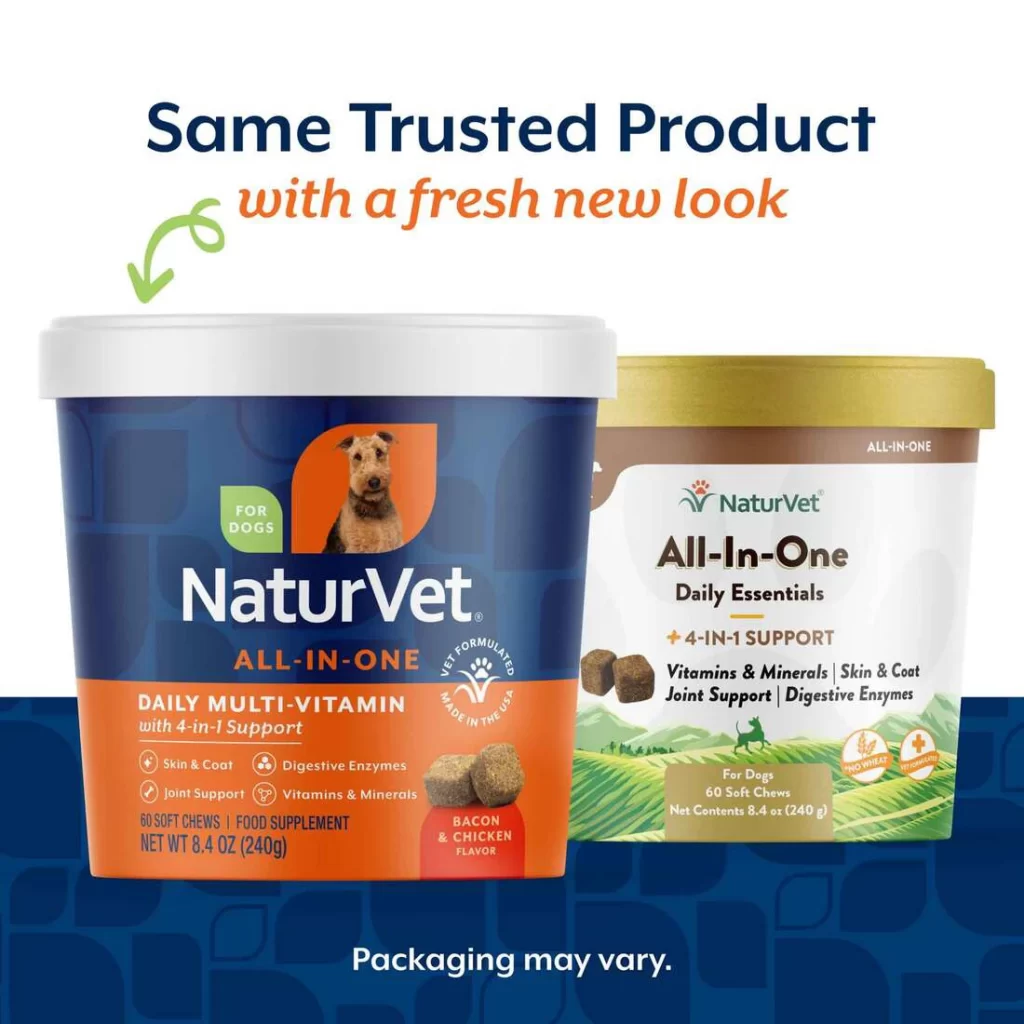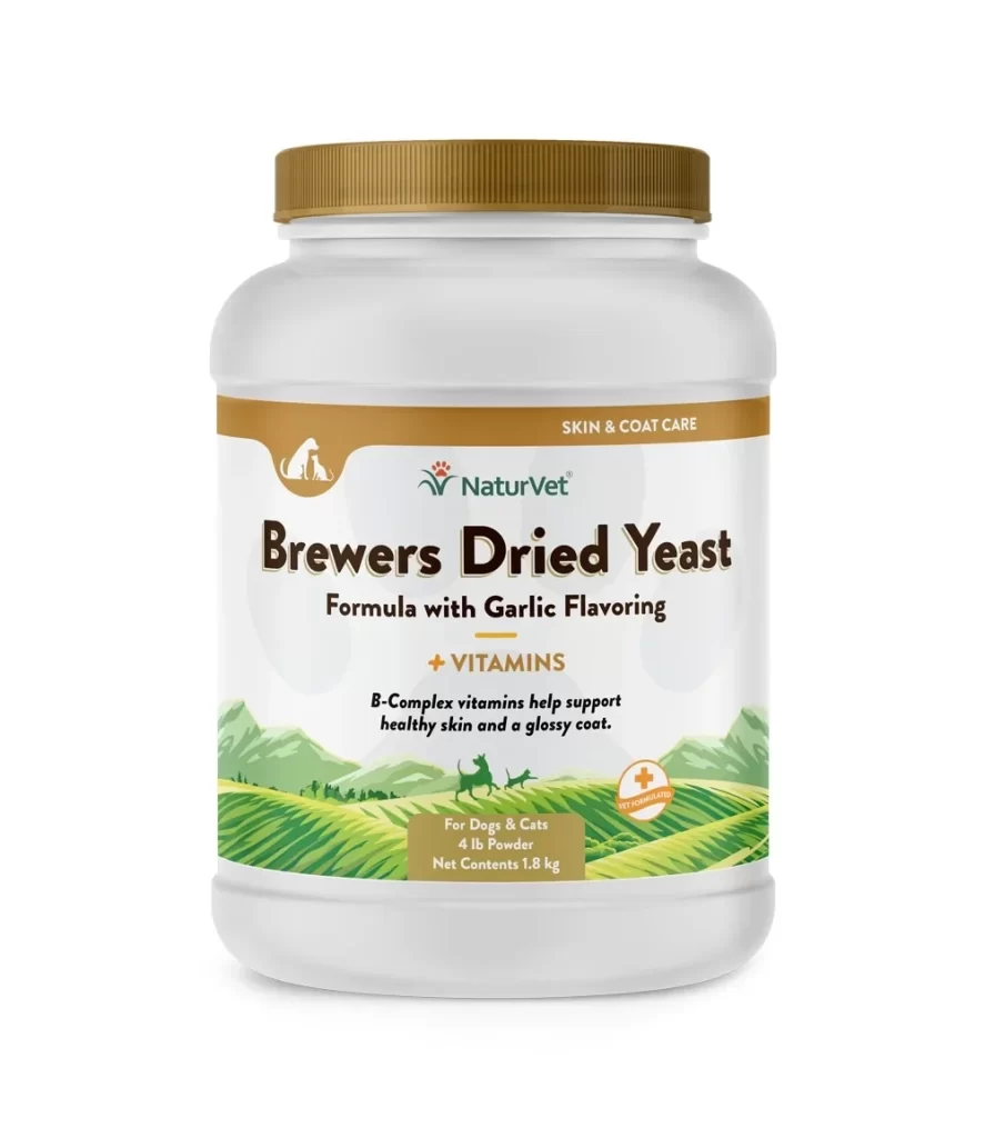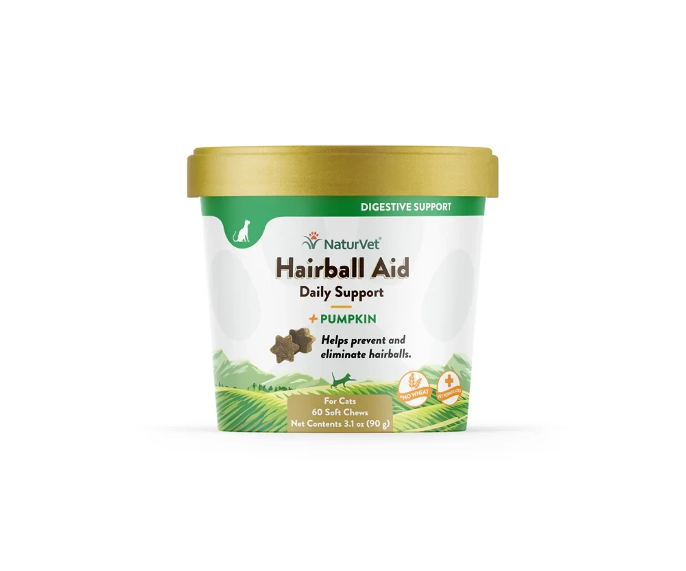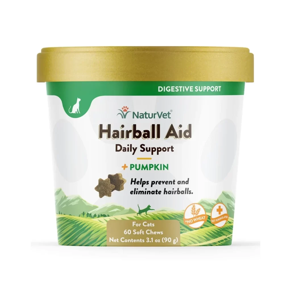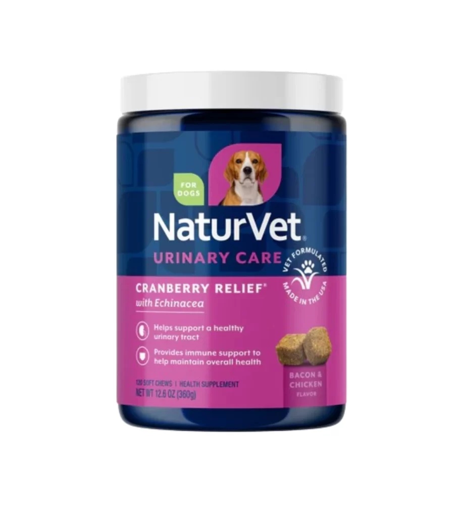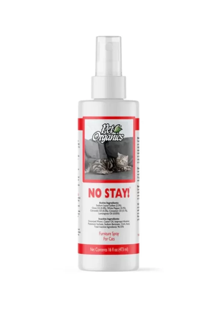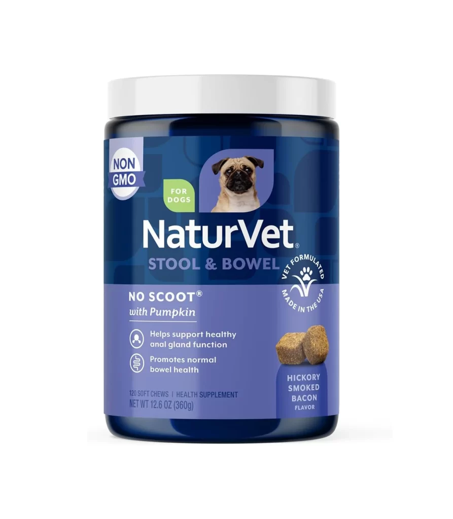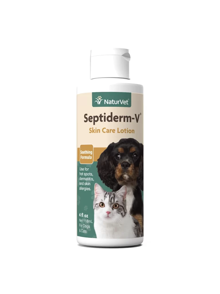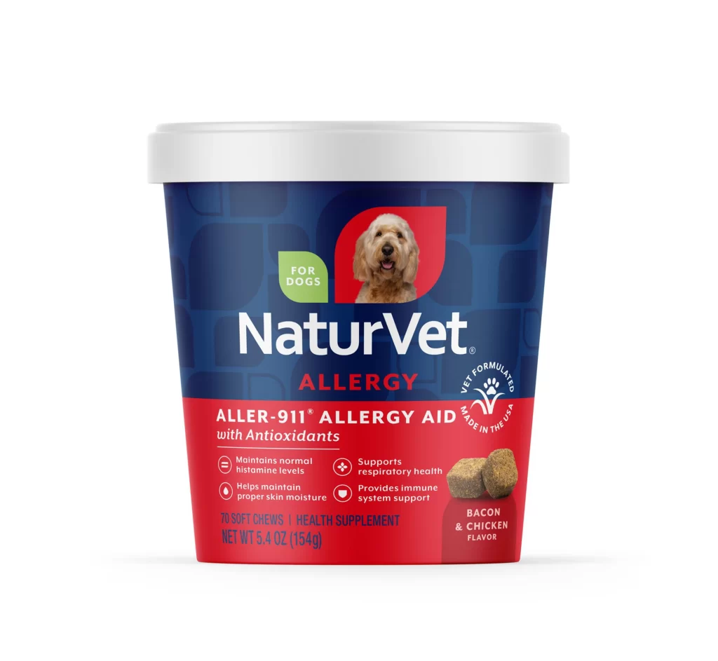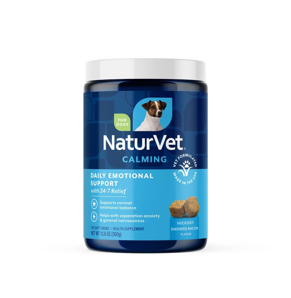
NaturVet Pet Supplement Packaging
Topics
Details
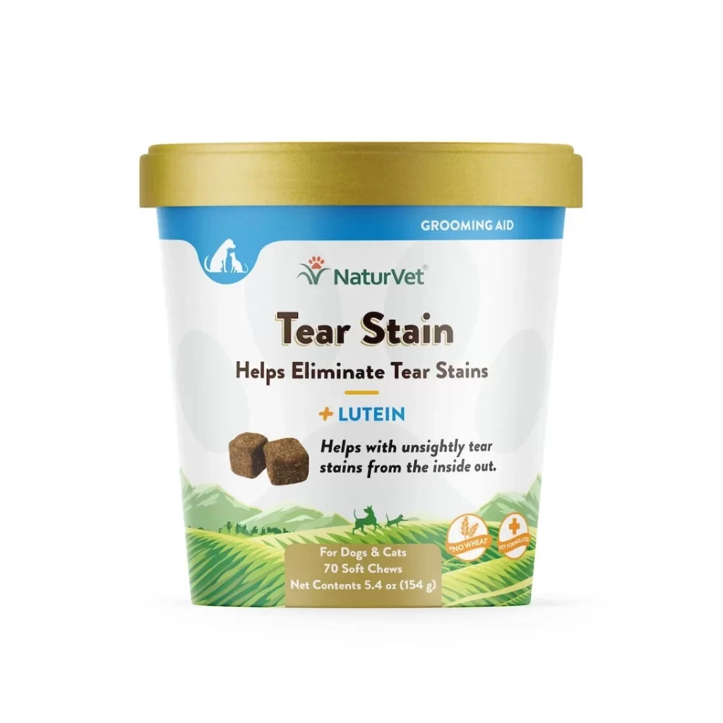
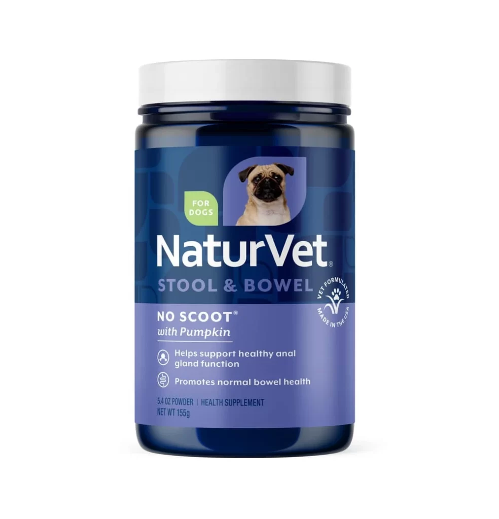
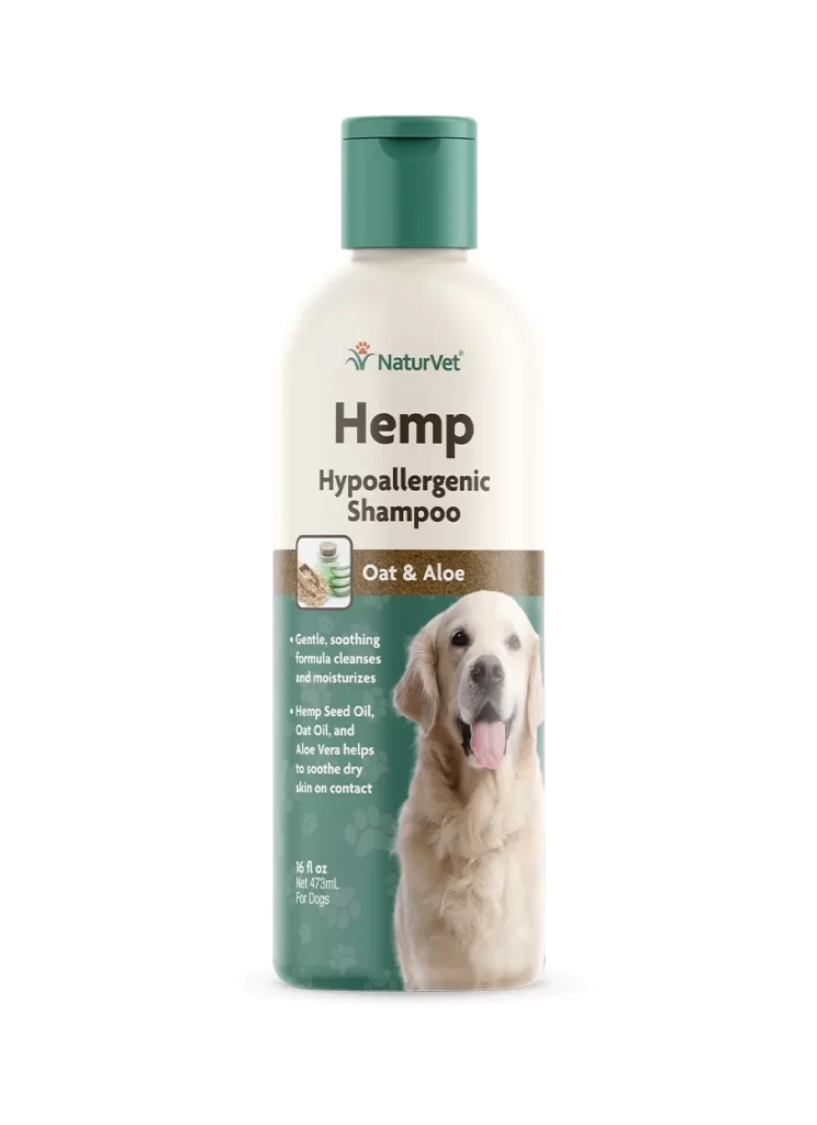
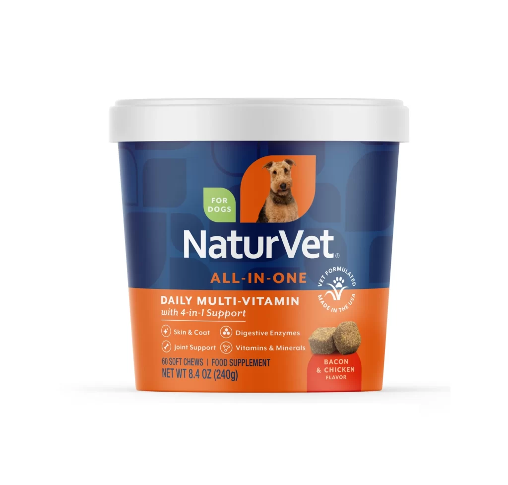
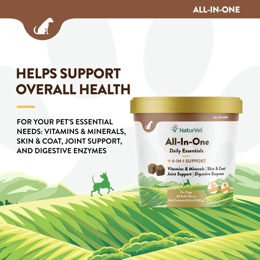
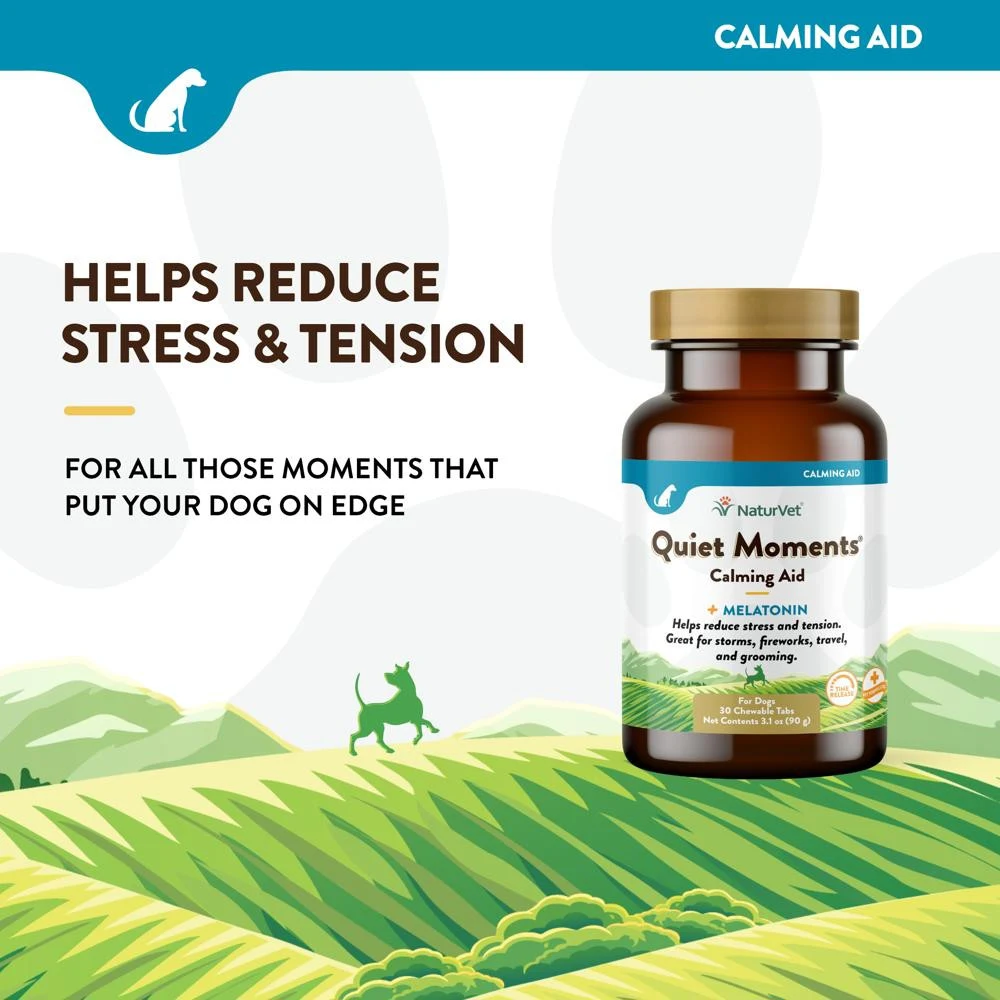
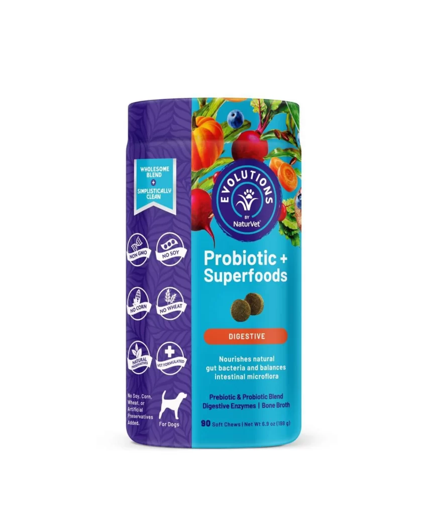
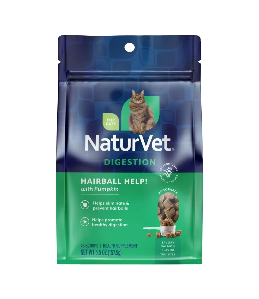
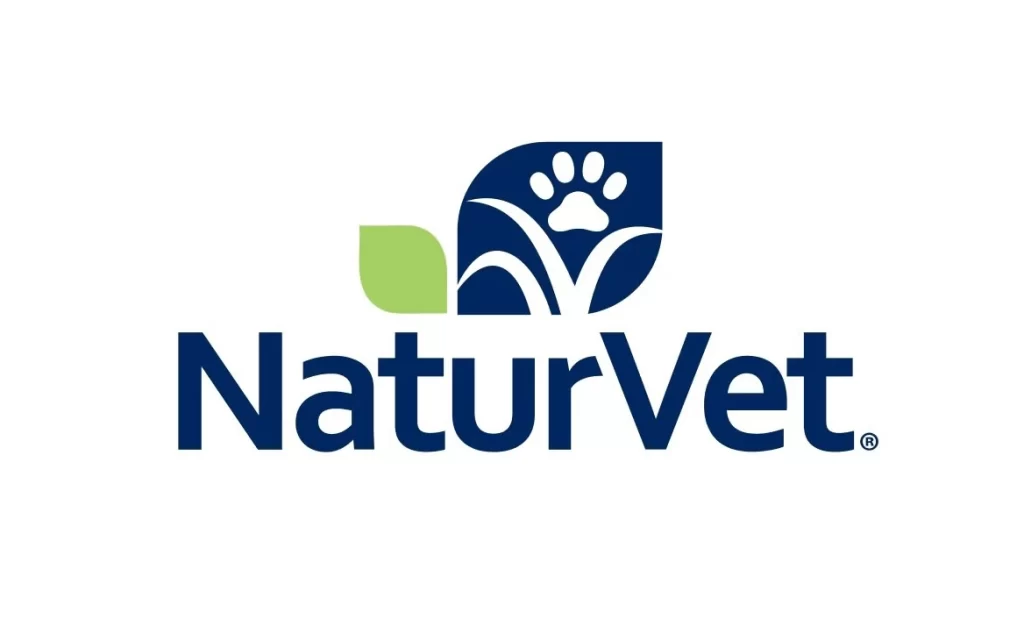
The NaturVet logo features bold, sans-serif typography in deep navy blue, with the brand name accompanied by a registered trademark symbol. A primary icon in the same dark blue displays a white paw print resting above stylized grass blades within a shield-like form, while a single lime green leaf shape accents the left side of the composition on a white background.
Visual interest stems from the clever integration of organic motifs within a rigid geometric container, balancing softness with corporate stability. The limited palette of navy, green, and white ensures high legibility while the specific choice of a leaf element immediately signals an eco-friendly or holistic product philosophy to the viewer. Such a design successfully bridges the gap between medical reliability and gentle, nature-based solutions through its symbolic imagery.
Brand strategists might analyze this mark to understand how to effectively communicate ‘natural’ values within the pet health sector without sacrificing authority. Packaging designers could study the weight of the letterforms and the spacing of the icon to inform their own work on supplement labels requiring a trustworthy aesthetic. Marketing teams may also utilize this visual example when briefing agencies on how to combine animal-centric symbols with botanical elements for a cohesive look.