NaturVet Immunity Pet Electrolyte Concentrate Packaging
Topics
Details
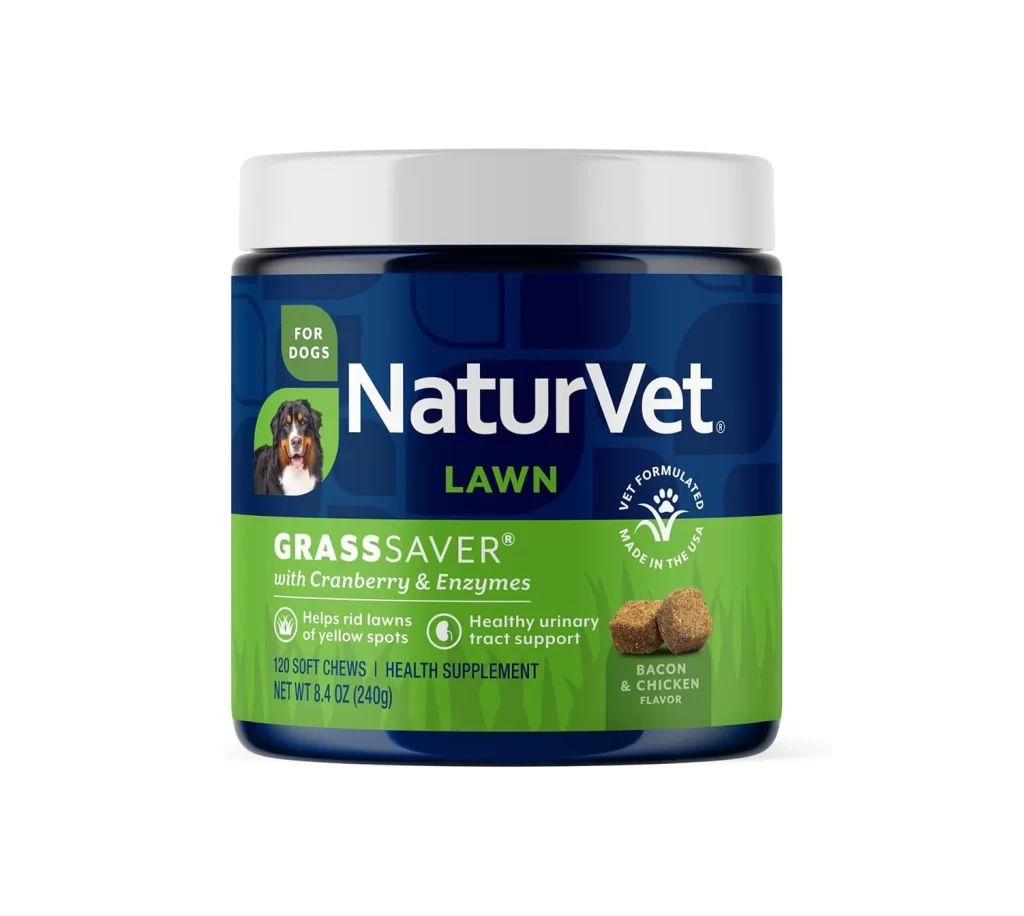
A cylindrical bottle of NaturVet Immunity Pet Electrolyte Concentrate stands upright on a white surface, captured from a direct frontal perspective. The container features a deep navy blue plastic body topped with a white flip-cap, while the label is bifurcated into a dark blue upper register and a vibrant golden-yellow lower section. Prominent white sans-serif typography spells out the brand name above product claims detailing electrolyte replenishment and hydration support.
Visual hierarchy is established through the bold chromatic contrast between the cool navy background and the warm amber information panel, which immediately draws the eye to the product’s functional benefits. Three circular icons containing water droplet, flame, and muscle symbols succinctly communicate hydration support and electrolyte replenishment without cluttering the layout. The inclusion of specific volumetric data—16 FL OZ (473 mL)—and the ‘FOOD SUPPLEMENT’ classification at the base provides essential regulatory context while maintaining a clean, professional aesthetic typical of veterinary pharmaceutical packaging.
Packaging designers analyzing pet supplement branding would find this composition useful for studying how color blocking can organize complex nutritional information for consumer clarity. Marketing teams developing point-of-sale materials might reference this layout to understand effective placement of animal imagery alongside technical product claims. Furthermore, illustrators requiring reference for realistic bottle rendering could utilize the specular highlights on the curved plastic surface and the precise typographic weight distribution across the label’s distinct zones.