ProDen PlaqueOff Dental Pet Supplement Packaging
Topics
Details
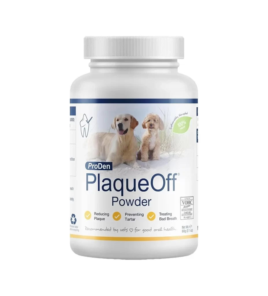
A cylindrical white plastic bottle with a ribbed grey cap stands as the central subject, its label defined by a crisp navy blue header and footer that frame a photographic image of two dogs—a golden retriever and a small doodle—resting on sand. Bold, dark blue sans-serif typography spells out 'ProDen PlaqueOff Powder' beneath the brand name, while three yellow checkmarks highlight the product's benefits for reducing plaque, preventing tartar, and treating bad breath.
Visual hierarchy is established through the strategic use of color blocking and iconography. The inclusion of a green leaf badge indicating ‘100% Natural’ alongside a VOHC seal of approval adds immediate credibility. By placing real animals in a natural setting rather than using clinical illustrations, the design softens the medical nature of the supplement, making it feel more like a lifestyle choice for pet owners than a chore.
Brand managers in the veterinary sector can study this layout to understand how to balance regulatory information with emotional appeal. Packaging designers might analyze the specific placement of the recycling symbol and net weight to optimize their own label real estate. Marketing teams could utilize this as a case study for positioning health-focused products within the premium pet care market.