NaturVet Calming Aid Pouch
Topics
Details
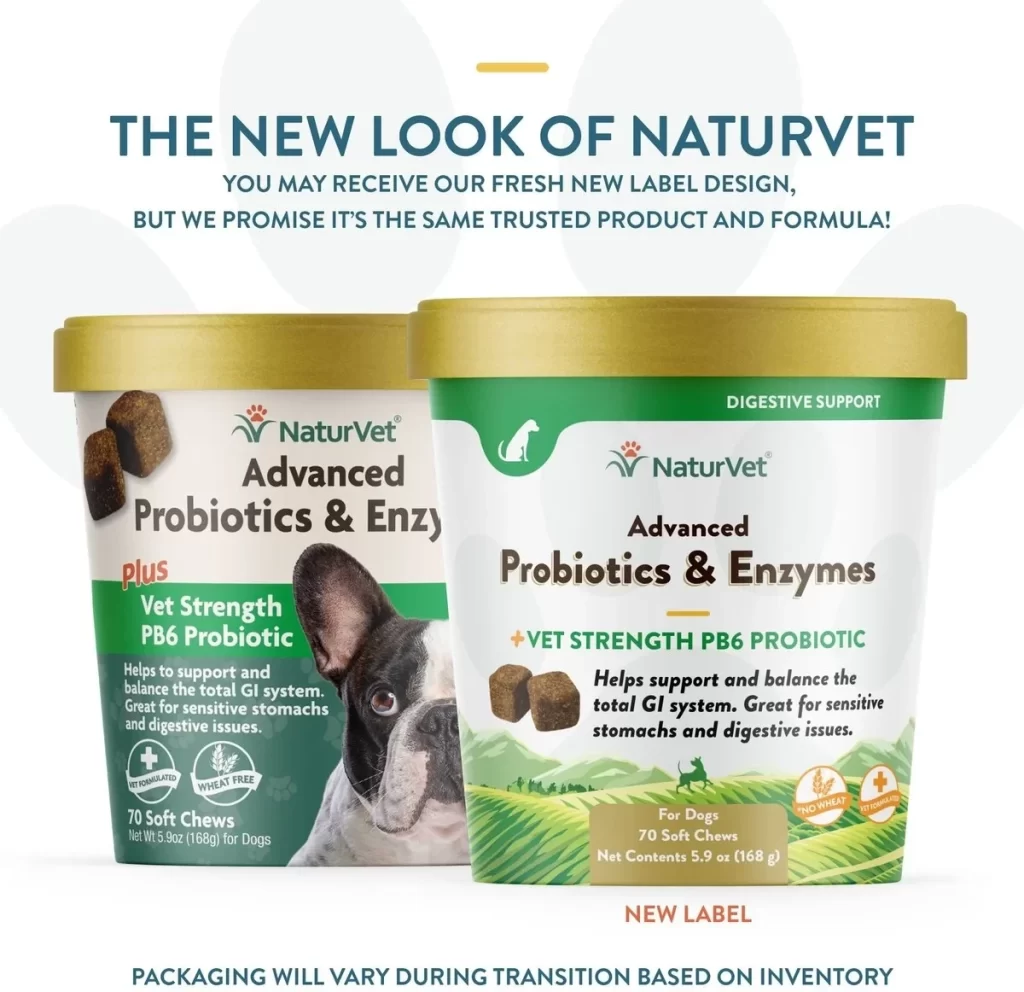
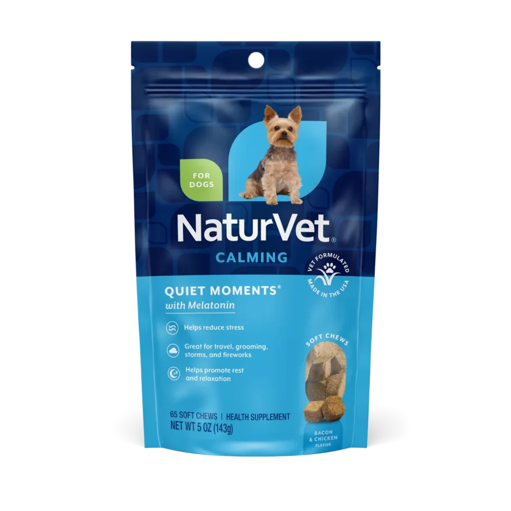
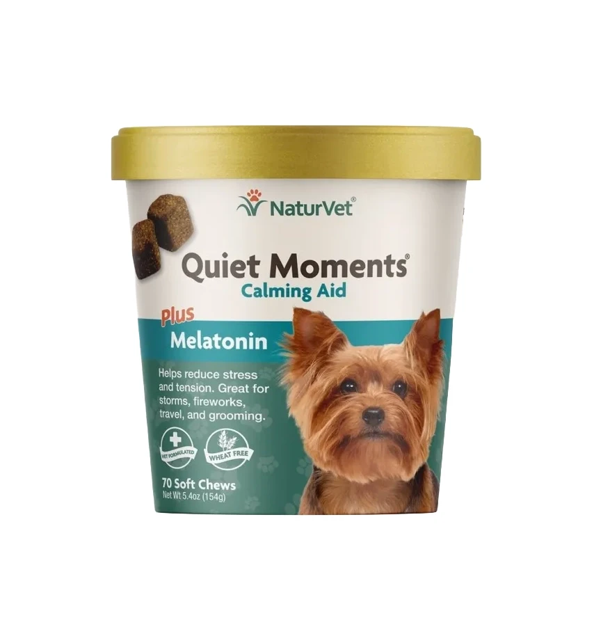
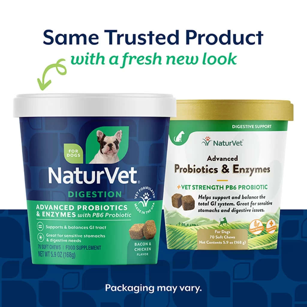
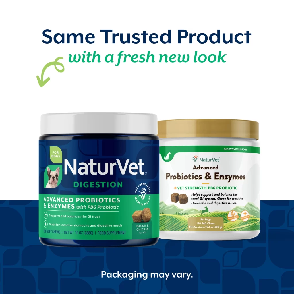
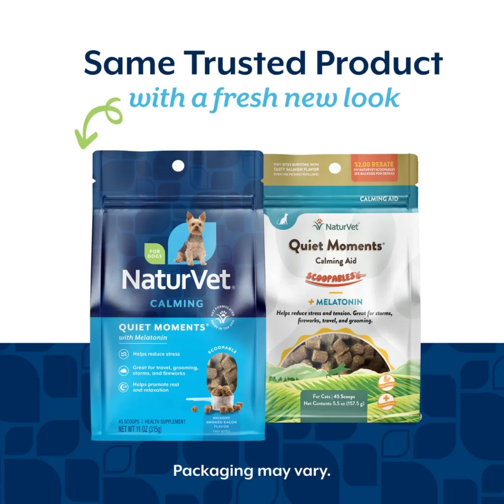
Against a clean white backdrop that transitions into a deep navy blue patterned footer, two distinct pouches of NaturVet Quiet Moments Calming Aid sit side-by-side. The left package features a dark blue gradient with a circular cutout revealing a small dog, while the right version opts for a white and teal aesthetic with a scenic green landscape illustration. Bold navy text at the top announces 'Same Trusted Product with a fresh new look,' accompanied by a playful lime-green arrow that curves toward the packaging below.
Visual contrast between the two designs highlights how the brand maintains product recognition while updating its aesthetic for different retail contexts or consumer preferences. The older blue design relies on clinical iconography and structured color blocking to convey trustworthiness, whereas the newer white variant uses organic shapes and warmer imagery to suggest natural ingredients. Both versions carefully balance the 'Scoopables' branding and melatonin benefits, demonstrating effective visual consistency across a rebranding effort without losing core identity markers.
Marketing teams studying package redesigns will find this comparison invaluable for understanding how to transition loyal customers to updated visuals without causing confusion. E-commerce managers can utilize this layout as a template for displaying inventory variations when old and new stock coexist in the warehouse. Additionally, brand strategists might reference this example when presenting refresh concepts to stakeholders who worry about alienating their existing audience during a visual overhaul.