NaturVet Hip & Joint Supplement Jar View
Topics
Details
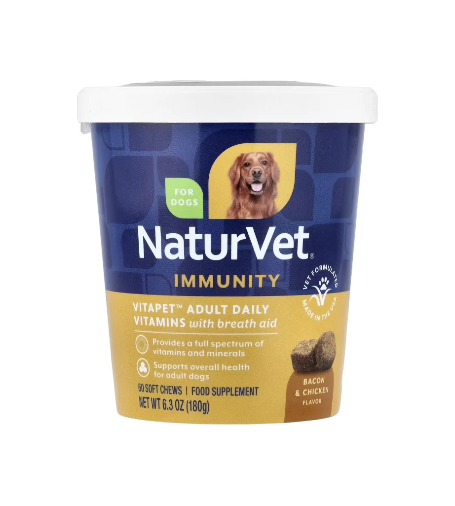
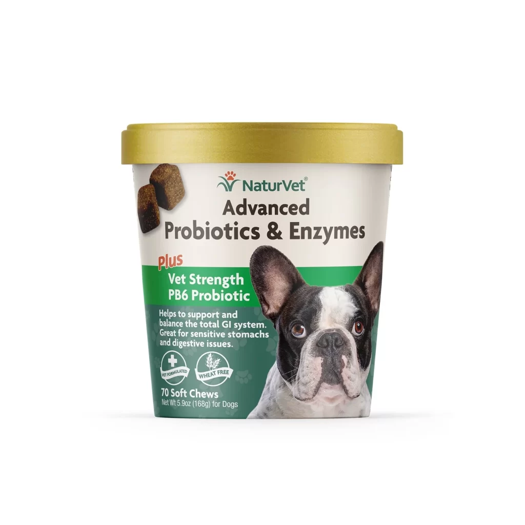
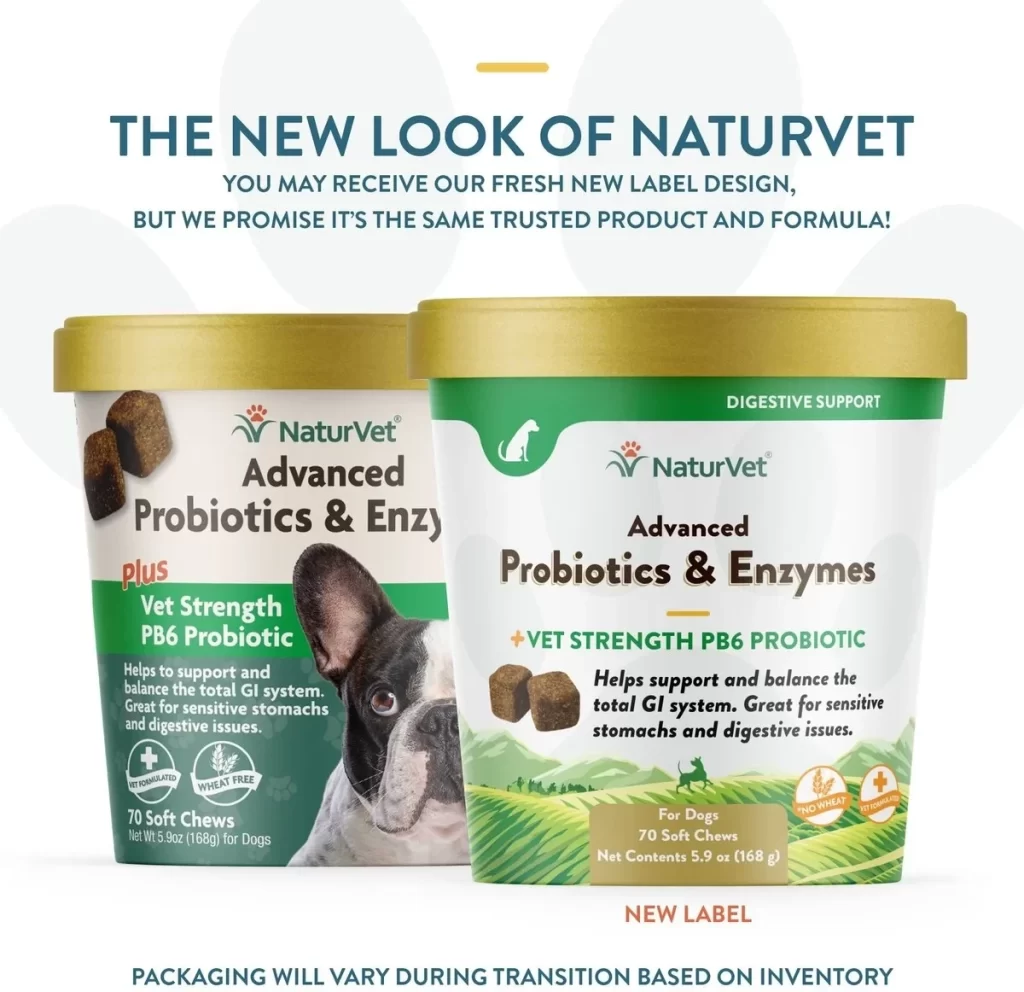
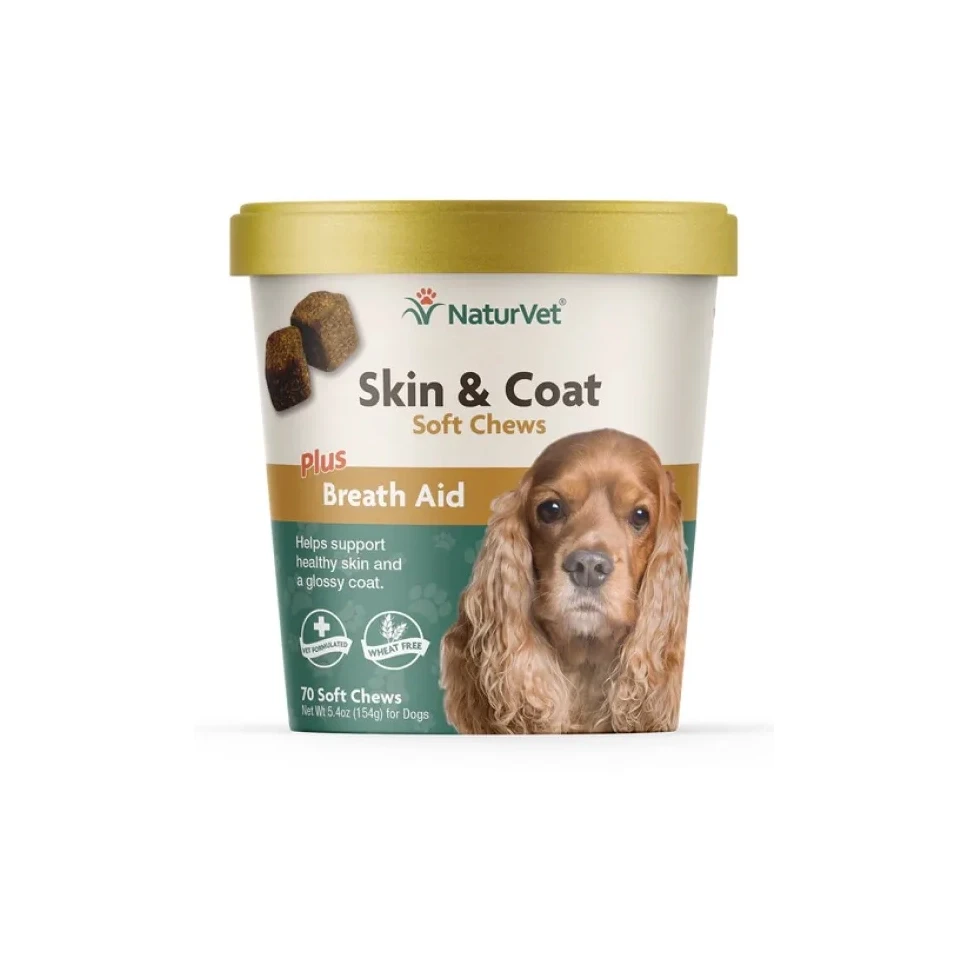
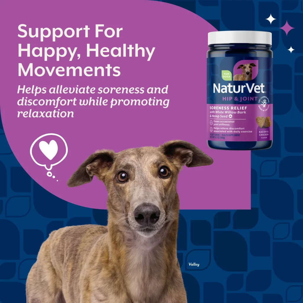
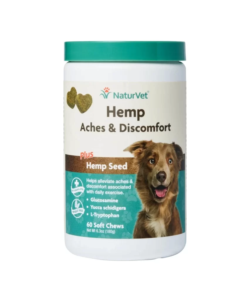
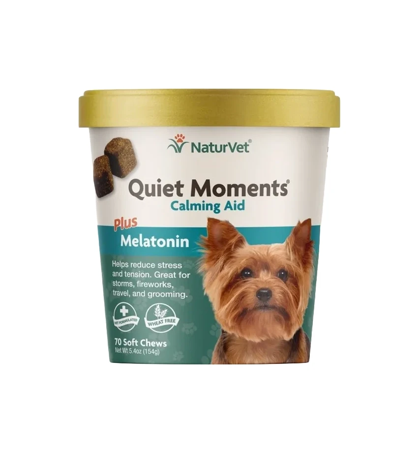
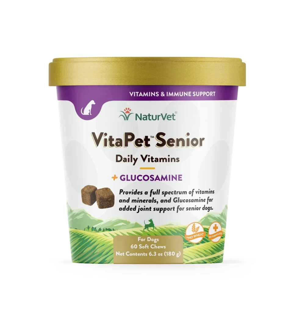
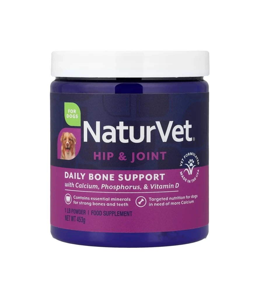
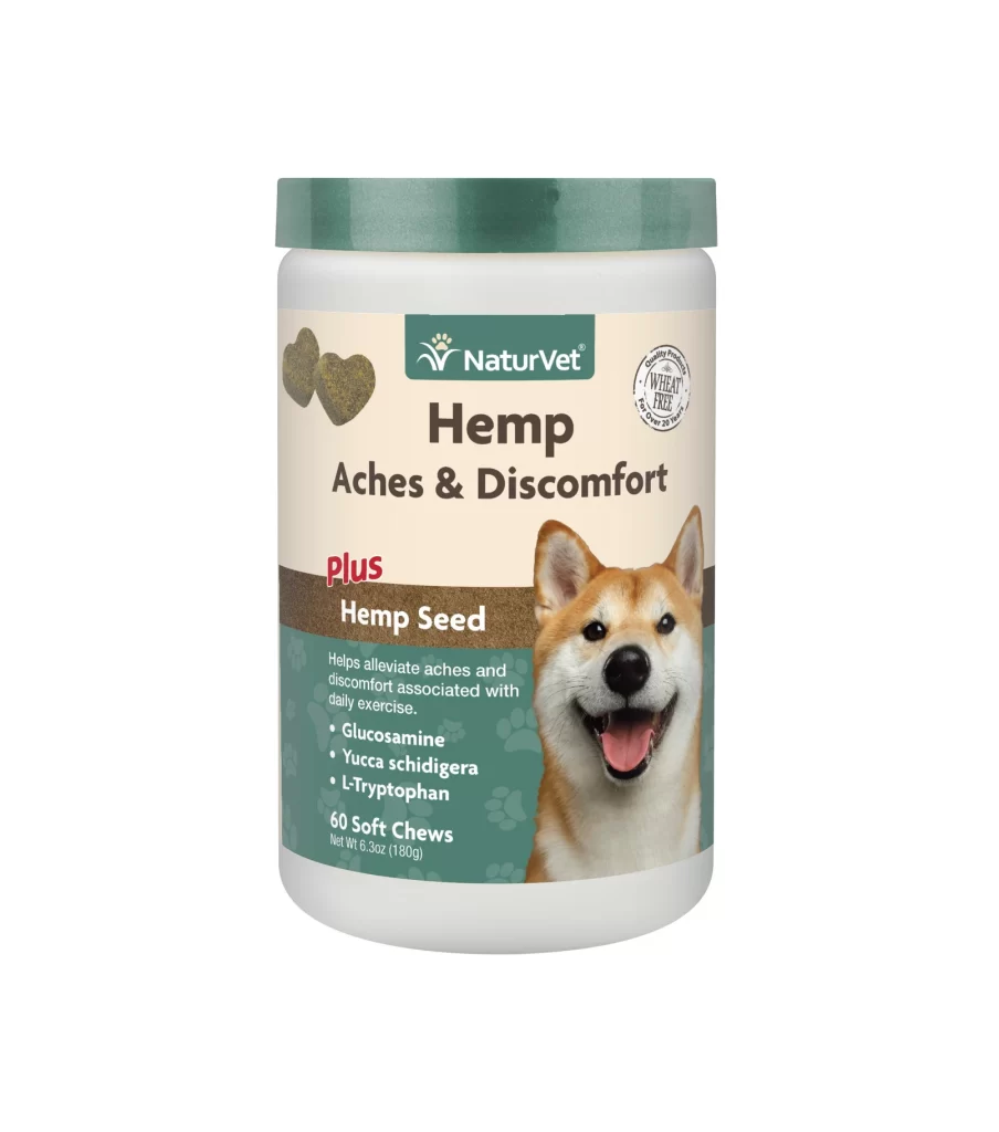
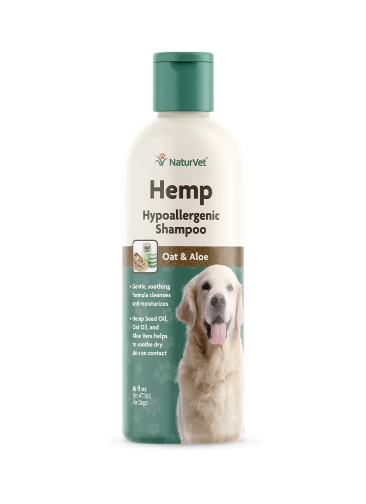
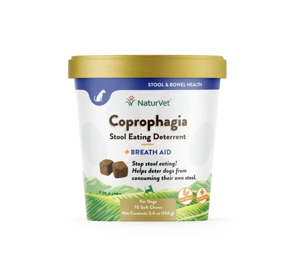
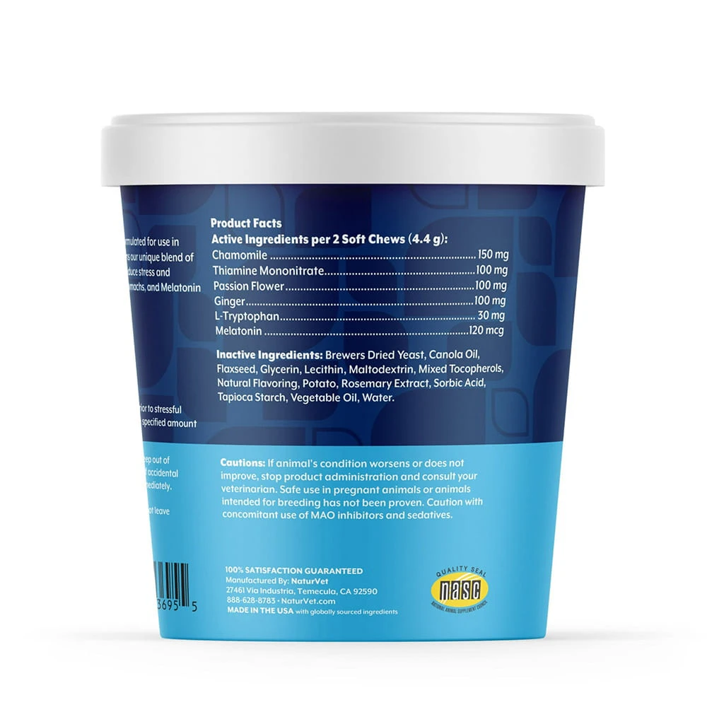
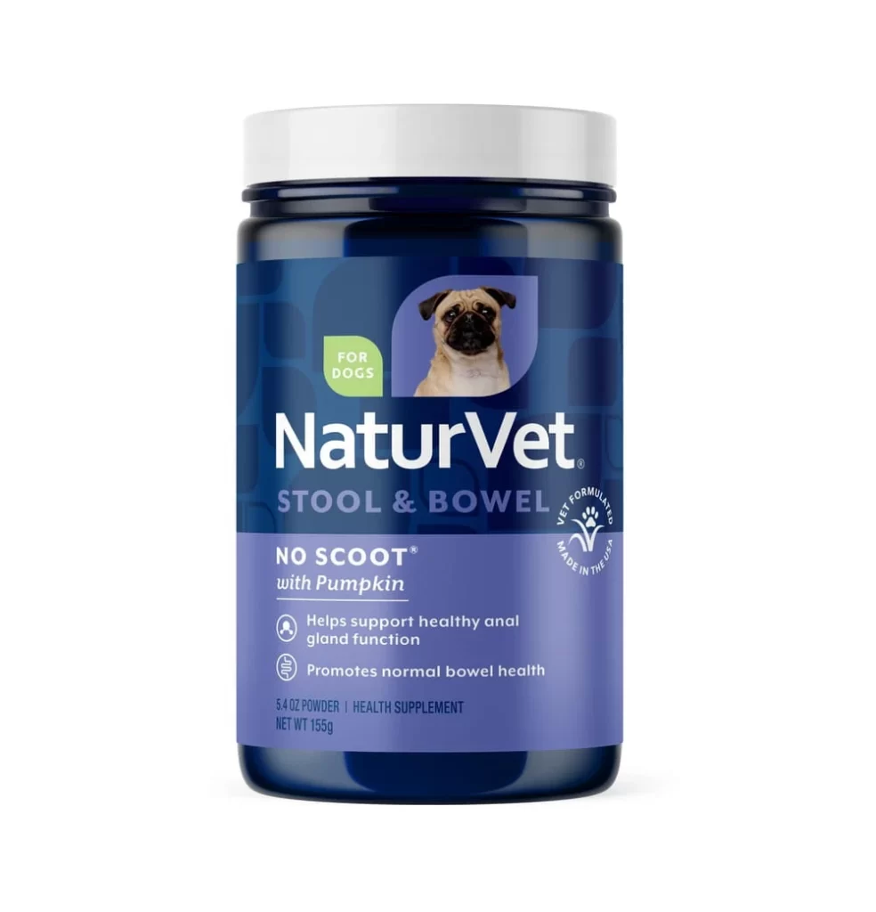
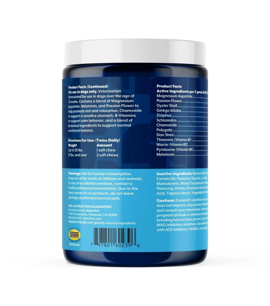
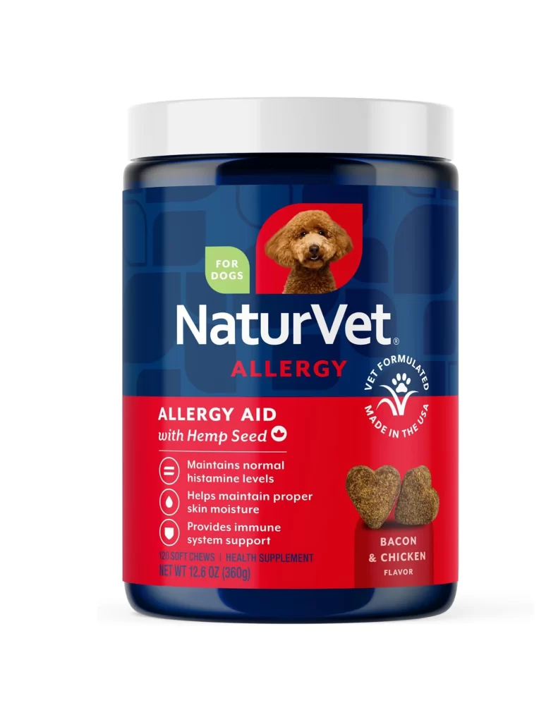
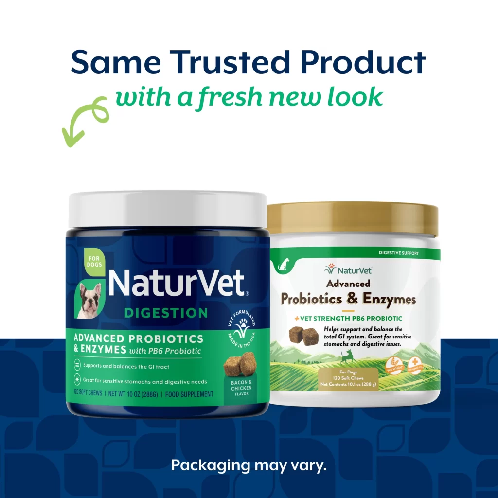
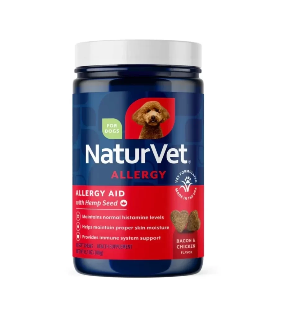
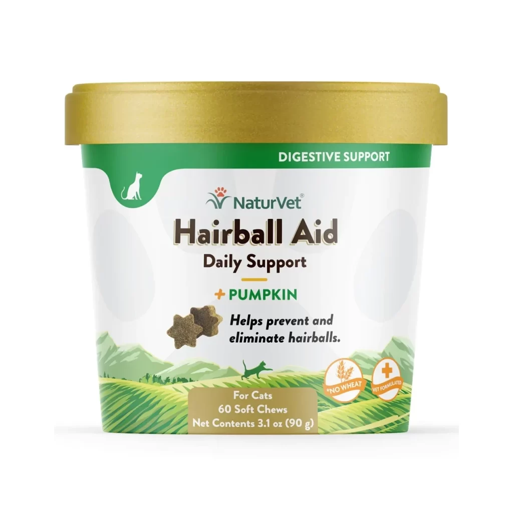
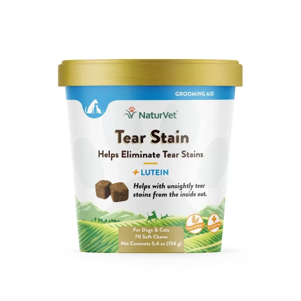
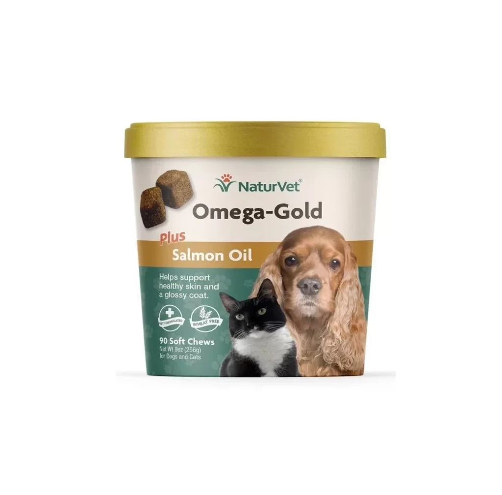
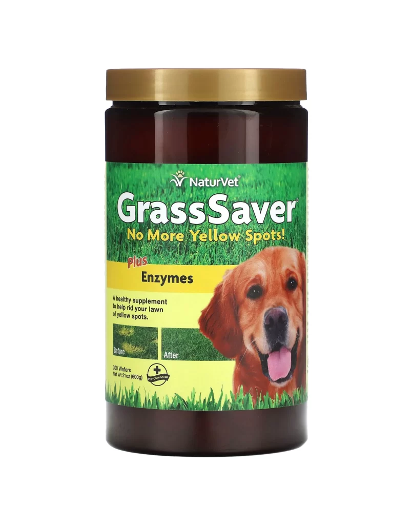
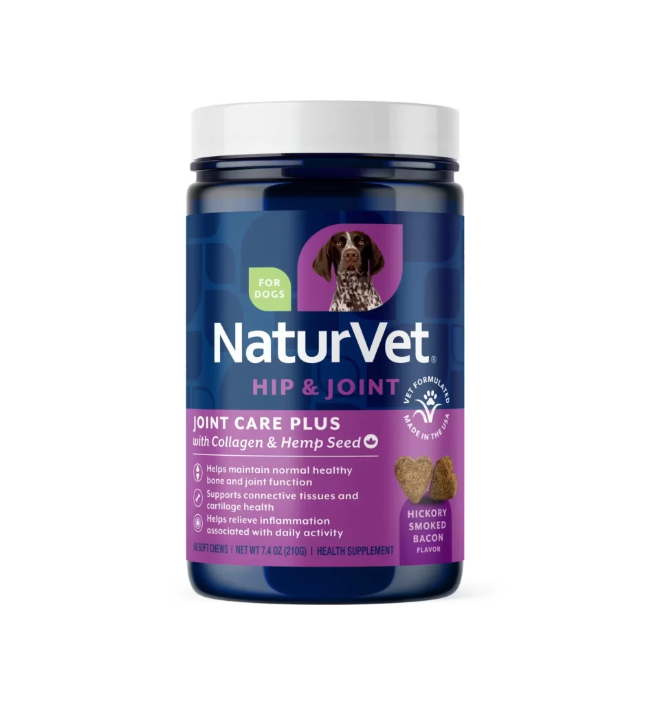
Centered within a seamless white void, a cylindrical supplement container displays a deep navy blue body capped with a flat white lid. The label features a prominent purple band at the bottom, housing the 'NaturVet' brand name in bold white sans-serif type above the product title 'HIP & JOINT'. A photographic image of a German Shorthaired Pointer occupies the upper right quadrant, while three bullet points detail health benefits alongside an illustration of two heart-shaped chews on the right edge.
Visual hierarchy is established through the strategic use of contrasting color blocks, where the vibrant magenta section anchors the lower third and draws immediate attention to the functional claims. The inclusion of realistic product photography for the treats provides tactile context that complements the clean, clinical typography used for the ingredient list. Such a layout effectively balances medical authority with consumer-friendly appeal through its organized spatial arrangement.
Packaging designers studying pet nutrition branding would utilize this composition to analyze how color psychology influences perceived efficacy in veterinary products. E-commerce photographers might reference the lighting setup to replicate the soft, even illumination required for catalog listings without harsh reflections. Marketing teams could also examine the text density to determine optimal information placement for regulatory compliance on supplement containers.