NaturVet Hip & Joint Supplement Jar Design
Topics
Details
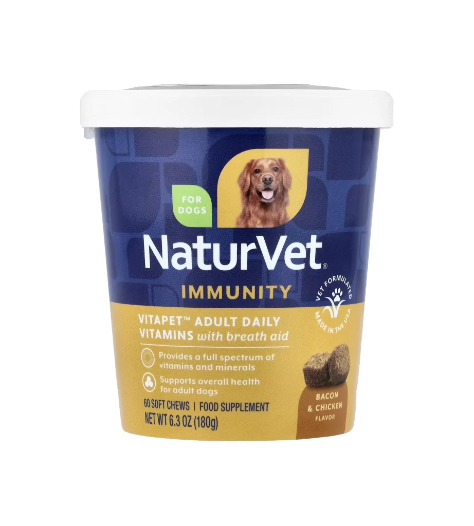
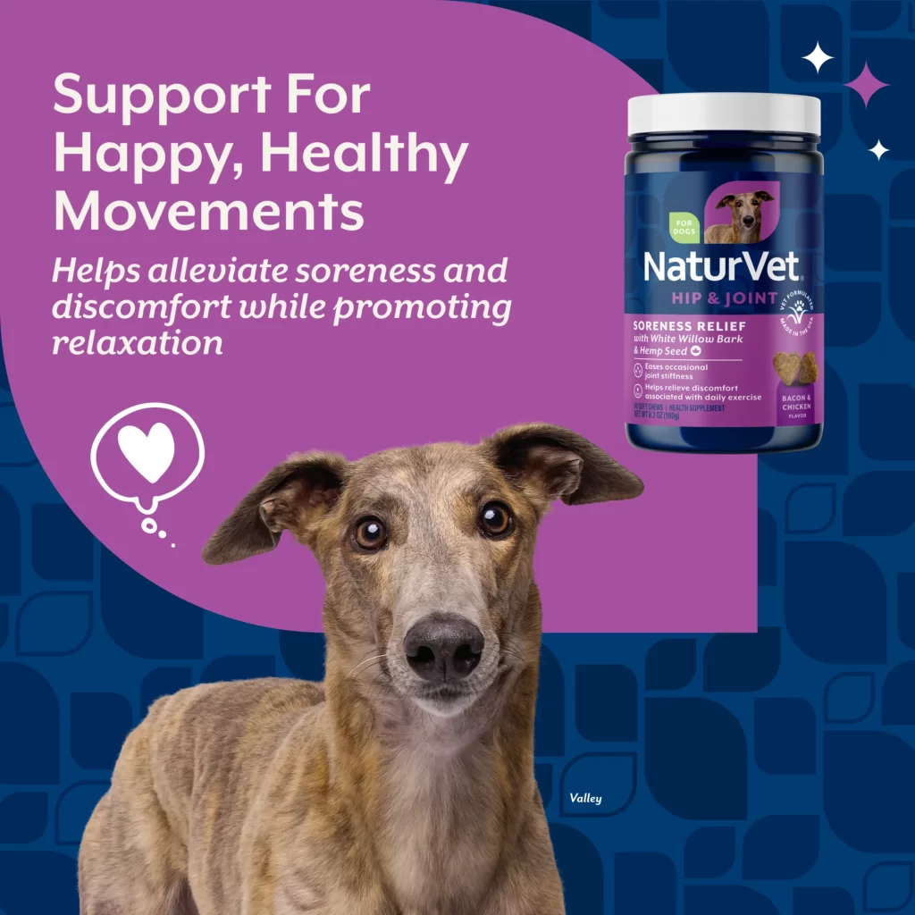
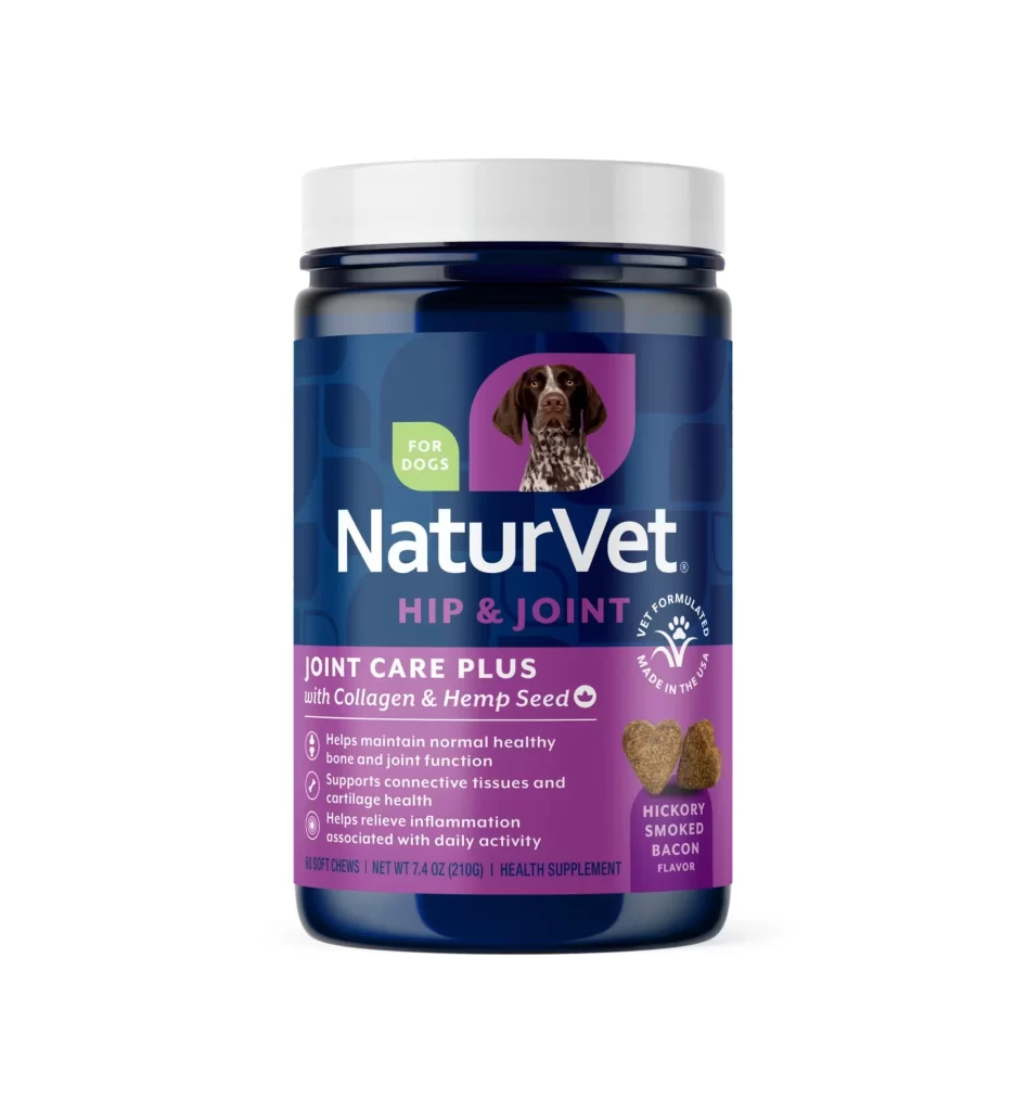
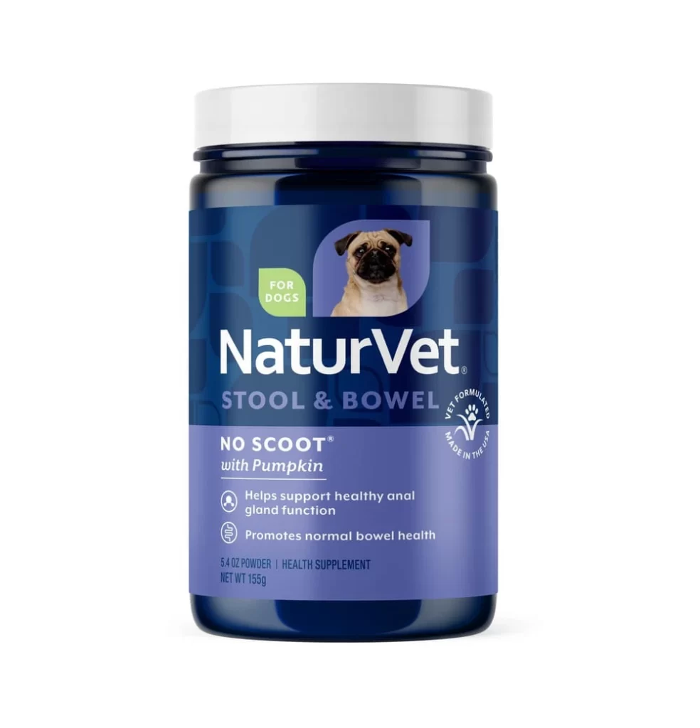
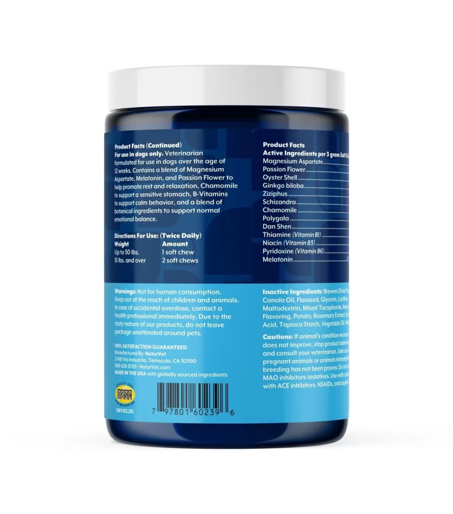
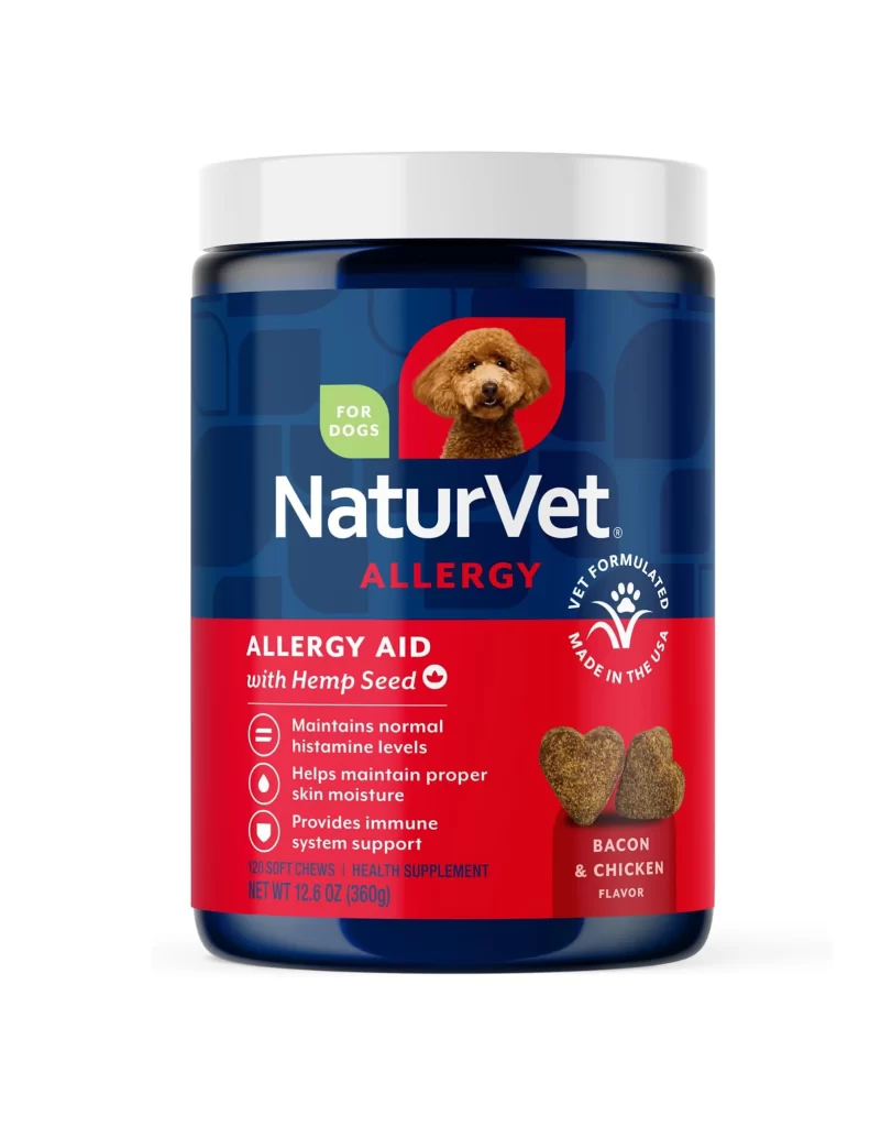
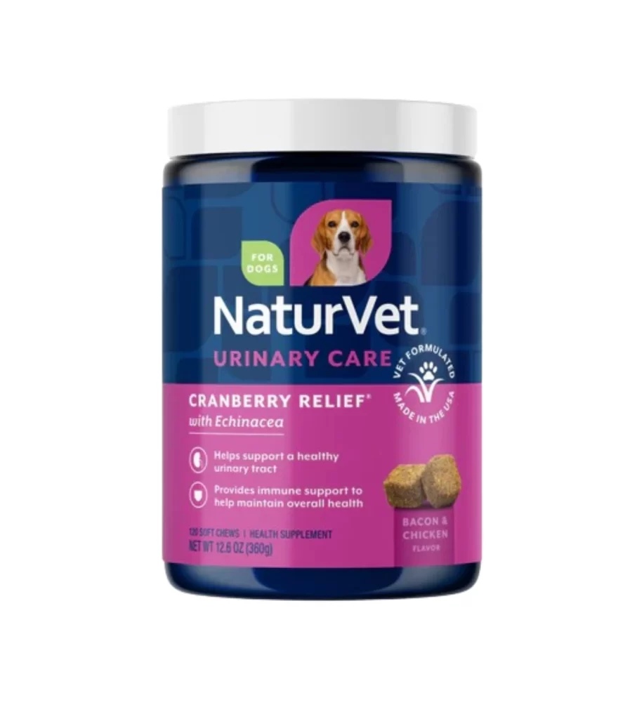
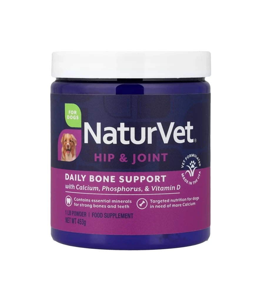
Centered within a clean, seamless white void, a cylindrical supplement jar stands as the sole focal point. The container features a deep navy blue body topped with a flat white lid, while the label itself is split between a dark charcoal upper section and a vibrant magenta lower band. Bold white typography spells out the brand name 'NaturVet' above the purple 'HIP & JOINT' subheading, accompanied by a small green leaf icon marked 'FOR DOGS' and a circular badge indicating it is 'VET FORMULATED MADE IN THE USA'.
Visual hierarchy plays a crucial role in this packaging layout, guiding the eye from the friendly dog portrait on the left to the essential product claims on the right. The stark contrast between the cool blue plastic and the warm magenta accent color creates a professional yet approachable aesthetic typical of premium pet care brands. Furthermore, the use of simple line icons for teeth and bones effectively communicates the product's benefits without cluttering the composition with excessive text.
Packaging designers studying effective color blocking for health-related products will find this example particularly useful for understanding how to balance information density. Marketing teams working on pet nutrition branding could utilize this visual to benchmark current industry standards for trust-building elements like veterinary endorsements. Additionally, illustrators looking to practice rendering realistic plastic textures and matte label finishes can study the subtle lighting reflections visible on the curved surface.