NaturVet Probiotics & Enzyme Jar
Topics
Details
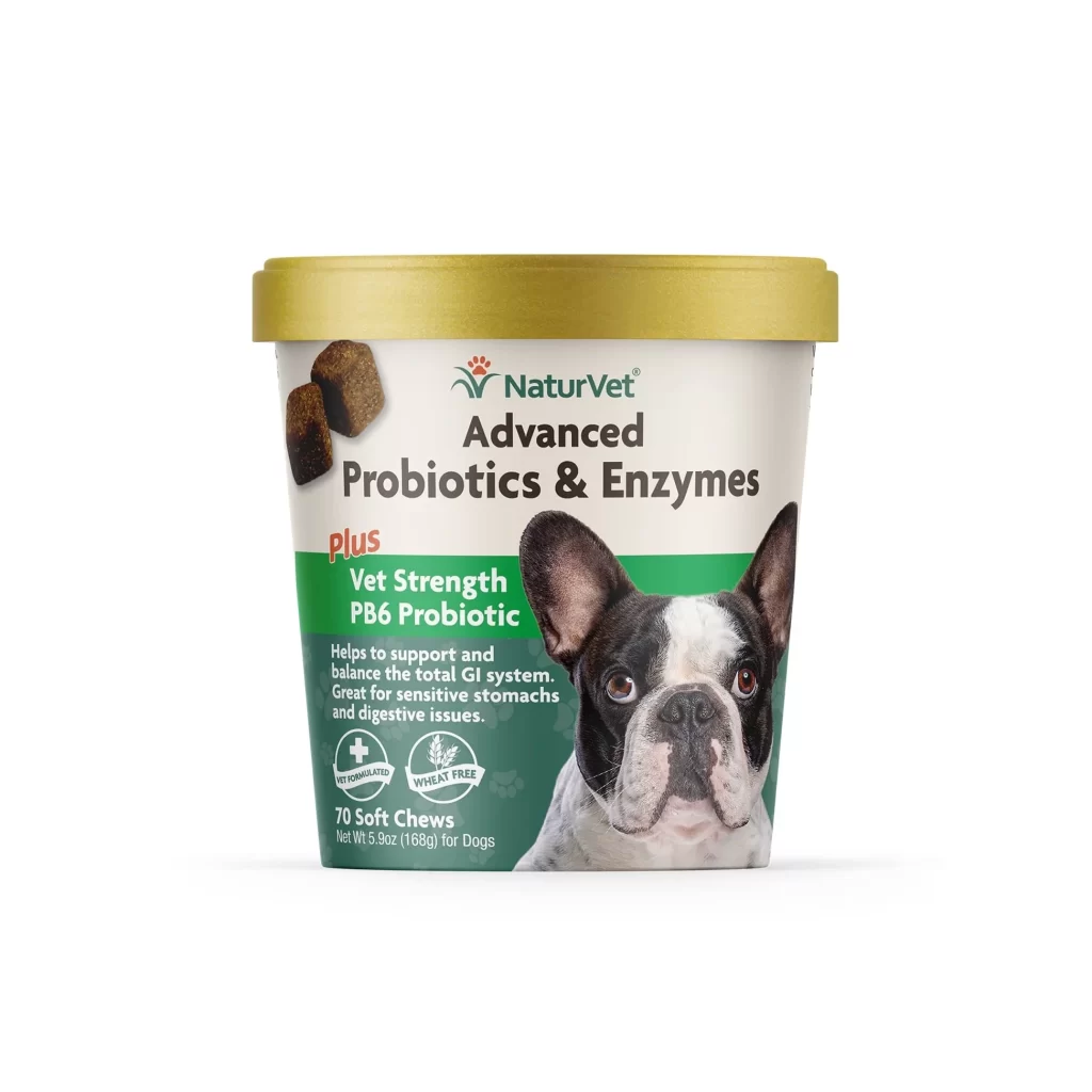
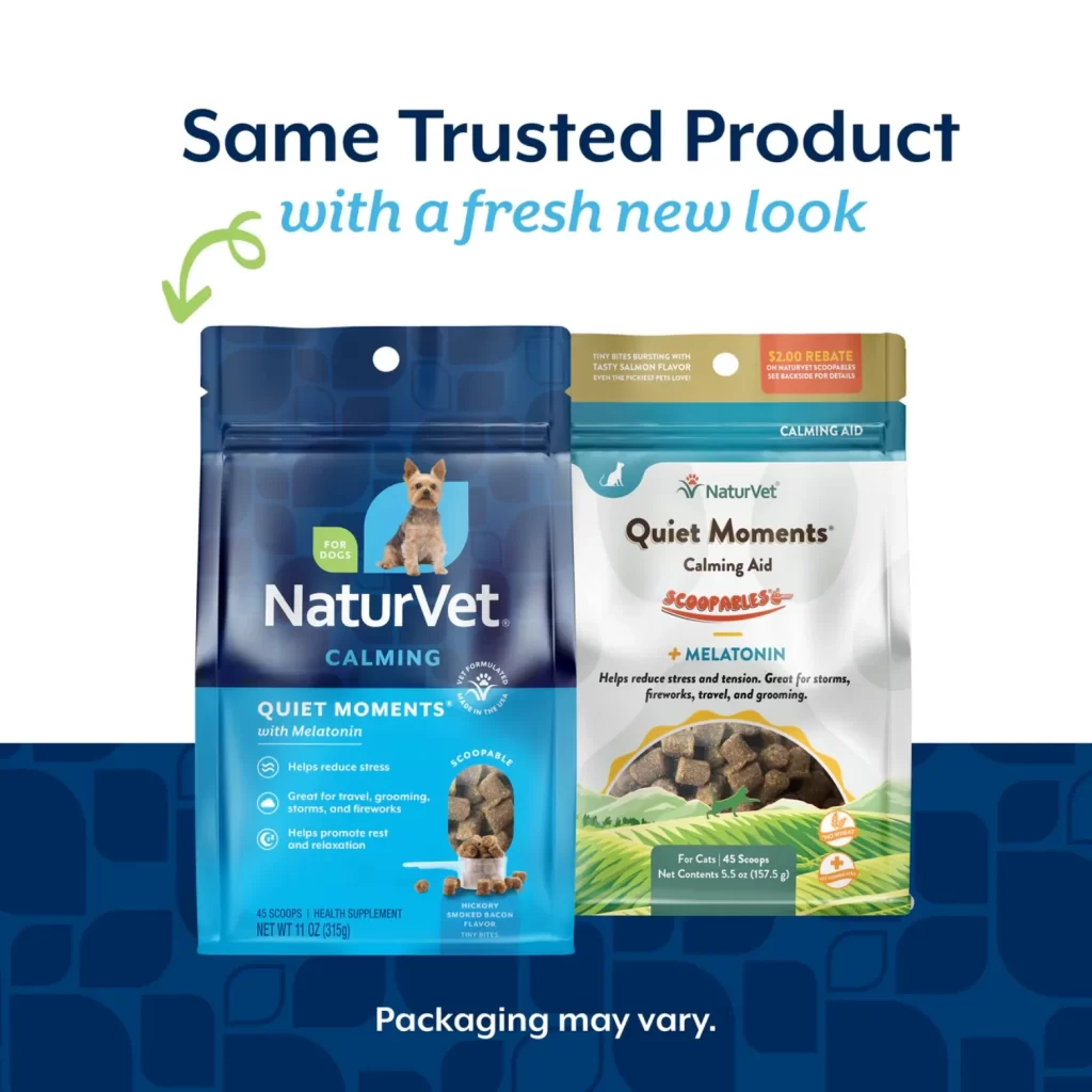
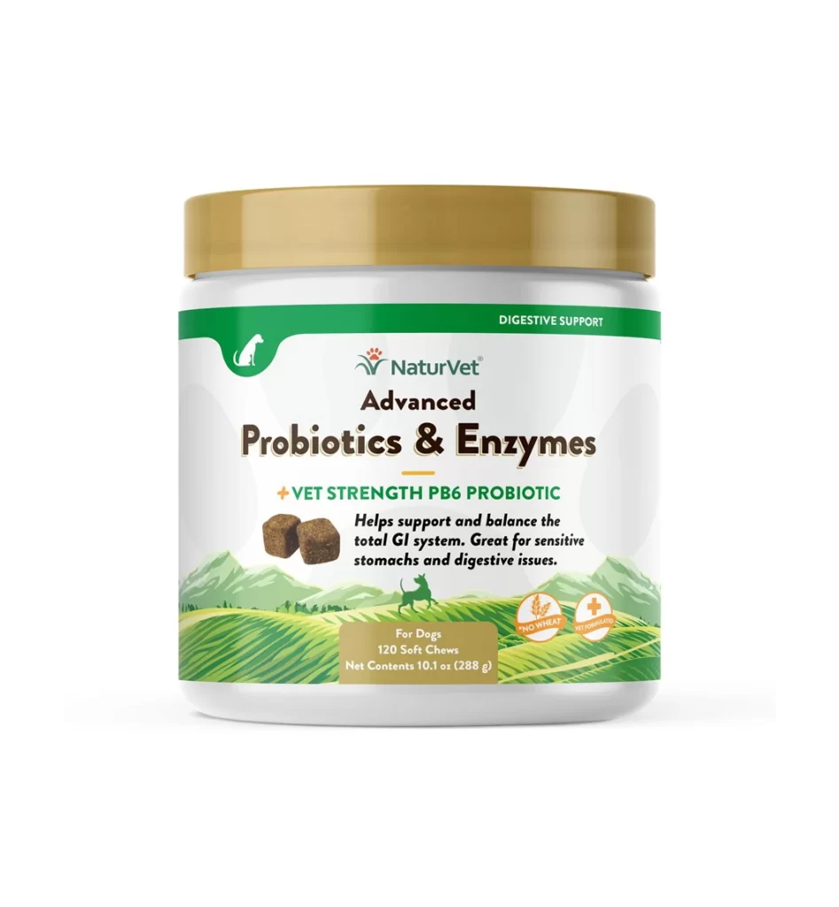
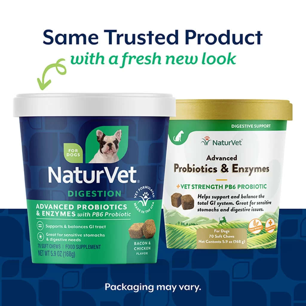
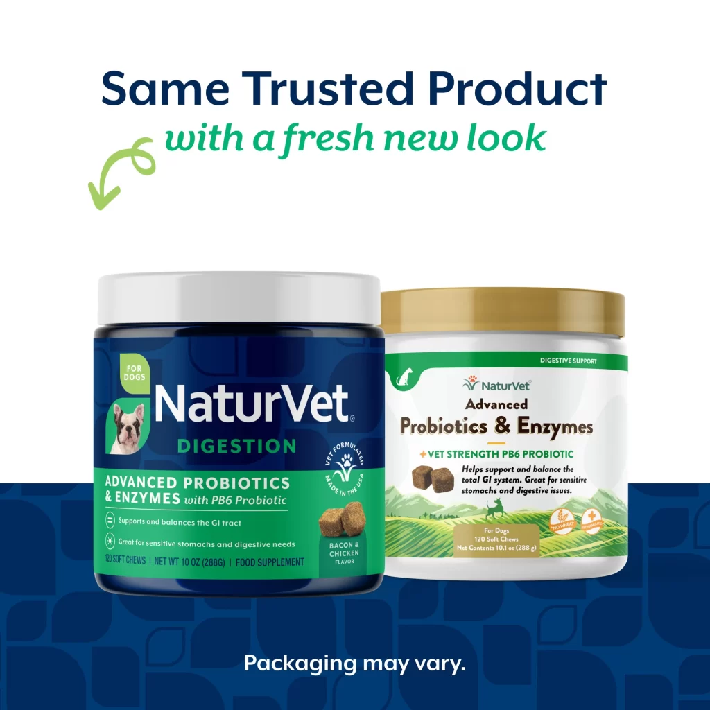
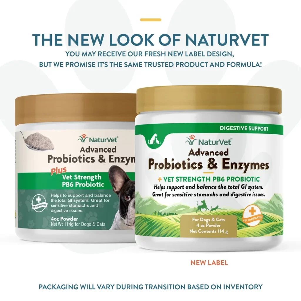
Against a clean white background with faint paw print motifs, two cylindrical containers of NaturVet Advanced Probiotics & Enzymes sit side by side, each topped with a metallic gold lid. The container on the left features a cream-colored label with a prominent photograph of a black and white French Bulldog, while the right jar displays the updated design with green grassy hills at the bottom and a small dog silhouette icon. Bold teal text arches above the products announcing 'THE NEW LOOK OF NATURVET,' with smaller subtext clarifying that the formula remains unchanged despite the label transition.
Visual contrast between the two packaging versions highlights the brand's recent rebranding effort, moving from a photo-heavy layout to a more illustrative, nature-inspired aesthetic. The older design relies on realistic product photography of the soft chews and an engaging pet portrait, whereas the new label incorporates scenic landscape graphics and simplified iconography to convey digestive support. Both iterations maintain consistent brand elements like the red paw logo and specific color coding for the 'Vet Strength PB6 Probiotic' designation, creating visual continuity despite the structural differences.
Packaging designers studying pet supplement branding trends would find this comparison useful for understanding how established brands modernize their identity without alienating existing customers. Marketing teams could reference these layouts when planning their own product line refreshes, particularly when needing to communicate formula consistency alongside visual changes. E-commerce managers might also utilize this visual guide to prepare customer service teams for handling inquiries about varying package appearances during inventory transitions.