NaturVet Omega-Gold Salmon Oil Soft Chew Jar
Topics
Details
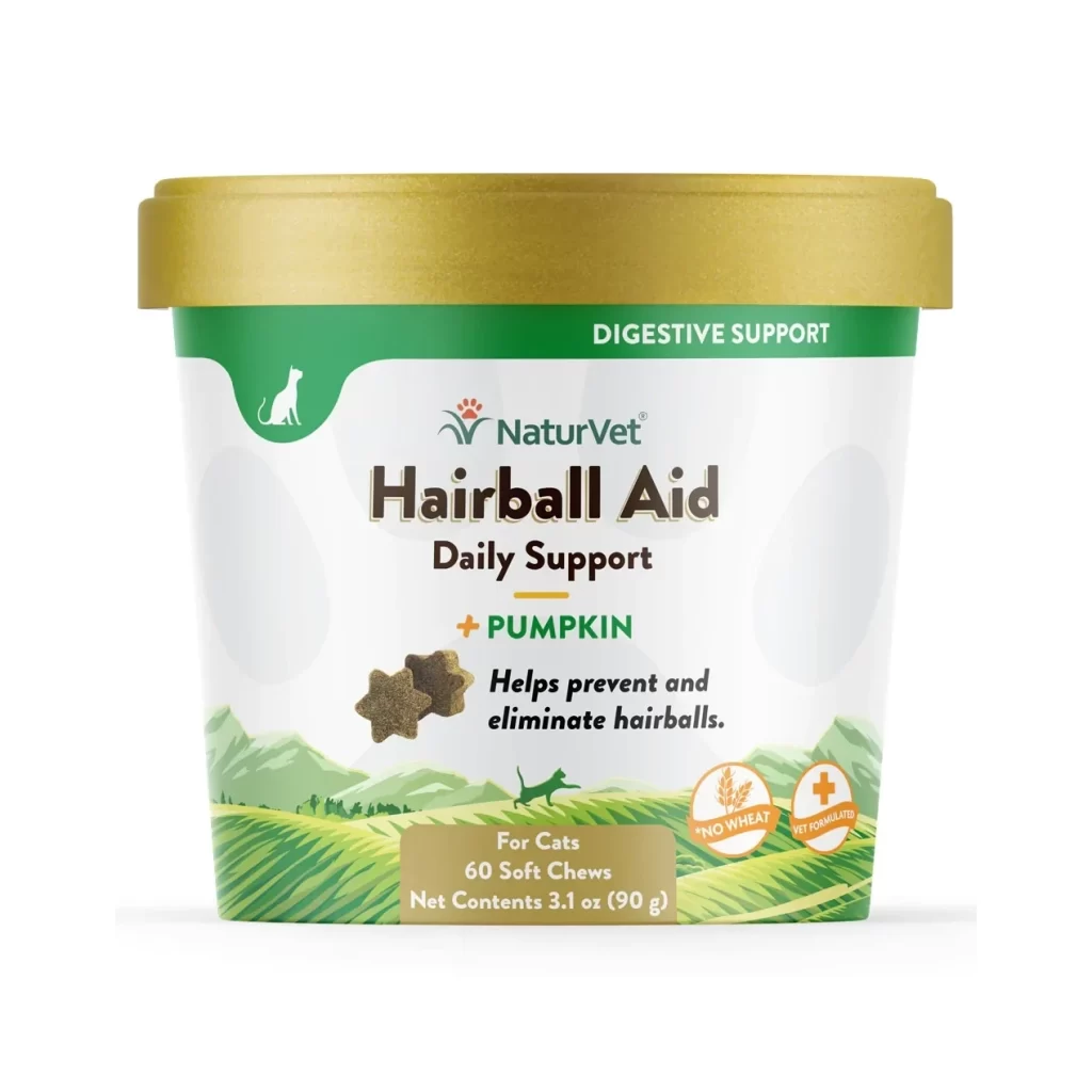
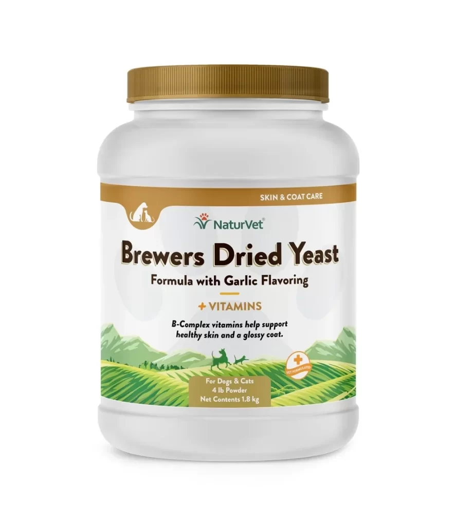
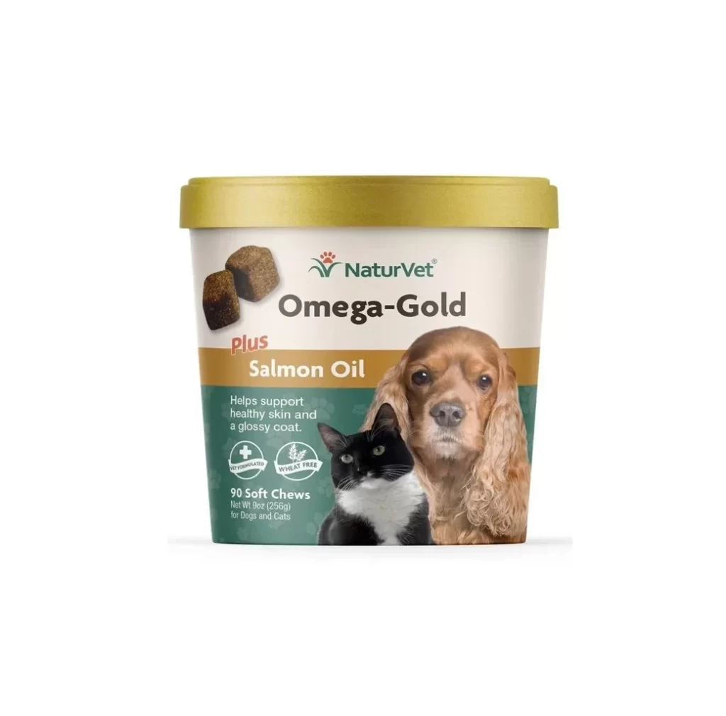
Centered against a clean white backdrop, a cylindrical container of NaturVet Omega-Gold Plus Salmon Oil stands out with its golden-yellow lid and cream-colored body. The label features a warm brown band across the middle, displaying the product name in bold black text above the words 'Plus Salmon Oil' in white. Below this, a deep green section contains white text about supporting healthy skin and coats, alongside two circular icons indicating it is vet-formulated and wheat-free. A photorealistic image of a Cocker Spaniel and a black-and-white cat occupies the right side, while two soft chews appear on the left, all captured from a straight-on camera angle with even, studio-quality lighting.
What makes this packaging visually compelling is its strategic use of color blocking to organize information hierarchy while maintaining an approachable, pet-friendly aesthetic. The combination of realistic animal photography with clean typography creates immediate emotional resonance for pet owners, signaling trust and quality without feeling overly clinical. The inclusion of both canine and feline imagery cleverly communicates universal appeal across species, making the product feel versatile and essential for multi-pet households.
Brand designers studying pet supplement packaging would find this reference valuable for understanding how to balance medical credibility with warmth through color psychology and imagery selection. Marketing teams could analyze the layout to see how benefit claims are positioned alongside visual proof points like the animal portraits. E-commerce photographers might study the lighting setup to replicate similar product shots that highlight texture details on both the container surface and the soft chew samples themselves.