Nissin Instant Noodle Box View
Topics
Details
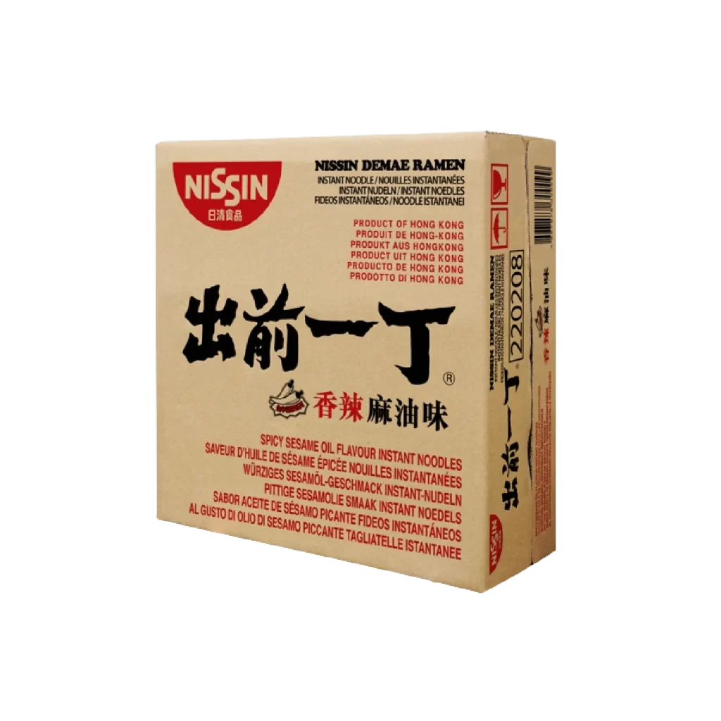
Against a seamless white void, a rectangular cardboard carton of Nissin Demae Ramen sits at a three-quarter angle, revealing its front and right side panels. The packaging features a natural kraft paper base dominated by bold black calligraphy for the characters "出前一丁" and red text identifying the flavor as Spicy Sesame Oil. A bright crimson Nissin logo anchors the upper left corner, while smaller multilingual product descriptions and a vertical barcode occupy the right edge under even, shadowless studio lighting.
Visual hierarchy on this Hong Kong market variant relies heavily on the contrast between the organic, brush-stroke weight of the Japanese kanji and the rigid sans-serif typography used for English and European translations. The restricted palette of unbleached cardboard, jet black, and signal red creates a utilitarian yet striking aesthetic that differs significantly from the more colorful or photographic approaches often seen in other regional instant noodle packaging. Such a layout demonstrates how traditional East Asian branding elements can coexist with modern regulatory information without cluttering the composition.
Product photographers and packaging engineers might study this specific angle to understand how to balance legibility across multiple faces of a three-dimensional container. Brand strategists could analyze the typographic choices to see how heritage scripts are integrated into contemporary retail environments. Additionally, 3D modelers looking to recreate grocery items would find the clear view of the side panel's warning icons and barcode placement particularly useful for achieving technical accuracy in their renders.