Oribe Hair Oil Bottle
Topics
Details
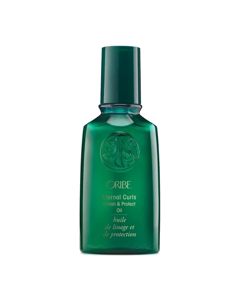
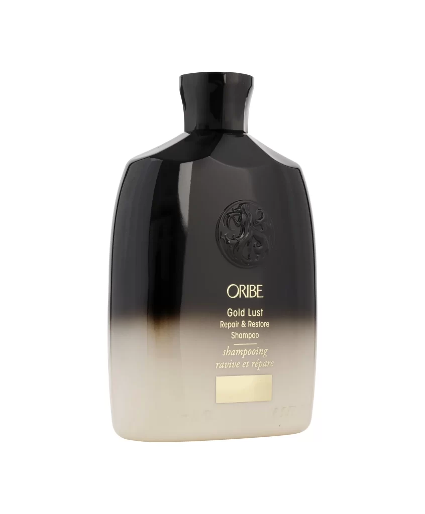
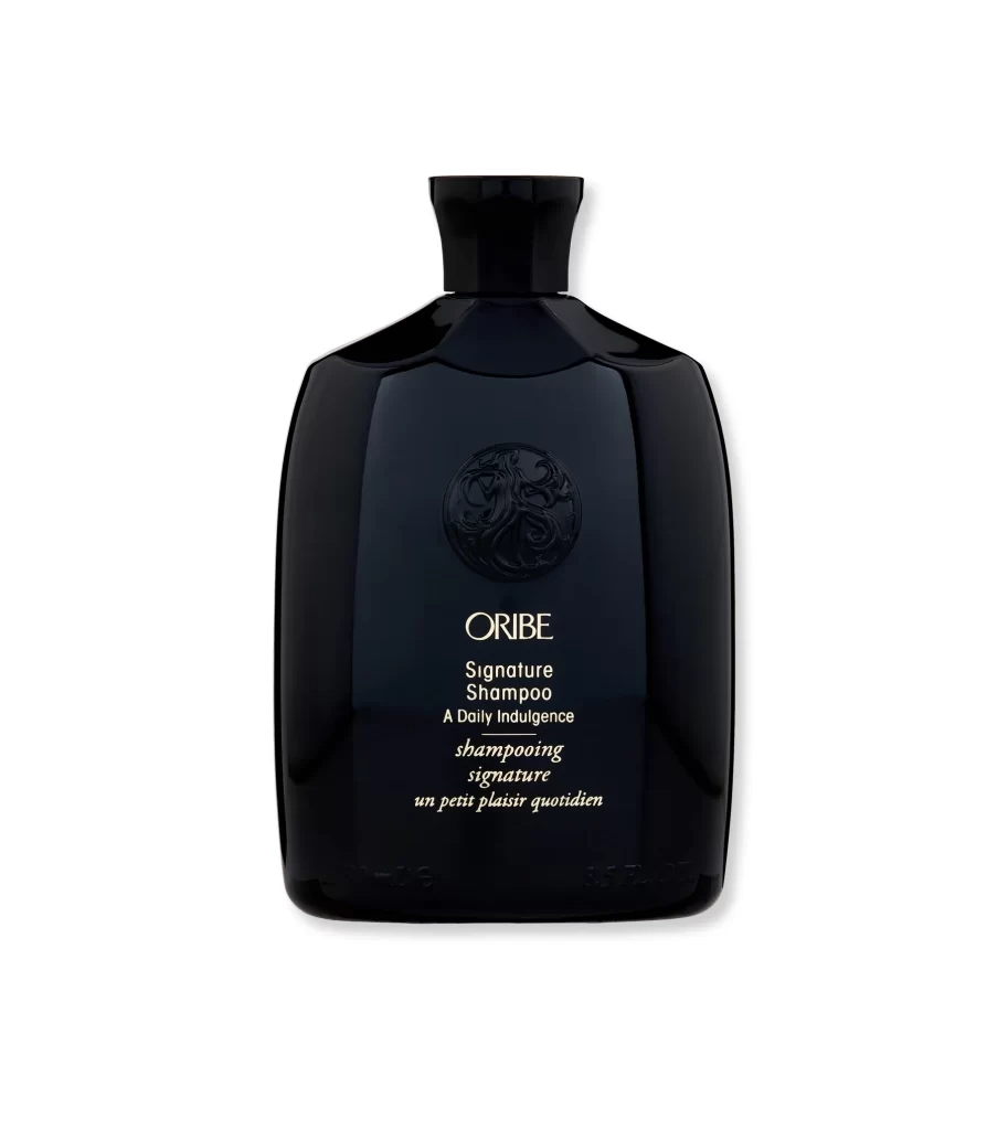
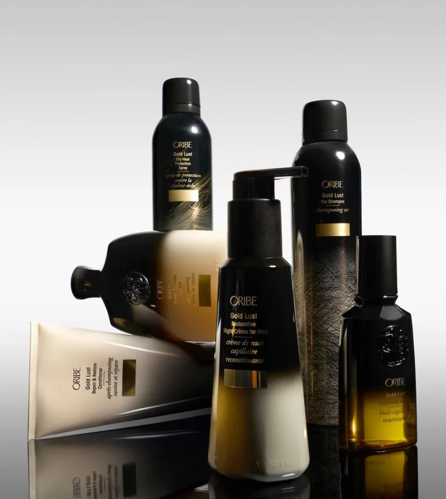
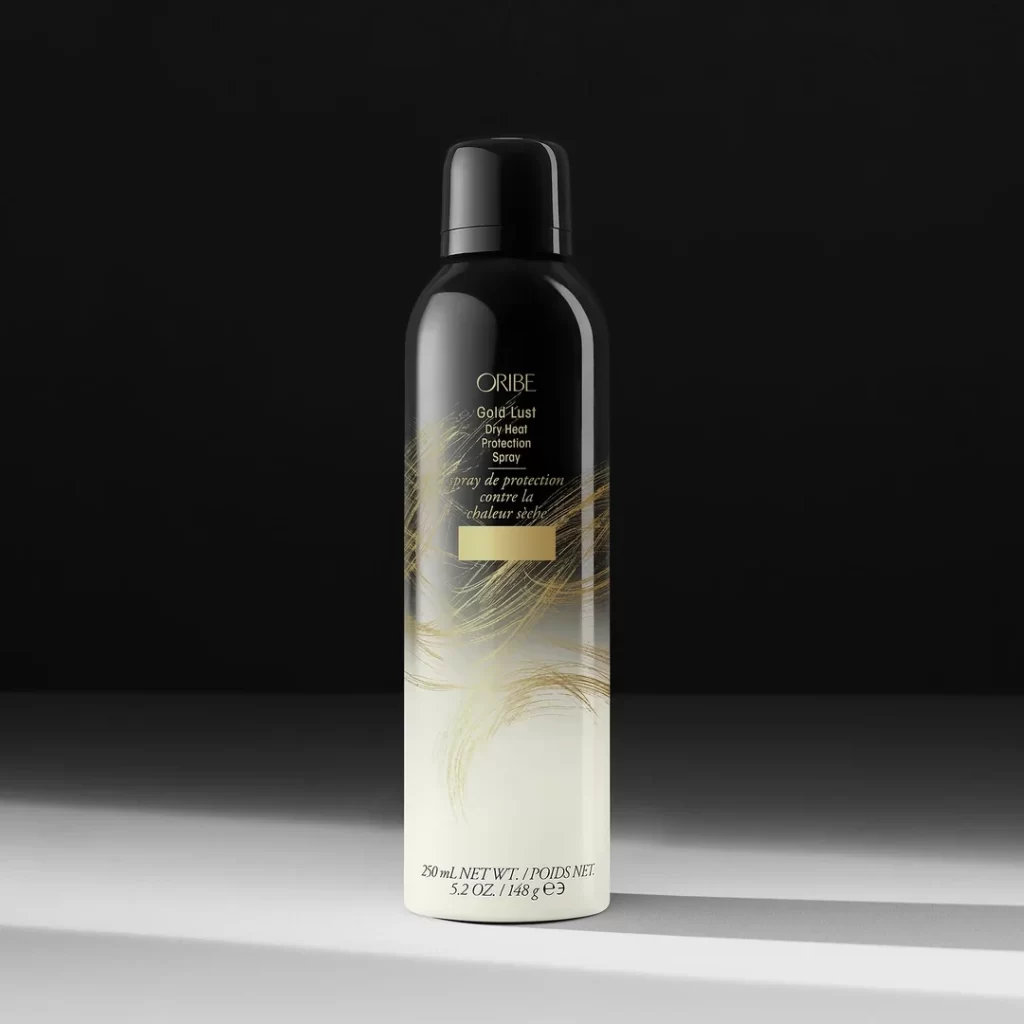
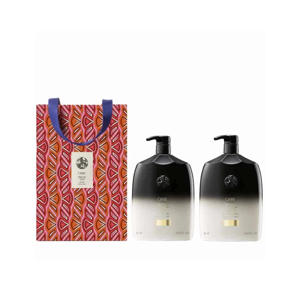
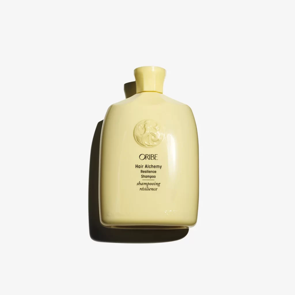
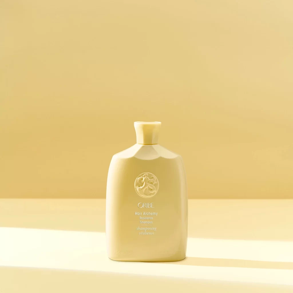
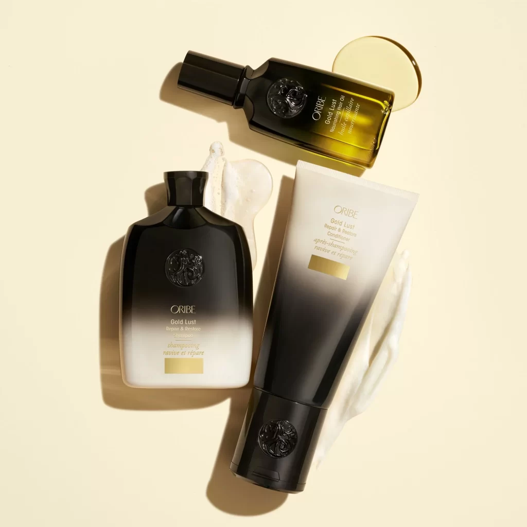
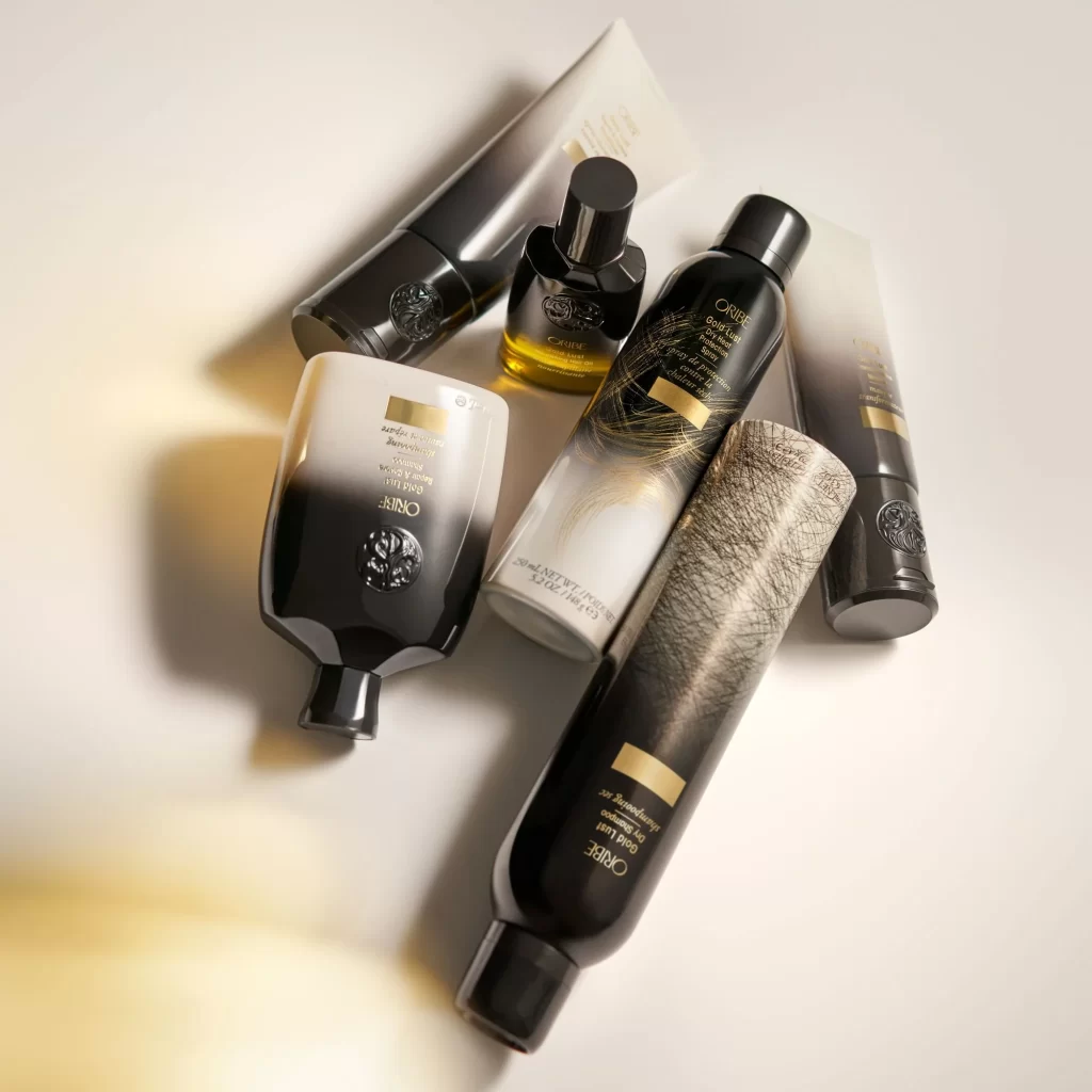
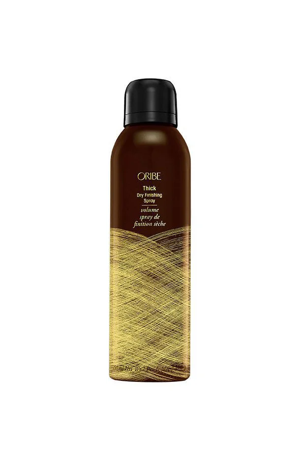
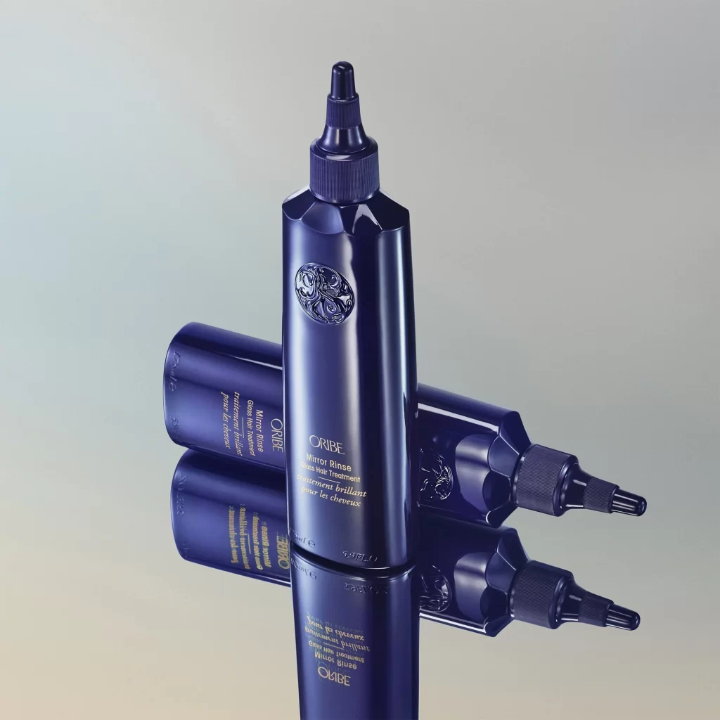
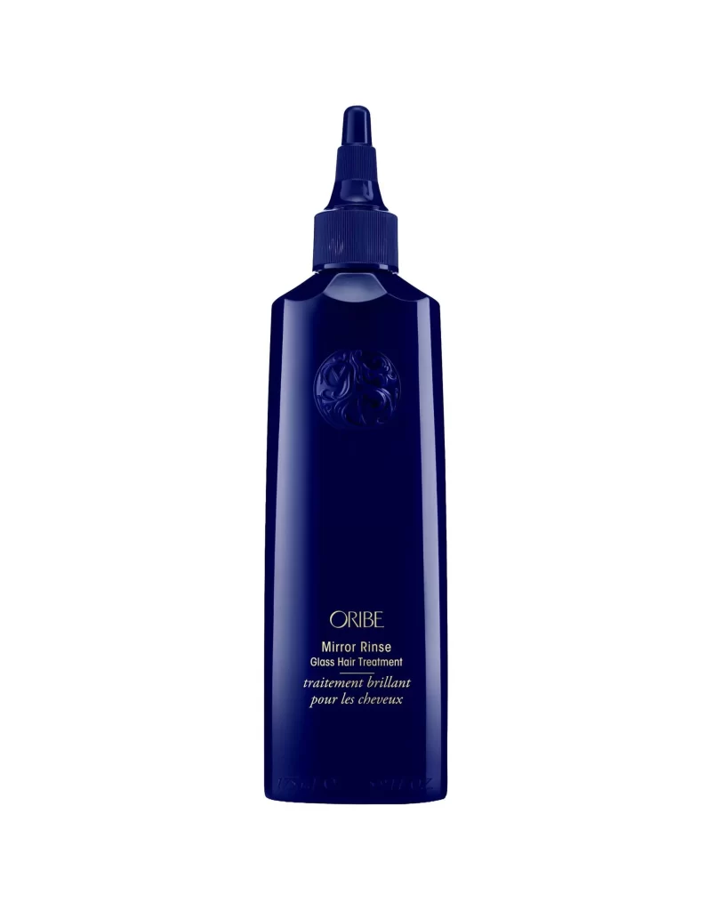
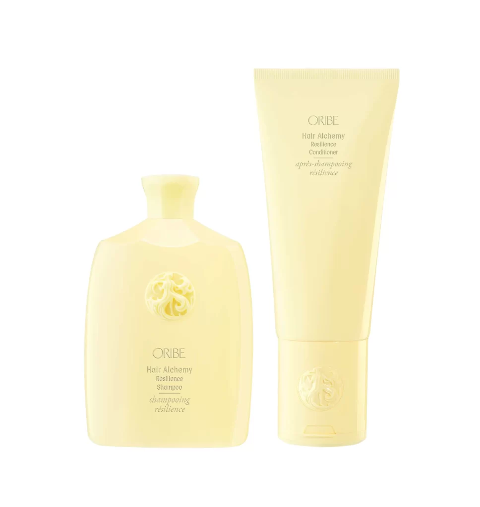
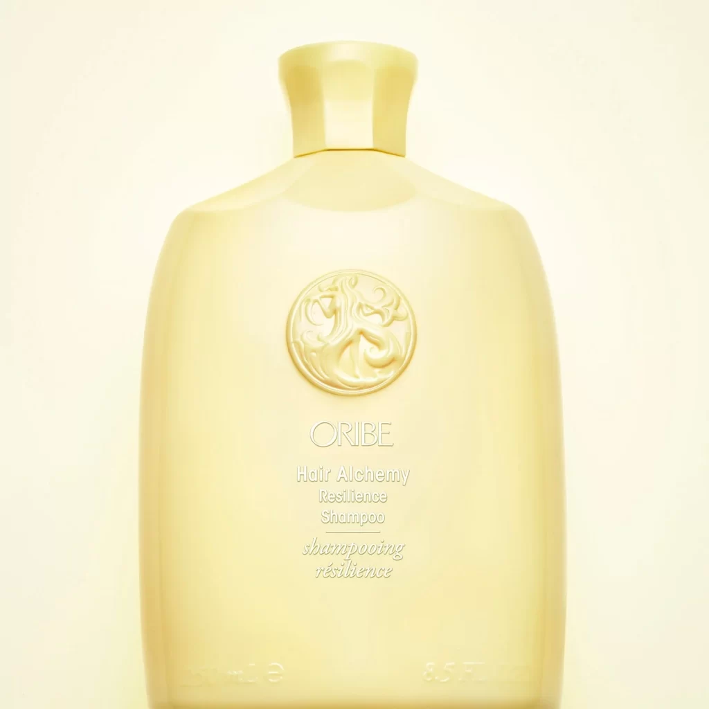
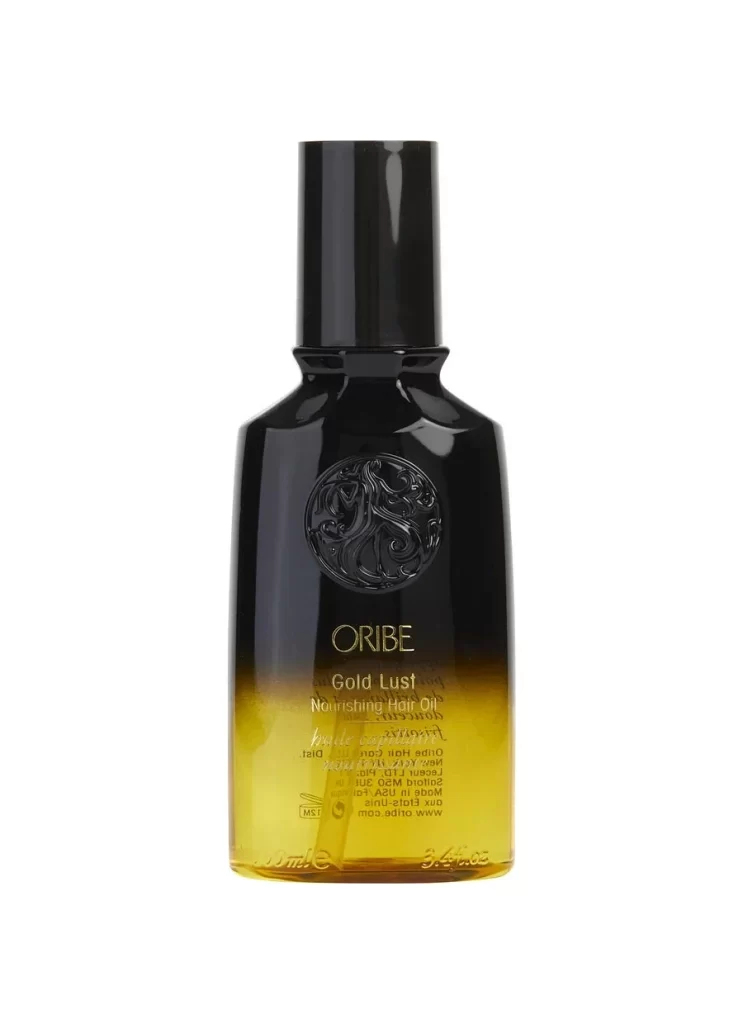
Centered within a void of pure white, the Oribe Gold Lust bottle presents a study in controlled opacity and material contrast. The vessel transitions from a dense, light-absorbing black at the shoulders to a translucent honey-yellow at the base, revealing the liquid level within. A cylindrical matte cap sits atop the narrow neck, while an embossed circular medallion interrupts the glossy surface above the serif brand name and product designation printed in metallic gold.
Visual weight concentrates in the lower third through the gradient effect, creating a sense of gravitational pull that grounds the otherwise ethereal composition. The interplay between the tactile relief of the central logo and the smooth, reflective surrounding surfaces generates subtle shadow play that defines the bottle's curvature. Such deliberate material juxtaposition—matte against gloss, opaque against transparent—establishes a luxury hierarchy through physical texture rather than ornamentation alone.
Industrial designers examining premium packaging solutions would analyze this object to understand how color gradients communicate product viscosity and quality without explicit labeling. 3D artists requiring reference for subsurface scattering effects on liquids or complex embossed typography on curved surfaces could derive technical data from the highlights and shadows present here. Marketing teams developing visual identity systems for high-end beauty brands might study the typographic hierarchy and spatial relationships between the logo, product name, and regulatory text.