Oribe Wave and Shine Spray Can
Topics
Details
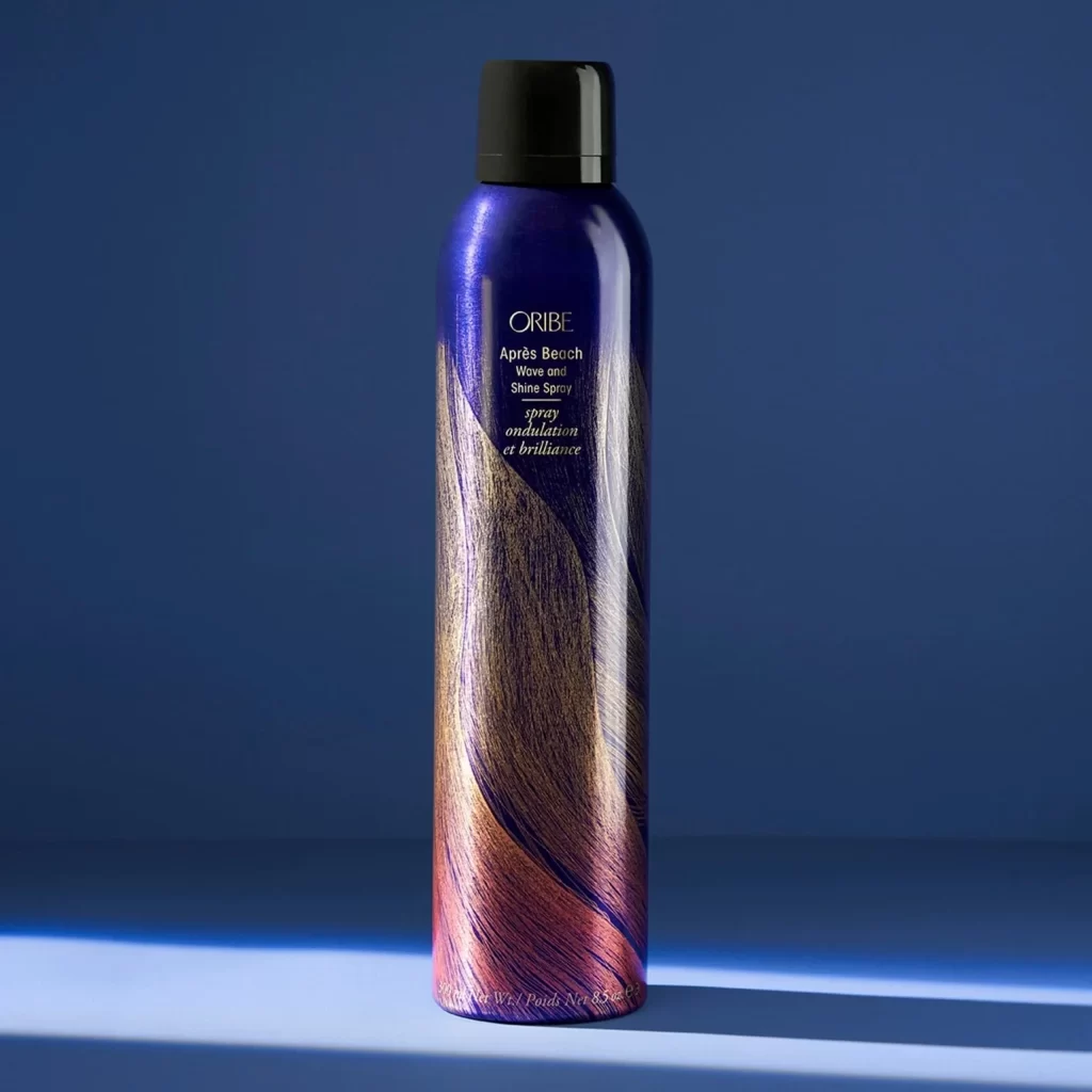
Against a deep navy backdrop, a metallic aerosol can stands in sharp focus, catching light that rakes across its surface from the left. The container transitions from a rich indigo at the crown through shimmering bronze and finally to a warm rose-gold at the base, with fine, hair-like striations following the curve of the cylinder. Centered near the top, the brand name 'ORIBE' appears above 'Après Beach Wave and Shine Spray' and its French translation, all rendered in elegant white typography beneath a simple black cap.
What sets this packaging apart is the sophisticated gradient treatment that mimics the iridescence of hair itself. Rather than relying on flat color blocks, the design utilizes textured, linear patterns that suggest movement and fluidity, making the object feel dynamic even when stationary. The interplay between the cool blue tones and the warm metallics creates a luxurious, high-contrast aesthetic that elevates a standard utilitarian shape into something resembling a piece of modern art.
Product photographers might study this composition to understand how directional lighting enhances reflective surfaces without causing harsh glare. Packaging designers could analyze the way the color transition guides the eye vertically while maintaining brand readability. Additionally, 3D artists looking to render cosmetic products would find the subtle specular highlights and soft shadows particularly useful for understanding material properties on curved metallic forms.