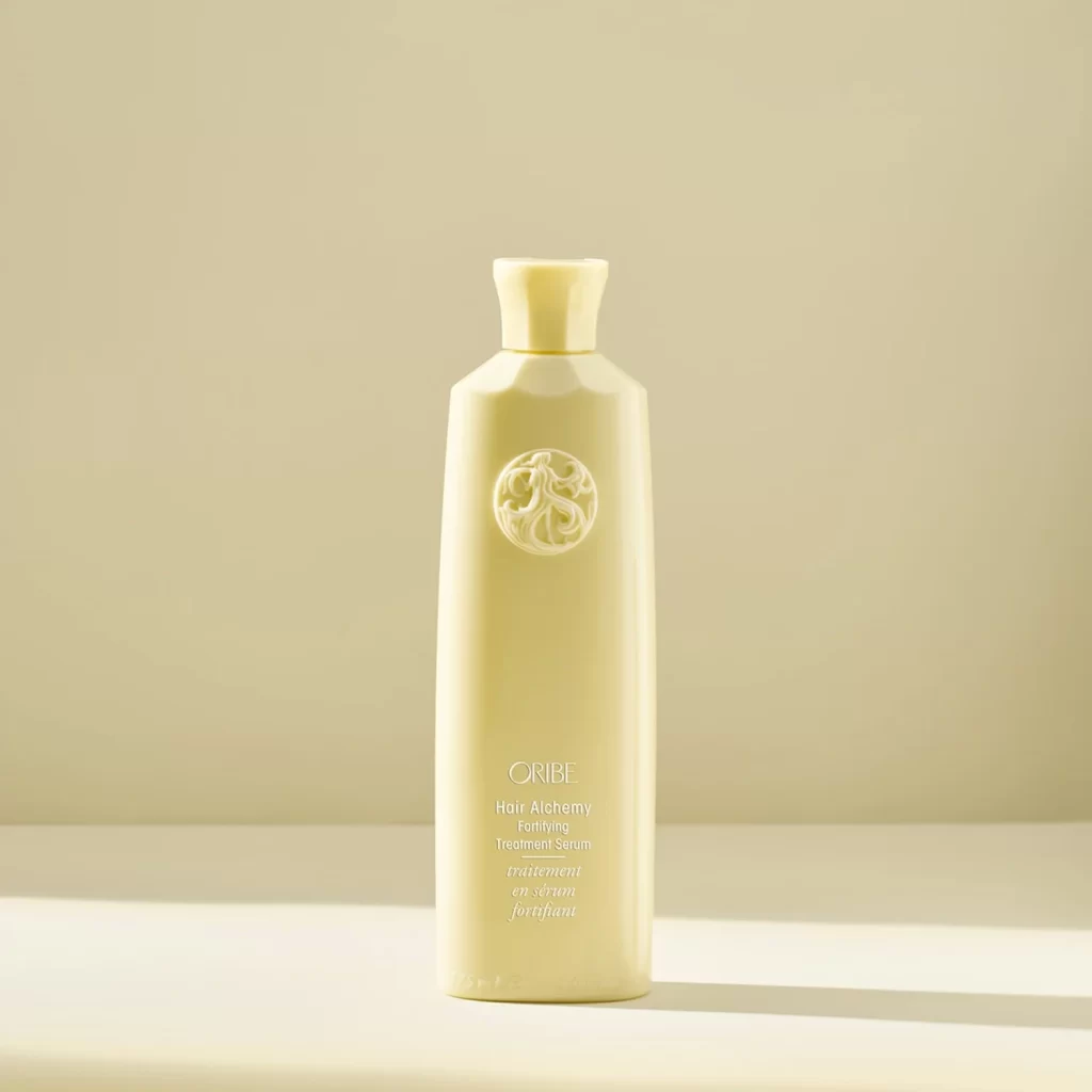
Oribe Hair Alchemy Fortifying Treatment Serum Bottle
Topics
Details
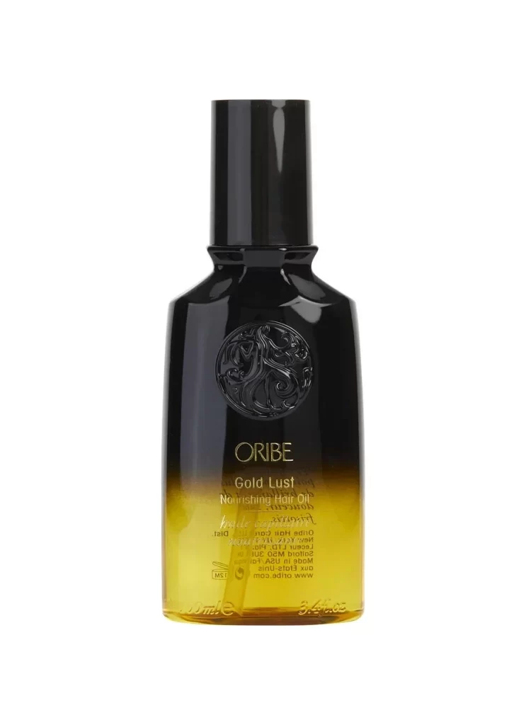
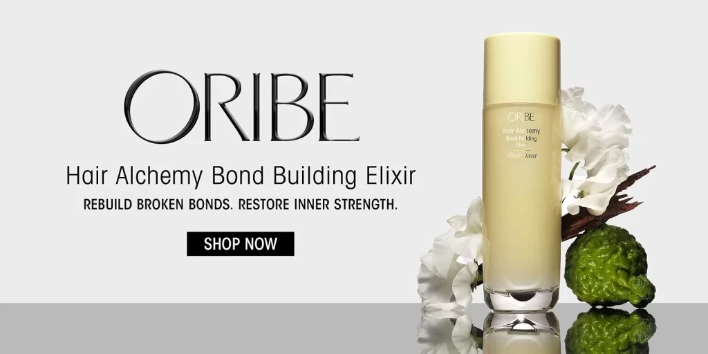
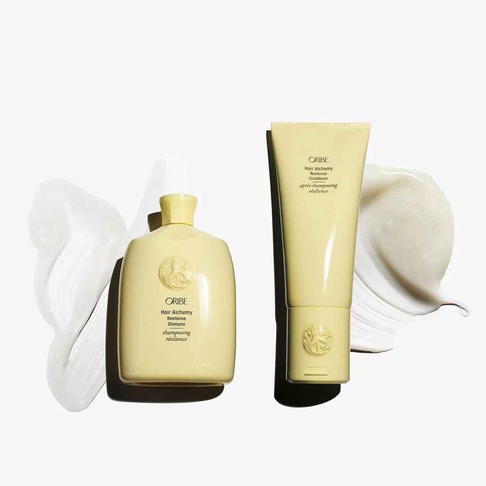
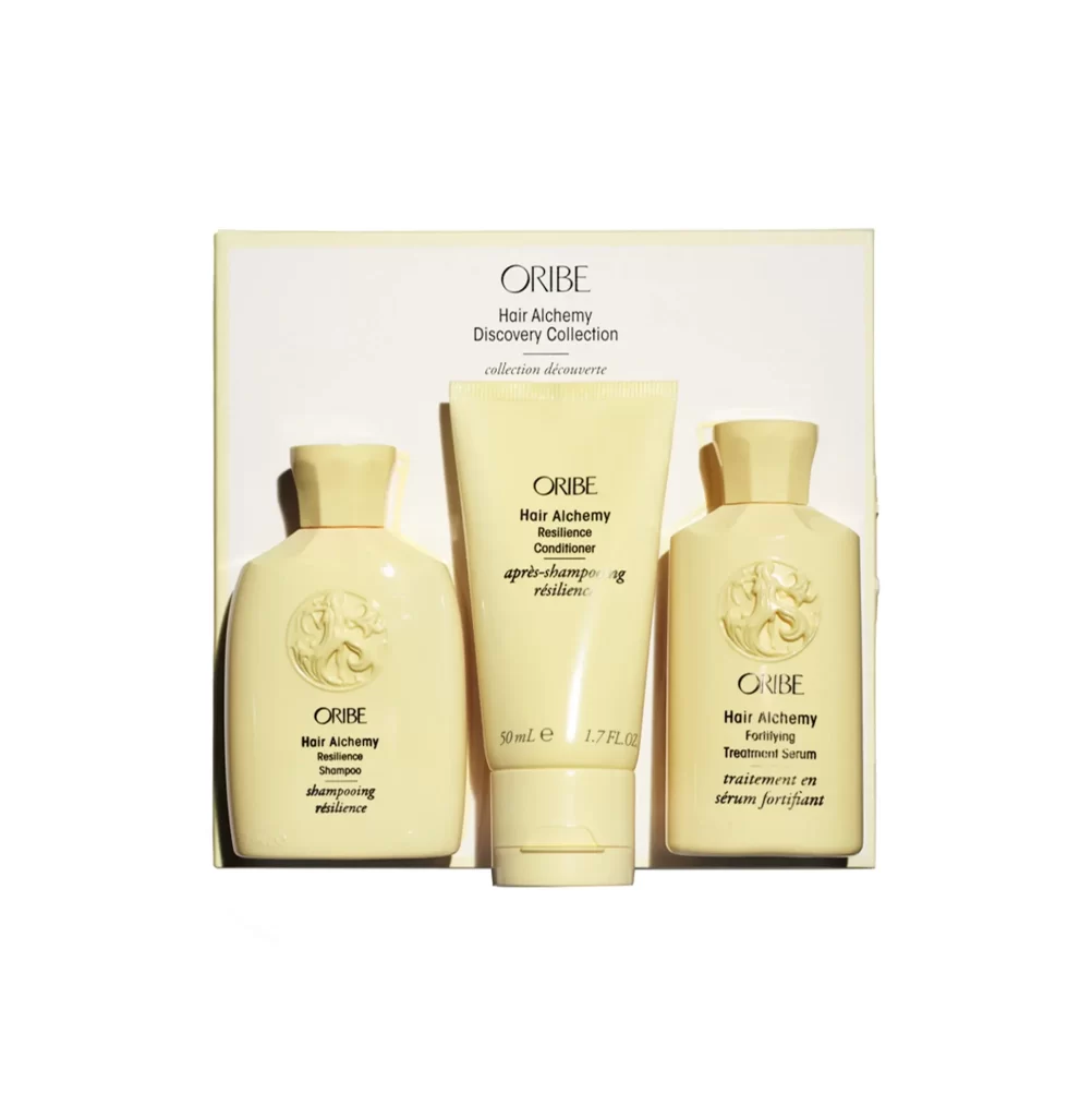
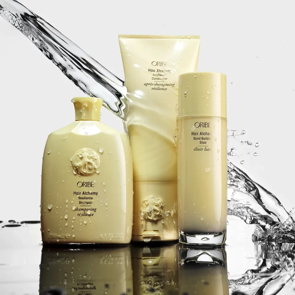
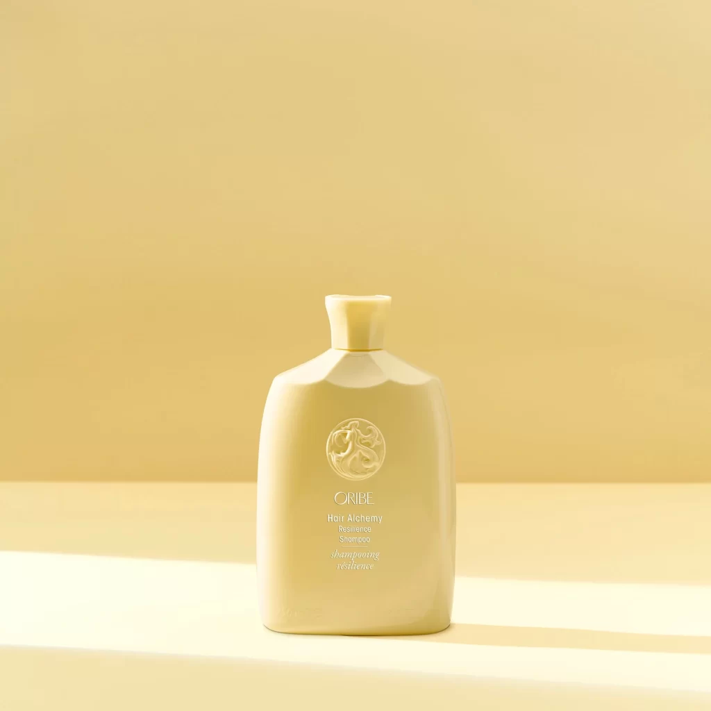
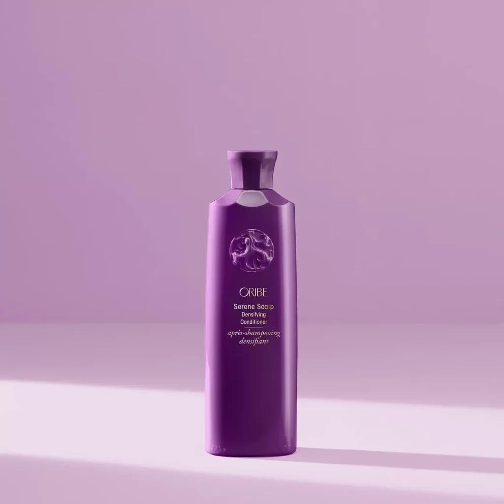
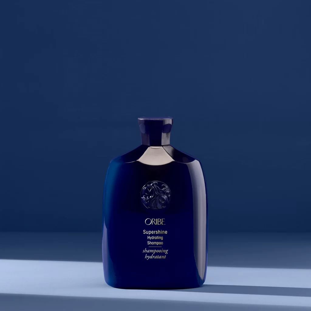
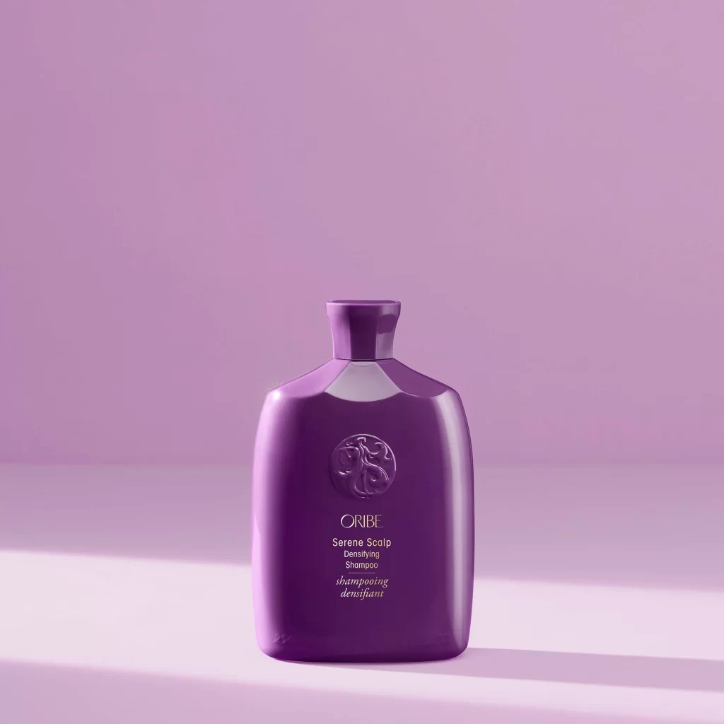
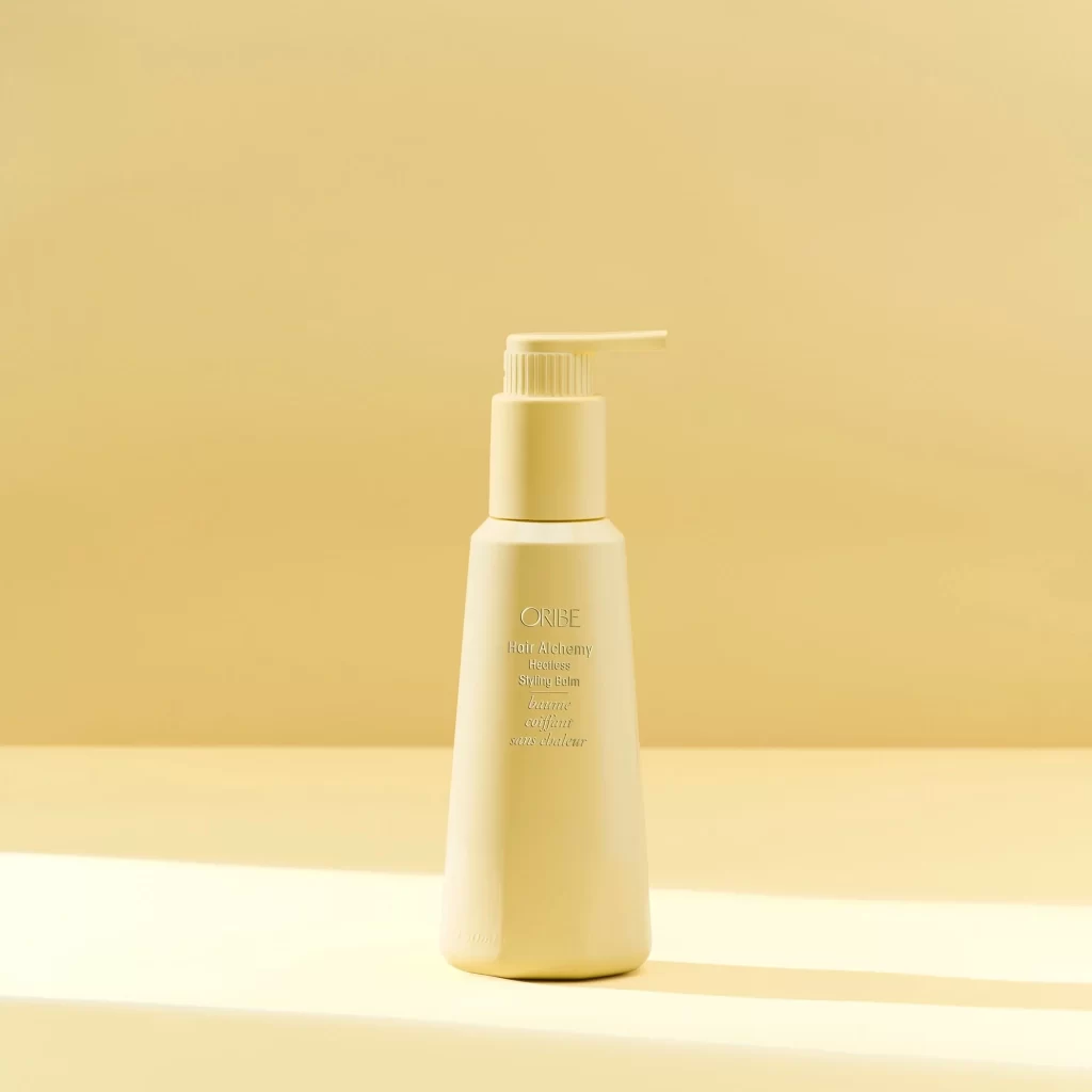
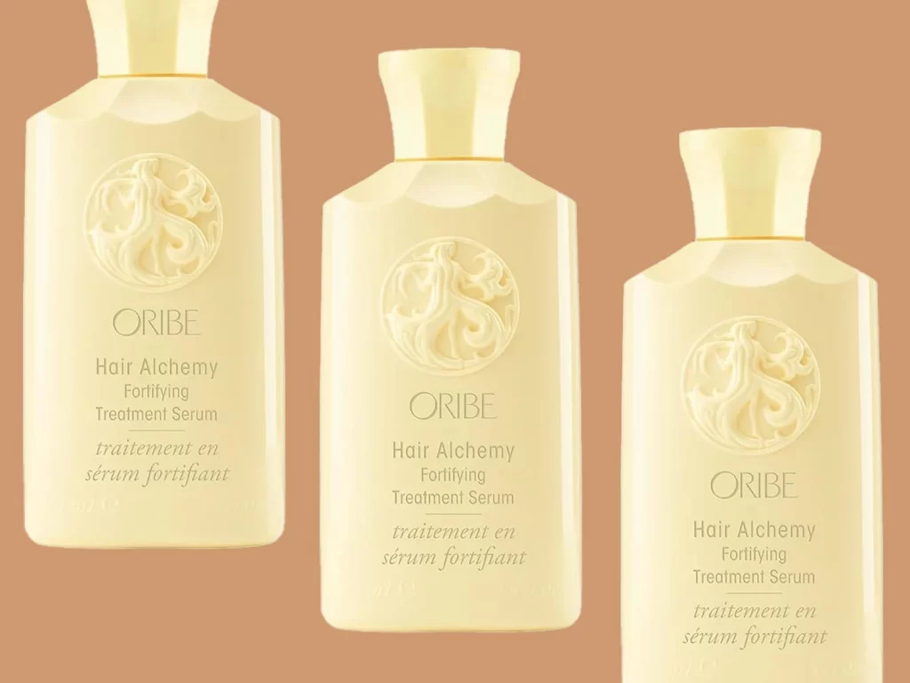
Three cream-colored Oribe bottles stand in a neat row against a warm, solid tan background, each displaying the brand's signature embossed circular emblem. The containers feature a soft matte finish with elegant serif typography that reads 'Hair Alchemy Fortifying Treatment Serum' in English and French below the logo. Soft, even lighting highlights the subtle contours of the flared necks and rectangular bodies while casting minimal shadows beneath each vessel.
What sets this packaging apart is its sophisticated monochromatic palette and tactile surface details, particularly the raised ornamental crest that adds depth without color contrast. The consistent use of ivory tones across all three sizes creates a cohesive visual family while the bilingual labeling suggests luxury positioning. Gentle curves on the shoulder transitions break up the otherwise geometric forms, lending an organic quality to the industrial design.
Product photographers studying cosmetic packaging will find this arrangement useful for understanding how to present multiple SKU sizes in a single frame. Industrial designers analyzing premium beauty branding can examine the interplay between embossed graphics and printed text for their own container concepts. Art directors planning e-commerce layouts might reference the spacing and alignment choices when organizing similar product groupings for digital catalogs.