Ricardo Rum Cocktail Can
Topics
Details
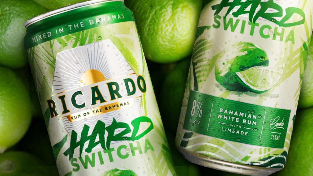
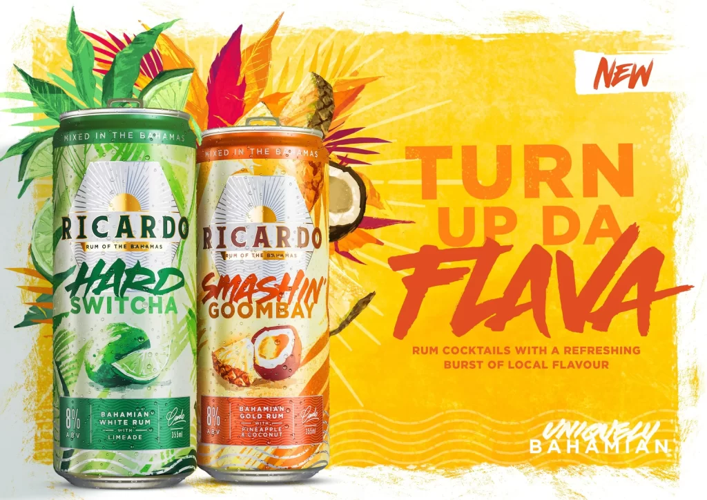
Against a sun-drenched yellow backdrop with radiating lines, two aluminum cans stand side-by-side, flanked by tropical foliage and fruit slices. The left can features a lime-green palette with a lizard illustration and the text 'HARD SWITCHA,' while its companion glows in warm orange with 'SMASHIN GOOMBAY' emblazoned above a coconut-pineapple graphic. Both containers display 'RICARDO' at the top, an 8% ABV badge, and 355ml volume indicators, all captured from a straight-on perspective that emphasizes their cylindrical symmetry.
Visual energy explodes through the bold, brush-stroke typography of 'TURN UP DA FLAVA' rendered in deep red-orange, contrasting sharply against the saturated background. Each flavor variant employs distinct botanical imagery—citrus leaves for the limeade version versus pineapple fronds and coconut halves for the tropical blend—to create immediate sensory recognition. The deliberate use of Bahamanian cultural markers, including dialect-inflected copy and local rum specifications, transforms standard beverage packaging into a vibrant geographic statement.
Brand strategists analyzing regional alcohol markets could examine how color psychology differentiates flavor profiles within a unified product line. Packaging engineers might study the integration of photographic elements with vector graphics to assess shelf-impact efficiency. Marketing teams developing Caribbean-themed campaigns would find valuable precedent in the balance between playful vernacular typography and premium rum positioning cues.