Razels Rum Packaging A
Topics
Details
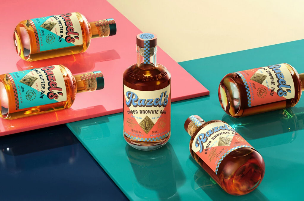
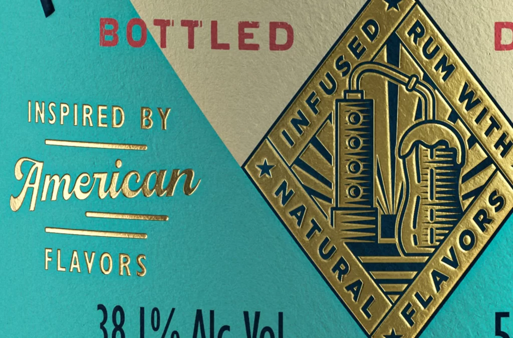
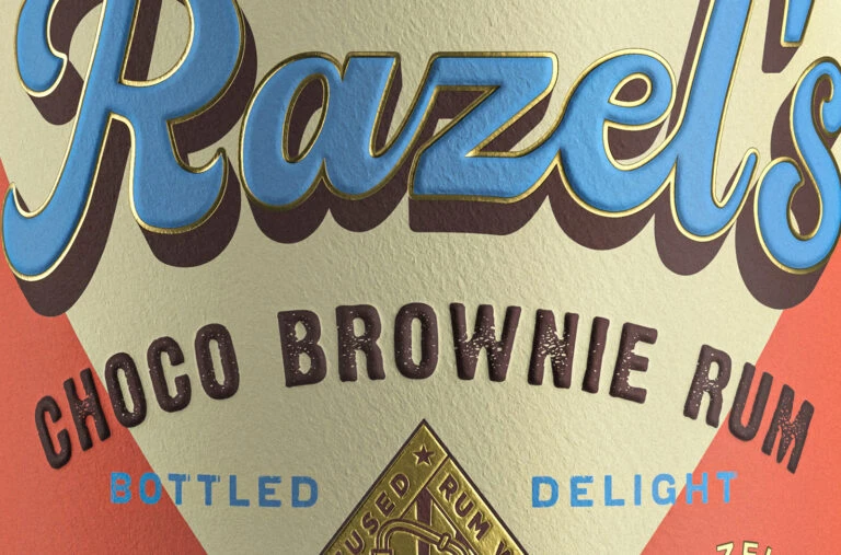
A bold, light blue script spelling 'Razel's' dominates the upper frame, featuring a thick dark brown drop shadow and delicate gold outline. Below it, 'CHOCO BROWNIE RUM' curves upward in a dark, distressed sans-serif font against a textured cream backdrop. The composition anchors at the bottom center with a diamond-shaped gold emblem.
What makes this packaging stand out is its masterful blend of retro typography and tactile textures. The 3D embossed effect on the lettering gives the design a physical depth that feels premium and handcrafted. By pairing the playful, rounded script of the brand name with the rugged, weathered look of the product description, the label achieves a balance between nostalgic charm and modern artisanal appeal.
Brand identity specialists and packaging illustrators will find this a perfect case study for mixing font weights and styles. It serves as an excellent visual guide for anyone looking to understand how to use drop shadows to create hierarchy without cluttering the layout. Furthermore, color theorists can analyze how the specific palette of cream, sky blue, deep brown, and gold creates a warm, inviting atmosphere for a dessert-themed spirit.