Razels Packaging
Topics
Details
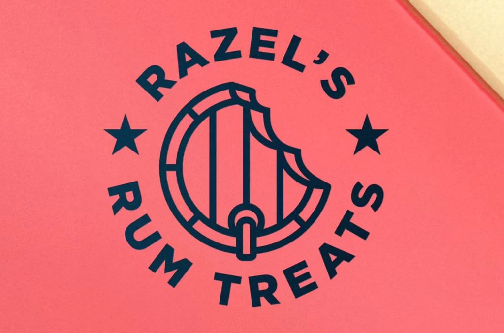
Deep navy ink forms a circular emblem on a matte coral-pink surface, displaying the brand name 'RAZEL'S RUM TREATS' along an outer ring. The central icon features a stylized barrel with vertical staves and metal hoops, partially bitten away to reveal negative space, while two five-pointed stars flank the composition symmetrically. Soft directional lighting from the upper
Visual distinction emerges from the clever fusion of industrial distillery imagery with playful confectionery cues, where the bitten barrel immediately signals edible indulgence rather than liquid spirits. Bold sans-serif typography maintains legibility while the monochromatic navy-on-coral palette creates high contrast without resorting to traditional black. Geometric precision in the circular layout balances the irregular bite mark, establishing a memorable visual rhythm between rigid structure and organic form.
Brand identity specialists developing packaging for artisanal food products might study this mark to understand how beverage-related motifs translate into snack categories. Print production teams could reference the ink absorption and color interaction when specifying spot colors on uncoated paper stocks. Entrepreneurs launching boutique treat lines would find value in analyzing how circular badge formats communicate both tradition and approachability within confined retail spaces.