Razels Rum Packaging B
Topics
Details
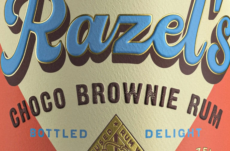
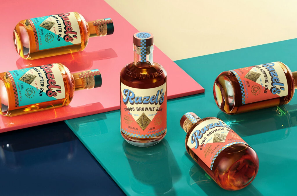
Five glass bottles of Razels Rum occupy a dynamic, multi-level composition across coral, teal, and navy geometric planes. The central vessel stands upright to display a 'Choco Brownie Rum' label in a peach and cream palette, while the surrounding bottles lie at various angles revealing a contrasting turquoise 'Peanut Butter Rum' variant. Cork stoppers with checkered detailing crown each bottle, and golden amber liquid fills the clear glass containers.
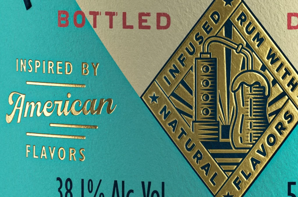
Visual interest is driven by the deliberate clash of retro typography and modern color blocking, where the script logo ‘Razels’ anchors a layout filled with diamond motifs and checkered borders. The dual-flavor presentation allows for a study in color theory, utilizing complementary warm and cool tones to differentiate product lines while maintaining brand cohesion. Furthermore, the tactile quality of the patterned bottle necks adds a physical dimension to the otherwise flat graphic elements of the packaging design.
Brand strategists might utilize this arrangement to analyze how multiple SKUs can be photographed together without visual clutter, while packaging illustrators could study the interplay between vector patterns and photographic textures. Art directors planning a lifestyle shoot will find the use of colored planes a useful technique for grounding products in a controlled environment. Additionally, 3D artists can reference the way light refracts through the liquid and glass to achieve realistic material rendering in their own digital scenes.