Ricardo Alcoholic beverage Can
Topics
Details
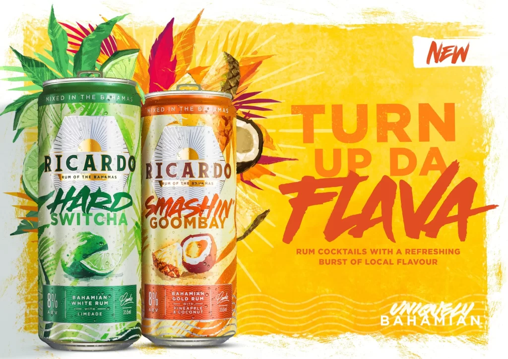
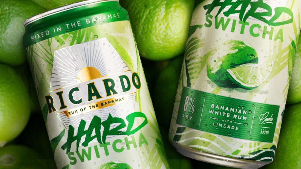
Amidst a bed of fresh, textured green limes, two aluminum beverage cans sit at a slight angle to the viewer. The left can features a prominent white sunburst graphic with a golden center above the word RICARDO in bold serif lettering, while the right can displays a realistic lime illustration with water droplets. Both containers utilize a palette of forest and mint greens against silver aluminum, with visible condensation suggesting they are chilled.
Visual interest is generated through the contrast between the geometric, tropical sun motif on one side and the organic, photographic fruit rendering on the other. The typography varies significantly between the cans, mixing elegant gold-outlined serifs with aggressive, brush-stroke style lettering for the HARD SWITCHA brand name. Layered palm leaf patterns in the background add depth without obscuring the essential product information printed on the labels.
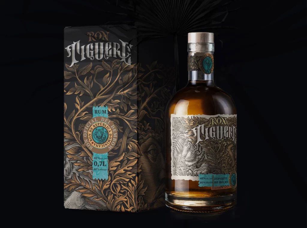
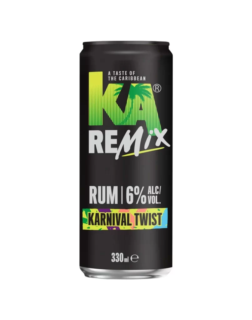
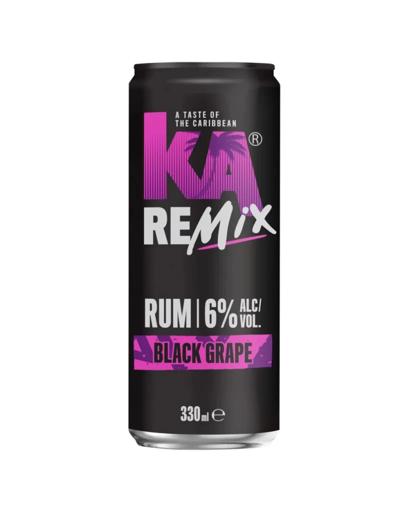
Product photographers studying beverage advertising will find the lighting setup on the metallic surfaces particularly useful for understanding highlight placement. Packaging designers examining tropical alcohol branding can analyze how the color hierarchy guides the eye from the rum origin statement to the flavor profile. Illustrators needing to render condensation on curved metal surfaces have a clear example of how water droplets catch light and create texture on this specific material.