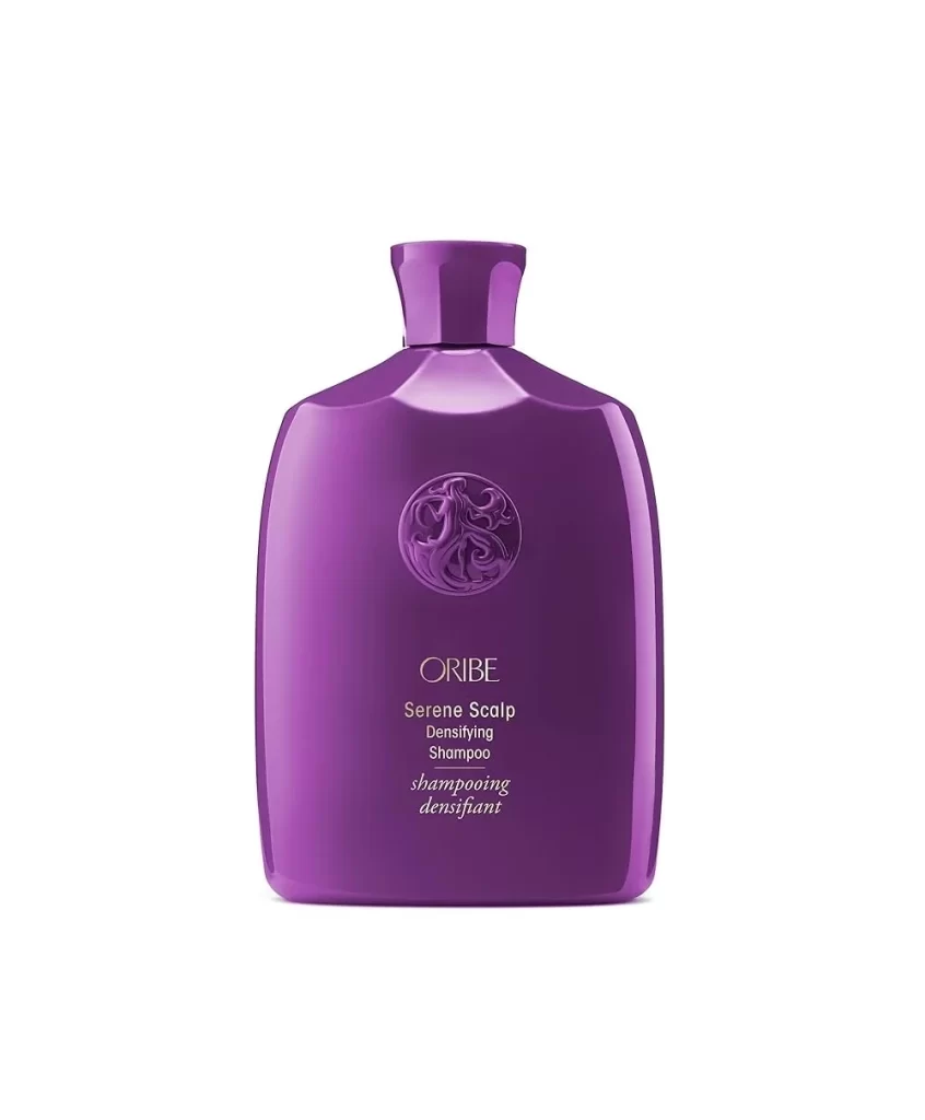
Oribe Shampoo Bottle Angle
Topics
Details
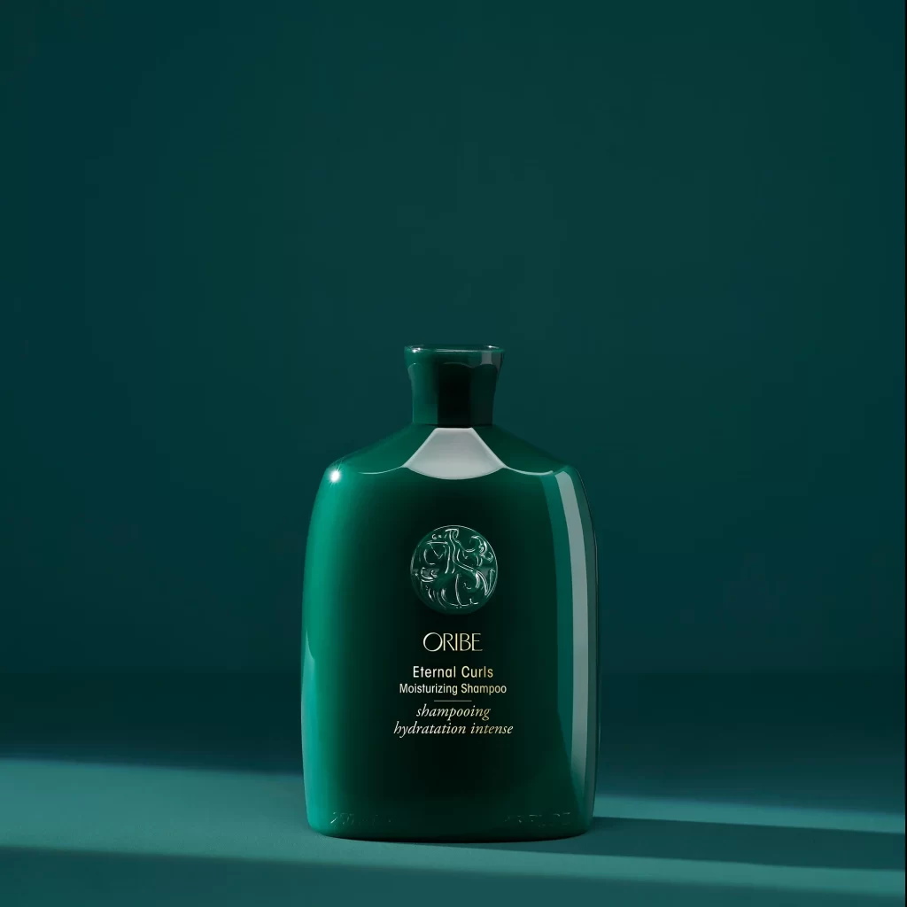
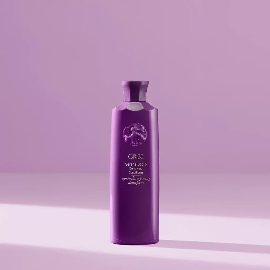
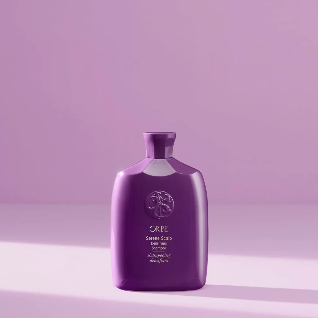
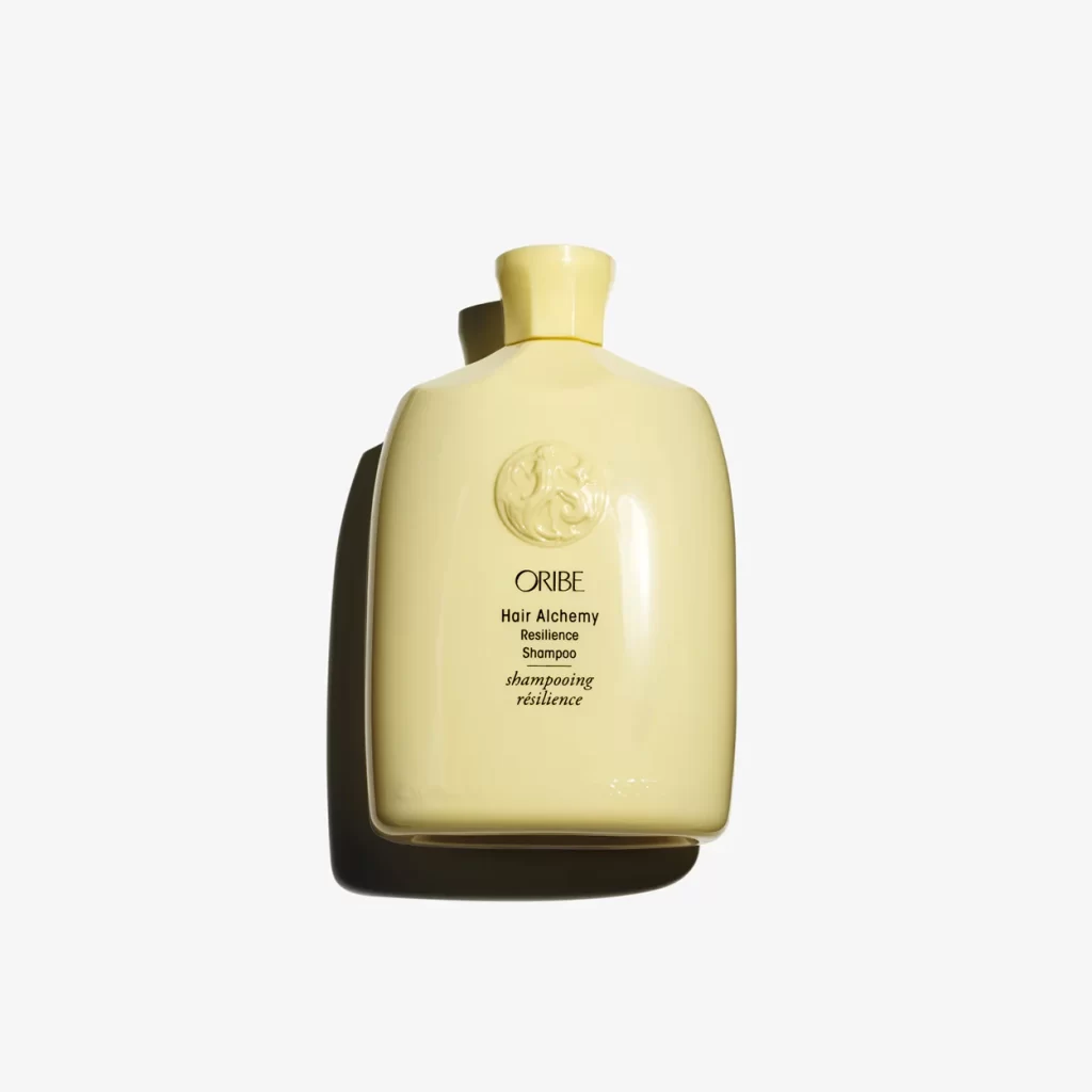
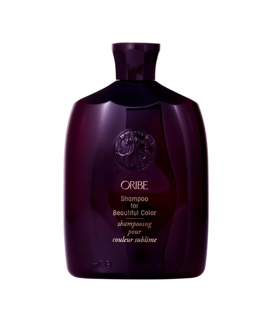
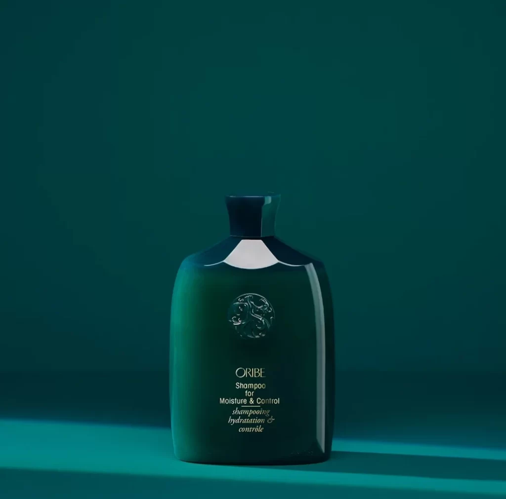
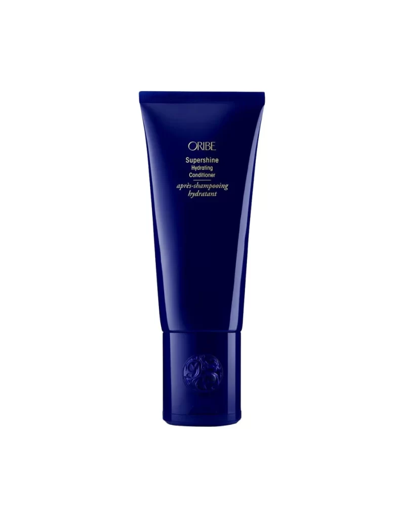
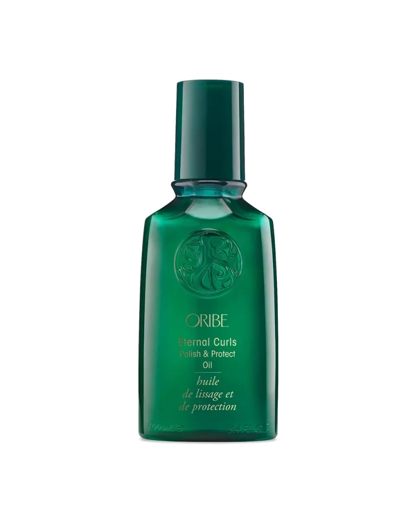
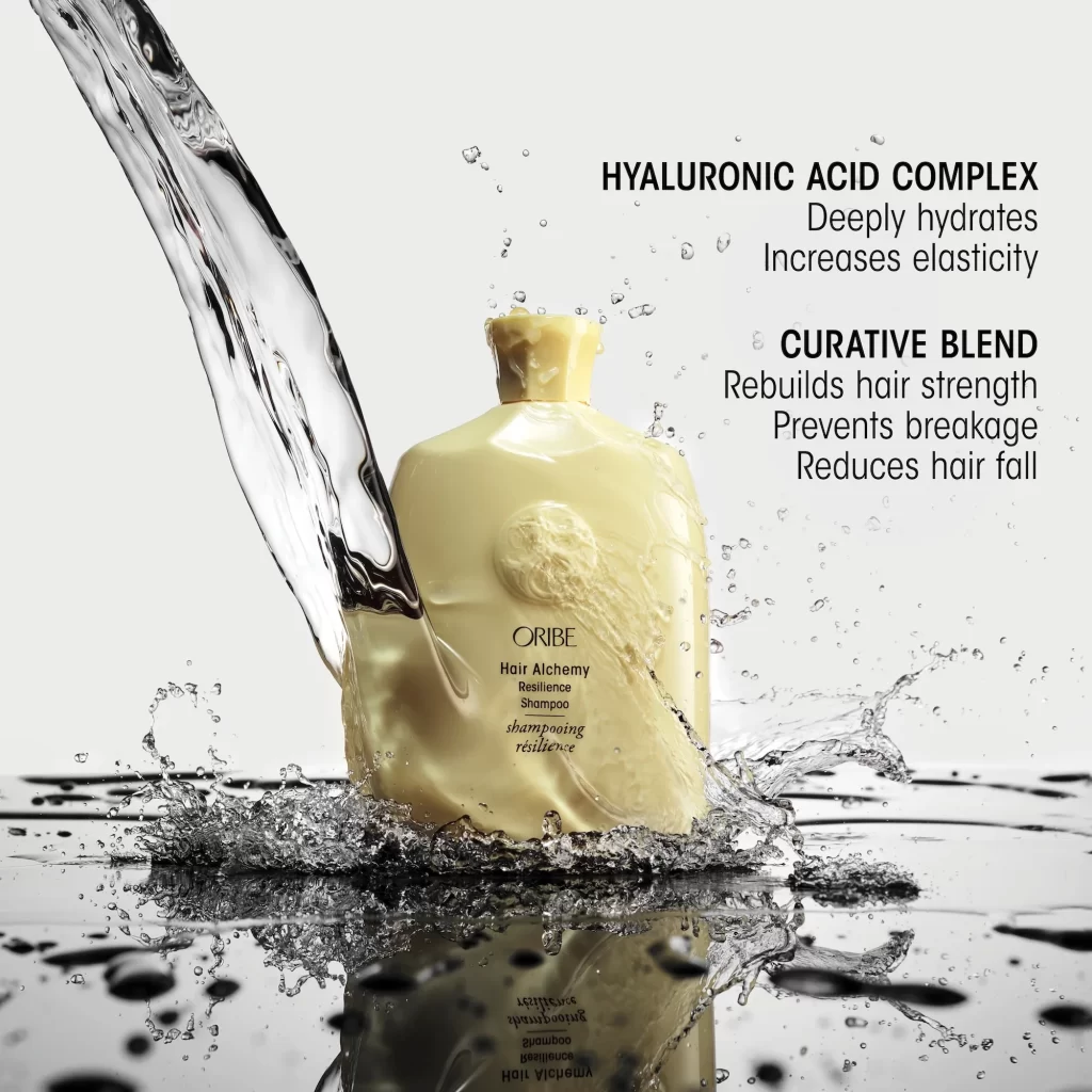
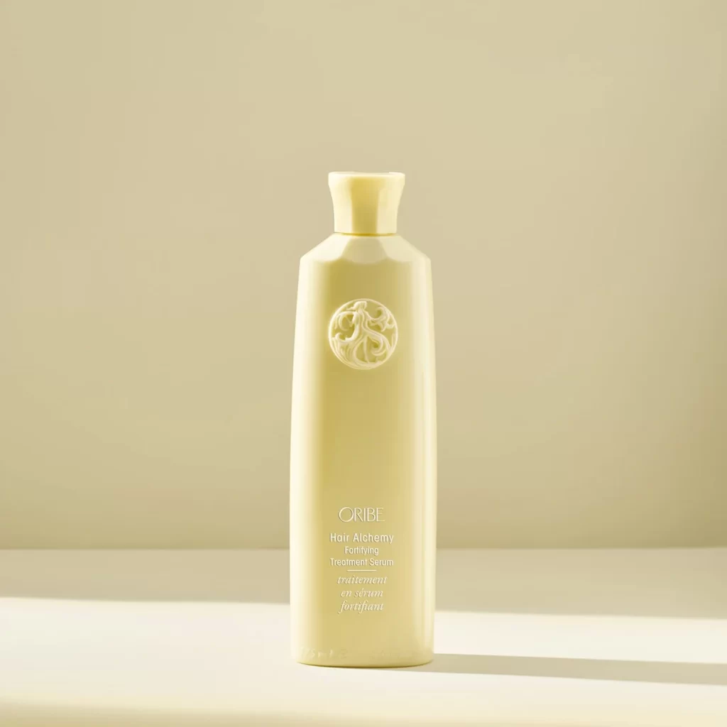
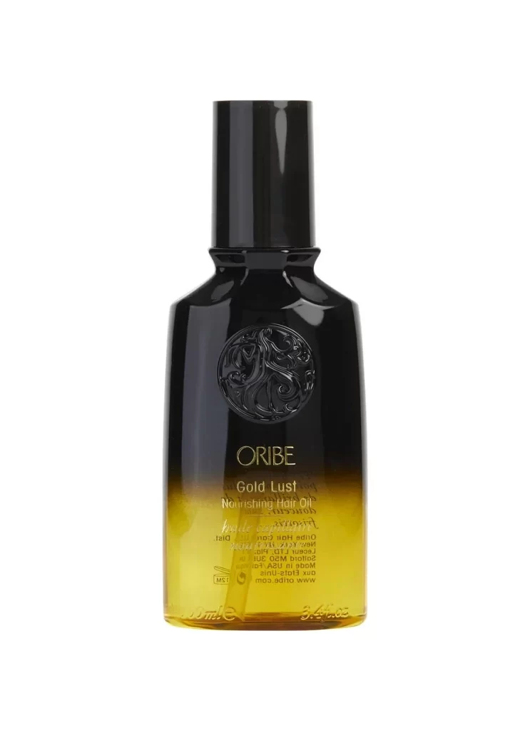
A deep violet plastic bottle stands centered against a seamless white background, its surface catching soft, even light that highlights the subtle sheen of the material. The vessel features a squared shoulder design tapering into a fluted neck and cap, with an embossed circular medallion containing stylized scrollwork positioned prominently on the upper body. Below this relief element, the brand name ORIBE appears in clean capital letters, followed by the product designation Serene Scalp Densifying Shampoo and its French translation shampoing densifiant in smaller italicized type.
Monochromatic purple packaging creates immediate visual cohesion while the embossed logo adds tactile dimensionality that distinguishes premium haircare from standard drugstore variants. The architectural bottle geometry—combining broad shoulders with a refined neck profile—balances substantial presence with elegant proportions, making it instantly recognizable on retail shelves. Typography hierarchy guides the eye from the bold manufacturer name down through functional descriptors, establishing clear information priority without visual clutter.
Product photographers studying luxury cosmetic packaging will find value in analyzing how the lighting accentuates the bottle's contours without creating distracting reflections. Industrial designers examining closure mechanisms can reference the relationship between the neck's faceted structure and the matching cap's grip surface. Marketing teams developing color-coded product lines might study how the saturated hue communicates specific brand attributes like calmness or sophistication across different media applications.