Pantene Pro-V Magic Water Cream
DownloadTopics
Details
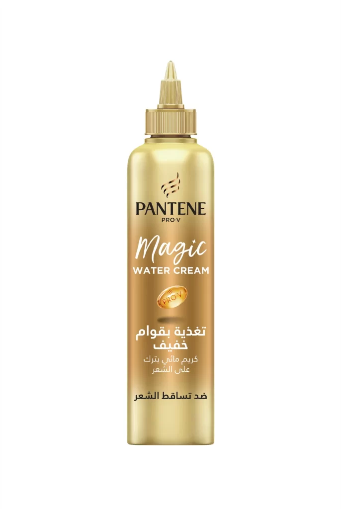
A metallic gold bottle with a cylindrical body and a pointed applicator cap dominates the frame, its surface catching light with a subtle gradient that shifts from bright champagne at the shoulders to deeper amber near the base. The Pantene Pro-V logo sits prominently above 'Magic Water Cream' in a flowing white script, while a golden oval seal bearing the PRO-V insignia anchors the center of the label. Below this, Arabic text detailing product benefits appears in clean white typography against the warm metallic backdrop, all set before a neutral white field that allows the packaging's lustrous finish to command full attention.
The design leverages a monochromatic gold palette to convey premium positioning within the hair-care category, using typographic hierarchy to distinguish between brand identity and product-specific claims. This particular regional variant stands out through its bilingual labeling strategy, where English and Arabic copy coexist without visual clutter, creating a cohesive look that feels both globally consistent and locally relevant. Designers studying cross-market packaging adaptations will find the high-resolution asset particularly useful for analyzing how luxury cues translate across different linguistic contexts.
Brand strategists examining Middle Eastern market presentations can reference this composition when developing localized packaging systems that maintain core identity markers while accommodating right-to-left text flows. 3D artists requiring accurate material references for cosmetic bottle simulations will appreciate the clear rendering of the metallic finish and cap mechanics. Marketing teams preparing e-commerce listings for Arabic-speaking regions might employ this visual as a benchmark for balancing elegance with informational clarity in beauty product photography.