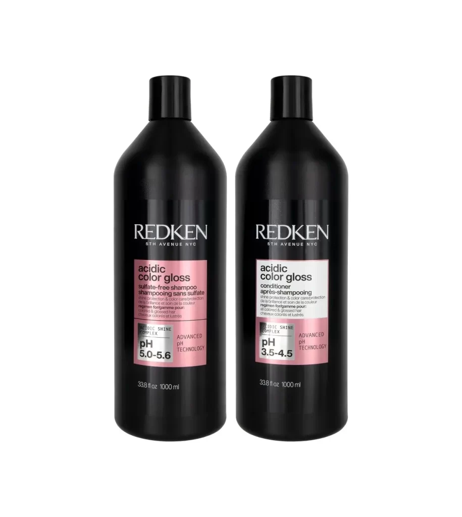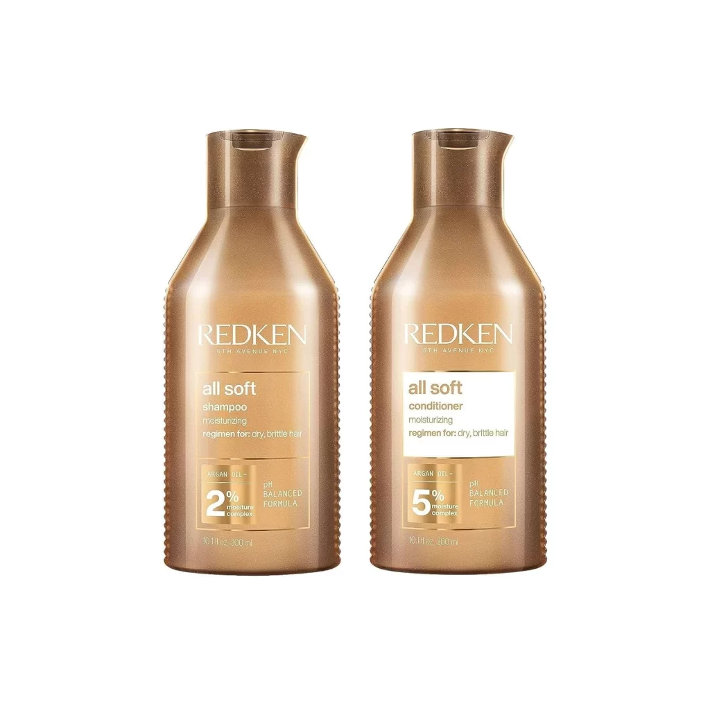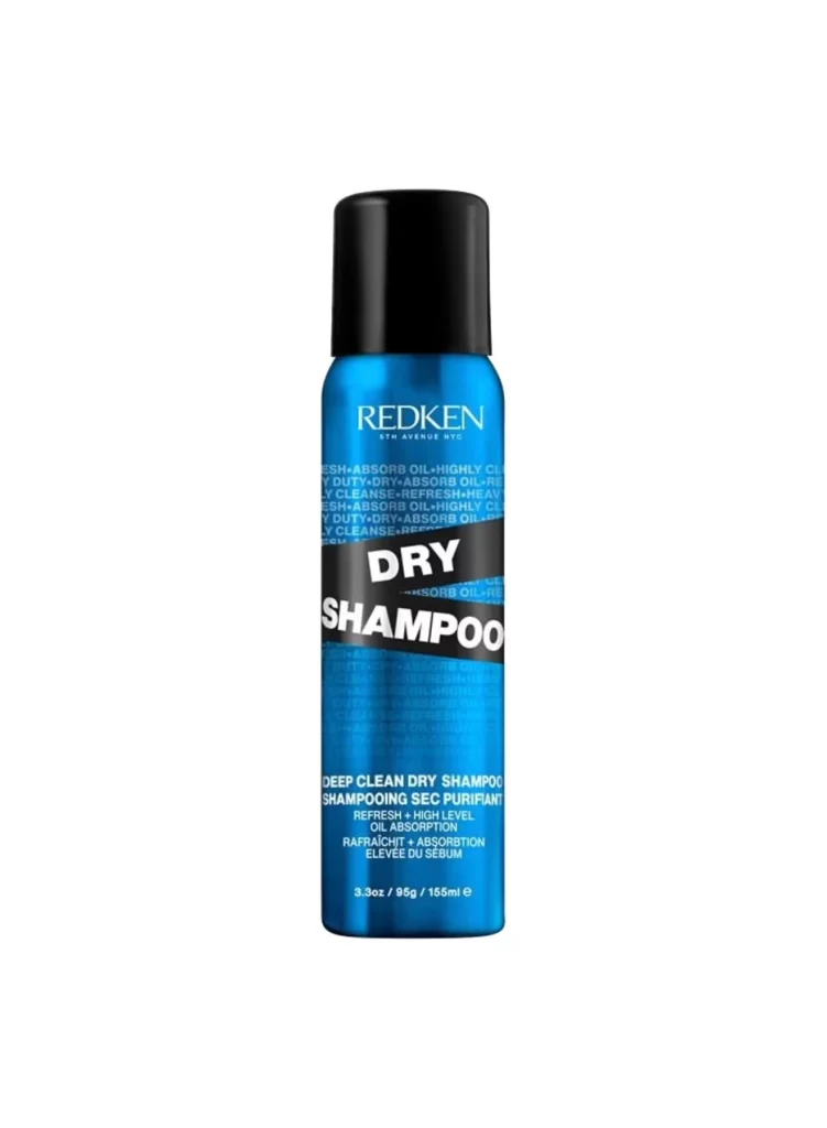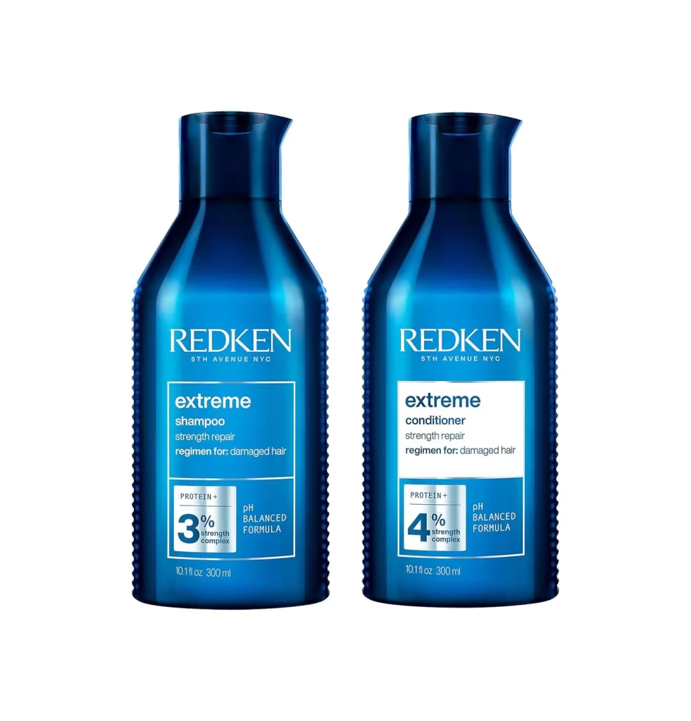
Redken Shampoos & Conditioner Pouch
Topics
Details
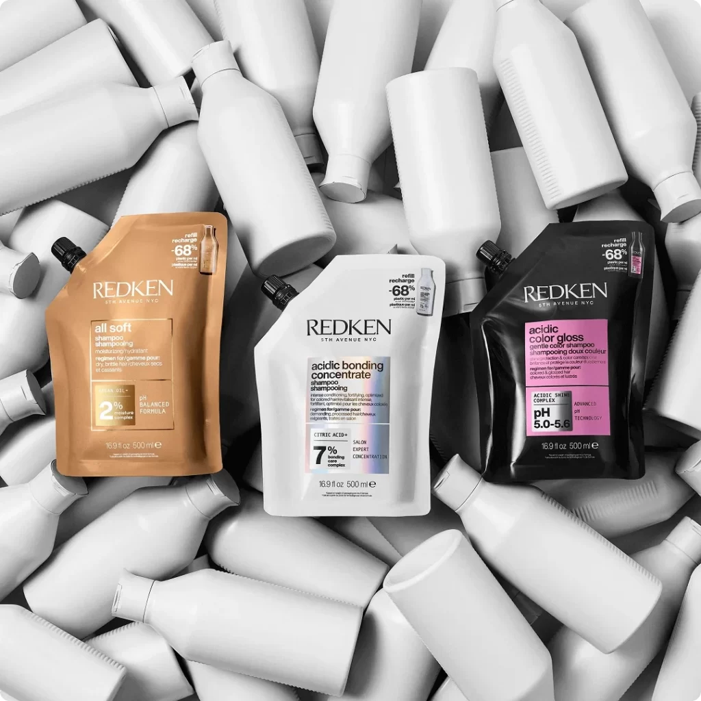
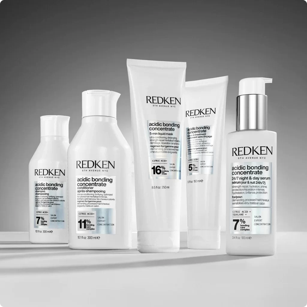
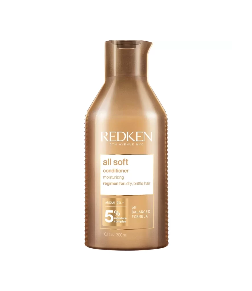
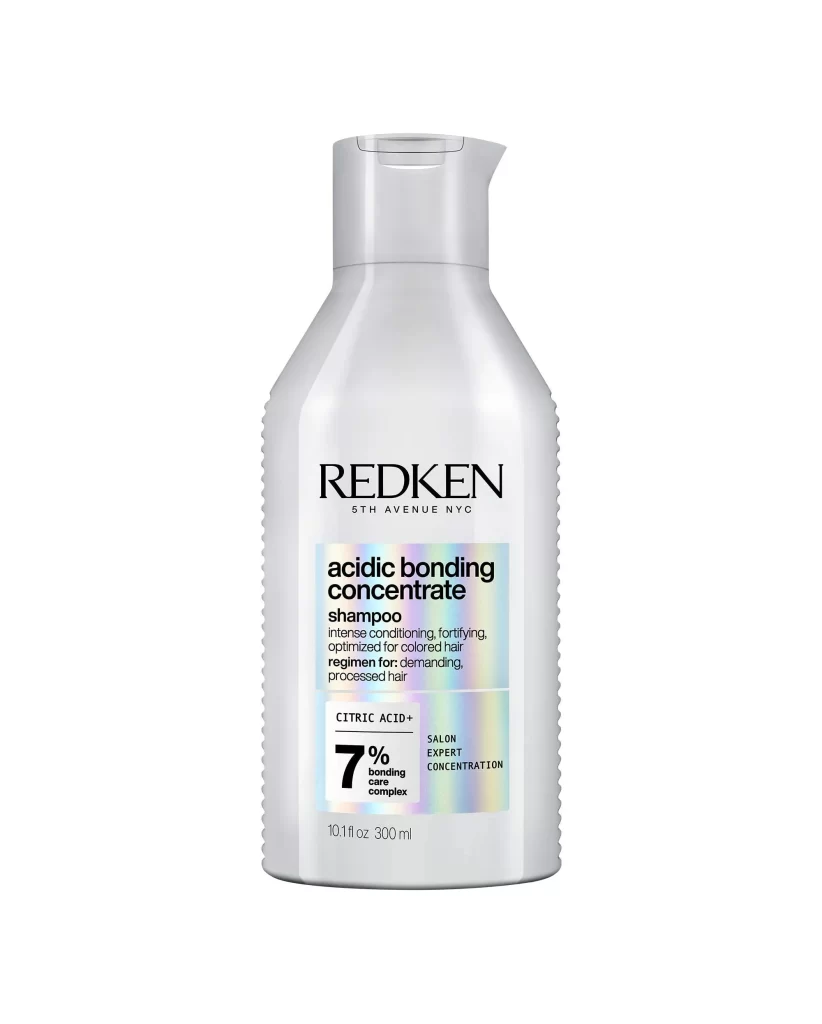
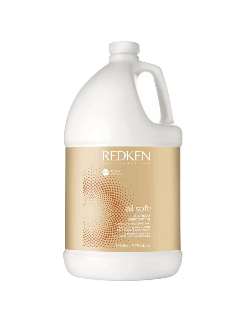
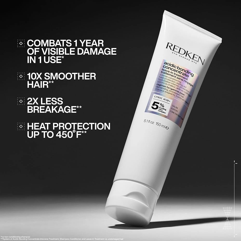
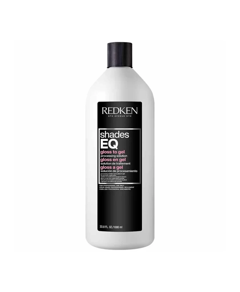
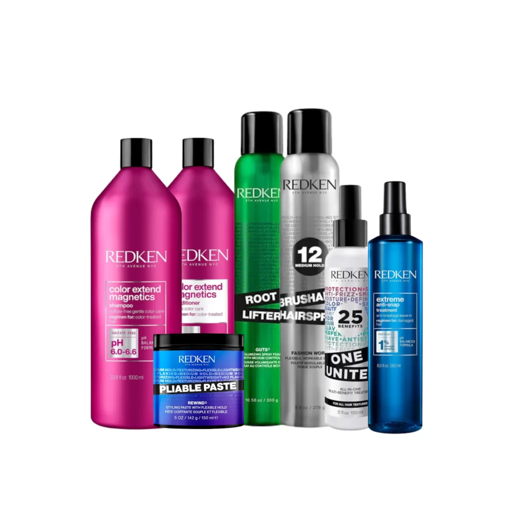
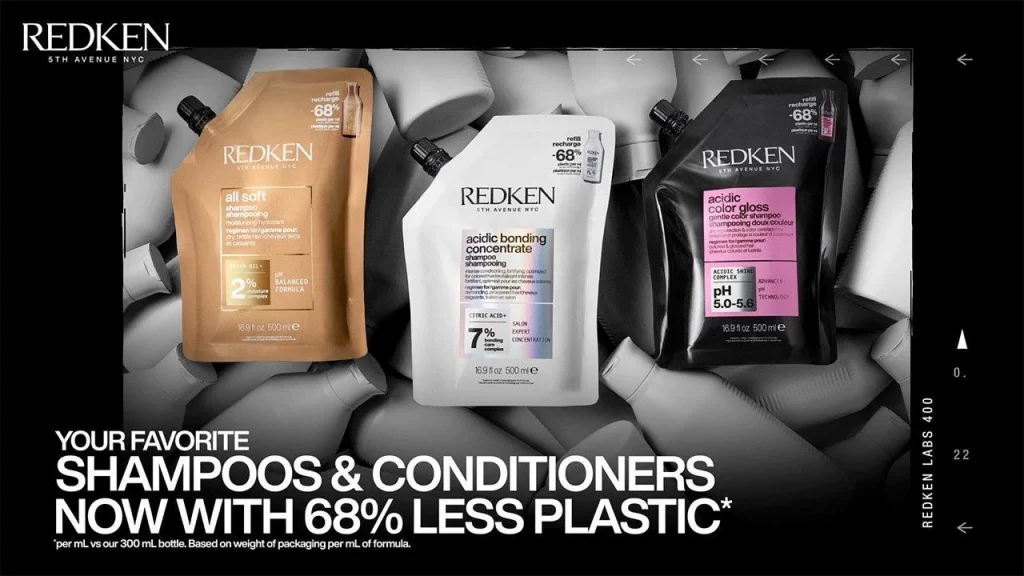
Against a monochromatic field of desaturated, overlapping cylindrical bottles, three flexible pouches command the foreground in a deliberate triangular arrangement. The leftmost vessel presents a warm amber tone with gold typography detailing the 'all soft' line, while the central white pouch features clinical blue accents for the 'acidic bonding concentrate' formula. To the right, a matte black container displays a vibrant magenta label for the 'acidic color gloss' product, each piece exhibiting the characteristic spout-top closure and 500ml volume marking visible on the lower edge.
Visual hierarchy emerges through the stark material contrast between the rigid background elements and the pliable, lightweight packaging that dominates the frame. The typographic system employs varying scales to distinguish product categories—bold sans-serif for brand identity, condensed lettering for technical specifications like the pH 5.0-5.6 range and 7% ureic acid concentration. Subtle gradients across the pouch surfaces suggest a metallic or pearlescent finish that catches light differently than standard plastic bottles, emphasizing the sustainability angle through the prominent '-68%' badge positioned near each cap.
Product photographers studying sustainable beauty packaging will find value in analyzing how the composition balances negative space with dense textual information. Brand strategists examining Redken's visual language can reference the color-coding logic that differentiates hair care functions without relying solely on imagery. Industrial designers working on refillable systems might study the structural form of these stand-up pouches to understand how spout placement affects perceived volume and usability in retail environments.