Redken Shampoo And Conditioner Bottle
Topics
Details
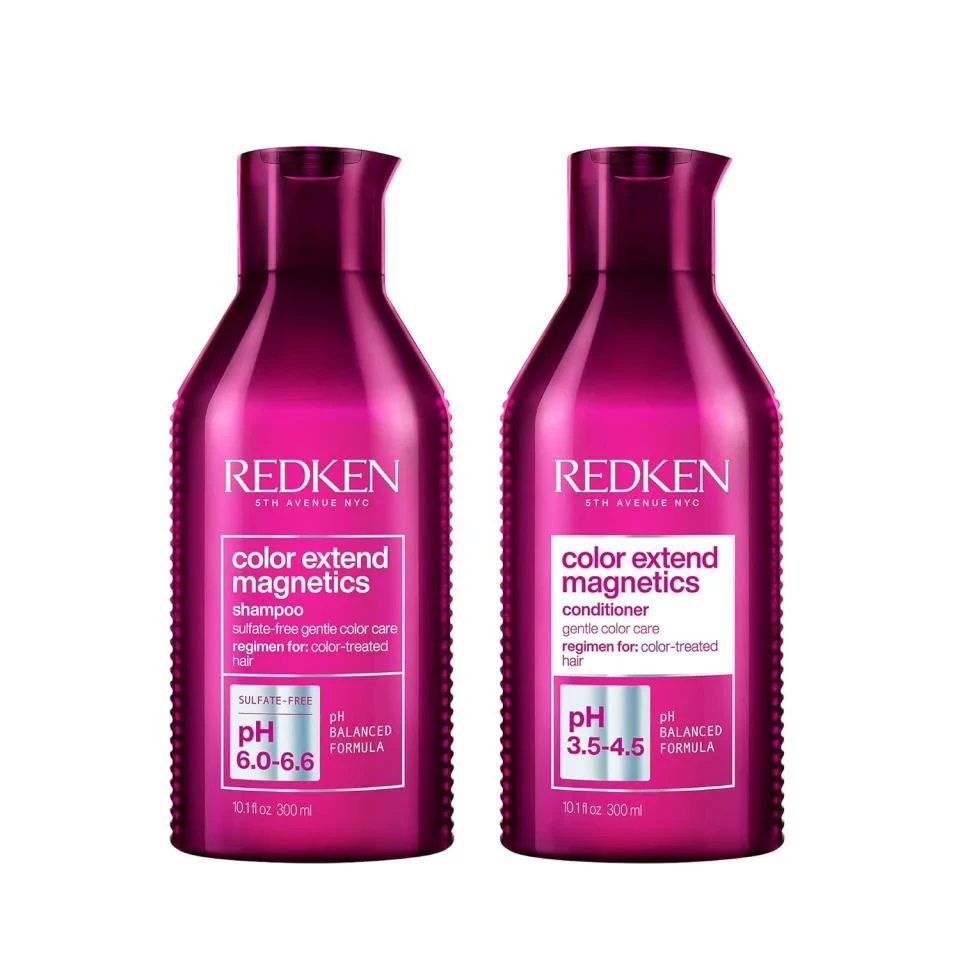
Set against a clean white background, two deep magenta bottles stand side-by-side, showcasing Redken's Color Extend Magnetics line. Each container features a sleek, cylindrical body with a textured grip pattern running vertically along the sides, topped with a dark purple flip-cap dispenser. The left bottle is labeled as a sulfate-free shampoo with a pH of 6.0-6.6, while the right identifies as a conditioner boasting a pH range of 3.5-4.5, both clearly marked for color-treated hair care.
Vibrant packaging like this commands attention through its bold use of saturated violet tones contrasted against crisp white labeling blocks. The strategic placement of technical data—specifically the pH balanced formulas and sulfate-free claims—demonstrates how functional information can be integrated into premium cosmetic branding without cluttering the aesthetic. Subtle details such as the ribbed texture and the specific typographic hierarchy between the brand name and product description create a cohesive visual language that feels both scientific and luxurious.
Product photographers studying commercial hair care presentations will find this arrangement useful for understanding standard e-commerce composition techniques. Industrial designers analyzing consumer goods can examine how ergonomic features like the side grip are visually communicated through lighting and shadow. Marketing teams developing color-coded product lines might reference how varying shades within a single hue family help distinguish shampoo from conditioner while maintaining brand unity across the set.