Redken Hairspray Bottle
Topics
Details
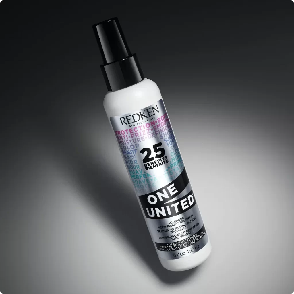
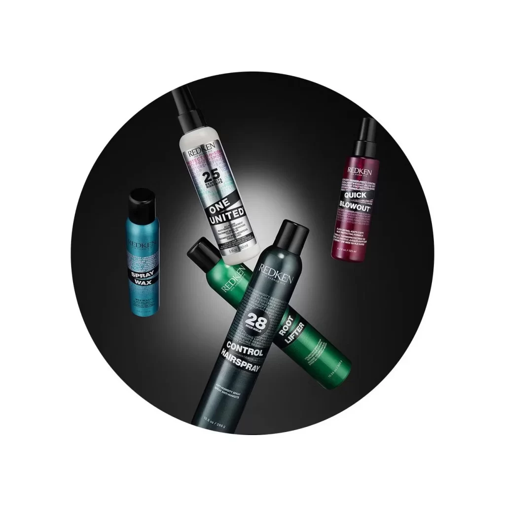
Against a stark black circular backdrop, five Redken haircare products are arranged in a dynamic, overlapping cluster. The collection features a teal cylindrical Spray Wax bottle on the left, a tall white One United bottle with silver accents at the top center, and a deep burgundy Quick Blowout bottle to the right. Crossing through the lower portion are a dark charcoal Control Hairspray can marked with the number 28 and an emerald green Root Lifter can, all featuring bold white typography and black caps that create strong visual contrast.
The visual hierarchy relies heavily on color coding to differentiate product functions within the same brand family. Matte metallic finishes on the larger cans suggest professional-grade durability, while the glossy plastic of smaller bottles indicates portability. Typography varies dramatically between items, from the clean sans-serif on the white bottle to the heavy block lettering on the hairspray, allowing each variant to maintain individual identity while clearly belonging to a unified system.
Product photographers studying commercial beauty layouts will find this arrangement useful for understanding how to stage multiple SKUs without visual clutter. Packaging designers examining haircare branding can reference how color psychology is applied across different product categories. 3D artists creating cosmetic mockups might study the specular highlights on the cylindrical surfaces to accurately render similar materials in their own scenes.