Redken Hair Spray Bottle
Topics
Details
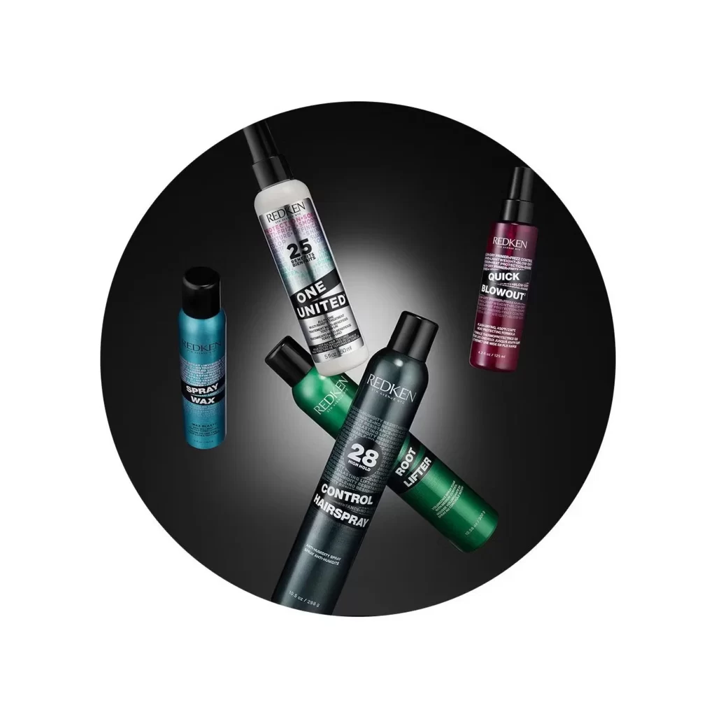
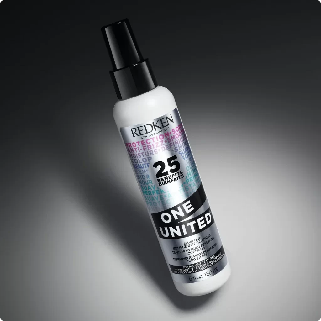
Angled diagonally across a dark, gradient background that transitions from charcoal to light gray, the Redken One United bottle presents as a study in controlled studio lighting. The white cylindrical container features a black spray nozzle and cap, while the label displays a complex typographic system with 'REDKEN 5TH AVENUE NYC' in black serif at the top. Dominating the silver metallic center is the number '25' flanked by 'BENEFITS' and 'BIENFAITS', surrounded by overlapping text in magenta and cyan announcing 'PROTECTION', 'ANTI-FRIZZ', and 'MOISTURE'. A bold black band wraps the lower portion containing 'ONE UNITED' in stark white sans-serif, with multilingual product descriptions in smaller type beneath.
Visual hierarchy operates through deliberate contrast between the reflective silver substrate and matte black graphic elements, creating a technical, almost industrial aesthetic uncommon in hair care packaging. The layered transparency of background typography—where words like 'SMOOTH', 'SHINE', and 'COLOR' appear in varying opacities—suggests depth without cluttering the primary message. This particular iteration balances pharmaceutical precision with cosmetic appeal through its restrained palette of white, black, and metallic silver, punctuated only by strategic magenta accents that draw the eye to functional claims.
Product photographers might analyze this composition for its mastery of specular highlights on curved surfaces, particularly how the light rakes across the bottle's shoulder to define volume. Packaging designers could reference the typographic density and bilingual labeling strategy when developing multinational beauty brands requiring compact information architecture. 3D artists studying material properties would find value in observing how the metallic ink interacts with diffuse lighting versus the absorbent quality of the matte black band.