Pantene Conditioner Keratin Vitamin E Pro-Vitamin B5
DownloadTopics
Details
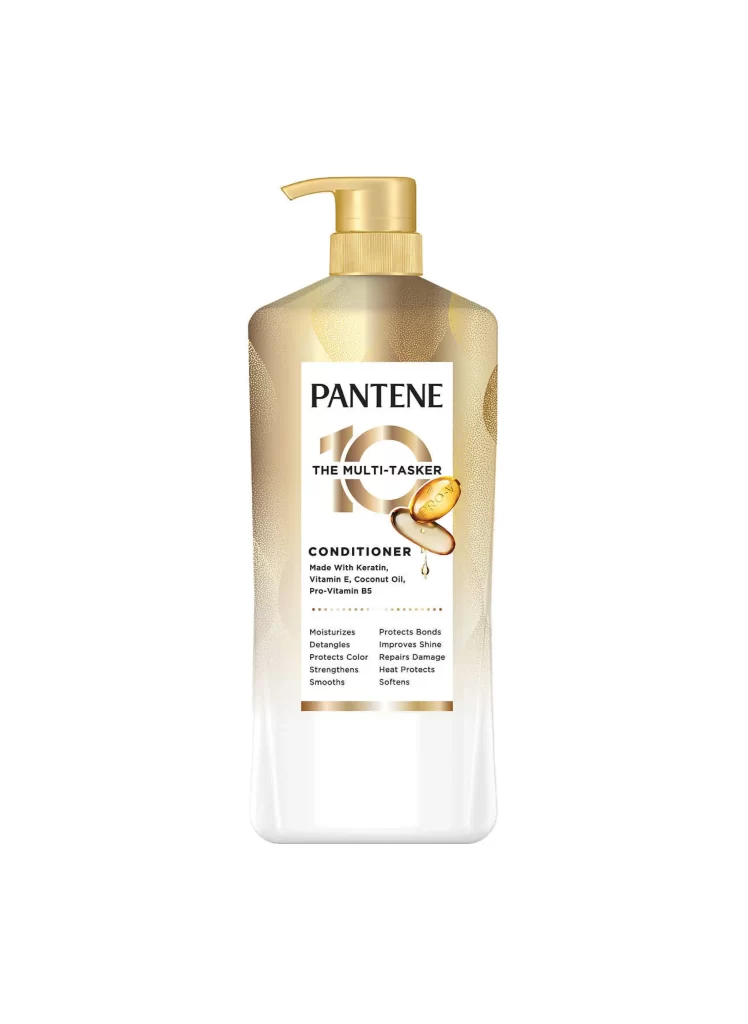
A translucent plastic bottle with a metallic gold pump dispenser stands as the central subject, its body fading from a shimmering champagne gradient at the shoulders to clear material at the base. The white label features bold black typography for the brand name PANTENE, a large stylized numeral 10, and the subtitle THE MULTI-TASKER, accompanied by two golden capsule graphics suggesting vitamin supplements. Below the product type designation, ingredient lists including Keratin, Vitamin E, Coconut Oil, and Pro-Vitamin B5 appear alongside a grid of ten benefit claims ranging from moisturizing to heat protection.
Visual distinction emerges from the sophisticated interplay between the bottle's pearlescent finish and the label's structured typographic hierarchy, where the oversized 10 creates an immediate focal point that anchors the multi-benefit marketing concept. The golden pump mechanism complements the warm tonal palette of the packaging, establishing a cohesive premium aesthetic that bridges pharmaceutical trust with cosmetic luxury. Designers seeking to study contemporary hair care branding can access the full-resolution asset for detailed texture analysis of both the matte label surface and the glossy bottle contours.
Packaging engineers and industrial designers might utilize this reference to analyze pump mechanism integration with large-format containers, while brand strategists could examine how numerical claims are visually prioritized within crowded information architectures. E-commerce photographers may study the lighting setup required to capture reflective gradients without losing legibility of fine print, and color theorists will find value in documenting how metallic accents influence perceived product efficacy across different retail environments.