Moisture Spray Leave-In Hair Care
DownloadTopics
Details
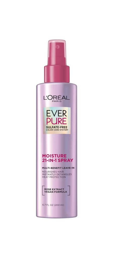
A cylindrical bottle of L'Oréal Paris Ever Pure Moisture 21-in-1 Spray stands upright, its metallic lavender body catching light with a subtle pearlescent sheen. The pink spray nozzle and translucent cap create a color-blocked crown above the label, where the brand name sits in refined black typography. Below, the product name appears in bold magenta lettering, followed by smaller text detailing its nourishing and heat-protective benefits, while the 6.7 fluid ounce volume rests quietly at the base.
The visual hierarchy relies on a sophisticated interplay between the cool-toned metallic container and the warm pink accents, creating immediate shelf appeal through contrast. Iridescent elements within the central logo add depth without overwhelming the clean layout, demonstrating how pharmaceutical-grade packaging can feel luxurious. Designers studying this composition will appreciate how the vertical alignment guides the eye from brand identity downward to functional claims.
Product photographers might analyze this shot to understand how soft, even lighting eliminates harsh reflections on curved surfaces while maintaining material texture. Marketing teams could reference the typographic scaling when developing their own beauty-care packaging, noting how font weight varies to establish information priority. The full-resolution asset is accessible at no cost for those needing to inspect finer details like the vegan formula badge placement or the exact hue of the rose extract callout.