Redken Gloss Bottle
Topics
Details
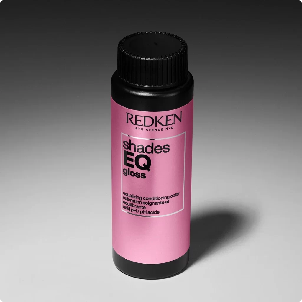
Set against a smooth gradient background that transitions from deep charcoal to pale gray, a cylindrical Redken bottle stands as the central focus. The container features a vibrant metallic pink label sandwiched between matte black plastic caps at the top and bottom, with the upper cap displaying fine vertical ribbing for grip. Bold black typography dominates the front, showcasing the brand name 'REDKEN' above '5TH AVENUE NYC', followed by the product line 'shades EQ gloss' enclosed within a thin white rectangular border and smaller descriptive text detailing its equalizing conditioning properties below.
Visual interest stems from the striking contrast between the soft, reflective pink surface and the stark, utilitarian black elements that frame it. The typographic hierarchy creates a clean, modern aesthetic where the oversized 'EQ' immediately draws the eye, while the subtle sheen of the metallic finish adds depth without overwhelming the minimalist layout. Such a composition effectively balances professional branding with an approachable, fashion-forward color palette that feels both clinical and stylish.
Product photographers might study this setup to understand how controlled studio lighting can enhance material textures like the ribbed plastic versus the smooth metallic paper. Packaging designers could analyze the spatial relationships between text blocks to inform their own label layouts for beauty or cosmetic containers. Anyone working on e-commerce listings would benefit from noting how the neutral backdrop ensures the product remains the undisputed hero of the shot.