Redken Acidic Bonding Concentrate Bottle
Topics
Details
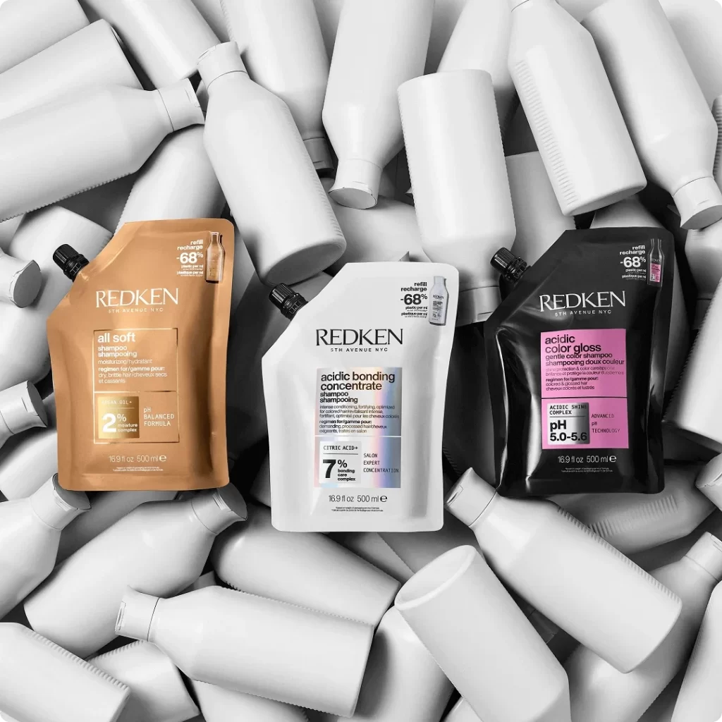
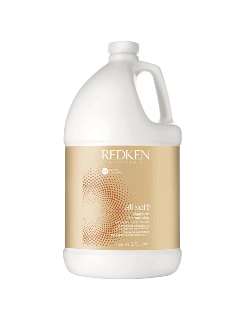
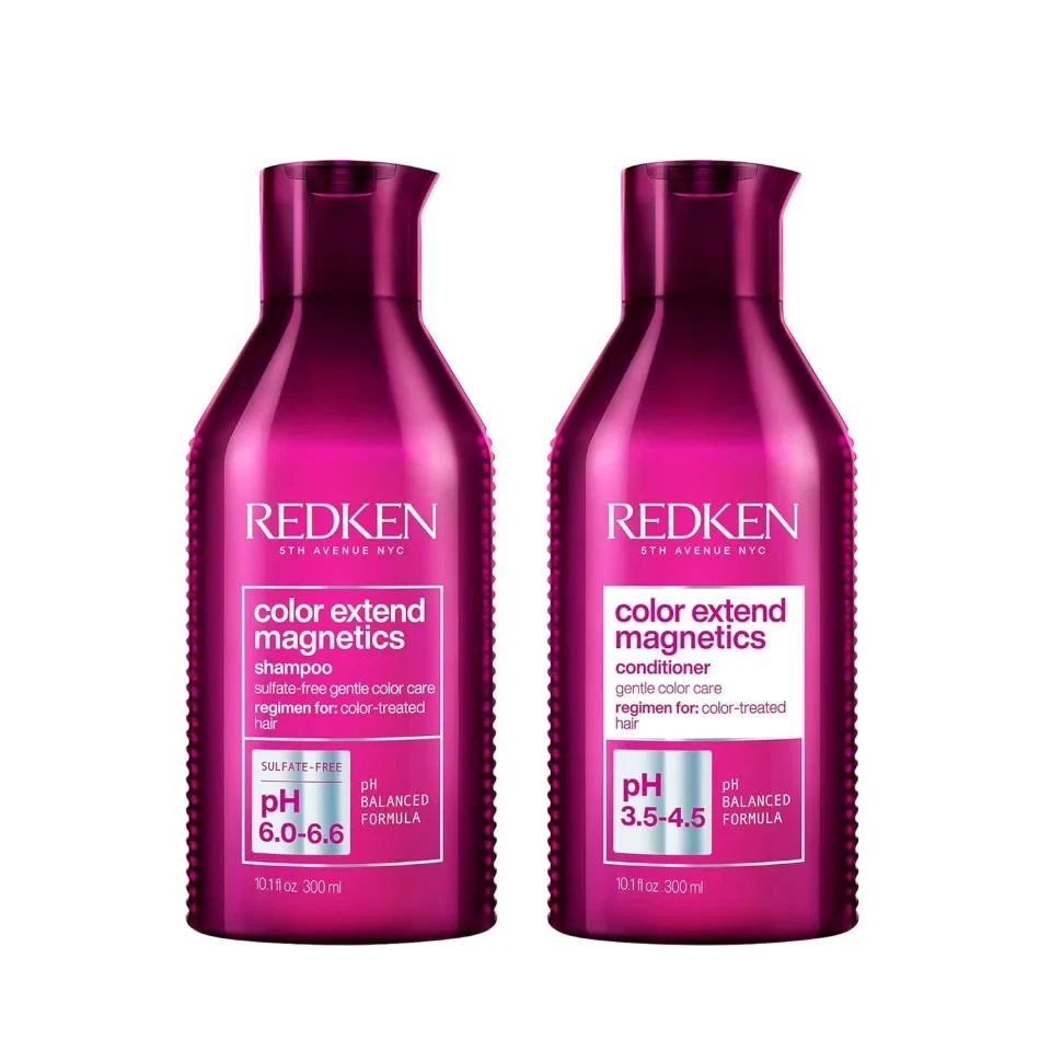
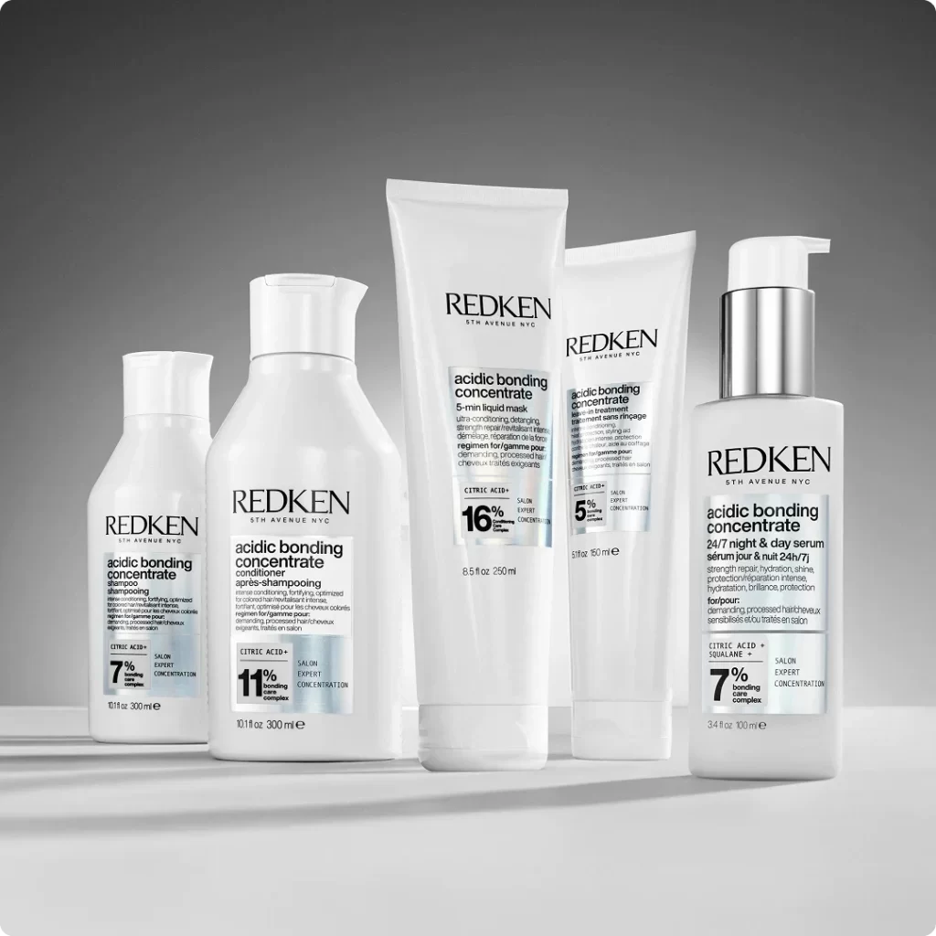
Arranged in a graduated line against a seamless gray gradient, five white Redken containers display a rigorous monochromatic aesthetic. The collection includes two bottles with flip-top caps, two tall tubes with flat crimped bases, and a cylindrical pump dispenser, all rendered in opaque matte plastic with crisp black sans-serif typography. Soft studio lighting from the left casts subtle shadows to the right, emphasizing the cylindrical volumes and the metallic silver pump mechanism while keeping the background deliberately neutral.
Visual hierarchy is established through the strategic use of bold percentage numerals—7%, 11%, 16%, and 5%—which dominate the label design and immediately communicate product potency. The consistent placement of the 'REDKEN 5TH AVENUE NYC' wordmark at the top of each vessel creates brand cohesion, while the varying heights and cap styles provide necessary functional differentiation within the uniform color palette. This minimalist approach relies entirely on typographic weight and spatial arrangement rather than decorative graphics to convey information.
Industrial designers examining sustainable packaging solutions would benefit from studying the material finishes and structural engineering of these forms. Marketing teams developing luxury haircare lines could analyze how the restricted color scheme and data-driven labeling create a clinical yet premium perception. Furthermore, 3D artists requiring accurate cosmetic prop models for commercial renders will find the specific proportions and pump mechanics particularly useful for digital asset creation.