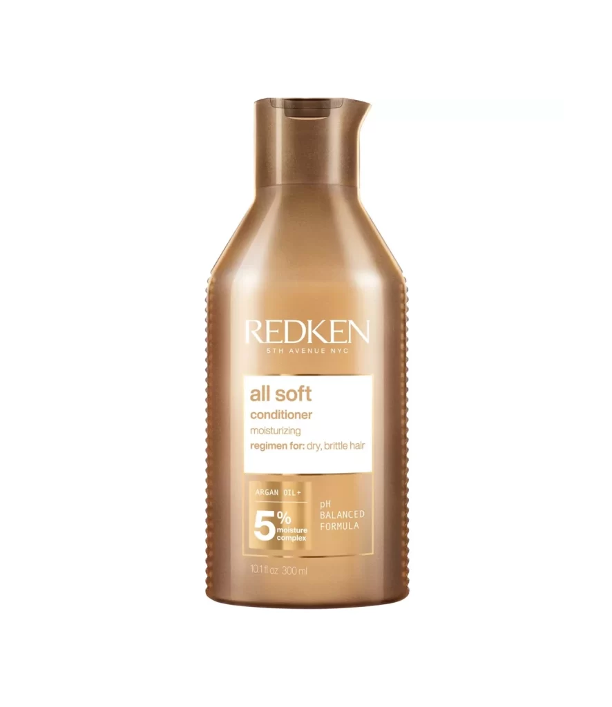
Redken Conditioner Bottle
Topics
Details
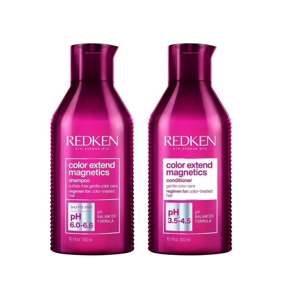
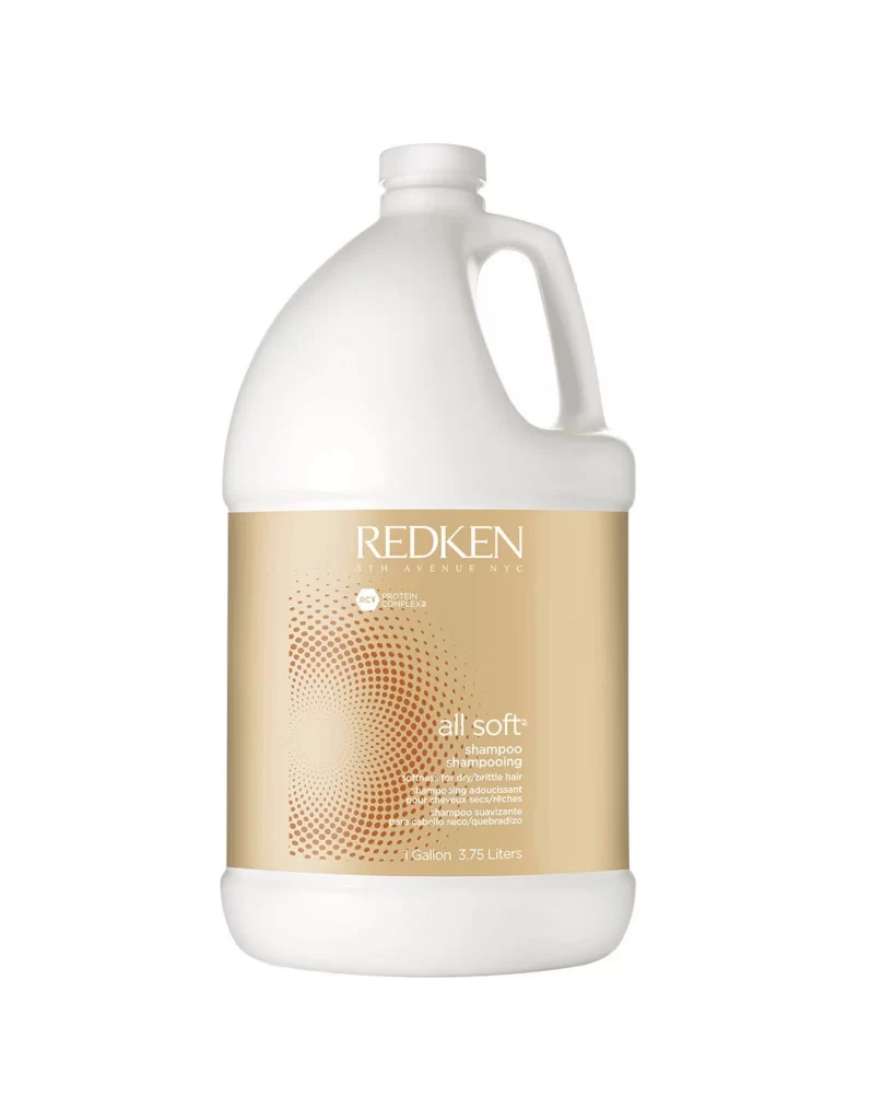
Centered within a void of pure white, a translucent amber vessel commands attention with its warm, honeyed glow. The bottle features an ergonomic silhouette defined by subtle vertical ribbing along the sides and a gracefully curved pour spout capped in dark brown. Prominently displayed across the upper chest is the REDKEN brand name in crisp white serif lettering, positioned above a stark rectangular label detailing 'all soft conditioner' and its specialized regimen for dry, brittle hair. Near the base, technical specifications highlight the inclusion of Argan Oil and a 5% moisture complex alongside pH balanced formulation notes, while the 10.1 fl oz volume measurement anchors the composition at the very bottom edge.
Visual hierarchy plays a crucial role here, as the contrast between the metallic gold typography and the deep bronze packaging creates immediate legibility without sacrificing aesthetic warmth. The interplay of light passing through the semi-transparent material reveals the liquid's rich color while emphasizing the tactile quality of those side ridges intended for secure grip. Such careful attention to typographic weight and spatial organization transforms a standard haircare container into a study of luxury branding, where every element from the angled neck to the scientific claims works in concert to convey professional efficacy.
Product photographers might analyze this shot to understand how studio lighting enhances translucent materials and creates depth through shadow play on textured surfaces. Packaging designers could examine the label layout to see how information density is managed without cluttering the visual field. Marketing teams reviewing this reference would note how color psychology—specifically the use of amber tones—communicates nourishment and hydration to consumers seeking solutions for damaged hair textures.