Redken Shampoo And Conditioner Bottle Design
Topics
Details
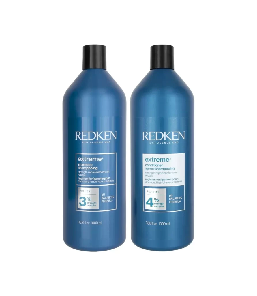
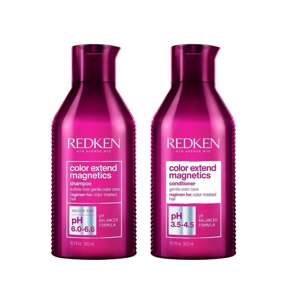
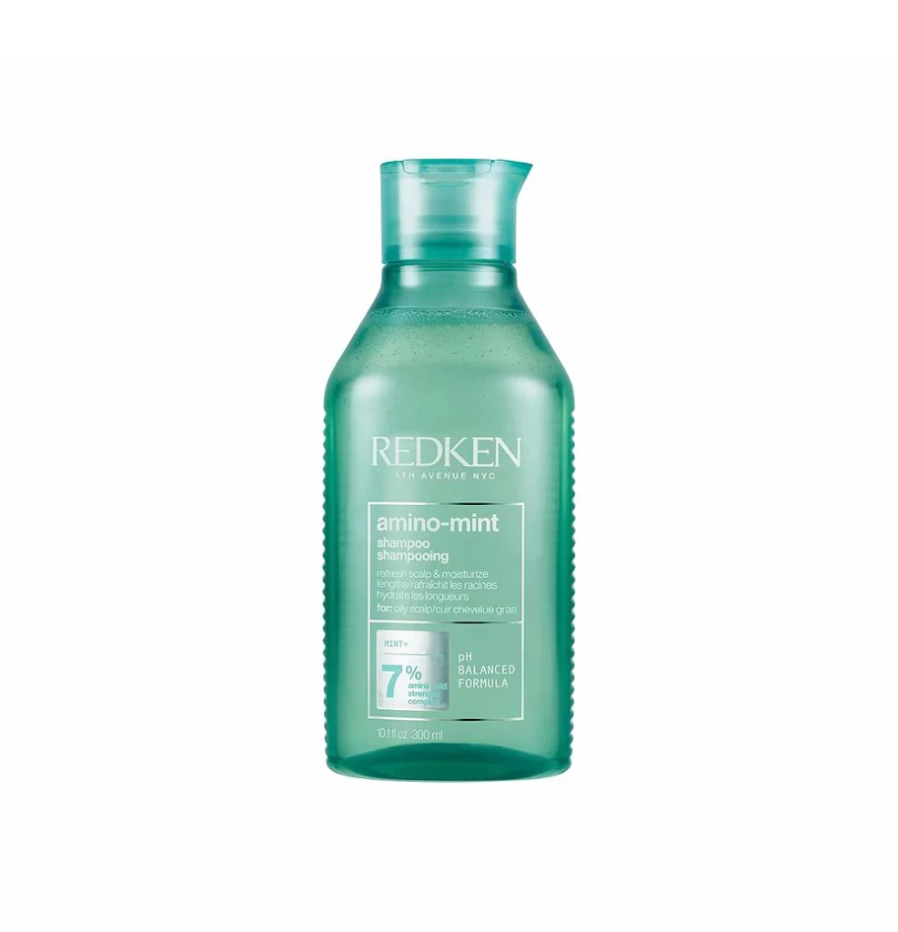
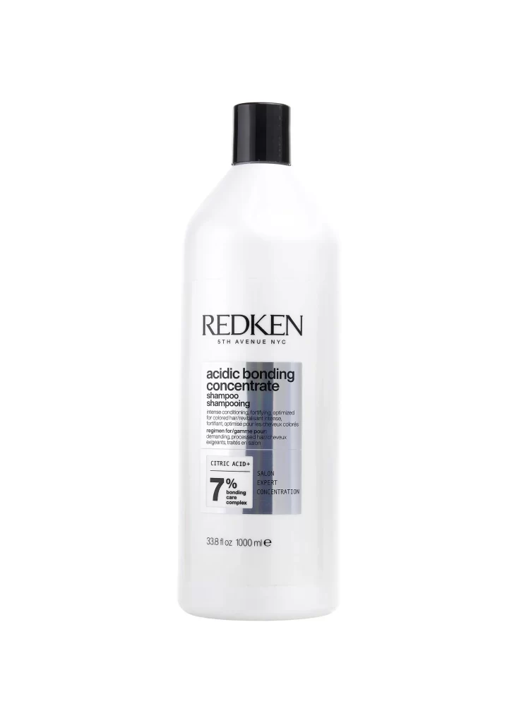
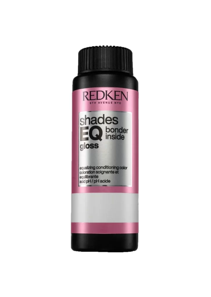
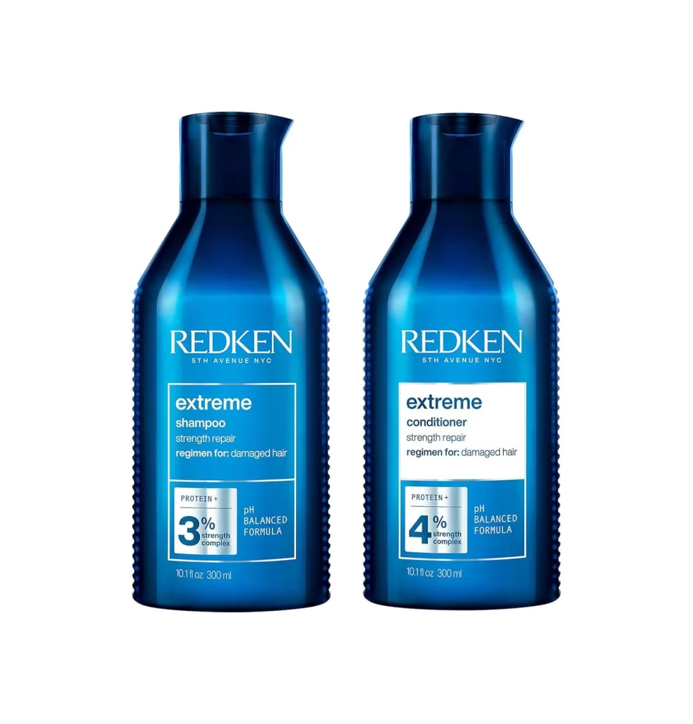
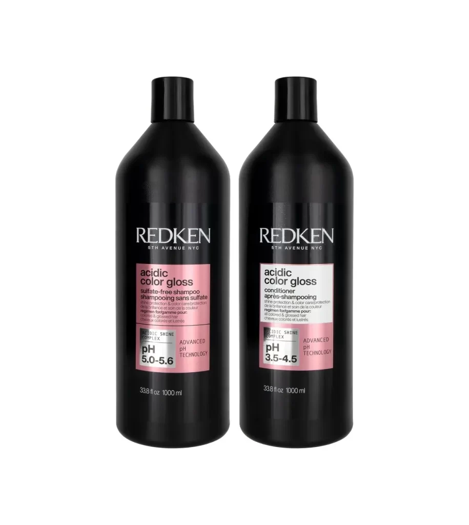
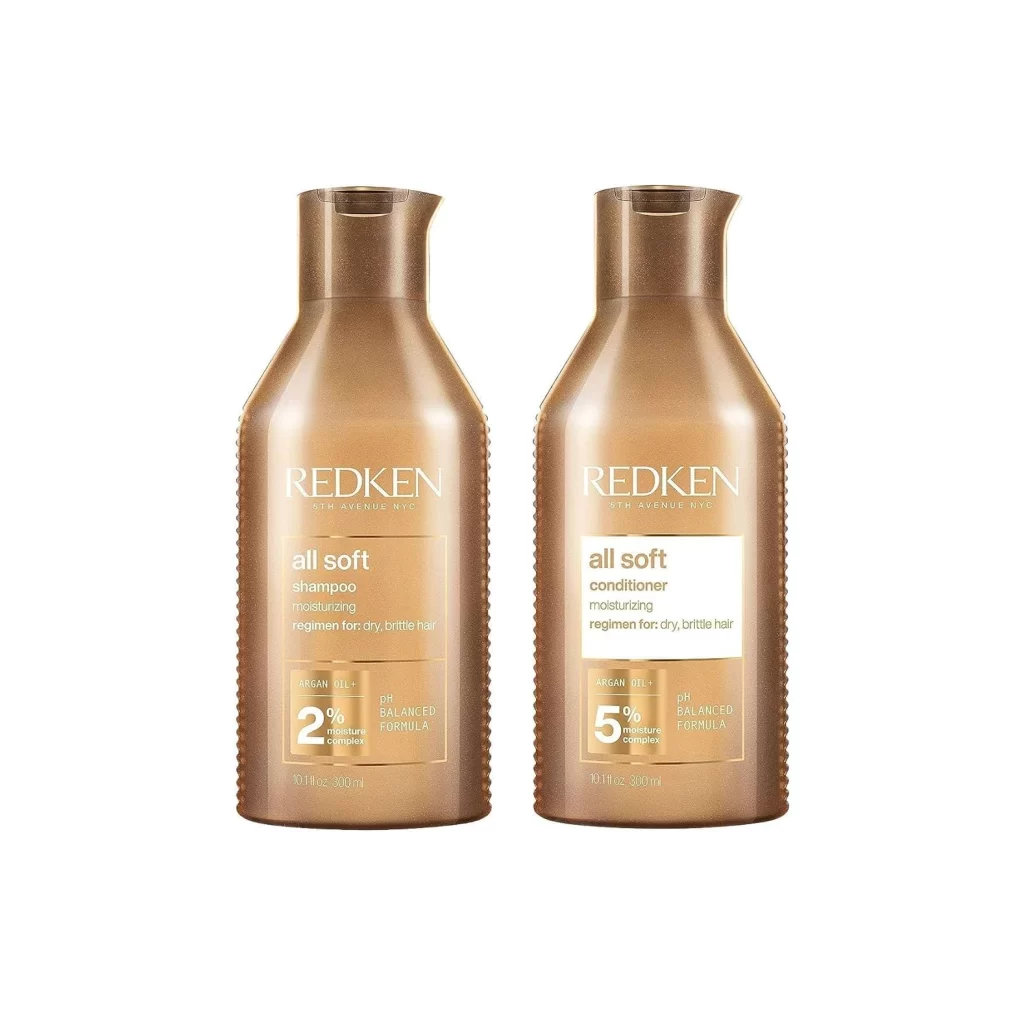
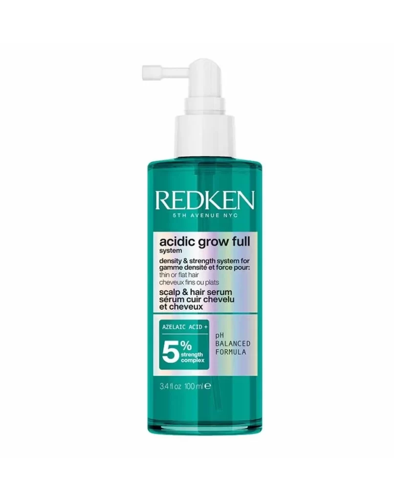
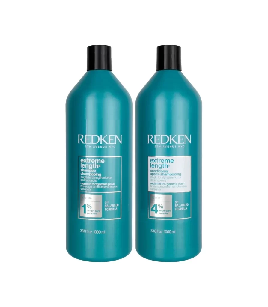
Two identical teal-blue cylindrical bottles with black screw caps stand side by side, each displaying the Redken brand name in white serif lettering above rectangular white labels. The left bottle is labeled as shampoo containing 1% length care complex, while the right bottle indicates conditioner with 4% length care complex, both featuring pH balanced formula text and 1000ml volume measurements printed near the base.
Visual hierarchy plays a crucial role in this packaging design, utilizing a restrained palette of deep turquoise and crisp white to convey professional salon quality. The typographic arrangement creates clear differentiation between the two products while maintaining brand cohesion, with the percentage callouts serving as immediate visual anchors for consumers comparing formulations. Subtle gradients across the bottle surfaces suggest premium plastic materials that balance durability with aesthetic appeal.
Packaging designers analyzing hair care branding will find this composition useful for studying how minimalist color schemes communicate product efficacy without clutter. Marketing teams developing retail displays can reference the spatial relationship between paired items to optimize shelf presence and consumer recognition. Industrial design students examining mass-produced cosmetic containers might utilize this example to understand how labeling proportions affect readability on curved surfaces.