Redken Shampoo And Conditioner Bottle View
Topics
Details
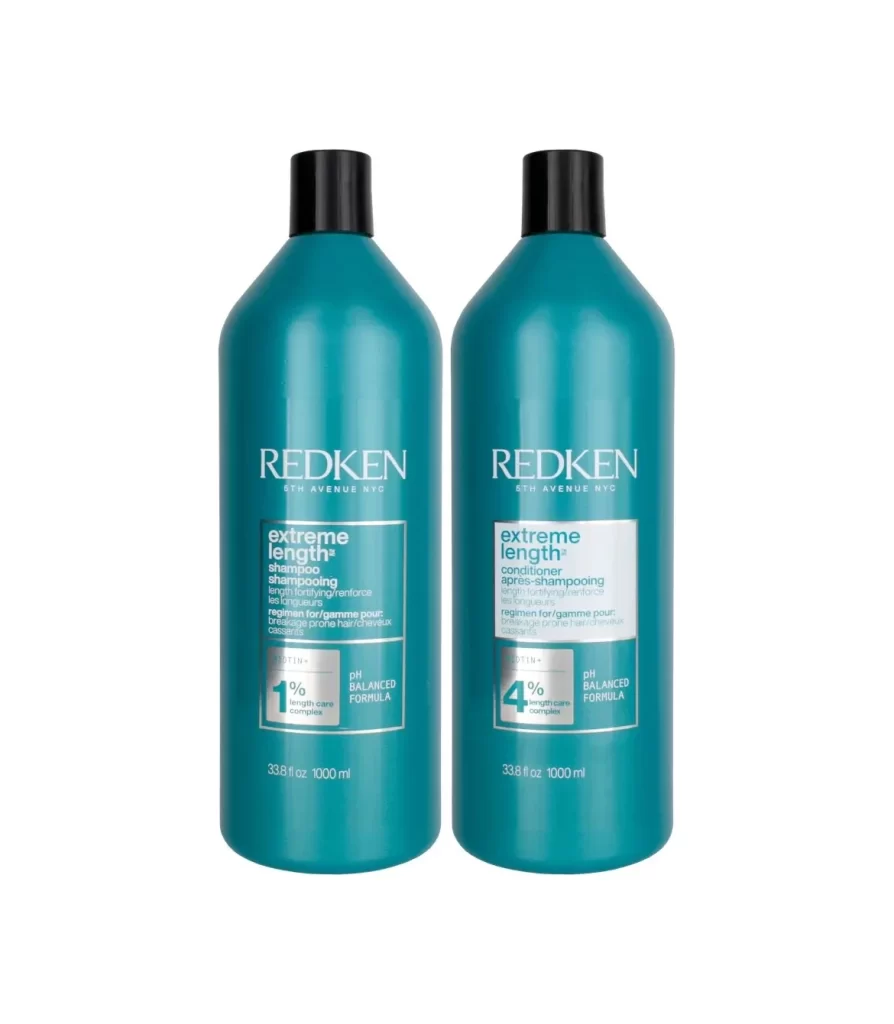
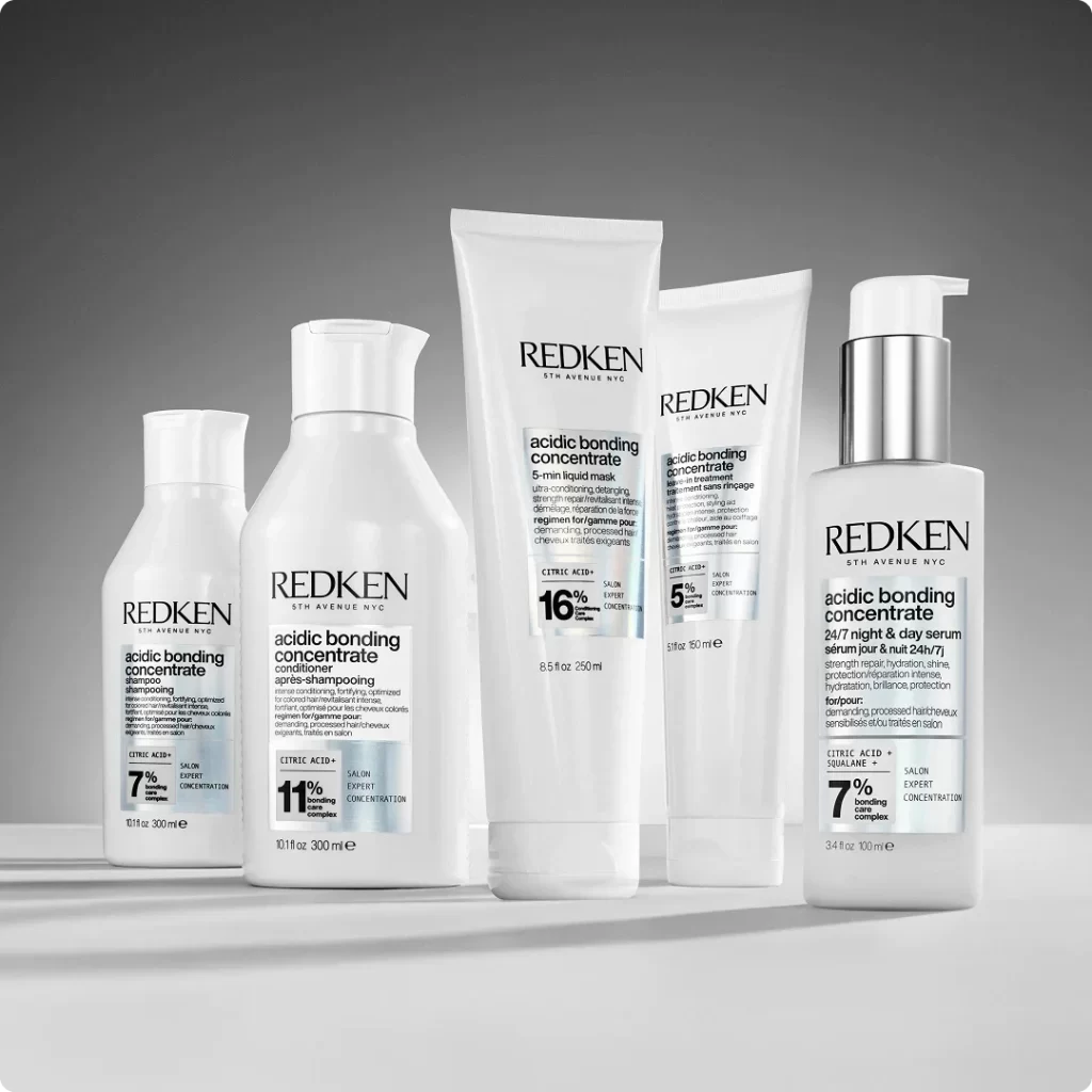
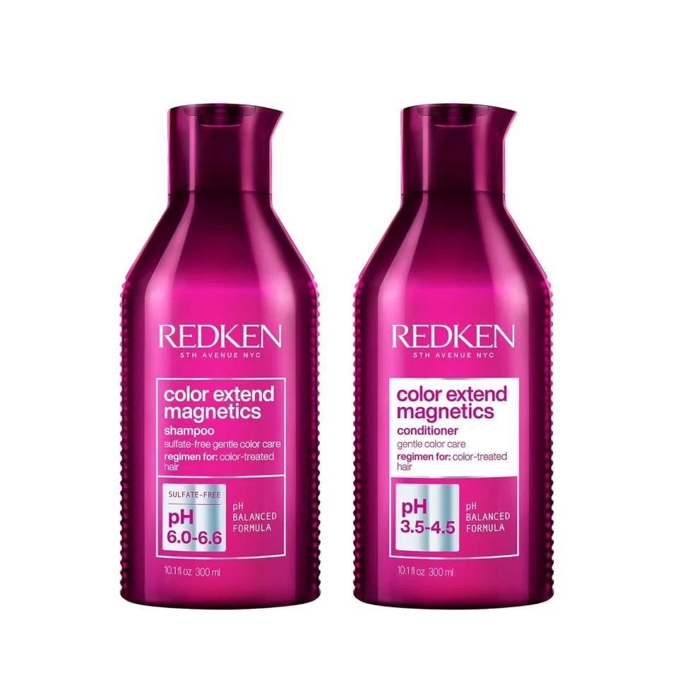
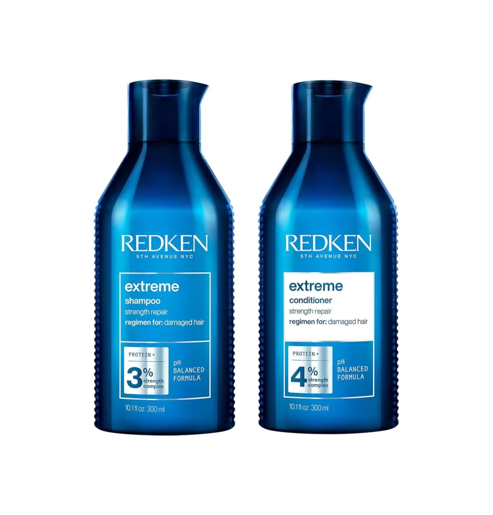
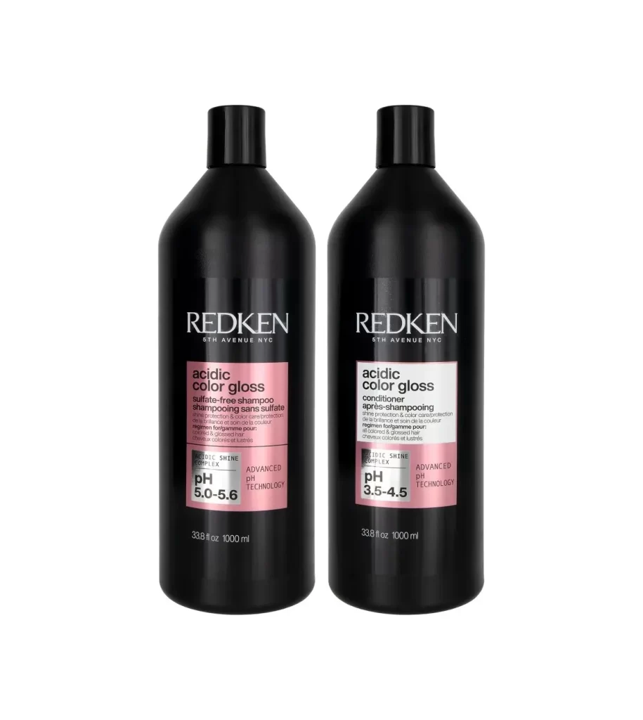
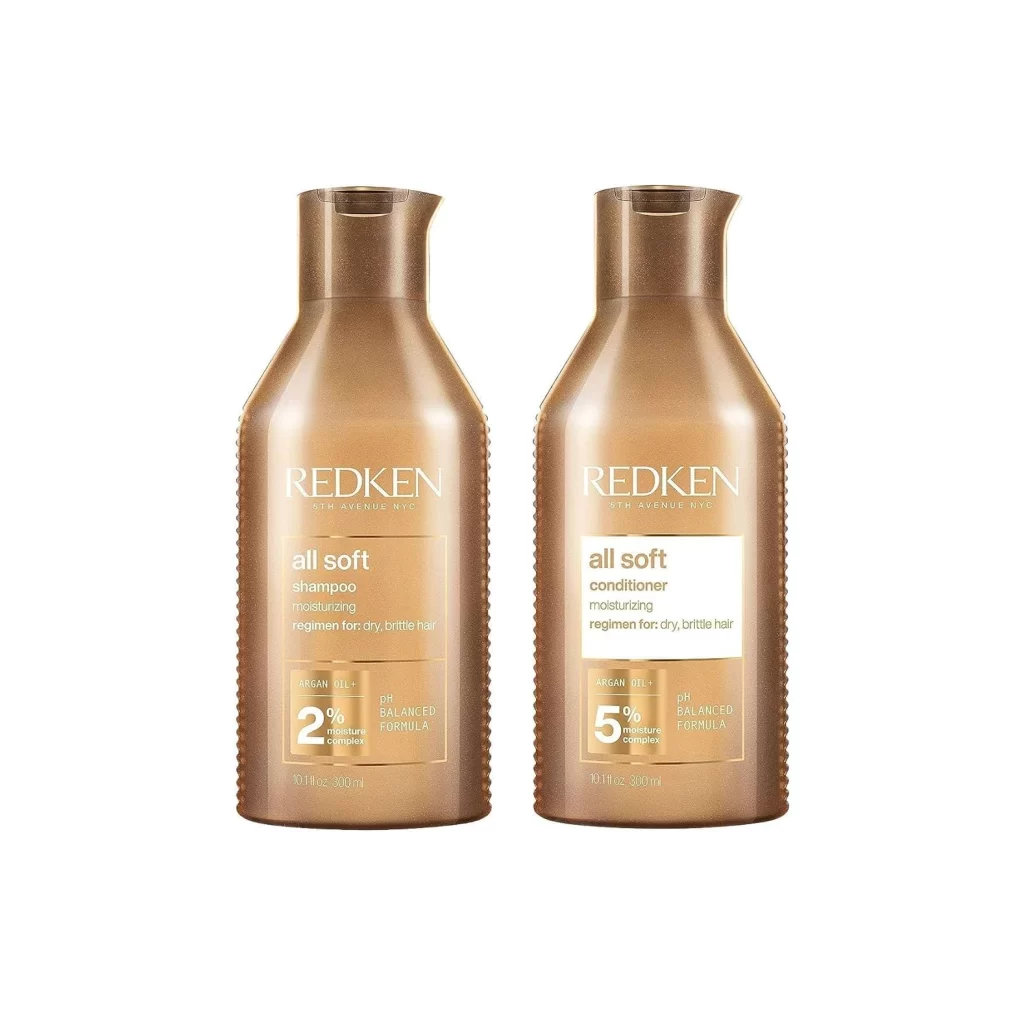
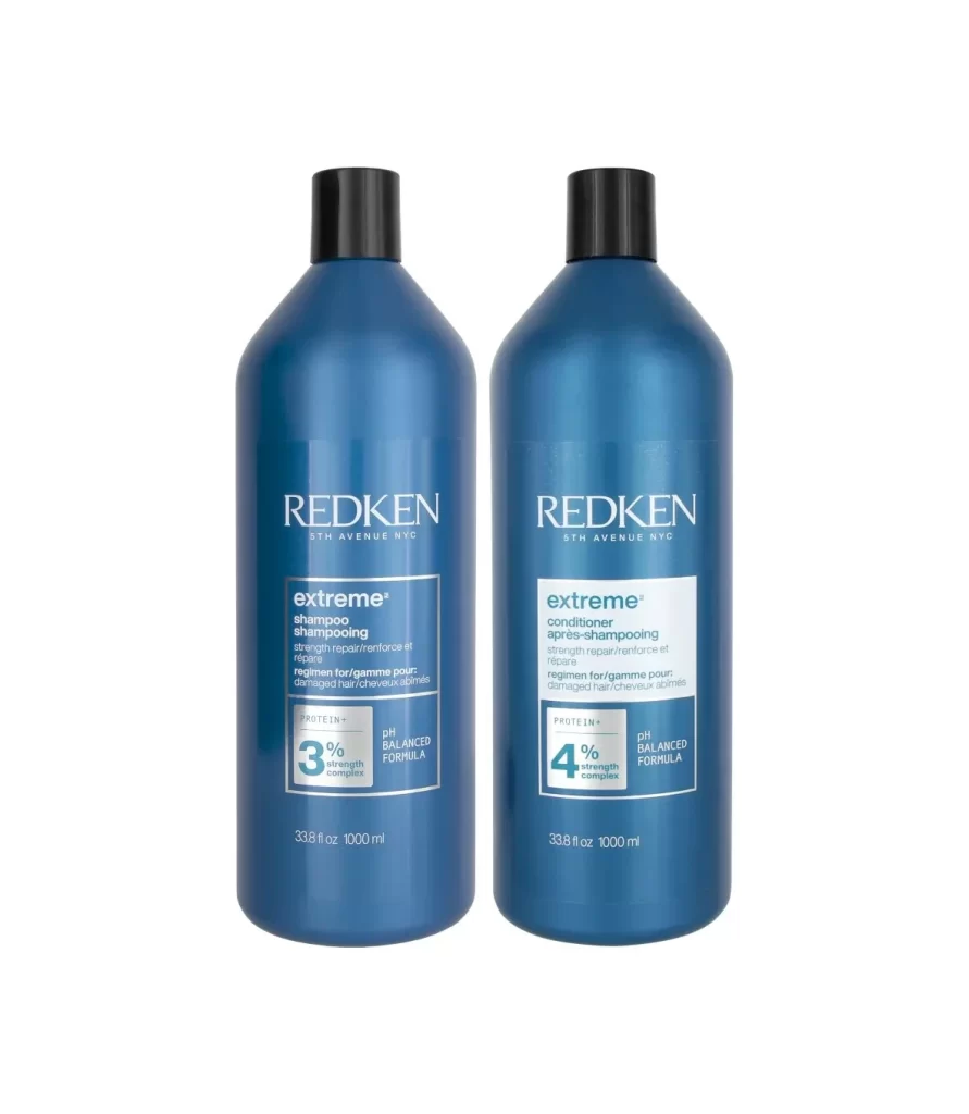
Two identical blue bottles stand side-by-side against a pure white background, each featuring a cylindrical body that tapers into a narrow neck topped with a matte black screw cap. The deep navy-blue plastic containers display the 'REDKEN' brand name in white serif lettering above the 'extreme' product line designation, with the left bottle labeled as shampoo and the right as conditioner. Both feature rectangular white labels containing technical specifications, including 'PROTEIN+' strength complex percentages—3% for the shampoo and 4% for the conditioner—alongside 'pH BALANCED FORMULA' text and 1000ml volume measurements at the base.
Visual hierarchy relies on the contrast between the dark blue substrate and crisp white typography, creating a clinical yet premium aesthetic typical of professional salon products. The consistent use of geometric label shapes and standardized placement across both variants establishes a cohesive product family identity, while the subtle gradient on the bottle surfaces suggests a metallic or pearlescent finish that catches light differently than standard matte packaging. This particular iteration emphasizes scientific credibility through prominent numerical data and bilingual text presentation, distinguishing it from more decorative consumer haircare packaging.
Product photographers can utilize this composition to study symmetrical arrangement techniques for dual-item beauty sets, while packaging designers might reference the typographic scale and color relationships between primary branding and secondary informational text. E-commerce specialists could examine how the neutral background isolates product details without distraction, and 3D modelers may find value in analyzing the specular highlights on curved plastic surfaces to replicate realistic material properties in digital renderings.