Redken Hair Color Bottle
Topics
Details
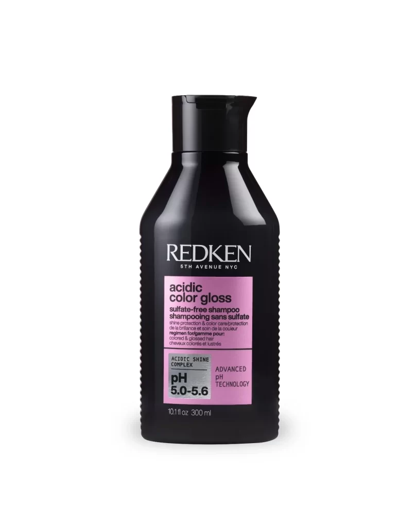
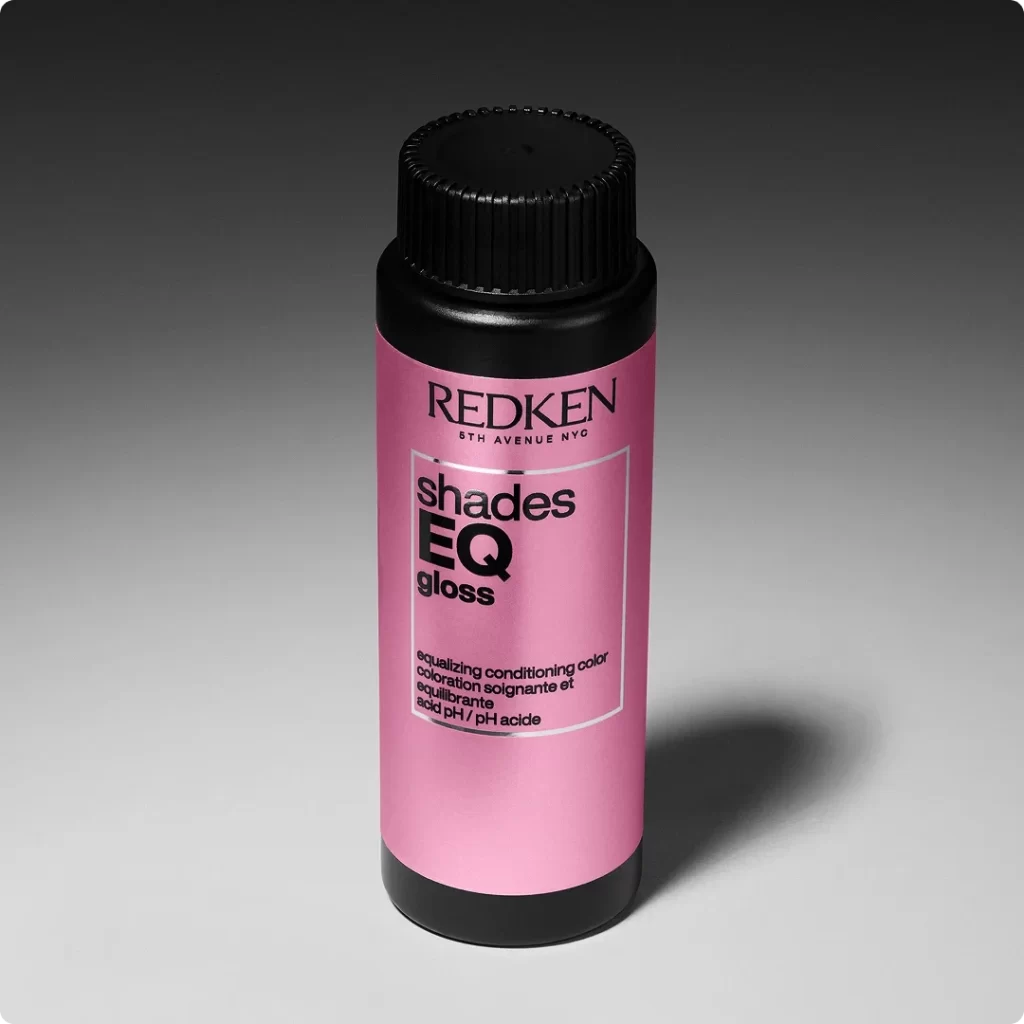
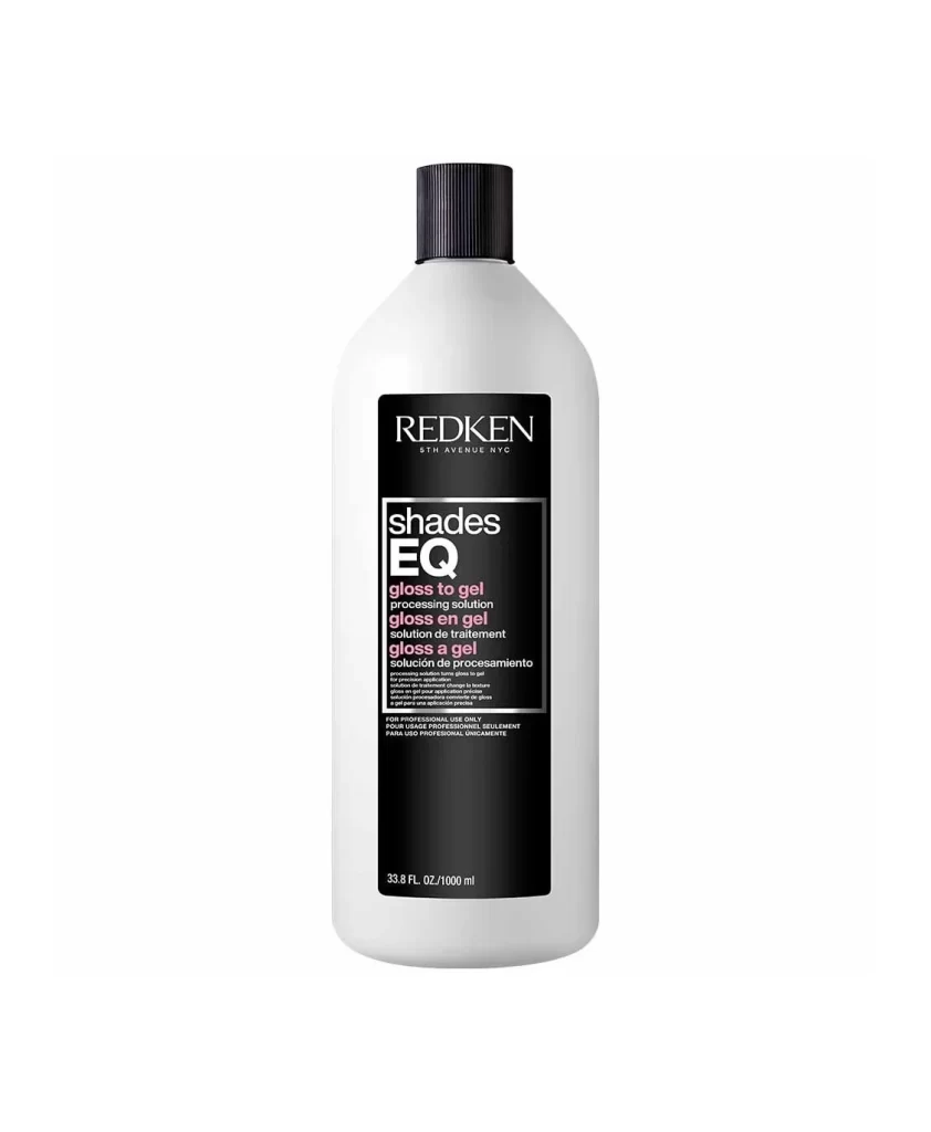
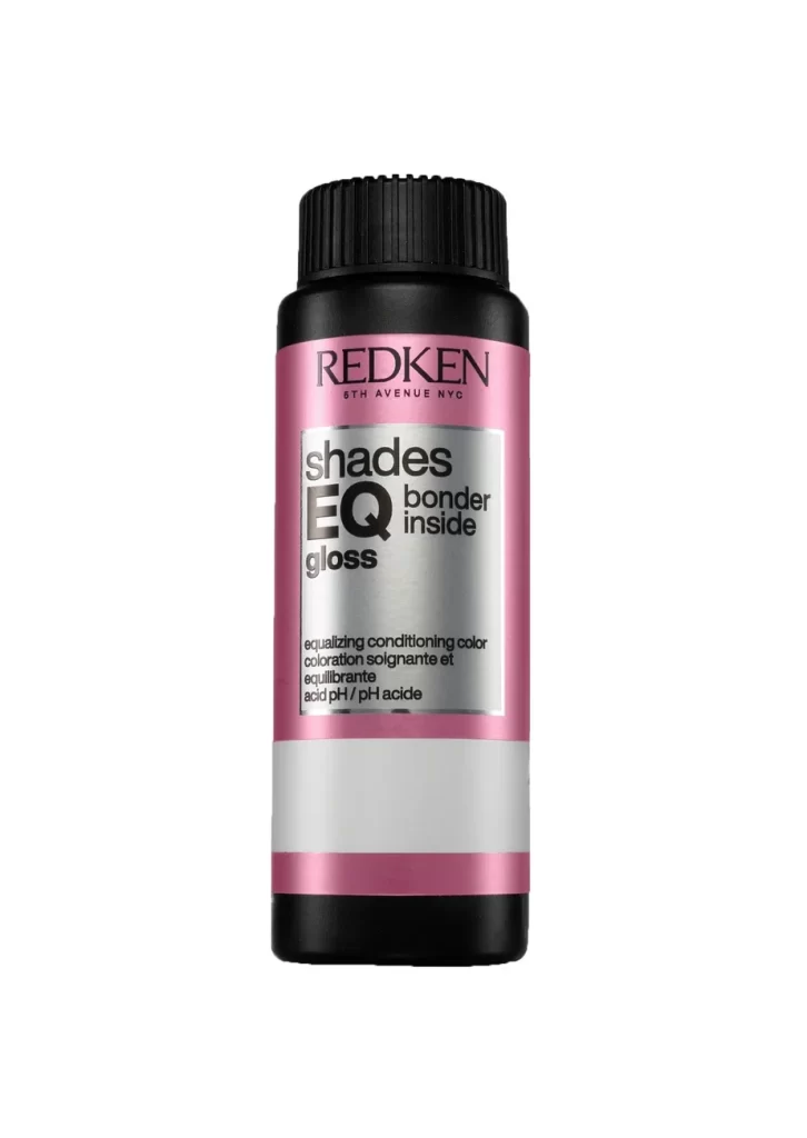
A cylindrical Redken hair color bottle stands upright with a black ribbed cap and a body divided into three horizontal bands: pink at the top and bottom, with white in the middle. The front label displays 'REDKEN' in dark lettering above the product name 'shades EQ gloss' in bold black typography on a metallic silver background, while soft even lighting illuminates the container from a straight-on angle.
Visual distinction arises from the striking contrast between the saturated pink metallic sheen and the industrial silver-grey accent band, creating a bold color-blocked aesthetic typical of professional salon products. The typography employs a clean, modern sans-serif hierarchy where ‘EQ’ is dramatically enlarged within the product name, immediately drawing the eye to the specific line identifier. This particular packaging design balances clinical precision with cosmetic allure through its combination of matte black components and reflective metallic surfaces.
Product photographers might study this composition to understand how to effectively showcase cylindrical containers with minimal distracting shadows. Packaging designers could analyze the color palette and typographic layout when developing new beauty industry branding that requires both professionalism and visual impact. Marketing teams may reference this image to ensure consistent visual representation of the Shades EQ line across digital and print retail platforms.