Redken Shampoo Bottle
Topics
Details
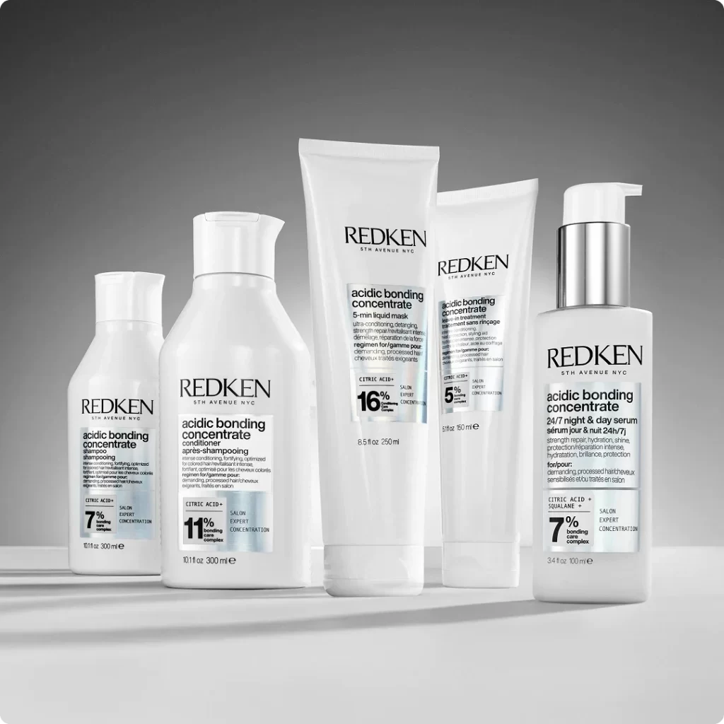
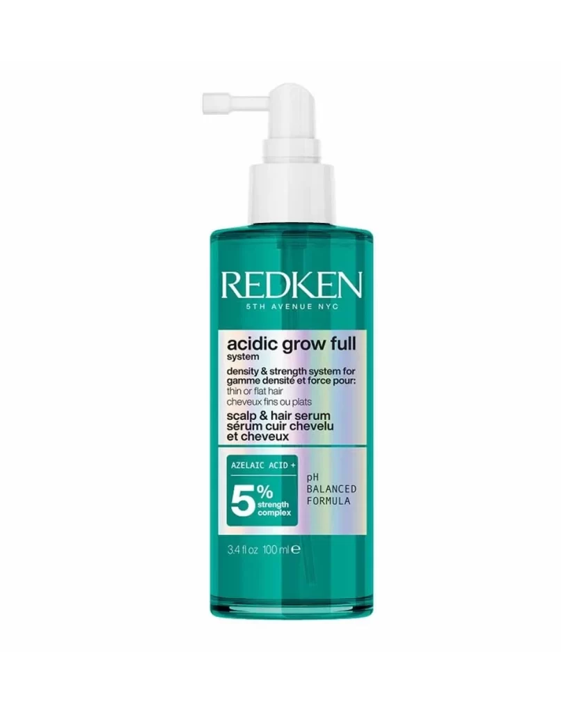
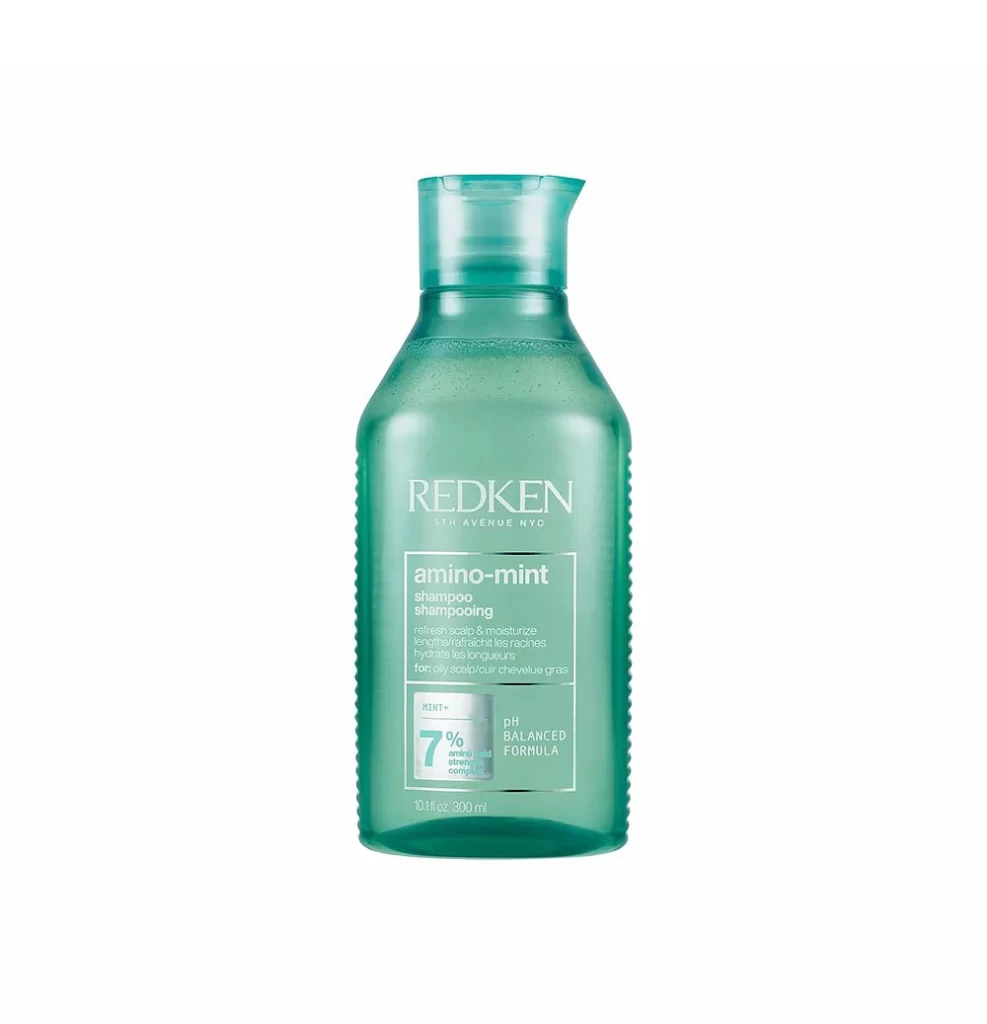
A translucent teal-green plastic bottle stands centered against a pure white void, its surface catching soft, diffused light that reveals subtle condensation droplets clinging to the interior. The container features a distinctive ergonomic silhouette with a narrow neck flaring into a functional pour-spout cap, while vertical ribbing textures the sides to suggest grip and tactile utility. Prominently displayed in clean white sans-serif typography, the brand name REDKEN anchors the upper portion, followed by the product designation amino-mint and bilingual descriptions promising scalp refreshment and moisture for oily hair types.
Visual hierarchy operates through disciplined typographic scaling and strategic use of negative space within a rectangular label frame, creating a clinical yet approachable aesthetic typical of professional salon formulations. The mint-infused color palette functions as an immediate sensory signifier, psychologically linking the cool green hue to the refreshing properties advertised on the packaging. Notable graphic elements include the bold '7%' percentage callout and pH balanced badge, which leverage numerical authority to reinforce the product's scientific positioning within the crowded haircare market.
Industrial designers examining consumer packaged goods might analyze this object to study how material translucency communicates product purity while concealing exact fill levels through controlled opacity. Packaging engineers could reference the bottle's structural ribbing as a case study in combining aesthetic texture with practical anti-slip functionality for wet bathroom environments. Marketing teams developing eco-conscious branding strategies would find value in dissecting how the minimalist color scheme and reduced ink coverage signal environmental responsibility without sacrificing shelf presence.