Redken Shampoo And Conditioner Bottle Detail
Topics
Details
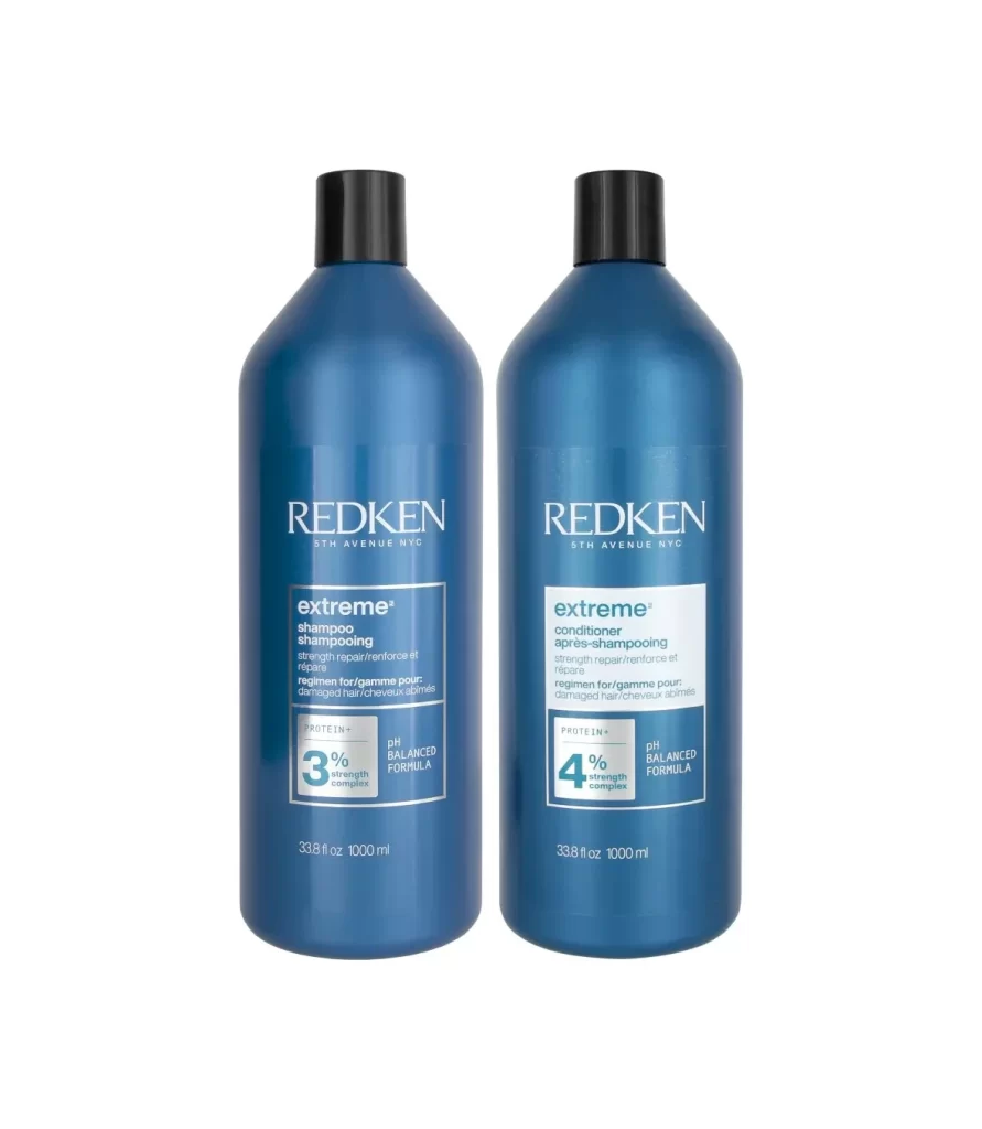
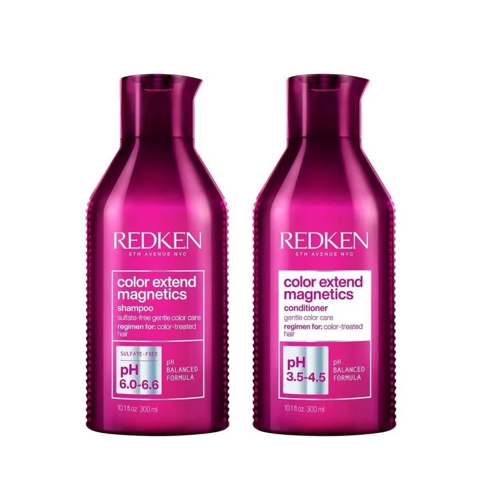
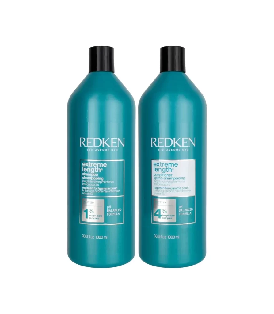
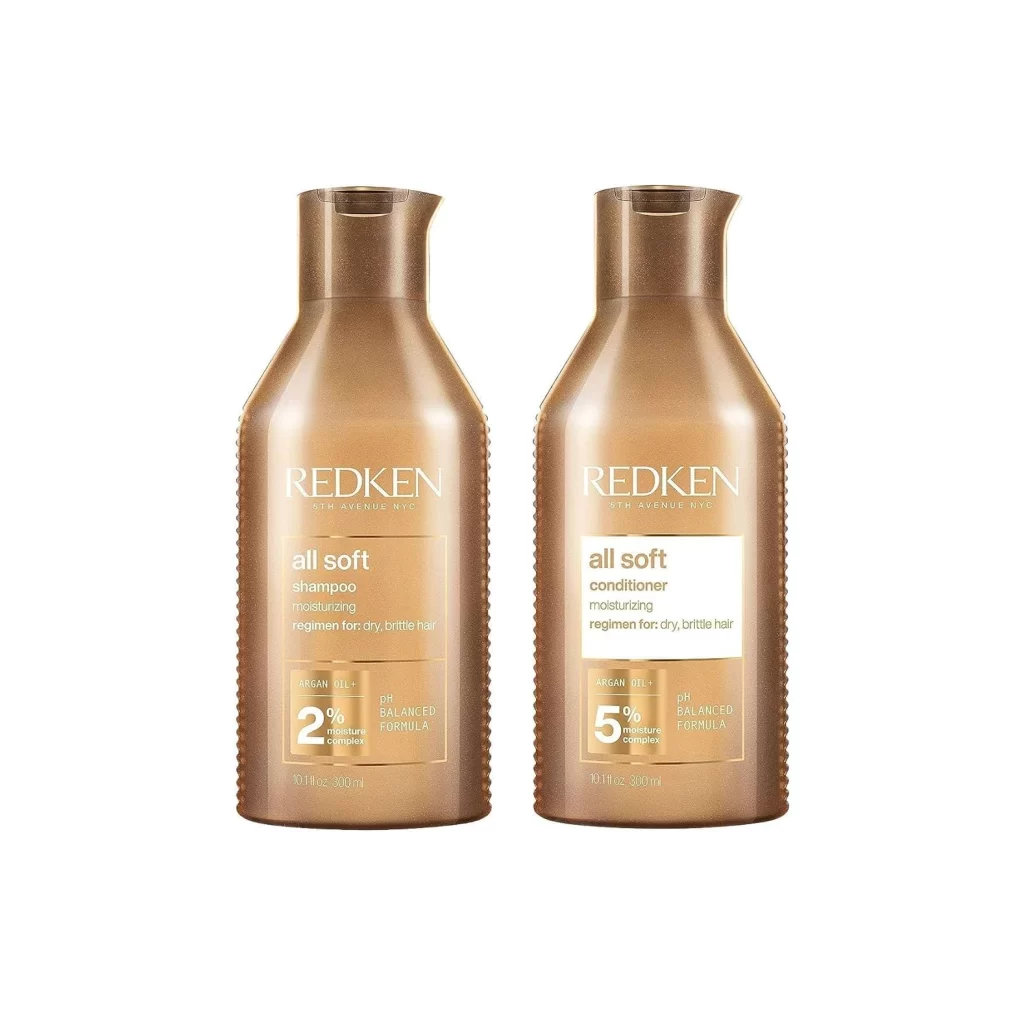
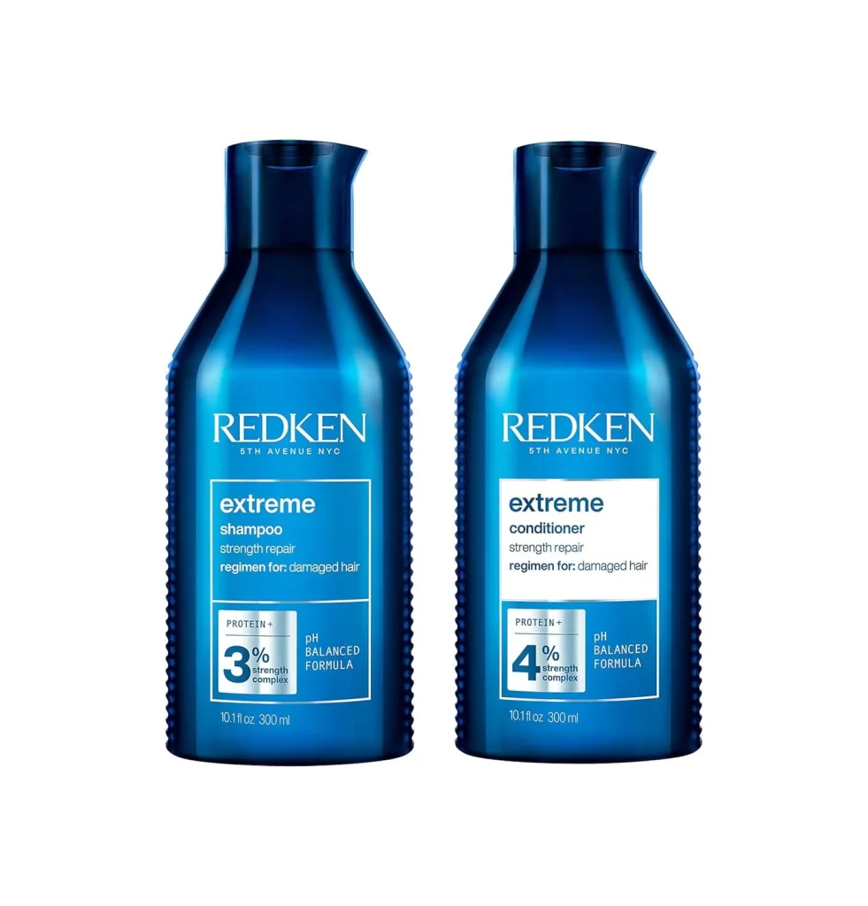
Positioned side-by-side against a pure white void, two deep cobalt blue bottles dominate the frame with their glossy, reflective surfaces. Each vessel features an ergonomic, slightly tapered silhouette crowned by a functional pour-spout cap, while the sides exhibit a subtle ribbed texture that catches the light. The left bottle is clearly labeled as shampoo containing a 3% strength complex, whereas its counterpart on the right identifies as conditioner with a 4% complex, both displaying the 'extreme' product line and 'strength repair' regimen for damaged hair in crisp white typography.
Visual hierarchy within the packaging relies on the stark contrast between the saturated blue substrate and the high-contrast white label blocks, ensuring legibility of technical data like pH balance and protein content. The specific percentage callouts—3% versus 4%—serve as immediate visual differentiators between the two products, guiding the user through a coordinated hair care system without confusion. Furthermore, the tactile-looking ridges along the bottle's perimeter suggest grip and premium quality, distinguishing this professional-grade aesthetic from standard consumer packaging.
Industrial designers analyzing consumer goods packaging would utilize this composition to study how color psychology and typographic layout influence brand perception in the beauty sector. Marketing teams could reference the clear differentiation strategy between paired products to improve their own line extensions and cross-selling visual tactics. Additionally, 3D artists requiring accurate surface references for rendering cosmetic containers will find the specular highlights on the curved plastic particularly useful for understanding material properties under studio lighting conditions.