Redken Hairspray Can
Topics
Details
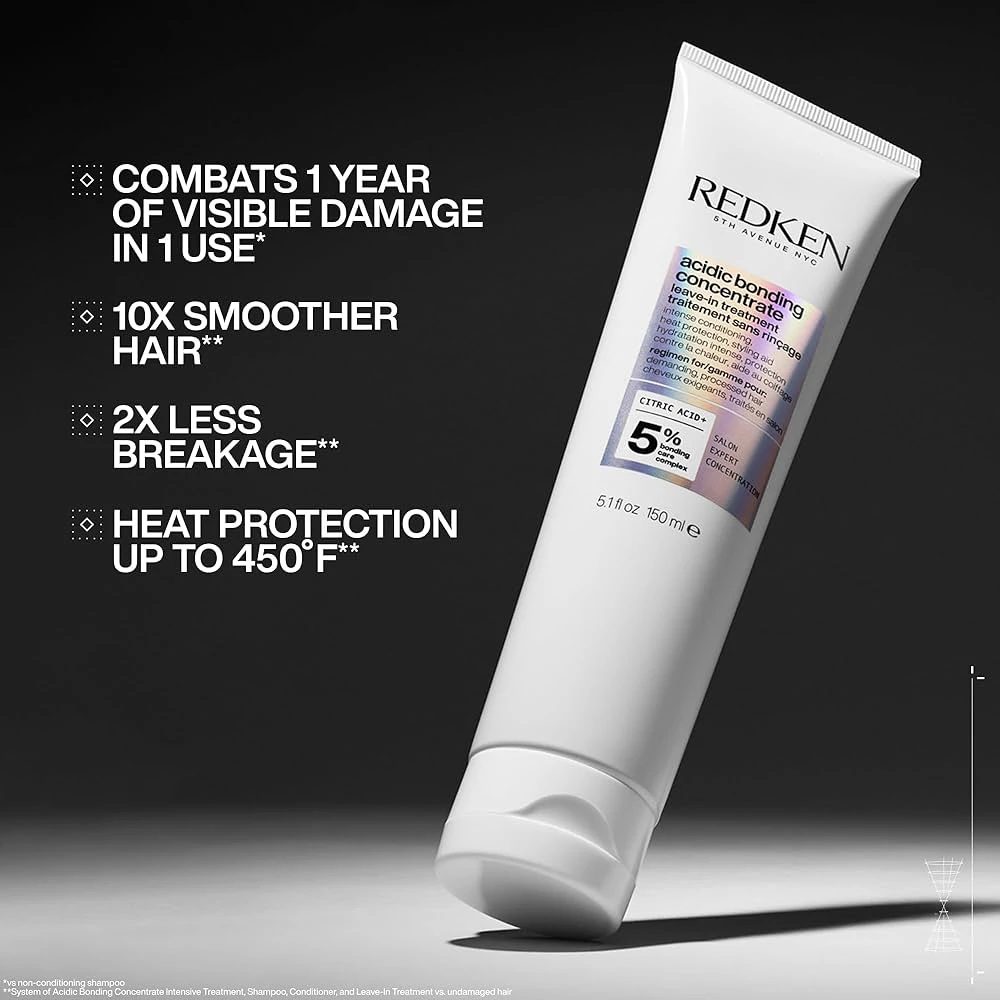
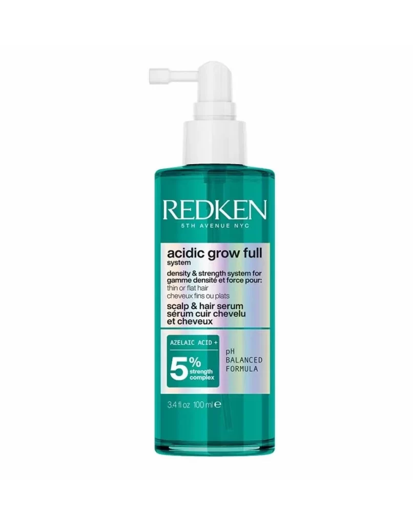
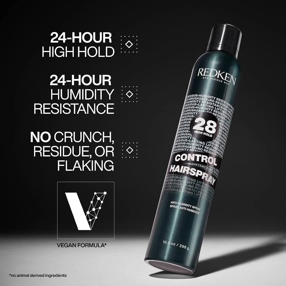
A sleek, dark teal aluminum hairspray can stands at a slight diagonal angle, its cylindrical surface covered in repeating white text that reads 'RESIDUE-HUMIDITY RESISTANCE' and 'NO CRUNCH' in varying sizes. Bold white typography dominates the left side of the frame, listing product benefits like '24-HOUR HIGH HOLD' and 'VEGAN FORMULA' beside minimalist diamond icons. Dramatic studio lighting casts a soft shadow beneath the can while highlighting the metallic sheen of the Redken bottle against a gradient background that transitions from black to light gray.
Visual interest stems from the intricate typographic texture wrapping the entire canister, creating an almost industrial aesthetic through layered, repetitive lettering that contrasts with the clean sans-serif marketing copy floating nearby. The number 28 appears prominently in oversized typography, anchoring the high-hold strength claim amidst the sea of smaller text, while the diamond-shaped bullet points introduce a subtle geometric motif that balances the organic curves of the bottle. Lighting carefully sculpts the metallic surface, emphasizing the premium finish and dimensional quality of the packaging design.
Product photographers studying cosmetic lighting techniques will find the gradient backdrop and specular highlights particularly instructive for capturing reflective surfaces. Packaging designers analyzing typographic hierarchy in beauty branding can examine how repetitive micro-text creates visual density without overwhelming primary messaging. Marketing teams developing e-commerce assets might reference this composition for balancing detailed feature lists with hero product shots in promotional materials.