Redken Dry Shampoo Can
Topics
Details
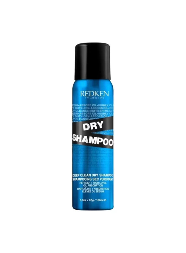
Cobalt blue metal forms the primary body of this cylindrical aerosol container, capped with a matte black plastic nozzle that creates a sharp tonal contrast. The 'REDKEN' brand name appears in clean white sans-serif lettering near the top, while a bold black diagonal band bisects the can to display 'DRY SHAMPOO' in oversized white typography. Below, smaller white text details product benefits including 'DEEP CLEAN DRY SHAMPOO' and multilingual descriptions of oil absorption capabilities, all set against a seamless white background under even studio lighting.
Visual hierarchy relies heavily on the aggressive diagonal interruption of the blue field, which forces immediate attention onto the functional purpose of the product. Repeating background text patterns create subtle texture without competing with the primary branding elements, demonstrating sophisticated layering of information density. The color palette restricts itself to industrial blue, absolute black, and crisp white, resulting in a clinical yet approachable aesthetic typical of professional salon formulations.
Product photographers might study the lighting setup to understand how metallic surfaces reflect light without creating distracting hotspots. Packaging designers could analyze the typographic weight distribution between brand identity and descriptive copy for similar cosmetic applications. 3D modelers seeking accurate material references for beauty industry assets would find the specific sheen values and cap geometry particularly useful for texture work.