Oribe Shampoo Bottle Closeup
Topics
Details
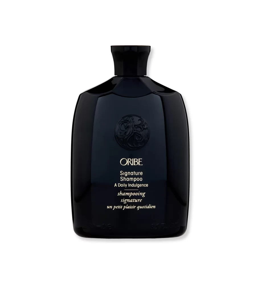
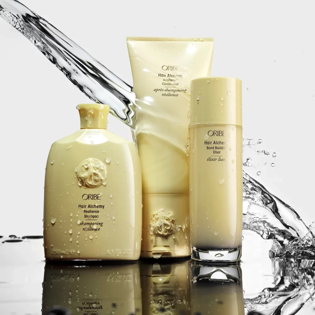
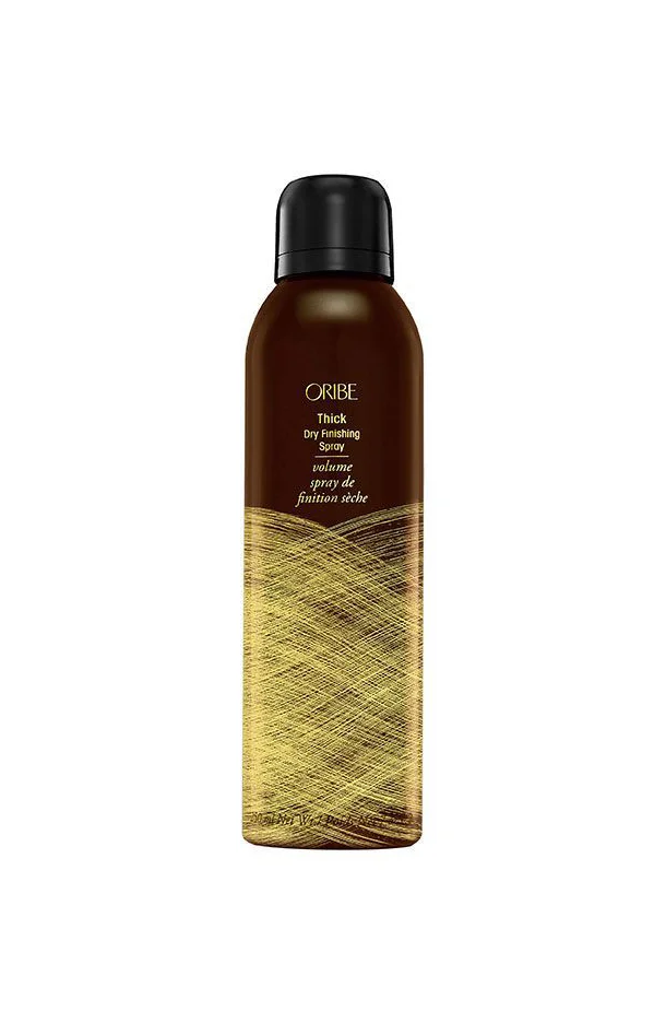
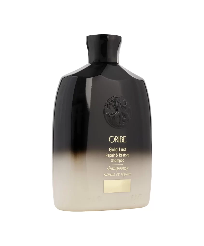
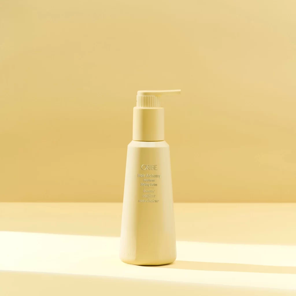
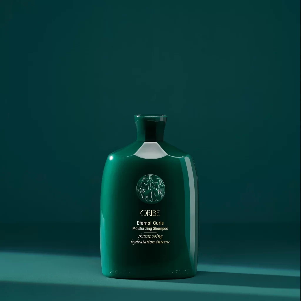
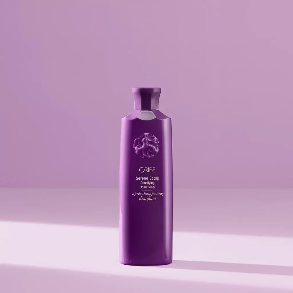
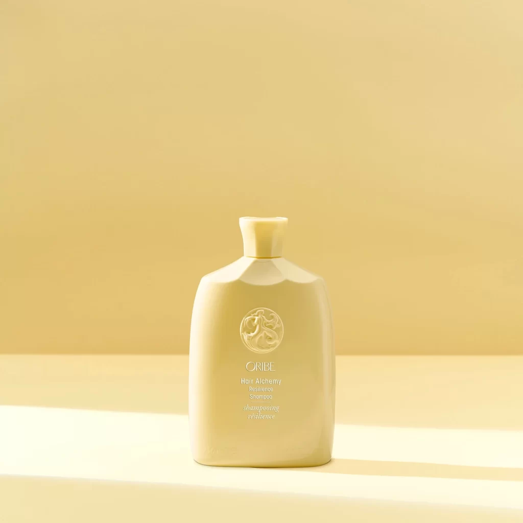
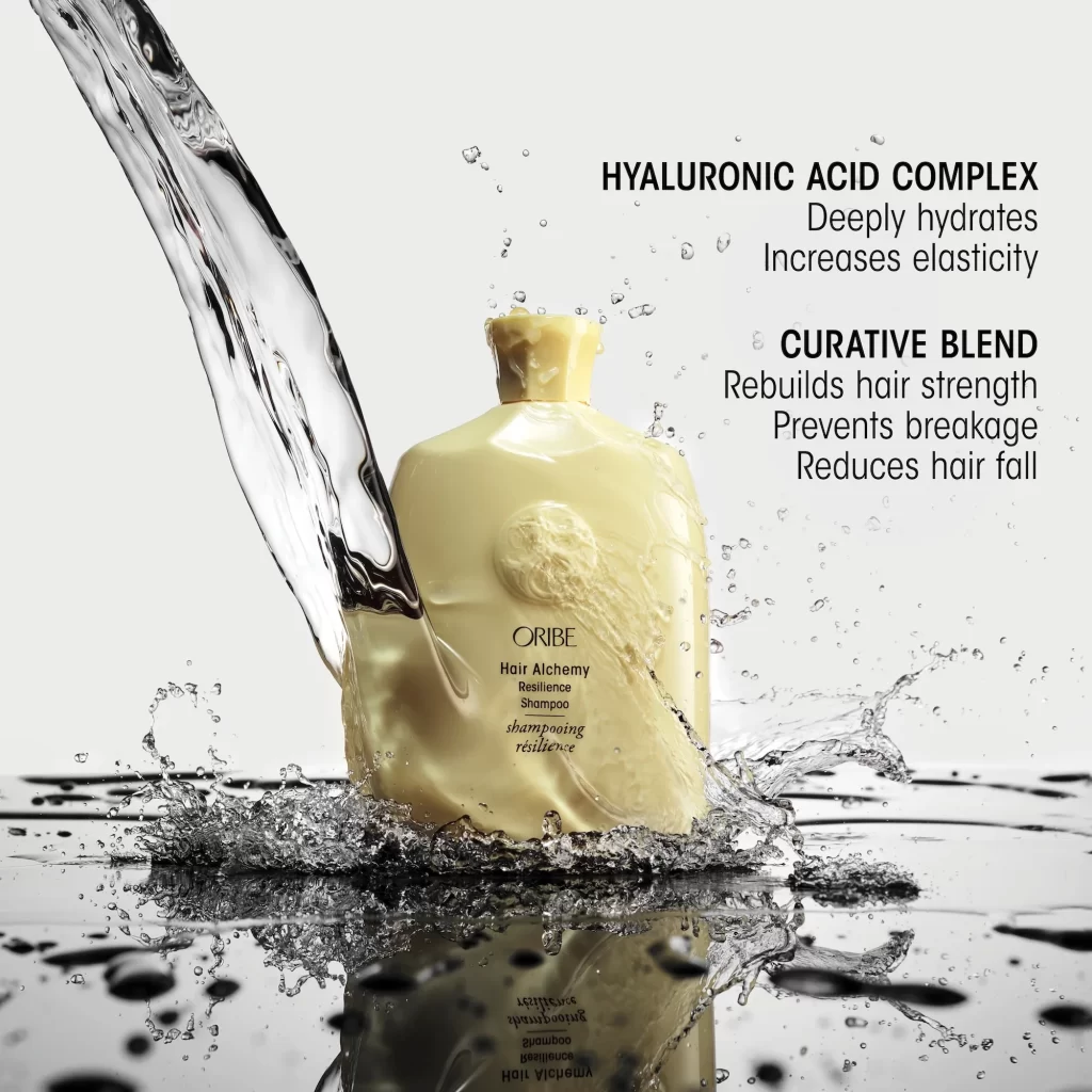
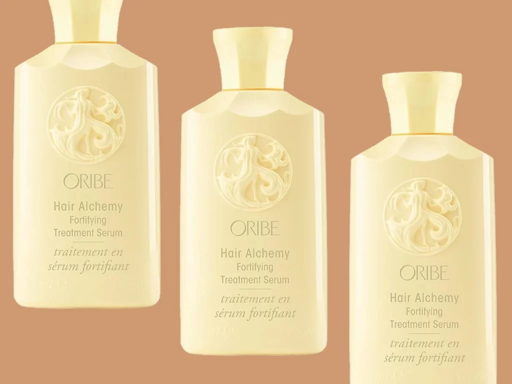
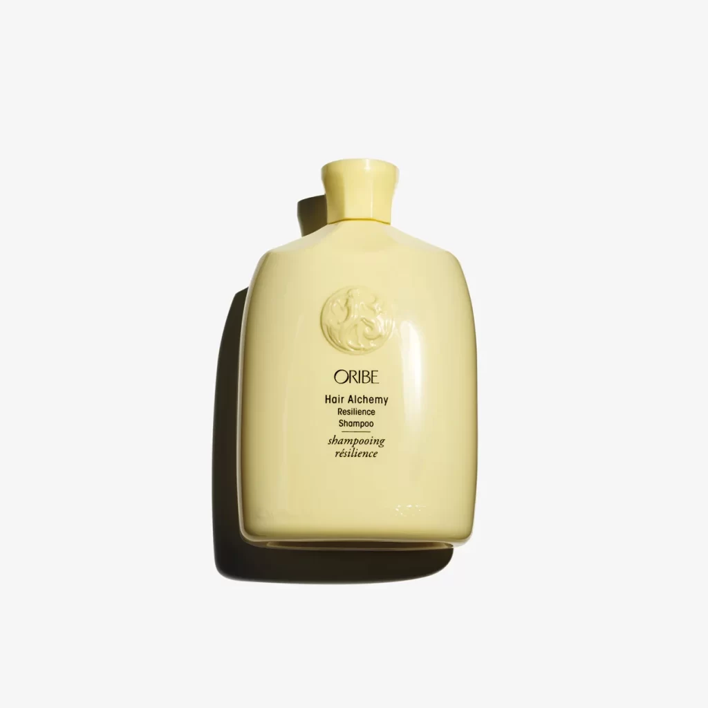
Centered within a pristine white void, a pale yellow Oribe shampoo bottle stands at a slight three-quarter angle, its soft, matte surface catching light from the upper left. The vessel features a gently squared body that tapers into a short, fluted neck topped with a matching cap. Black serif typography identifies the product as Hair Alchemy Resilience Shampoo, positioned below an embossed circular crest containing an intricate relief figure.
Visual distinction arises from the bottle's muted, creamy hue and substantial architectural form, which departs from standard transparent packaging. Subtle shadows cast to the right emphasize the object's volume and tactile quality, while the embossed logo adds a layer of physical depth rarely seen in mass-market hair care containers. This restrained palette and refined typography signal a luxury positioning through minimal ornamentation rather than excessive decoration.
Product photographers might study this composition for its mastery of soft-box lighting on curved matte surfaces. Industrial designers could reference the proportions when developing premium cosmetic packaging that requires both shelf presence and ergonomic handling. Brand strategists examining high-end market positioning will find value in how typography hierarchy and material finish communicate quality without overt branding.