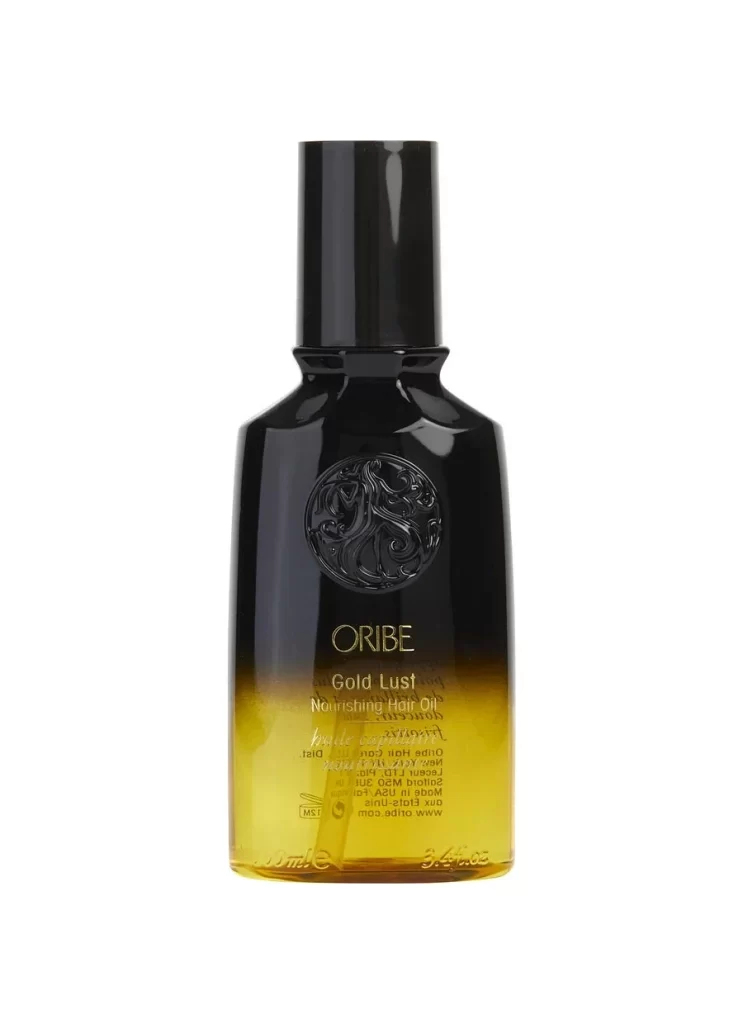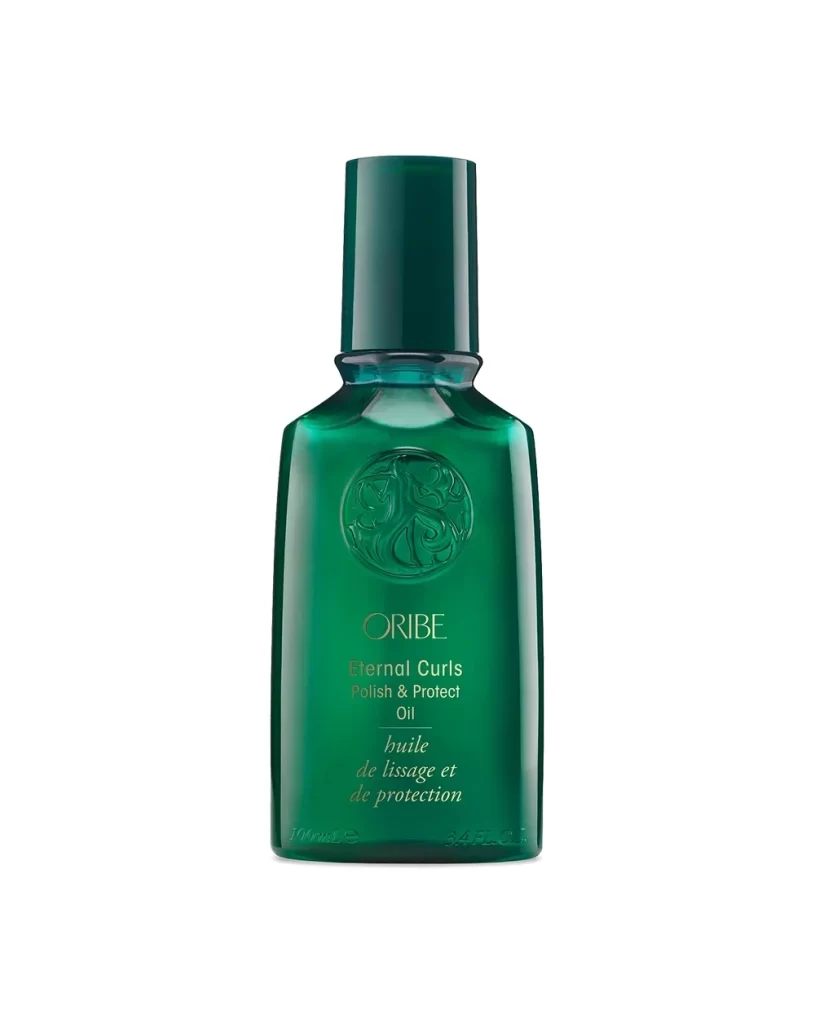
Oribe Hair Oil Bottle View
Topics
Details
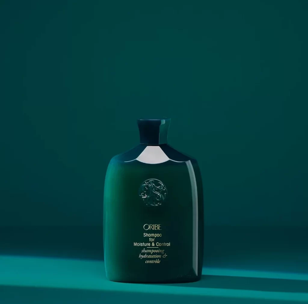
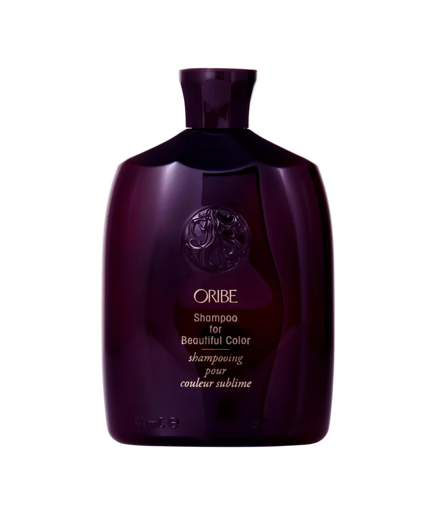
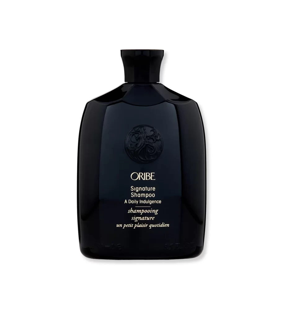
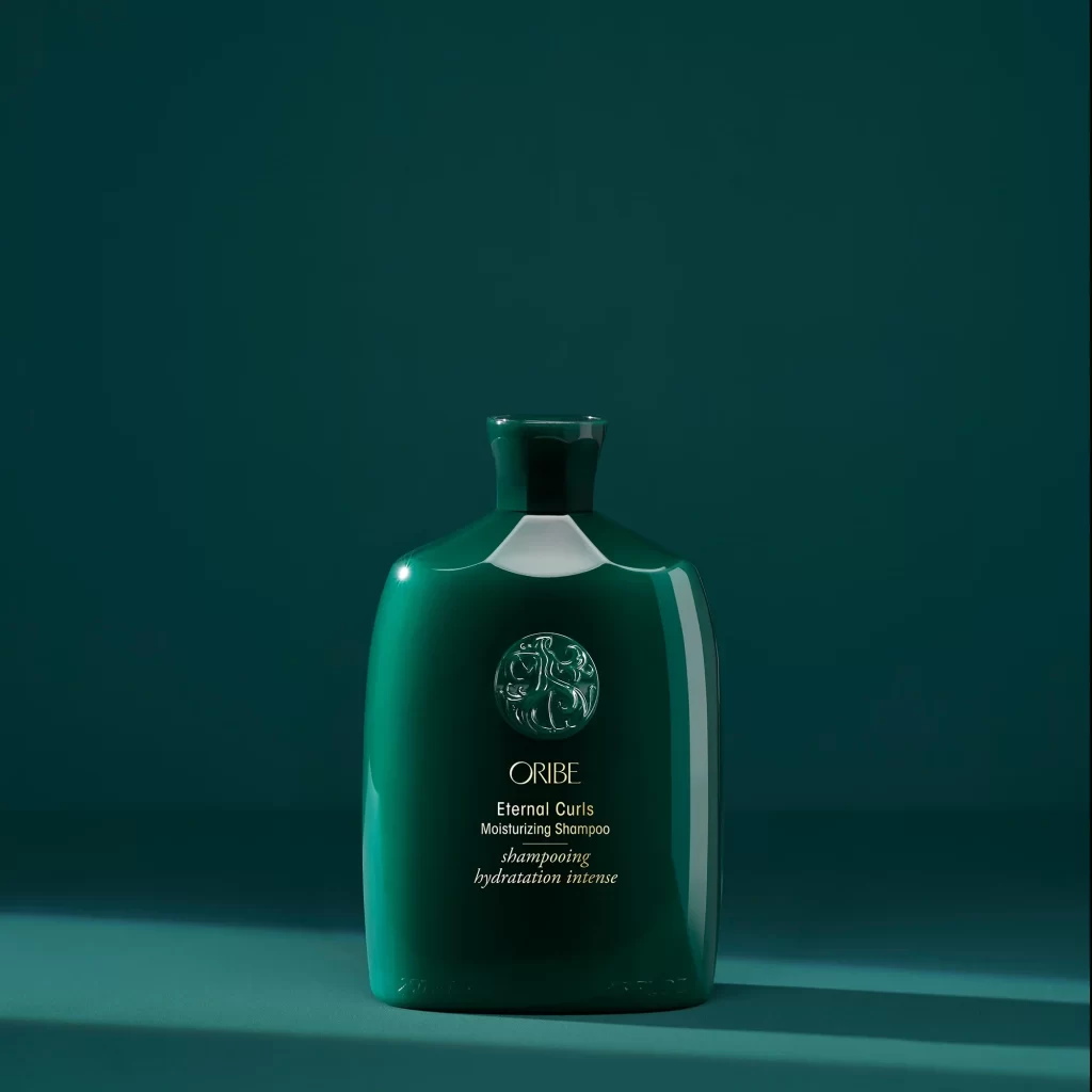
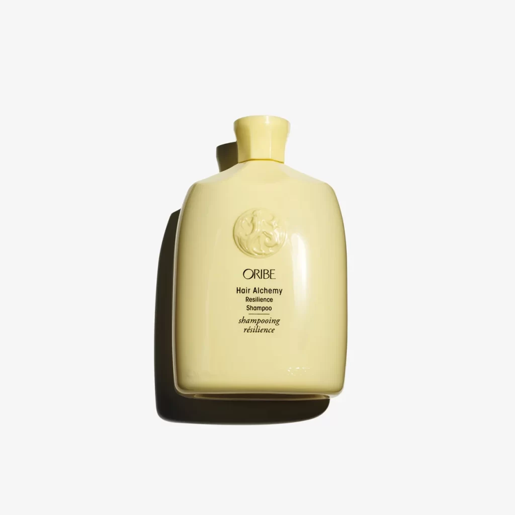
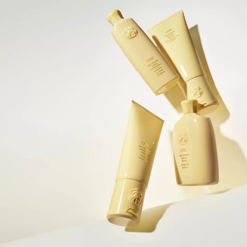
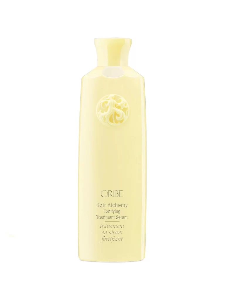
Centered within a void of pure white, a deep emerald glass vessel commands attention with its substantial, rectangular silhouette and softly rounded shoulders. The bottle features an elegant cylindrical cap in a matching dark forest tone that sits atop a subtle neck ring, while the front face displays an intricate circular relief emblem positioned above refined gold serif typography. Soft, diffused lighting creates gentle highlights along the glossy surface, revealing the translucency of the green material and casting minimal shadows that emphasize the product's three-dimensional form.
Visual distinction emerges from the sophisticated interplay between the rich jewel-toned glass and the metallic lettering, creating a luxury aesthetic that feels both organic and meticulously engineered. The embossed circular motif adds tactile depth to the otherwise smooth facade, serving as a brand signature that breaks up the expanse of color without cluttering the minimalist composition. Such careful attention to typographic hierarchy—balancing the bold ORIBE logo with the delicate script below—demonstrates how premium positioning relies on restraint rather than ornamentation.
Industrial designers examining premium packaging solutions might study this object to understand how color psychology and material finish convey product value in the beauty sector. Photographers specializing in commercial product work could analyze the lighting setup used to achieve such even illumination without losing the bottle's reflective qualities. Marketing teams developing visual identity systems for high-end personal care brands would find this useful when researching how to balance heritage elements with contemporary minimalism across physical touchpoints.