4 Drops Essential Oil Bottle
Topics
Details
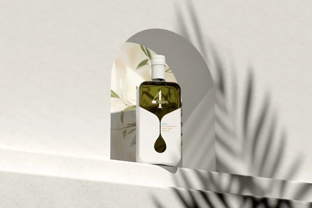
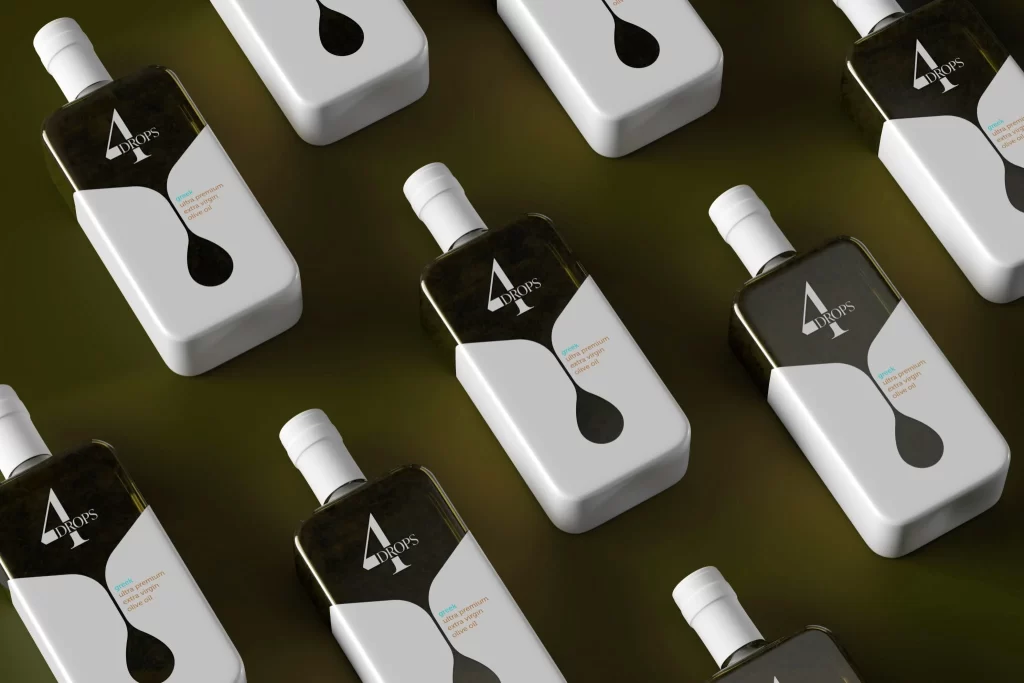
Against a muted olive-green surface, multiple rectangular bottles of '4 DROPS' essential oil are arranged in a staggered diagonal formation. Each vessel features a two-tone construction with a translucent dark upper section and a solid white lower half, separated by a sweeping curve that terminates in a bold black teardrop graphic. White screw caps top the bottles, while the brand name appears in a crisp serif font above smaller descriptive text, all illuminated by soft studio lighting that creates subtle shadows beneath each object.
Visual interest is generated through the clever integration of the liquid droplet motif directly into the bottle's silhouette, creating a seamless relationship between form and graphic identity. The high-contrast palette of black, white, and deep amber establishes a premium aesthetic that feels both modern and organic. By repeating the unit across the frame, the composition emphasizes consistency in manufacturing while allowing viewers to appreciate how light interacts with both the glossy label areas and the matte white surfaces.
Product photographers might study this arrangement to understand how to effectively showcase cylindrical packaging without losing dimensional clarity. Packaging designers could analyze the typographic hierarchy and negative space usage to inform their own label layouts for wellness or cosmetic brands. Art directors planning e-commerce shoots would benefit from examining how the diagonal grid creates dynamic visual flow while maintaining a clean, organized presentation suitable for luxury market positioning.