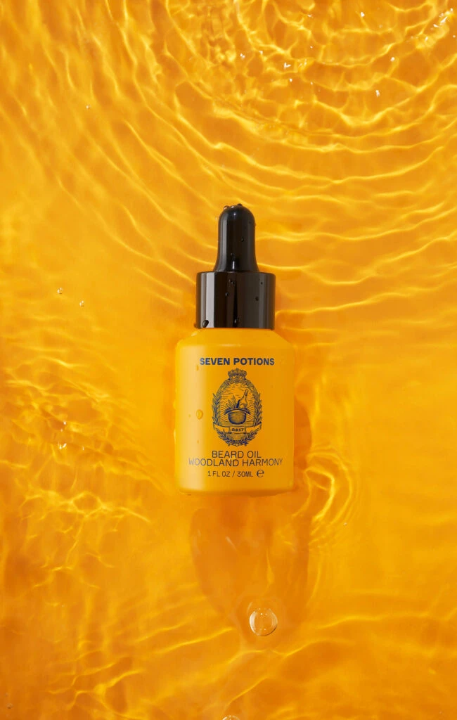
Seven Potion BEARD OIL Bottle
Topics
Details
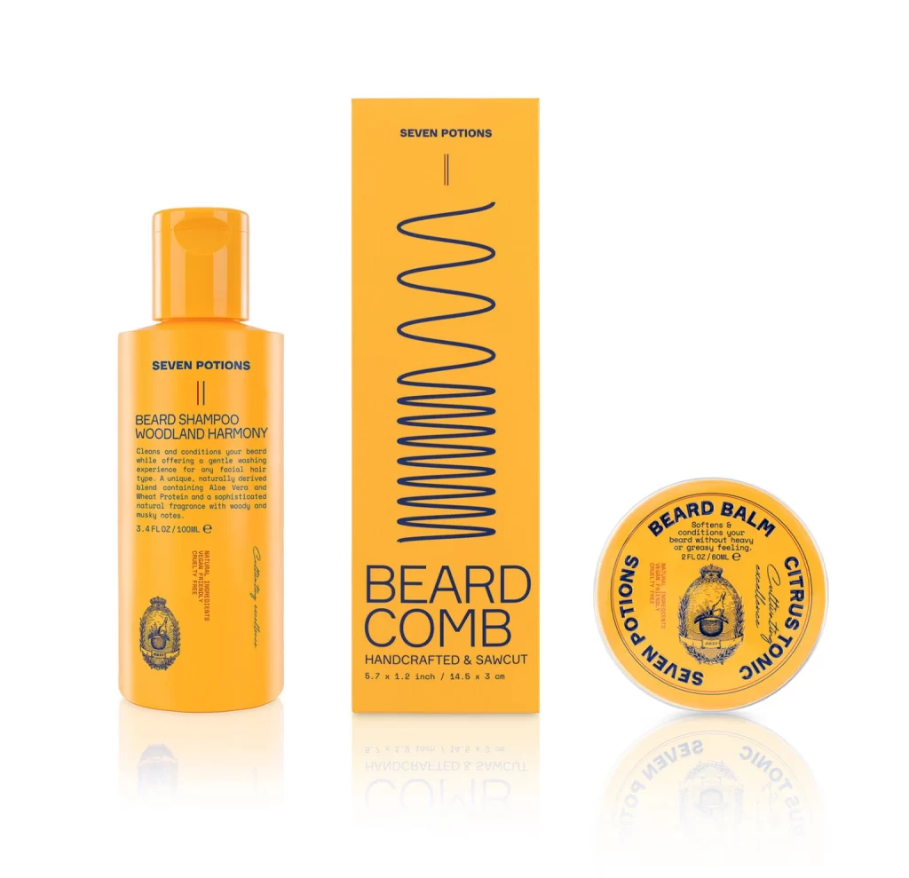
Amidst a sea of rippling amber liquid, a matte yellow bottle of Seven Potions beard oil sits centered in the frame. The container features a black dropper cap and displays dark blue typography reading 'SEVEN POTIONS,' 'BEARD OIL WOODLAND HARMONY,' and '1 FL OZ / 30ML' beneath an ornate crest. Overhead lighting catches the fluid's undulating surface, creating concentric wave patterns that radiate outward from the product.
Visual tension arises from the contrast between the bottle's solid, opaque geometry and the surrounding liquid's organic movement. The monochromatic orange palette unifies the composition, while the dark cap and text provide necessary anchoring points for the eye. Such deliberate color harmony transforms a standard cosmetic shot into a study of texture and light interaction.
Commercial photographers might analyze the lighting setup required to achieve such luminous transparency without losing detail in the shadows. Packaging designers could examine how the brand's crest and typeface hierarchy communicate artisanal quality through minimal elements. Art directors planning aquatic or grooming campaigns would find this useful for conceptualizing color-driven mood boards.