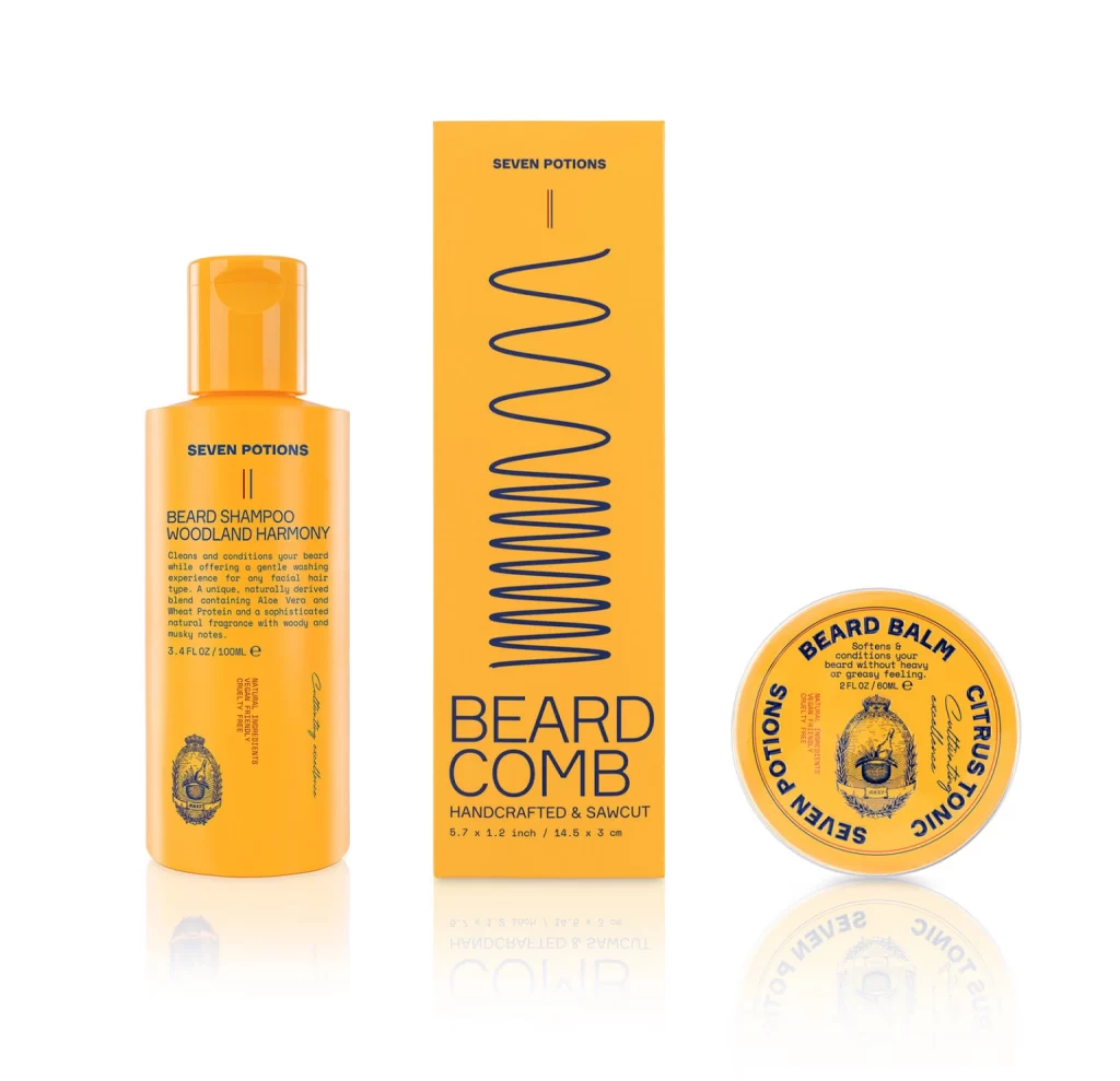
Seven Potion BEARD SHAMPOO Bottle
Topics
Details
A vibrant orange bottle with a matching screw cap stands on the left, featuring dark blue text that identifies the product as 'BEARD SHAMPOO WOODLAND HARMONY' from the brand 'SEVEN POTIONS'. To its right sits a tall rectangular box of the same hue, displaying a vertical wavy line graphic and labeling a handcrafted beard comb, while a circular tin of 'CITRUSTONIC' beard balm completes the trio on the far right. All three items rest on a reflective white surface that mirrors their forms, illuminated by even studio lighting that eliminates harsh shadows and presents the objects from a straight-on, eye-level perspective.
Visual cohesion is achieved through the strict monochromatic palette of saturated orange and deep navy typography across all three packaging formats. The contrast between the cylindrical bottle, the elongated box, and the round tin creates a balanced geometric composition that highlights how a single branding language can adapt to different physical containers. Subtle details like the crest emblem and the specific wavy pattern on the comb's box add texture and visual interest without cluttering the minimalist aesthetic.
Packaging designers studying consistent brand identity systems across multiple product lines will find this arrangement particularly useful for analyzing color theory and typographic hierarchy. Art directors working on men's grooming campaigns can utilize this layout to understand how to photograph complementary products together to suggest a complete grooming routine. Furthermore, 3D modelers requiring reference for cosmetic containers can study the specific proportions of the flip-cap bottle and the screw-top tin to ensure accurate digital recreations.