4 Drops Oil Bottle
Topics
Details
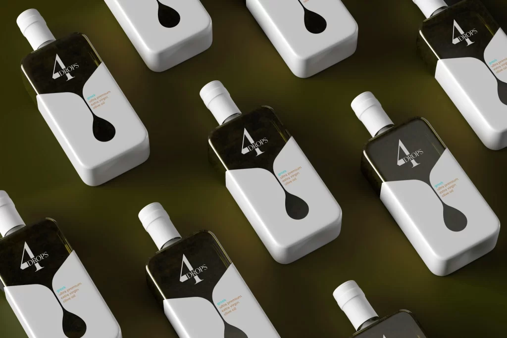
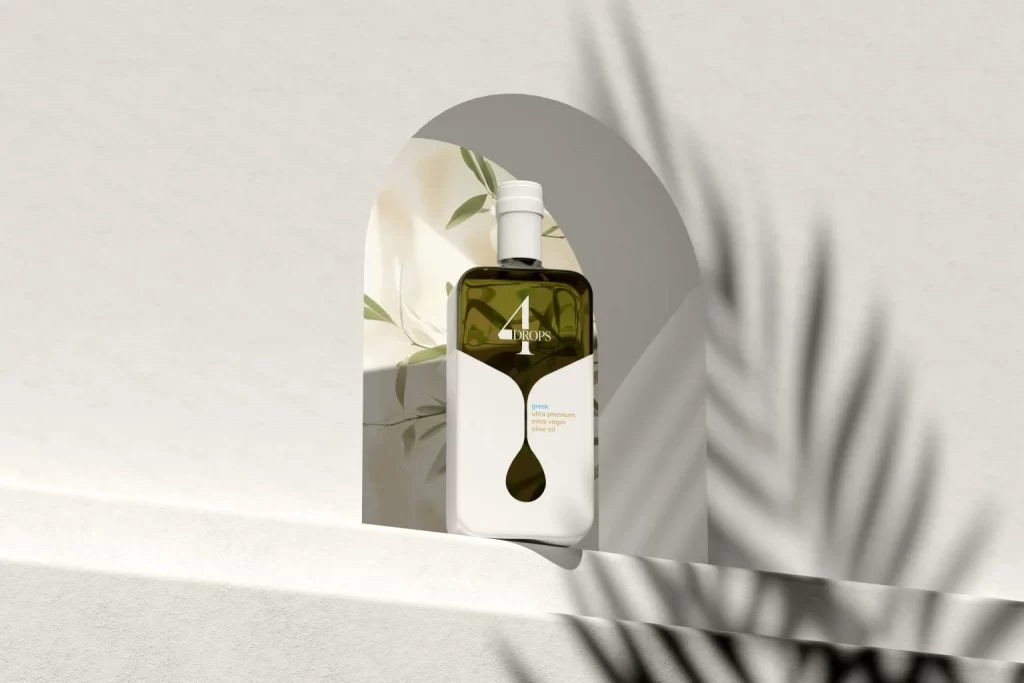
Centered within a soft arched cutout, an olive oil bottle stands against a backdrop of pale botanical leaves and stark white architecture. The container features a dark amber glass body paired with a crisp white label that curves into a teardrop silhouette at the bottom, prominently displaying the text '4 DROPS' in elegant serif typography. Natural sunlight filters in from the right, casting long, rhythmic shadows of palm fronds across the textured white surface and creating a serene, Mediterranean atmosphere.
What sets this packaging apart is the clever integration of form and function through its label design, where the negative space literally shapes a liquid droplet to reinforce the product's identity. The minimalist color palette—restricted to forest green, pure white, and subtle cream—lends the object a sophisticated, modern aesthetic that feels both organic and meticulously curated. Such a restrained approach allows the architectural geometry of the bottle and the playful typographic hierarchy to become the true heroes of the visual narrative.
Brand strategists might study this composition to understand how lighting and shadow can elevate a simple product shot into a lifestyle statement. 3D artists could utilize the distinct material contrasts between the matte paper label and the glossy glass to practice realistic rendering techniques. Even photographers will find value in analyzing how the archway frames the subject while the organic background elements add depth without distracting from the main focus.